Word Art Wizardry
![]()
Are you ready for a really long tutorial?? There are a lot of screenshots in this one, but only so I can be sure you’ve got the steps down.
If you’re like me, you probably have a good sized collection of word art in your stash. And, if you’re anything like me, you want to make it look unique to you, even though using it as is would be super simple. Let me show you a pretty easy and relatively quick way to customize and jazz up some word art. I chose this one from Jennifer Arbon of Word Art World, who guested at GingerScraps earlier this year. I wanted to use different colours for different sections of it, so I decided how many colours I was going to use – 3, then I made that many copies of the word art.
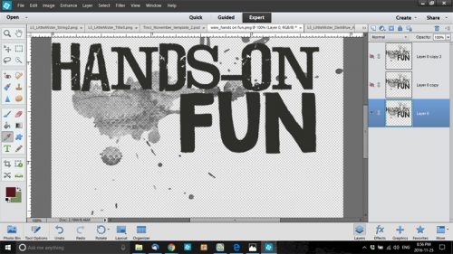
While I was working through my usual process, I discovered an even better way of doing things, which I’ll share with you later, but to start off, I wanted to isolate the paint smears, splatters and hand prints. So I selected the bottom layer in the Layers panel and a hard eraser brush. I turned the visibility of the layers I wasn’t working with off so I could see what I was doing. Then I started erasing. (You might note that I’m not using a layer mask here. I could have, but because I’m working on a copied layer, I didn’t worry about going too far or not far enough.)

After about 10 minutes of work, I had what I wanted. I only took me that long because of the complexity of the areas I wanted to keep.

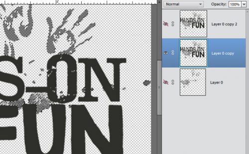
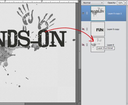
Then I moved on to the next layer. I turned the first layer’s visibility off (closed the eye) and the middle layer’s on. And this is when I had a major EUREKA moment. I was dreading having to find and erase all the little splashes of paint that I just knew were going to be hard to see until I applied a shadow or other style to it. So I thought… why not try selecting the image I have left on my bottom layer using the Layer Thumbnail and then deleting it. Just to see what happens. And it WORKED. Don’t remember how to do that? With the layer you want to change selected in the Layers panel, then CTRL/CMD>click on the layer thumbnail – the box with the image in it.

If you look really closely at this screenshot, you can see the marching ants around the hand prints and the paint just under the “s”. See also that even though that layer is turned off, the software still selected what is on it. Now it’s just a matter of deleting or cutting out the stuff I don’t want on the layer. Keyboard shortcut is CTRL/CMD>X. Or if you prefer to go the long way, you can click on the Edit tab and select Cut from the drop-down menu.
Poof! The paint and handprints are history. Sort of.

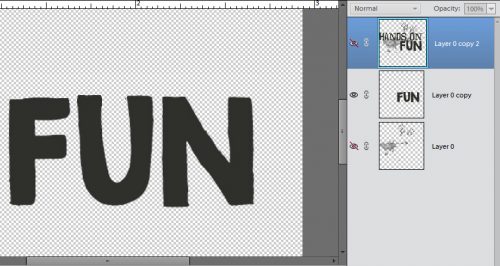
From here it’s a lot easier, especially since my discovery worked so beautifully. To remove HANDS-ON from the middle layer, I used the Marquee tool. It’s the rectangle symbol in the Tools panel; I clicked and dragged out a rectangle that encompassed everything I wanted to remove without including any part of the word FUN.

Simple CTRL/CMD>X and bye-bye!
Then I clicked on the Layer thumbnail for the FUN layer. Voilà the marching ants.
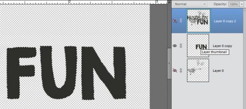
Here you can see the top two layers visible, with the marching ants around the word FUN. Remember that the top layer is the entire word art, because I haven’t removed anything from it yet.

After I deleted the word FUN I could still see an outline.

A couple of minutes with a light touch on the eraser and it was gone.

I still had to remove the paint and handprints so I selected the Layer thumbnail again (CTRL/CMD>click inside the image box) and deleted the area now outlined with marching ants. (CTRL/CMD>X or Edit>Cut)
So now I have the three separate areas of the word art on different layers and I’m ready to colour!

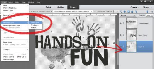
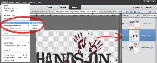
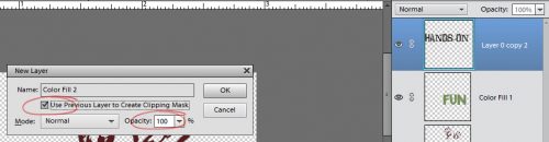
If you’ve never worked with Adjustment Layers, prepare to be amazed! I worked from the bottom up in the same way I would have if I was putting together a word art with paper items and paint. Click on the Layer tab, then select New Fill Layer from the drop-down and Solid Color from the fly-out.
A new pop-up menu will appear as shown below.

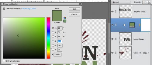
Once you’ve clicked on OK, the Color Picker opens. I want the messy part to look like beets or cranberry sauce, so I pulled the colour I wanted from my photo. (Not shown.)

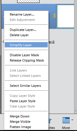
After I clicked OK, it looked like this. Not quite what I was looking for. I knew I was going to have to copy the layer and stack it to bring the colour out more. But first I had to Simplify the layer. What that does is make the colour layer and the word art layer a single object.
A right click on the colour layer brings up this menu.
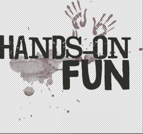
Then I made 3 more copies of that first paint-handprints layer one on top of the other. See how much darker the red is now? Looks a lot like beet juice!

I followed the same process for the FUN layer, only I used green.

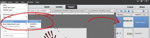
For the HANDS-ON layer I wanted to use a dark navy colour so I opened up one of the alphas I was using for my title and with the Eyedropper (Color Picker) tool I chose a spot on the letter that was nice and dark.
Then I went on to do the same steps as before.

But when I was done, there wasn’t as much definition for the words as I wanted. So I went ll the way back to my first tutorial and turned the words into stickers. To do that, I started with the HANDS-ON layer and clicked on the Edit tab. Then I selected Stroke from the options.

There are some choices to make in this menu. I wanted the white outline to be fairly thin, just barely there, so I went with 3 pixels. I wanted it to follow the contours of the letters but not cover up much of the actual letter so I went with Center. That puts the very center of the stroke on the edge of the object to be outlined, some of it inside and some of it outside. If you put the stroke inside the edges of the item you might hide most of the colour and lose some details. If you go outside there might be some areas that don’t look nice and smoothly curved. It’ll really depend on your own preferences when you’re doing it as to which location you choose. The beauty of digiscrapping is that nothing is ever final. You can try it each way and see how it looks, then if you don’t like it, CTRL/CMD>Z and it’s gone. (If you’re undoing several changes and find you’ve undone something you didn’t want to undo, you can undo the undo by clicking CTRL/CMD>Y.)

This is how the stroke looked on that blue HANDS-ON layer. I was happy with it so I used the same process and settings on the FUN layer too.

Now it’s time to make the word art into a single layer so when you move it onto your layout, it all goes together. Select all the layers and CTRL/CMD>E will merge them together. Or you can right click with all three layers selected and choose Merge Layers from the pop-up.

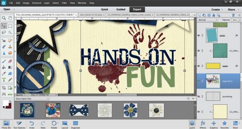
This is what the finished product looks like on my layout. It’s the layout I did for the second November Template Challenge. The template was generously provided by Krisztina of Tinci Designs. If you’re not playing along with the GingerScraps challenges, you don’t know what you’re missing!
Whew, what a marathon! Do you feel like you’ve been through the wringer? You know I’ll be looking for word art wizardry in the Gallery, and I know you won’t let me down!
Next week the lesson will be much shorter, sweeter and simpler, I promise.
![]()


[…] Tutorial Tuesday (Photoshop Elements) – 1 freebie(s)? […]