Archives for April 2017

April Bake Sale Time!!

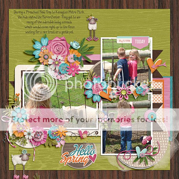
It’s that time again. Let’s see what our designer’s have placed in this month’s Bake Sale. All these items are only $1 each from the 15th to the 20th.

And if that’s not enough to get you excited, how about a Spring Cleaning Sale? The items in this group are going to be retired by our designers. This sale goes until April 20th at 11:59 pm (Eastern Time).

Time to head over to do some shopping.

Fresh Baked: April 14, 2017

Happy Friday. Spring is definitely here. Flowers are blooming all around and the songs of baby birds chirping for their meals are common. The designers are feeling the joy of the warmer weather, and have some great kits out. Several are also doing spring cleaning, so you’ll find some good sales, as well!

Remember when you spend $10 in the store, you get a great new collab!

fwp32 
https://store.gingerscraps.net/GingerBread-Ladies-Collab-Renew.html

[Read more…]

Sneak Peeks April 13th 2017

Happy Thursday! Hopefully tomorrow is a holiday for you and you get to enjoy a 3 day weekend! This weekend will be filled with lots of egg hunts, food and a visit from the Easter Bunny! I hope everyone has their camera’s ready and can use one of the great new releases in their layouts this weekend!

From Ponytails

From Craft-tastrophic


From Mags Graphics

From Tinci

From Neia Scraps

From Miss Fish

From JoCee Designs

From Luv Ewe Designs

From Clever Monkey Graphics

Image may contain: 3 people

Image may contain: 5 people, people smiling

Image may contain: 5 people, people smiling, text

Tutorial Tuesday (Photoshop Elements)

Title Tweaks

Titles are an integral part of fabulous scrapbook layouts, whether they’re done the traditional way with papers, printed photos and glue, or digitally. Having a title on your layout that connects with the topic, means something to either the creator or the viewer and is pleasing to the eye, can elevate a layout from merely “nice” to OUTSTANDING. I received a private message last week from GingerScrapper Lisa (slfam in the forum and gallery) asking me if I knew how anGELLeyes created the title for this layout, and if I did, could I make it a tutorial topic. So here we are!

This tutorial is going to build on some of the techniques from previous tutorials, so for some of you, working through it is going to be really quick and easy. But because there are always new viewers to the Blog, I’m still going to go step-by-step.

I started with a swirly twirly font called Risthi Script.

Before you can make alterations and adjustments to fonts other than those related directly to the text itself, it’s usually required that you Simplify the layer. Right click on the layer and select Simplify from the drop-down menu. Now you can play with it to your heart’s content.

When I looked at the phrase I liked the font but felt like it needed a bit more weight. So I selected the text – CTRL/CMD>click on the layer thumbnail to produce the marching ants – then Modify>Expand.

The fly-out menu looks like this. You can enter whatever number you want into that box where I have the number 4. I wanted to beef up my text a little so I went small.

That move shifted the marching ants out 4 pixels from the edge of the selected object, the text.

Then I used the Fill tool, aka the Paint Bucket (Work Smart Not Hard – just hit the “K” key on the keyboard) to fill in that blank space.

One problem with this little trick is that it leaves some gaps where the marching ants were. To get rid of the gaps, just hit your text with the Paint Bucket again.

After the gaps were filled, I Duplicated the layer (WSNH: CTRL/CMD>J) so that the original layer would remain untouched, as my base layer. You’ll see why this is important in a minute. The multi-step method for duplicating is to right-click on the layer then select Duplicate Layer… which then opens another menu that asks you where you want the copy to go.

On the new copied layer, I wanted to create a white Stroke around the outside. Edit>Stroke opens this menu. As you can see, I chose a relatively narrow stroke but you can choose whatever number makes sense to you for your title. The other thing I want to point out is that I put the stroke centered over the edge of the text. If I were to zoom in tightly on my text, I’d see that the edge of is it actually quite jagged. If I put the stroke on the outside of the text’s edge, those jaggies would be magnified. Putting it inside would emphasize them. There is some degree of smoothing that comes with centering the stroke, so that’s where it went.

It’s hard to see in the image below but there’s a nice white border around the text and it’s applied to the top layer in my Layers panel.

Here we go… see the white stroke now? And the jaggedy edge? It’s not really visible at the size the finished title will be so don’t fret over it. My next step is to CTRL/CMD>click on the layer thumbnail of the base layer. That bottom layer has no white border, so when you click on the thumbnail, the entire text will be selected. You’ll see that in the image following this one.

Because I centered the stroke over the edge, the marching ants are about halfway between the red and the edge of the white, as shown. That’s okay, because what I’m trying to do is create a 3D border and it doesn’t have to be gigantic to look good. Once I had the red text area selected ON THE TOP LAYER I hit CTRL/CMD>X to remove the red text section on that layer, leaving only the white. (The multi-step way is to select Edit>Cut.)

There’s that white border. (Visibility of the red layer is turned off so you can see what I’m doing.)

To get the 3D look that anGELLeyes created, I applied a Bevel from the Effects panel. (You’re getting a real good look at where my money goes… Bevels are default effects that come with the software though.)

The Bevel menu looks like this. When you have a few minutes, play with them and see what they do. It’s fun! I chose the Simple Emboss style for this purpose and double-clicked on it, once I was sure I was on that TOP layer that only had the white outline on it.

The default size on this Bevel style is 21 pixels, which is much too much for this technique. By double-clicking on the fx icon on the layer, I can adjust the size of the Bevel.

When I decreased the size down to 4 pixels, I ended up with a nice, well-defined, 3D border with a tiny shadow for added definition. Other than the multi-coloured effect on our example, that’s really all there is to it. You need go no further, your title is already awesome.  And you can accomplish all of this in about 5 minutes. No lie!

Let’s play with this technique a bit. I created some examples of adding other styles to the same phrase so you can see how easy it is to make your title something really special. For these examples I used a collection of styles from Just So Scrappy‘s Up on the Housetop collection. But first, I again duplicated the bottom-most layer, the one that is only red text.

Red coarse glitter…

…looks like this!

Red glitter gel looks like this. (I LOVE this one!)

This one is the red fine glitter.

Let’s see what the translucent red acrylic gel looks like.

It was really shiny and overpowering, so I pulled the Opacity of that layer down to obtain this effect.

How about changing the colours of some of the words… I used the rectangular Marquee tool (WSNH = “M“) to select the word “Flowers” and Cut it away. (CTRL/CMD>X) Then I Pasted it back onto my work space (CTRL/CMD>V), resulting in it being on its own layer, repositioning it so it lined up with the bottom layer. I did the same with the word “Showers”.

I like to turn the visibility of the other layers off while I play around so I’m not distracted and can see exactly what’s happening. I wanted to apply the opaque red acrylic gel style to most of the phrase so that layer is the active and visible one.

The style gives the text a shiny look, which you’ll see in the image following this one. This is what the base layer looks like without any adjustments.

I like how this looks. So I’m going to leave it alone.

I turned the visibility for the “Flowers” layer on and selected the opaque pink acryic gel style.

Isn’t that cool? It looks like enamel inside a form, which is what I was going for.

“Showers” will go next.

The opaque blue acrylic gel style might be a good colour for something watery, don’t you think?

This is what the final version looks like. I could have played with this for hours, but needed to get all the screenshots edited for the tut, so I stopped there. Total time to actually make all the adjustments to this? 25 minutes start to finish. It’s just that easy!

There were only two entries for the Tutorial Challenge in March, and rather than go through the bother of a draw, I’m going to give both gals their moment in the spotlight. Michelle and Ellen, please send me a message with the topic you’d like me to work up for you and I’ll get on with them right away!

Remember, if you’ve used a technique from these tutorials, post your finished layout in the GingerScraps Facebook Tutorial Tuesday Challenge Gallery for an opportunity to have YOUR chance to challenge me. If you’re not a Facebooker, you can post a link to the layout you’ve created with the tutorial you used in the comments section here on the Blog. I’ll get a notification and will then enter you into the draw. The first week of each month I’ll have a random draw of all entries and the winner will be announced at the end of the first tutorial of that month.

See you all again next week!

April Feature Designer – Neverland Scraps

Wow. We’re already a week into April. I should have gotten this posted for you last weekend. I hope everyone is enjoying the new month and the new challenges.

This month our featured designers are Neverland Scraps and Dear Friends Designs. Let’s talk to Wendy of Neverland Scraps and find out a few things about her.

How did you get started in digital scrapbooking?

After I had my middle child, I started seeing people sharing their digital layouts on the crafting board. I asked a lot of questions, saved a lot of tutorials and scrapped my first layout using Word. It was frustrating and shortly after I attempted my first layout, I discovered I had Paint Shop Pro on my computer, which made things a lot easier.

What made you decide to design?

I figured if someone else could create kits, why couldn’t I? I mean I did teach myself to scrap, why not teach myself to design using the same concept. I worked through tutorials, creating myself a kit. When I shared it with my fellow moms, they kept encouraging me. About a month later, I was approached to sell my products in a store and thus began my designing journey.

What do you use to create your designs (program, additional tools, etc.)?

Mostly Photoshop CS5. I was using a tablet, but that didn’t make our recent move. I’m still waiting a reimbursement, which until then won’t get replaced. Sometimes I’ll scan items in and extract them, however my printer/scanner also didn’t make the move!

Describe your design workplace.

I have an office, however it’s also the spare bedroom. When family is visiting in town, I try not to use my office to give them space. I have a desk that my father bought for me several years ago. It’s large enough to hold two monitors and my computer tower. I love my set-up. I have a calendar just for digiscrapping/designing with due dates and what not, as well as a single notebook with ideas and other things scribbled inside.

What is your favorite thing about designing?

Seeing people using the product in their own projects. Sometimes how they transform a template amazes me. When I see my kits used, I think of all the love that went in to designing that kit and now it’s shining through on their layout. Definitely the joy comes from the outcome of the product being used!

What is your favorite kit currently in your GS store and why?

You Are My Sunshine—many know a few years ago I took an extended maternity leave. That said child is also our 9-year miracle child. Since he’s been born, I’ve been singing “You Are My Sunshine” to him every time I rock him. Those days are getting fewer and fewer, since he is now 4-years old, and I cherish that song and the kit because it was created in love for the memory of singing that song, and others, to my son while putting him to sleep at night.

What was your first job?

I was a cashier at a store called Ames, which has been out of business for many, many years!

How many languages do you speak? What are they?

One – English

What’s your favorite holiday?

Valentine’s Day – it’s the day my husband and I were married!

What is your favorite family holiday tradition?

We don’t really have any holiday traditions. We used to go to his family for Christmas one year and then my family the next year. However, with this current duty-station, we are too far for visits to either of our families.

What three things do you think of most each day?

1. God, how I’m thankful He allowed me another day on this earth.
2. Family, how I’m thankful they are mine to cherish and to love.
3. Home, how I’m grateful for the many opportunities that God has given our family.

If you had a warning label, what would yours say?

Warning – Shy, please leave to self.

Is there anything you wished would came back into fashion?

No, I’m not in to fashion. I am still wearing the same clothes from when my oldest was a baby!

Do you collect anything?

My children collect Precious Moments, but they say it’s my collection! I did buy, as souvenirs, the “You are Here” Starbucks cups from all the parks at Disney, as well as from our time in DC, since my son was born there. But other than that, we move too much to collect needless treasures.

If you were a super-hero, what powers would you have?

Multiplicity – There are times I need to be in two places at once and it’s hard as a mom to decide what has more value over the other. If there were more of me, I could do more things in a day, without feeling like I had let someone/something down.

Aside from necessities, what one thing could you not go a day without?

The Bible –The verses are such an encouragement that if I did not have a copy, I probably become a different person, one that would disappoint my Lord and Savior.

How would your friends describe you?

I’m not quite sure and I don’t know if I would want to know!

If you were a fruit or vegetable, which one would you be?

Grape – because they can be both sour and sweet. While I try to be sweet in all that I do and say, sometimes my words/wisdom comes across as sour note to the listener, especially if we don’t see eye to eye. I’m not mean, but I also will stand my ground.

What would you prefer as a second home: Mountain cabin, beach house, or big city condo?

I already live in the mountains and I’m not too fond of the weather that the mountains bring every day. I don’t care for the beach or sand and my children are quite loud to share a condo with my neighboring walls! With that logic, leaves me the big city—if I could have that, can I please go back to Washington, DC?

What would you do on your dream date?

Go out somewhere with money and time not being an issue and I knew the children were being taken care of so I wouldn’t have to worry about them. I’d be game for whatever anyone wanted to share with me, as long as I didn’t have to worry about time, money or the children!

Thanks Wendy!!

Make sure to check out her GS Store, and her FB Fan Group. Also she has a great coupon for you to use this month:

She has also teamed with Dear Friends Designs for this month’s Daily Download.

Fresh Baked: April 07, 2017

Happy Friday and welcome to April officially! It’s been a full week (or will be at the end of today). How’s it been? The designers, I think, have been quite happy with something because they have been hard at work with some gorgeous new kits and templates! So many new things to check out!

Remember when you spend $10 in the store, you get a great new collab!

fwp3
https://store.gingerscraps.net/GingerBread-Ladies-Collab-Renew.html [Read more…]

Sneak Peeks April 6, 2017

Happy Thursday! There’s a ton of new goodies coming tomorrow!

From Mags Graphics

From Aimee Harrison

From Miss Fish

From Amy Stoffel


From Tinci

From Ponytails

From Craft-tastrophic

From Lindsay Jane


From Neia Scraps

Tutorial Tuesday (Photoshop Elements)

WSNH Tips and Tricks

For my 30th (yes, this is #30! I can’t believe it either!!) Tuesday tutorial I thought I’d do a bit of a recap and put my Work Smart Not Hard tips and tricks in one place. We all have busy lives and could use a little help to streamline our workflow. So we can scrap more layouts, right? Can I get an AMEN??

  • Use a template if you’re short on time. They take out the drudgery without eliminating creativity. If you’re like me and have a gazillion templates in your stash, it can be more time-consuming to find the one you want to use than it would be to wing it and build your layout from scratch. I’ve developed a way of expediting my search by relabeling the previews with some key words my file explorer search menu can track down. It was a gargantuan job to go through all of the ones I already had but it was so worth it! What do I do, you ask? I had to decide what system I wanted to use first. To do that I had to think about how I select them in the first place. I usually choose photos first, so my labeling system needed to reflect that. And although I rarely make 2-page spreads, I thought it might be easier to find what I’m looking for by putting that in the label too. My main categories then are “single#” and double#”. Then I thought about some other factors that relate to templates and started adding labels like “large” to templates with large photo spots, “circle” and “square” for those predominating shapes, “blend” for templates with blended photos, and “mask” for those with masks. Your labels should reflect how YOU work, so don’t feel like you need to duplicate what I do, just because it works well for me. Do what works for YOU. If you start with the new ones you download and do it as you’re unpacking your zip files, then gradually work your way through your existing collection, it’ll save you a lot of time in the long run.

This is what a search for a “single3” template in my GingerScraps stash looks like:

With the extra-large view, I can scroll through the whole list in a matter of a couple of minutes and choose the one that fits my desired photo(s) and kit(s) selections. Right-clicking on the preview image and selecting Open File Location takes me to the folder where the template lives. And away we go! (P.S… keyboard shortcuts to follow in a single list.)

  • When working with templates, once you’ve added an item onto your canvas and moved it into position over/under the place-holder template symbol, look for all similar items. Duplicate the one you’ve just added and move it up or down the Layers panel until it’s just above or just below the symbol. Then nudge it into position on the layout over/under the place-holder symbol. **If you’re working with a pre-shadowed template, copy the symbol’s Layer Style and apply it to your element BEFORE duplicating, so you don’t have to do each layer individually.** Do this with each element of your template and all that will be left is to create a title and do your journaling. If you’re not using a pre-shadowed template, you can select all similar layers and shadow them with your drop shadow styles (either default ones that came with your software, or those you’ve purchased) all at the same time. Trust me, this will save you a LOT of time!
  • Speaking of shadows… remember that whatever you’ve typed should never look like it’s floating. Journaling, sub-titles and date labels – anything you use a FONT for – should sit directly ON the paper below it. No shadows. NO shadows. The exception to this rule is if you’ve turned your font into a sticker; then you can apply a very slight shadow to it to show that it’s a sticker.
  • And speaking of text… If you’re going to use more than one font, remember to Simplify your text layers as you go along to prevent the software from changing the font on ALL your text layers. This is more than annoying!
  • I like to create my titles on a separate canvas. That lets me see what I’m doing without any distractions. I have a general idea how I want it to look in terms of shape and size, so I’ll select a canvas size big enough for me to move things around and see it all clearly. I like to use alphas with or without a font, and it’s nice to see what I’ve got going on without trying to take everything else into consideration. Once I think I have it right, I Merge the individual alphas for each word together then Link all the layers together so that when I move the title onto my layout, everything goes, but I still have some flexibility to adjust placement in order to fit it better into the layout.
  • Don’t be afraid to turn off the Visibility of other layers if you’re trying to stitch a ribbon down, apply a staple or brad, or for any reason. Stitches and staples, just like text, should be on the layer immediately above whatever they’re securing. (If you want to turn on or off Visibility for a lot of layers, hold down the left-click mouse button as you move the cursor over those creepy little eyeballs.) Once you’re happy, you can turn all the other layers back on.
  • Make good use of Layer Masks to add more realism to your layouts. The advantage of the Layer Mask is that it’s easy to correct over-zealous erasing by simple toggling the white foreground colour to the background, the black background colour to the foreground and painting back whatever you oopsed on. With this nifty trick you can dangle a charm from a string or a ribbon, make a paper clip look like it’s really holding two sheets of paper together, twine a ribbon or a vine around some flowers and twigs, tuck a flower into a pocket… really, anything your imagination can conjure.
  • If your Panel Options aren’t set to give you a full-sized thumbnail in the Layers panel, you may want to rename your layers as you go along so you know what’s where. Don’t know how to change the layer name? Double-click on the label PSE has given the layer in the Layers panel and type in whatever you want. Want to change your thumbnail size? Click on the little icon that looks like a stack of papers at the upper right corner of the Layers panel right next to the trash can icon. Then select Panel Options>Thumbnail Size>Jumbo. Also make sure Thumbnail Contents>Layer Bounds is selected, otherwise what you’ll see in the Layers panel is a tiny little image in the area where it’s located on your layout inside the thumbnail box. I tried that and hated it!
  • Learn some basic keyboard shortcuts. There are a lot of them, but you’ll probably only use about a dozen with any regularity. Once you’ve incorporated them into your workflow, you’ll wonder how you ever got anything done without them. I find that my fingers just do it automatically. Below is a list of the ones I use most often, roughly in order of use. Windows users will use the CTRL key, Mac users CMD.

If you want to save this to your computer just right-click on the image and Save Image As… and then name it something you’ll be able to find later.

Since March has only been over a couple of days, I’ll wait until next week to check the galleries for entries into the Tutorial ChallengeRemember, if you’ve used a technique from these tutorials, post your finished layout in the GingerScraps Facebook Tutorial Tuesday Challenge Gallery for an opportunity to have YOUR chance to challenge me. If you’re not a Facebooker, you can post a link to the layout you’ve created with the tutorial you used in the comments section here on the Blog. I’ll get a notification and will then enter you into the draw. The first week of each month I’ll have a random draw of all entries and the winner will be announced at the end of the first tutorial of that month.
See you all again next week!


Challenge Spotlight April 3, 2017

It’s a new month which means there’s a new batch of challenges to scrap in order to receive this fabulous collab for free!!! All you have to do is create 10 layouts for our fabulous challenges!

And this year, there’s new challenges you can do!

Check out the challenge Rachel from Seatrout Scraps hosts every month, A Year of Blessings!

The challenge changes monthly and this month you can grab a free template and scrap it!

Check out some of the layouts that have already been posted:

Don’t forget to log your challenge layouts in the Cookie Jar Thread!

There’s No Fooling You Today!

April Fool’s! No, not really! I promise! Everything you read in this newsletter can be believed!

INCLUDING: the announcement of the winners for Survivor: Digi-Land! Before we announce them, though, I do have to show off all the new stuff! New buffet, new daily download, new monthly mix, new designers, even a new kit you can earn! This is no joke!

65% off 24 hours only (sale ends promptly at 11:59pm EST)
*APRIL 1st* NO JOKE 65% OFF!

It is the First of the month, and that means the revel of our new Buffet!!

Don’t forget to check out the Buffet Bundles, one easy click to add bundles of Buffet goodies to your cart, and an amazing value too!

[Read more…]