Archives for May 2017

Tutorial Tuesday (Photoshop Elements)

Putting the “OH!” in Your Photos

Given the great interest in my two previous photo-editing tutorials, along with some requests for more, today we’re going to play a bit with some simple photo edits. You know that those spectacular photos on photo-sharing sites are mostly NOT straight out of the camera (SOOC)… they’ve usually had some post-production tweaking to add impact. The photo I’m working with today is one taken in Chicago several years ago; it’s of a statue by Dessa Kirk called Magdalene and is part of the Congress Plaza sculpture garden.

Step one when you’re unsure how you’ll like the result is to work on a copy. So I went ahead and CTRL/CMD>J my photo. If you like to work hard, right click on the layer then select Duplicate Layer.

I usually adjust the lighting first, because a lot of the time simply improving the lighting is enough. Well-lit photos are the ones that get attention.

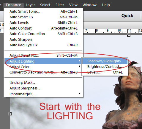
Elements automatically lightens shadows 35% when you select Shadows/Brightness from the drop-down. Take a good look at the results before you make any further adjustments.

I knew I was going to be making other changes to this photo that could affect the lighting so I pulled the slider Lighten Shadows back over to the left to 0. It’s vital that you look for “blown highlights”, especially if you’ve lightened the shadows. How do you know they’re blown? They’re light areas that should have detail but don’t. To bring them back pull the Darken Highlights to the right, watching what’s happening to your image while you’re adjusting. Even with the shadows unchanged, there were some blown highlights in my photo so I moved that slider a bit. Then check the overall contrast of the image. The bottom slider adjusts Midtone Contrast, so not the highlights or the shadows. Move that to where the image looks good to your eye. Be really careful that you don’t overdo it!

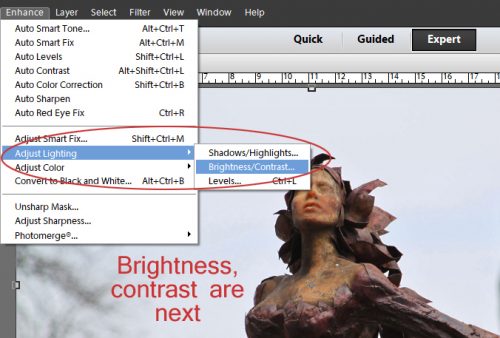
Next I adjust Brightness/Contrast. Seems redundant, but it isn’t.

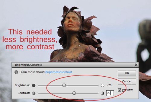
I found my image was TOO bright, so the slider went left. It also needed more contrast, so that slider went right. Everything you do will show on your image, and it’s really crucial that you watch what happens so you can avoid creating something obviously artificial. You’re going for gorgeous, not Oh-Look-I-Edited-This.

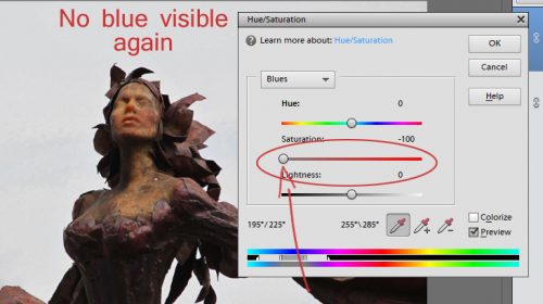
Once I’m happy with the lighting, I move on to colour. For this image I wanted to try to make the sky look more blue and to emphasize the rust, so I went into Adjust Hue/Saturation (WSNH: CTRL/CMD>U).

This menu has lots of options. You can adjust only one colour family or the overall colour. I went to the selector, clicked on the tab and selected Blues from the pop-out submenu. There’s no visible blue in my photo, alas. Pulling the Hue slider all the way to the left didn’t make much difference, but the sky looks vaguely green with a swath of lime.

Pulling the slider all the way to the right gave me these pinkish patchy spots that looked awful.

So I put the slider back to centre. Then I tried adjusting the Saturation. All the way left made the sky look leaden grey.

All the way to the right… WHOA, that’s very… umm… abstract.

I moved the slider back almost to centre then went to the Lightness slider. All the way to the left (darkest) eliminated any hint of blue there might have been.

All the way to the right and it’s back to blah grey.

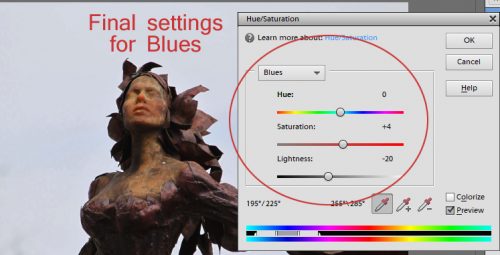
Here’s where I ended up. I wasn’t totally happy with the sky but I moved on for the time being.

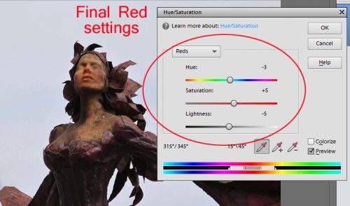
Then I reopened the Hue/Saturation menu and selected Reds in the same way. Hue all the way to the left and she looks like she’s a gorgon.

All the way to the right and she looks like Zelena from Wicked.

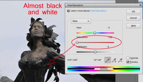
Hue ended up just left of centre. Then I went on to Saturation. This is a great way to see what a black-and-white version of your photo would look like and it’s one of the easiest ways to do it.

All the way to the right sets her on fire!

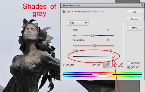
As you can see, the Saturation slider ended up just right of centre. The Lightness slider when full left again makes it look like a black-and-white image.

All the way to the right and it’s more like a really faded sepia.

Here’s where I ended up. Can you see the changes?

Then I wondered… what would it look like with a High Pass filter on it? Since I was already working on a copy of my image, I could apply the filter right on that layer.

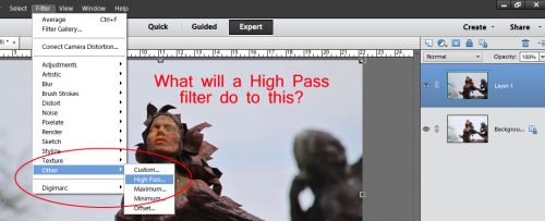
I adjusted the slider on the filter so that I could see the outline but not really any colour. And then I changed the Blend Mode to Overlay.

See the difference? It’s subtle but adds a little something, I think. (Her face looks a little thinner and her bosom a little bigger but I didn’t touch either one of those areas.)

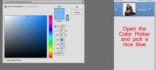
Now… on to making the sky look like sky. I played around a bit before I found a method that worked for me. I opened the Color Picker and chose a soft blue.

I used the Quick Selection (Magic Wand) tool to select the outline of the statue, including the larger of the little gaps. Then I Inverted the selection (WSNH: CTRL/CMD>Shift>I) so the sky was outlined. Next I used the Fill tool (Paint Bucket) to turn the sky blue. I noticed a couple of areas that were still that almost-white so I used a small hard brush and the same blue to paint out the gaps.

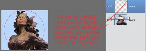
Better. But still not what I wanted. So on I went. I opened a new blank layer over the image.

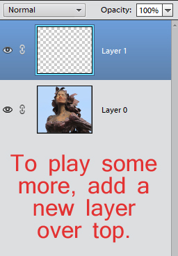
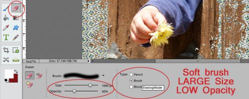
I chose a large, soft brush that covered the section of my photo shown below. The Opacity is set to 100%.

I went back to the Color Picker and selected a darker value of the same blue. Then, on the blank layer, I clicked the brush over my image a few times to build up an opaque blue orb with fading edges over the face of the statue.

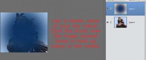
Okay… can’t see her at all right now. I changed the tool from Brush to Eraser and centred it over the blue splotch in the same way as I did with the brush. The Opacity is still 100%.

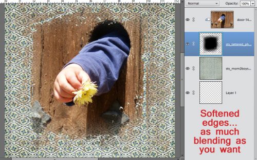
Now her face is visible again, but needs some more TLC.

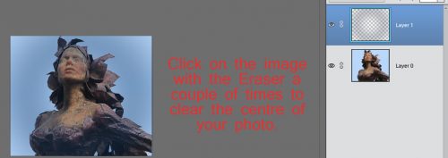
I zoomed in quite a lot then adjusted the size of my brush so that I could Erase the remaining blue from the statue. If you’re shaky at that activity, you can use a Layer Mask so you can paint back if you go outside the lines. I really didn’t want a visible white line around the edges of the statue so I was really careful.

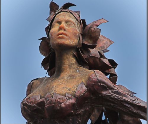
And the end result! It took me about 40 minutes to do all these steps and the screenshots, so you can see it’s not a huge time outlay for those special images that you just want to look a wee bit better.

Our next lesson will pertain to some of the mechanics of Elements. Stay tuned!

Remember, if you’ve used a technique from these tutorials, post your finished layout in the GingerScraps Facebook Tutorial Tuesday Challenge Gallery for an opportunity to have YOUR chance to challenge me. If you’re not a Facebooker, you can post a link to the layout you’ve created with the tutorial you used in the comments section here on the Blog. I’ll get a notification and will then enter you into the draw. The first week of each month I’ll have a random draw of all entries and the winner will be announced at the end of the first tutorial of that month.

Fresh Baked: May 26, 2017

It’s Friday! June is nearly upon us! One last newsletter until the 1st is upon us. The designers aren’t letting the work for the first stop them from creating some amazing kits and some awesome templates! Seriously, you have to check everything out!

Remember when you spend $10 in the store, you get a great new collab!

fwp32

https://store.gingerscraps.net/GingerBread-Ladies-Collab-Ice-Cream.html

[Read more…]

Sneak Peeks May 25, 2017

Happy Thursday! Happy day before Memorial Day Weekend! My son is already out of school. Summer is upon us! I know kids all over the country are getting ready for Summer Vacation! I hope you have your camera’s ready! Check out this week’s new releases, hopefully they will inspire awesome layouts!

From Neia Scraps

From Tinci

From Craft-tastrophic

From Aimee Harrison

From Luv Ewe Designs

From Deer Friends Designs


Tutorial Tuesday (Windows)

Michelle: Finding Font

At long last, the tutorial Michelle (belis2mi) has been waiting for! (It IS still May, right?) She didn’t have any burning learning needs for Photoshop Elements. What she really wanted was some tips on managing all her fonts. Can you relate? In the process of setting this tutorial up I discovered I have nearly 1700 of them!! No wonder it takes me forever to find the one I want to use. So I set out to test drive font management software. I had NexusFont on my old laptop but only made it a short way through my list of fonts (which has exploded since then) before I got burnt out with the sorting process. So I knew I wanted something a bit more user-friendly. And it had to be FREE. That led me to check out MainType by High Logic. They have a free version which will handle up to 2500 fonts, and a paid version for professional/commercial users. The version I’m going to show you is the free one. Be observant when you open the software, because it will ask you if you want to upgrade, and it moves the “leave me alone” button around. So pay attention and only select the free option.There is a pop-up that appears every so often while you’re working on tagging, asking if you want to go pro. I just X out of it. There is no Mac version, though, so if you’re using Apple, you can save yourself some time by skipping this one. 

This is where you’ll find the link to the software on your computer. (Shown in Windows 10) Open the folder view.

You can choose to pin it to your Start toolbar along the bottom if you think you’re going to use it regularly. Right-click on the name in the view as shown and select “Pin to Start“.

This is the Home screen. It’s completely customizable. You just click on the little pushpin icon at the upper right corner of any of the panels and it’s removed to the little strip to the left of the screen. Click on the tab to make it reappear. This is where you start. The software will automatically find the fonts that have been installed into the Windows font directory. You may have fonts in another folder, as I did. I had to manually find the folder, which was found on this path: C:\Program Files (x86)\Common Files\Adobe\Fonts and then add it as a new folder using the Tools menu. If you hover your cursor over the various icons on the screen, the software will tell you what they do. There is also an extensive searchable Help section, which I only had to use a couple of times because the software is really quite intuitive.

The panel in the upper left corner has a list of font folders in it. The centre panel is a list of the fonts. You can change the order of them by clicking on the headers. I went in alphabetical order… it’s easier and it’s the default setting. This is also the panel where your Tag Search results will show up. The far right corner panel is a Character map of all the various characters in the font. You can look here to see if there are numerals or punctuation marks included in the font. The centre-left panel is the Tag Search box. It will have a list of all the tags you’ve selected for the software to use for searching. Just underneath that is the Font Tags panel. This is where you choose the tags you’re going to give each of your fonts for later searches. In the lower centre is a Pangram. That’s a fancy word for a preview panel. You can put whatever you want in that box. More on that later. And last is the Zoom panel. You can select any letter, number or symbol from the active font by clicking on the character in the Character map.

MainType will find all the fonts you have on your computer, whether you’ve installed them onto the hard drive, or simply put them in a folder. These fonts are available to any and all software that uses fonts. There is an advantage to NOT installing all your fonts. When you activate the Text tool in your software, you’ve probably noticed it takes a while before you can actually use it. That’s your computer finding and generating the list of your installed fonts. If you load the font you want to use from the folder it’s stored in when you’re ready to use it, the time lag is only a couple of seconds. There’s an easy way to know which fonts are installed and which are just in folders. When you look at the preview panel in MainFont, right ahead of the font name there’s a little bubble. The colour of the bubble tells you if the font is installed on the hard drive (green) or loaded (blue) and accessible. The caveat to this is that when you turn off your computer, the loaded fonts are reset to not loaded. But as I say, it takes maybe 2 seconds to load, which still is less time than it takes Elements or whatever software you’re using to build the font library with installed fonts.

So let’s talk Tagging. This is how you’re going to find the exact font you’re looking for later. There is a preset list of tags in the software, including Comic, Serif, Bold, Italic, Sans and Typewriter. You can add as many different tags as you can think of to make your searches easier. As you’ll see, I’ve added quite a few. Tagging is the time-consuming set-up phase. Here’s your obligatory WSNH tip: Don’t tag all of those system fonts you can’t remove from your machine. You know the ones I mean… the ones you’re NEVER going to use on a layout, greeting card or holiday newsletter. Like Courier, Myriad Pro and Times New Roman and the rest of them. Generally speaking, if there are 24 different versions of the same font, it’s one of those and you can just skip them all. It’ll save you a lot of time, some repetitive stress on your wrists and some small measure of sanity. This is a case of “don’t do what I did”! I was already through the first 1000 fonts before I decided I would untag the system fonts. Hours later………..

You can use the usual Windows tools to expand or shrink a panel. I made the top panel very small so there would be less scrolling between all of my custom tags.

You can use as many tags as you want for each font. The more tags you use, the easier it will be to find them later. Be descriptive. I added a Tag called Marker so I could find those fonts that look like they’d been done using a felt pen. I added Brush for the same reason. As you work through the list of fonts, you’ll see the name of the font in the top centre panel, and an example of how it appears in the lower centre as shown. Bubbliest is tagged as Bold, Handwriting, Marker and Slab. If I want a heavy, handwritten font for some purpose, I can just select those tags and MainType will find this one and any others that fit the category.

To add a new tag, click on the icon shown.

I have a number of fonts that are all upper-case, so I added a tag called All CAPS. In the image above, you can see I’ve added a lot more!

When you click on the Add Tag icon, this menu opens up. Just type in whatever you want your new tag called.

If you don’t like a tag, or don’t find it something you’d use, you can rename it. Select the Tag you want to rename, click on the icon shown below (or F2 if you’re into Function keys) and wait for the drop-down menu to open.

I don’t really have any Distorted fonts. At least in the sense I would use the word. So I chose to rename that one.

Distorted didn’t really work for me so I changed it to Meandering. I use that tag for those fonts that don’t sit on a baseline but wander all over, as you can see in the image below. Kind of like torsades-de-points… a little medical humour there.

You can change the text in the Sample box to whatever you want. If you’re trying to see how a certain phrase will look in a variety of fonts, pop it in here and then run a Tag Search.

It’s really handy to be able to see your own text in the fonts you’ve searched for, and to see a close-up of individual characters too.

Here’s an example of a Tag Search. I selected For Fun (a tag I used for whimsical fonts, the ones I’d use for layouts with kids for example, and Handwritten/Printed (a renamed tag that meant more to me than Handwriting did) and this is the list the search produced.

In the box at the top of the Tag Search list panel, you can change the search terms to any of the ones in the drop-down menu: Font Name, Characters in font, Digits, Alphabets (upper), Alphabets (lower) and Alphabets up and low. You can adjust the preview size here too. If you select Characters in a font, it will show you a number, which can help you narrow down your choices to fonts with foreign characters, for example. Or you could select Digits if you knew you were going to be putting a date into your journaling.

You can also change the search terms to whatever you want.

Here’s an example of a Tag Search I did for Typewriter fonts. It’s so easy!! It literally took seconds.

What makes this software more user friendly than NexusFont for me was the easy tagging system. I didn’t have to drag-and-drop my fonts into different groups, which made a big difference to my satisfaction with the software. If I would have skipped over the system fonts from the start, I think tagging all my useful fonts would have taken me about 3 hours of continuous work. It’s easy to break up into shorter stints and your work won’t be lost. Another feature is automatic syncing. Every time you open the software, it will search for new fonts on your computer and automatically add the new ones to your database. How awesome is that?!! You can control how often the software refreshes itself in the Tool Options tab. I think you’ll find this software to be simple and effective for most average-digiscrapper purposes. If you give it a try, let me know how you like it.

Remember, if you’ve used a technique from these tutorials, post your finished layout in the GingerScraps Facebook Tutorial Tuesday Challenge Gallery for an opportunity to have YOUR chance to challenge me. If you’re not a Facebooker, you can post a link to the layout you’ve created with the tutorial you used in the comments section here on the Blog. I’ll get a notification and will then enter you into the draw. The first week of each month I’ll have a random draw of all entries and the winner will be announced at the end of the first tutorial of that month.

From The Archives | Vol. 9

Happy Saturday everyone! It has been since November since we took a trip back into the archives here at GingerScraps. I thought it a perfect time to take a look at some of the oldies…but goodies! Today we are going to look at digital scrapbooking kits in the store from around 2015. All images are linked. Enjoy!


Panda-Monium is an oriental style collection including some super cute Pandas and lots of Chinese-inspired goodies as well as non-themed elements. In beautiful pinks and greens, this collection is just in time to welcome spring, and is perfect to scrap your pictures at the China Pavilion in Epcot, a vacation to Asia, a visit to your local botanical gardens, a night out at your favorite Chinese restaurant, a visit to Chinatown, a recent adoption, and so much more!


Whether your desk is completely organized, is total chaos or falls somewhere in between, this is a unique kit to scrap office, work, desk and homework type photos. It is a great everyday kit as well, to add to your stash!


Sushi Time is a great themed kit, based on the love of Sushi! This kit is perfect for scrapping anything you want about sushi! However this kit would work well with other types of food or even non food related layouts! This kit is very unique and one you will surely love scrapping with!


This kit is very near and dear to my heart – because it’s the story of my life!


This kit is perfect to scrapbook of your vehicle-themed fun! It includes cars, trucks, a motorcycle, a moped / scooter, a go kart, a 4-wheeler, tons of themed elements, road signs and so much more! It’s also perfect for lots of other masculine layouts and projects. The very manly color palette includes black, gray, tan, brown, blues, greens, yellow and red.


I hope you enjoyed a look back at some fun items in the store. I am not exaggerating when I say this is only a tiny glimpse of what is in the store. Today we were only looking at kits as well. There are pages and pages of all kinds of goodies! Jump in and take a look yourself if these do not tickle your fancy. Happy Scrapping!

Fresh Baked: May 19, 2017

It’s Friday! Can you believe it? The time of graduations and summer fun is nearly upon us! The designers are feeling it, I think, because they have a lot of kits perfect for that summer time prepping! Plenty of templates and kits, something for everyone!

Remember when you spend $10 in the store, you get a great new collab!

fwp32

https://store.gingerscraps.net/GingerBread-Ladies-Collab-Ice-Cream.html

[Read more…]

May Featured Designer: Blue Heart Scraps and Luv Ewe Designs


So… May has gotten away from us here on the blog. The month is more than half over and we’re only just getting to introductions. This month’s Featured Designers are JoyLynn of Blue Heart Scraps and our returning-to-the-fold Jennifer of Luv Ewe Designs. These two lovely ladies have created this month’s gorgeous Daily Download, Grateful.

Let’s get to know Jennifer again…

How did you get started in digital scrapbooking?

I started making siggies for a forum and a member told me about digital scrapbook products.

What made you decide to design?

When I was creating the siggies I started creating some items to match my requests and it took off from there.

What do you use to create your designs (program, additional tools, etc.)?

PSCC

Describe your design workplace.

Just a little corner that I am about to outgrow. My desk is special to me as it was my grandmother’s. There are ink spots on it from when she and her siblings did their homework with an old fashioned dip pen.

What is your favorite thing about designing?

Playing with colors and seeing all the awesome pages my CT creates with my products.

What is your favorite kit currently in your GS store and why?

A New Me …there are many changes I am trying to make in my life and that was my inspiration to making this kit!

What was your first job?

Well I babysat when I was 12/13. But my first tax paying job was when I was a carhop at Sonic at age 15. Had to save for my first car!

How many languages do you speak? What are they?

Not much other than English. I took four years of Spanish in high school but barely remember any of it (Sorry Senor Niles!)

What’s your favorite holiday?

I love Christmas. I love the spirit and the decorating. Second is Halloween because it is my birthday!

What is your favorite family holiday tradition?

Getting everyone together for Christmas and having a big meal.

What three things do you think of most each day?

Why do I have to get up today? Also about my kids and hubby.

If you had a warning label, what would yours say?

Warning: contents under pressure.

Is there anything you wished would came back into fashion?

I used to love those Hypercolor shirts! The warmth of your hands would make the shirt change colors.

Do you collect anything?

Not really a certain item, but I love the farmhouse look and buy things to decorate my house with.

If you were a super-hero, what powers would you have?

I would love to be able to be a fly on the wall!

Aside from necessities, what one thing could you not go a day without?

Electricity! I hate it when it goes out for just a few hours.

How would your friends describe you?

Quiet until you get to know me but will help anyone.

If you were a fruit or vegetable, which one would you be?

Salted watermelon. It’s sweet and salty at the same time! Kinda like me.

What would you prefer as a second home: Mountain cabin, beach house, or big city condo?

Beach house would be cool!

What would you do on your dream date?

Romantic dinner on the beach.

Thank you, Jennifer! Don’t forget to check out her GingerScraps shop, her Facebook page, and her blog.

JoyLynn is also active on social media; visit her GingerScraps shop, her Facebook page and her blog, too.

While I’m thinking on it, I should remind you to stop back here every day to pick up the Daily Download. (If you’d rather, you’ll be able to buy the kit in the store later on.)

Sneak Peeks May 18th, 2017

Happy Thursday! Here’s a sneak into the awesome new products releasing tomorrow! Our awesome CT has made awesome pages with them! Check it out!

From Aimee Harrison

From Tinci


From Keley Designs

From Miss Fish

From Amy Stoffel

From Lindsay Jane

From Little Rad Trio

Tutorial Tuesday (Photoshop Elements)

Behind the MASK

Today’s tutorial came about from a support request Ginger received; a faithful GingerScrapper asked how MASKS are used. So I have some suggestions. For this lesson I’ve used a mask from Seatrout Scraps lovely Tattered and Torn collection (retired) and papers from her Mom to Boys collection.

Masks are really versatile tools for the digital scrapper. They essentially create a cutout of whatever is clipped to them. With a little creativity, the sky’s the limit! They can be resized, flipped, turned, stretched, filled, glittered, glossed, textured, beveled – really, anything you can think of. Let’s start with the simplest use, clipping a paper to a mask.

I opened a neutral patterned paper as my background, then dragged my mask onto it. I use Elements 12, which turns everything into Smart Objects when you drag and drop, meaning it’s the same size as the canvas it’s dropped onto. Sometimes this is a real curse… who wants a button with a 12 inch diameter?? (The work-around is to open the item on the workspace then drag it DOWN onto the page.) But in this situation I left the mask full-sized. Then I dragged a daisy-patterned paper on top of the mask. Right click on the layer, then select Create Clipping Mask, (WSNH: CTRL/CMD>G) to clip the paper to the mask as shown.

Once the paper is clipped to the mask you can play with Blend Modes. Working on the MASK layer, I changed the Blend Mode to Overlay.

And this is what it looks like. For this purpose, it looks kinda blahhhhh. But it might work beautifully with different papers.

Next I tried the Linear Burn mode. (Actually, I tried them all but I’m not sharing the really ugly results.)

As discussed in the tutorial about Blend Modes, any mode that includes BURN in the name DARKENS.

Hard Light doesn’t do exactly what one would think it does.

See how faded it is? So maybe it DOES do what it sounds like it should.

Next I played with a solid paper clipped to the same patterned paper.

To my eyes it looks a little umm… boring? So I played with some Blend Modes again. As before, I worked on the MASK layer.

Multiply darkened but also added some more transparency.

I tried some of the lighting modes and liked Soft Light best.

Soft is a great description for this look. But… it really reduces definition.

I played with the Texture Filter. (Filter>Texture>Texturizer)

This is the menu that opens when you select the Texturizer. There are several adjustments you can make in this menu, starting with the type of texture you want. The selections are Sandstone, Burlap, Canvas and Brick. I selected Canvas. Then I used the sliders to adjust the Scaling, Relief and Light direction. The Preview panel lets you see what you’re doing.

This is what it looks like after I’m finished.

Then I reversed my previous choices, clipping a patterned paper to the solid one.

I tried Soft Light on the Mask Layer.

It looks rather pretty.

Multiply?

Dramatic!

You can also clip PHOTOS to your masks. For best results, enlarge your photo so the entire mask is covered. You don’t want the mask itself to be visible.

CTRL/CMD>G and voilà!

If you want to blend the edges into your background, you can use the Eraser tool with a large, soft brush set to a lowish Opacity so it softens but doesn’t erase completely.

All I did was make a circle around the outside with my eraser brush. If you look at the thumbnail of my mask in the Layers panel, you can see how the edges have been lightened.

Another super way of playing with masks is to Fill it with colour. Using your Eyedropper, you can pull a colour from your photo or your background paper. Then select Layer>New Fill Layer>Solid Color.

The drop-down menu looks like this. Check the Use Previous Layer to Create Clipping Mask box.

And you end up with this.

You can adjust the Opacity of the coloured layer by sliding the Opacity slider  on the MASK layer to the left. If you adjust the opacity of your coloured layer the black from the mask will alter the colour you’ve used, darkening it.

But there are more options with Fill Layers! Let’s see what the Gradient… setting does.

Again, make sure you’ve checked that Use Previous Layer box. Otherwise your Fill Layer will cover up everything.

Ooh, that’s really pretty!

What does that third choice in the New Fill Layer menu do?

It opens up this menu…

… which then opens THIS menu.

Wow… that’s an interesting look! I could play with this all day!

So there you have some ideas about what you can do with masks. They’re so much fun! Do you think you can guess which of these little tricks I’ve shown you is the one I used for my May Inspiration Challenge layout? Can you pick out the other tutorial techniques I’ve used?

When I contacted Bekki (bekfek) to tell her she was Mr Random’s choice to challenge me, she was pleased but felt that Ellen (gmae) should have had more entries. So she has graciously passed on her opportunity to Ellen, who is thinking upon it. I’m still working on Michelle’s (belis2mi)  challenge…

Remember, if you’ve used a technique from these tutorials, post your finished layout in the GingerScraps Facebook Tutorial Tuesday Challenge Gallery for an opportunity to have YOUR chance to challenge me. If you’re not a Facebooker, you can post a link to the layout you’ve created with the tutorial you used in the comments section here on the Blog. I’ll get a notification and will then enter you into the draw. The first week of each month I’ll have a random draw of all entries and the winner will be announced at the end of the first tutorial of that month.


May 2016 Bake Sale

Goodness, it’s already mid-May and time for the Bake Sale. Any of these lovely kits are on sale from now through the 20th for just $1 each. Let’s see what our designers are offering this month.

Hop on over to the store to take advantage of these and more!!