Tutorial Tuesday (Photoshop Elements)

Realistic Snowy Titles

PDF Version : https://bit.ly/4an7OEw

Well, to be completely fair, I used this technique for my December siggy, but that’s not really any different from a title. Right? This technique will work best with either a simple font or a plain, flat alpha. I went with the alpha from the GingerBread Ladies’ Holiday Joy. It’s a painted kraft alpha and it was perfectly suited for the technique. I aligned and spaced all my letters, then Merged the layers – Click>SHIFT>Click on the first and last layers, which Activates all the layers in between, Right-click then choose Merge Layers. Or use the keyboard shortcut CTRL/CMD>E.

Why do all this extra work when you can just use a white glitter Style, you ask. This is why!

Instead, a Pattern Style will give me a much more realistic look. To find this collection of awesomeness – which comes with your software! – click on that Styles button at the bottom of the Layers Panel then using the drop-down menu found at the top, scroll down to Patterns. And there they are!

The Pattern I used is Fiberglass. It looks a bit (a lot) rough, but that’s not permanent.

To adjust Layer Styles, double-click on the fx icon on the layer to open up this menu. Then use the slider to make your tweaks. I decreased the Bevel to 8 pixels, which nicely softened the edges of the lumps, and changed the Direction to Up.

Yeah, it looks a bit like lumpy concrete, but that too is fixable. First, though, the layer needs to be Simplified. (Broken record, amirite?) Right-click on the layer and choose Simplify Layer. (No keyboard shortcut. 🙁 )

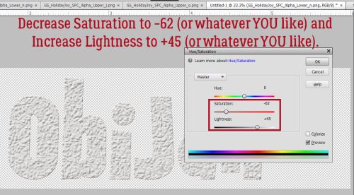
Now we can go into Enhance>Adjust Color>Adjust Hue/Saturation. Keyboard shortcut (yes!) is CTRL/CMD>U.

These sliders are the key to white! Pull the Saturation slider to the left to (about) -62 and push the Lightness slider to the right to (about) 45. You have control here; these are the settings I used, but you may like something different. Just watch what’s happening on your screen as you make your adjustments and stop when you’re happy!

Now to give it a bit of sparkle! I’m going to go back to the glitter and apply it to a Copy layer – right-click>Duplicate Layer…>OK. Or CTRL/CMD>J.

Just So Scrappy‘s Winter Whimsy has been archived, but there are a LOT of choices for glitter in the Shop. Click HERE. After trying all the white options in the collection, I decided to use the fine glitter-gloss Style. It’s a bit extra, so I’ll tone it down.

All I had to do was decrease the Opacity of the layer to ~40% and now I have frosty snowy letters!

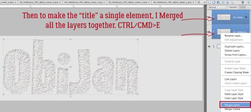
The last step is to Merge all the layers together to make the word move as one element. Too easy!

Maybe I should play with some of the other Pattern Styles and see what they look like. Maybe I’ll come up with another way to elevate our titles.

Designer Spotlight: December 2023

Scrapping Serenity!


Typing the word December is painful! But here we are… This month our Spotlight falls on Christie Dawn, also known as Scrapping Serenity. We had a lovely little chat and I’d like to share some of the fun with all of you so you too can get to know her better. Be sure to read all the way to the end, because Christie has some fabulous treats for us!

J: Christie, thanks for spending some time with me. I know my readers are interested in getting better acquainted with the GingerScraps Designers. How long have you been at it?

C: I’ve been designing for like 14 years! I needed a hobby after my youngest was born, and just started designing after scrapping for a while!

J: That’s a long time! Do you have a dedicated workspace?

C: Currently working on a laptop in Photoshop Elements 2022, on a lap-desk in my living room! Our 2 year German Shepherd puppy is super hyper and needs eyes on her at all times! 🙂

J: Ooh I remember the puppy stage really well. They get into mischief almost worse than toddlers! Do you have colours you prefer to work with, or colours you avoid when you design?

C: I DO! My favourites are purple and teal. I don’t love yellow and orange.

J: We’re kindred spirits there! I love blues, pinks, purples, teal and some greens but tend to avoid yellow and orange except in the fall. Do you have a green thumb?

C: I grew some veggies – tomatoes, squash, zucchini, cucumbers – this summer from seeds!! First time hadn’t killed something!

J: That’s awesome! I don’t have space to grow veggies. I hope you don’t mind that I’ve got a roast in the oven. I felt like I should put some effort into supper tonight. If you could only eat one meal for the rest of your life, what would it be?

C: Pasta! Any way you can cook it!

J: I do love pasta. Even just plain macaroni and butter. Maybe I never grew out of the toddler age. Might be my super-power. If you could have one, which one would you want?

C: Mind-reading, having teenagers is hard! Mind-reading could really help!

J: Oh noooo! I don’t think I would ever want to know what my kids were thinking when they were teens! My younger daughter was pretty clear about what she thought of her parents. I’m still trying to process that. She’s 42. Aside from necessities, what’s the one thing you couldn’t live without?

C: Is a phone a necessity? Cause I definitely need that to play my Monopoly Go! 🙂

J: I can relate! I play Words with Friends, Design House and Wordle on mine every day. When I booked my son’s dental cleaning I asked the receptionist what we did before smart-phones. Did we really have to remember all the stuff we keep in our phones? But seriously, I need to win the lottery so I can pay his dental bills. What would you do if you won?

C: Pay off the house, the cars, the camper. Put plenty of money aside for my kids colleges and future houses. Buy a vacation house on the ocean… any ocean.

J: Being debt-free is fabulous. Fun question for a second… If you came with a warning label what would it say?

C: Caution – Brutally Honest – Don’t ask questions if you don’t really want to know the answer.

J: That’s actually a super-power. No pussy-footing around. I see it’s getting late. One last question for you: If time travel was a thing, would you want to? And which way would you go, to the future or the past?

C: I’d love to go back in time and tell my Grandma everything she’s missed and how much we miss her!

J: Oh, yes! I’d love to spend some time with my great-great-grandmother so I could ask her why she wasn’t able to settle in Canada. She tried. Three times. But every time, she went back to England. Anyway, thanks so much for the time and the chatter! I enjoyed it.

Before we close this down, I want to make sure all my dedicated readers know the business side of being in the Spotlight. Christie is providing this month’s Daily Download, found right here on the Blog. Here’s a sneak peek:

Isn’t that just so cute??! She’s also hosting the December Designer Spotlight Challenge, in addition to her usual Font Challenge. Be sure to check them out. But that’s not all!! She also has not one but TWO very generous coupons!

She’s practically giving her work away! Make sure you take a look at her store.

I can’t believe this year is almost over! Where does the time go?? I feel like I’ve accomplished NOTHING this year, but when I look at it objectively, I actually got a LOT done, just nothing to write home about. I bet you know exactly what I mean. But onward and upward. 2023 isn’t over yet!


Tutorial Tuesday (Photoshop Elements)

Quick Trick: Type Tool Measurements

PDF Version : https://bit.ly/47YTe4g

When we talked about Editing Preferences awhile back, I sort of glossed over the units of measure for the Type Tool. Today, I think we should talk about it a little, not so much to make you change anything but to add some understanding. Let’s have a look at the options.

To access the Type Tool Units, click Edit>Preferences>Units & Rulers…

My Preset Measurements for New Documents are as shown. The best Print Resolution for digital scrapbook layouts is 300 Pixels/Inch. The rationale is that when your layout is printed up, you want it to be a sharp and crisp as possible. But what does all that mean? What’s a Pixel anyway? Pixel is the abbreviation for Picture Elements. At lower resolution an image becomes “pixelated” or much less defined. So you can see why going higher here will give a better image, even though it creates a humongous file. Screen Resolution can be set much lower, partly because the eye isn’t going to really distinguish the individual Pixels on a screen at normal viewing distance and at normal image size. The other options for both of these is Pixels/Centimeter. You metric thinkers, have at it! But why is the Type Tool default setting in Points? What the what??

First, let’s see what other choices we have here. Hmm. Pixels, Points and Millimeters. Still clear as mud. I can tell you that there are 254 Millimeters in an inch… and that a Point is just a smidge smaller than 1/72 of an inch. Which makes no sense either. I’m not even going to mention Picas. So maybe a practical demonstration is in order.

All of my basic Preferences are unchanged for this test. My canvas is 4 inches wide and 2 inches high. I plucked 30 out of a hat for my base number and using Points, typed out the top line. Here’s a tip: Changing Units doesn’t require a trip back through the Edit>Preferences menu, you can simply type in either “px” for Pixel or “mm” for Millimeter in that Size box as shown. Just remember, if you change the Unit for Size, you must also change the Unit for Leading (the space between lines of text), otherwise you’ll end up with a mess.

Here are the results of the rest of the test. At 30 Pixels, the text is virtually invisible. It’s right there under the “30 points” sample, but it might as well not be. When I boosted it to 300, the end result was almost the same size as the 30 Points sample. I don’t know what that means and my brain isn’t cooperating with the mental math bit. Last is the 30 Millimeter and again, I have no clue how that’s measured. 30 mm is 1.18 inch so that text shouldn’t eat up 3 1/2 inches of space, right? The numerals are a little less than 3/4 an inch tall. How does that work? No idea! At any rate, I’m going to stick with the default Points setting because it’s familiar, it’s safe and it’s comfy!

I’ll see you again soon when I bring you the December Designer Spotlight this weekend. Yes… it’ll be December on Friday. Argggh!

Tutorial Tuesday (Individual Style)

Challenge Spotlight: Scraplift

There are several great things about GingerScraps Challenges. They can provide inspiration when we might think we have no gas in our scrapping tanks. (That’s me right now.) They can get us out of our comfort zones. They can teach us new tricks or techniques. They can help us through tough times, through distraction or through acknowledging them. Some of the Challenge hosts provide us with free templates or minikits to use for our layouts. Other hosts offer participation prizes or coupons for their stores. (Were you expecting me to tell you which ones? Not today, Ray! I want you to go look at the Challenges!) Last, but definitely not least, there’s the monthly Challenge Reward kit, a collaboration between several of the GS Designers, that is completely free for simply completing 10 layouts. More about that later. This month’s Reward is this one:

My purpose behind the Challenge Spotlight is to let YOU, the lifeblood of GingerScraps, shine. This month I’m showcasing the Scraplift Challenge, hosted by Lena, aka LDragDesigns. This Challenge asks you to look at a layout created by a member of our Community, chosen by the host, and create your layout using the chosen layout as your inspiration. When I participate, I tend to be about 95% faithful to the exemplar layout, because why not? Others will be inspired by the colour palette, others by the way the clusters are arranged, still others by the subject matter. That’s what makes this such a great Challenge – we all have our own perspectives. So let’s look at how differently each Scrapper has interpreted the Challenge, shall we? [As usual, each of the layouts to follow is linked to the Gallery so that you can get a better look, and so you can offer some praise to the Scrapper. Just click on their user name and it’ll take you right there! Your layouts appear in the order they were uploaded to the Gallery.]

First, though we should look at the layout Lena chose as her exemplar. It’s from Cinna.

Firstoscartgrouch has the basic structure of the exemplar here, but she’s substituted 4 photos for the 2 Cinna used. Her clusters are larger but no less beautiful! She’s added texture to the background with brushes, a technique I love.

B2N2Scraps has the basic structure as well, but she’s used a journal card where the original has journaling; to make that work so well, her photos and journal card space are all the same size. I don’t think it would look as balanced had she made the journal card smaller to fit into the dimensions of the original. Another unique touch is the reversal of the colour palette. Well played!

GrannyNKy too has kept to the basic structure but has gone more minimalist. She’s used some confetti to add dimension without taking the attention away from her photos.

Grace. has the structure, and she’s replaced the journaling with a transfer (which I LOVE!) and embellished her title to emphasize her theme. I see she’s substituted a doily for the paper circle – I approve!

The bones are easily visible in chigirl‘s layout. She’s added some torn paper in the upper left corner, which coordinates well with her photos’ palette. Her title treatment sets her work apart as well.

This stripped-down layout by zanthia keeps the framework intact. Rather than complex clusters, she’s chosen themed elements to complement her photos.

Pups_r_Paps is one of only a handful of non-12×12 Scrappers. Her sense of humour is front-and centre here!

Jill has such vision! She has the basic blueprint here, but has really taken the Challenge seriously. Those paint splatters ground all the various elements of her work. This layout just bursts out of the Gallery… I think it’s the contrast between the blues, yellows and blacks, which draw from her photos. Love it!

For her layout, dhariana has gone stripped-down too. The muted colours of her papers and embellishments draw the eye to the bright kingfisher in her photo. There’s a lot of movement there too.

AJsRandom pulled the bones and the wooden background from the original, but chose a softer palette for her papers. The pops of yellow are very eye-catching. And of course, her heritage photos steal the show.

If you don’t smile when you see breoni‘s layout, you’re broken. Sorry. It’s true. She’s kept to the overall design of the layout, but those photos. Oh. My. Heart. The soft blues and golds are the perfect foil for them.

I’ve mentioned how much I admire KatherineWoodin‘s dedication to her daily layouts before. She always finds a way to create a layout that meets the Challenge criteria AND diarizes her day. She’s the only one to have made her journaling spot larger than her photos!

Our last entry is from 01lousmith. She really made the layout her own. She’s got the same number of different papers – 6 – and the same number of clusters – 3 – as the original and used a shabby painted wooden paper for her background. Double the photos. At first, I didn’t see that she’d also flipped the arrangement horizontally. Fabulous!

As I mentioned above, I want to talk about the Challenge Reward, because it can be confusing. Missi keeps a running total each month for each participant and she follows the rules. First of all, you earn the Reward in the month during which you reach 10 completed Challenge layouts, properly posted, since the LAST time you received a Reward. For example, if you completed 10 layouts in the month of September because you had some extra free time and lots of mojo, you’d qualify for the September Reward. Then October rolls around and you get really busy, so you only manage 4 layouts. That’s cool. It’s not a competition. In November, you’re pretty busy again so you get 4 more layouts done. Now you’re at 8 layouts toward your next Reward. December arrives and you’ve once again got some extra time (yeah, I know, right?!) and you’re super-productive, participating in 7 Challenges. Eeeerchhhhhhh! Only TWO will count. The other 5 don’t get carried over. Your counter starts over at zero on January 1st. I know I can’t be the only one who got caught by that, right? Right? Anyway, I highly recommend keeping track of your own count, and strategize your Rewards. Let’s face it, the Rewards kits aren’t ALL going to be attractive to you. If you don’t like the kit for a given month, don’t feel any pressure to hit your 10 layouts in that month. Simple!

Now… I haven’t created a single layout this month and it’s already the 21st. I have 6 in the can from October, so if I want this month’s Reward, I have 9 days to crank out 4 layouts. I should get to work!

Tutorial Tuesday (Potpourri)

Two Minute Warning! Holidays Ahead!!

PDF Version : https://bit.ly/49DmZsQ

Hey y’all! Life’s about to get VERY hectic for a lot of you, am I right?? In the United States, Thanksgiving marks the run-up to Chanukah (it starts at sundown on December 7 this year), Christmas, Kwanzaa and then the New Year. Diwali was this past Sunday; I’m sorry I missed you! (But I did get to see the fireworks!) Thanksgiving’s only 9 days away, and if the TV news is to be believed, a LOT of Americans will be traveling – they’re saying record numbers! – so that means TONS of photos will be taken. I know most of you won’t be even thinking about scrapping layouts for the next few weeks, and that you’ll be making a bunch of new memories at the same time. But hear me out. Your memory-keeping can be made easier if you do some planning ahead of time. I’ve covered a lot of these handy tips before but an updated refresher is never a bad idea.

  1. Find your camera’s battery charger NOW and make sure you use it! If your camera uses disposable batteries, stock up NOW. I keep a basket filled with several sizes of battery so I have them handy when I need them. (Like Sunday at 5 am when the battery in the smoke detector in my bedroom announced it was quitting and moving to Arizona. Fun times!)
  2. Check that you have a fresh SD card in your camera and that it has a decent amount of memory available. If you’re into phonetography, you might want to trim your in-phone collection by saving them to your computer or the Cloud, then deleting them from your internal storage. I have a handy little PhotoStick where I’ve backed up my phone’s gallery. If you’re an Amazon Prime member, you also have unlimited Cloud storage as part of your membership perks.
  3. Think about how your typical holiday events usually evolve. There will be some traditions that are carried out no matter whose house you’re having the celebrations at, so plan ahead to capture those moments. Make a list, if you need to. I’d need to!
  4. If you haven’t done it lately, review the manual that came with your camera. Review the settings and modes you’re most likely to use for your shots and remind yourself what each is doing while you’re shooting. I use the metadata from my most successful bokeh and full moon shots to set my camera up ahead of time so I don’t miss the shot.
  5. Refamiliarize yourself with your tripod, if you use one. I have two – an aluminum ball-head one that allows infinite adjustments but takes a lot of room and needs to be set up ahead of time and a Platypod Max, which looks like a little travel iron but is actually a very clever and sturdy tripod that can be set up in minutes on any surface. Why use a tripod? It lets you take longer exposures while keeping the images tack-sharp and it lets you be in the photo! Use the built-in timer and get in FRONT of the lens for a change. You’ll like the results much better than those you get with a selfie-stick.
  6. Practice a few creative techniques that you can memorize so that when you’re ready to take photos of the candles on your dinner table or that gloriously brown turkey, you won’t have to fumble. Practice, practice, practice! The best thing about digital photography is that we don’t have to keep the duds!
  7. Do you go all out with a gorgeous table-scape for your guests? I’ve never done it, but I love seeing what others do. (Okay, so I HAVE done a couple of table-scapes in the home decorating game app on my phone. But not a REAL one.) If you’re hosting and have your table all set well in advance (like the experts recommend for sanity’s sake 😉 ) take a few minutes to look at it with your photographer’s eye. Take a shot of a single place setting. Try and get the whole table in a shot, easiest if you shoot from one end. Take a closeup of your crystal.
  8. Don’t forget to get some shots of the dinner prep. Be stealthy and get some candids of the main cook, or if that’s you, get some of your helpers. Look for interesting camera angles of your turkey, ham or standing rib roast. Ask someone to be the carver and get some action shots. And look for smiling faces as the meal commences. When taking photos of food, get in close and vary the angles. Show the flaky texture of that piecrust, the glisten of the done-to-perfection skin on your turkey, the creaminess of your mashed potatoes, the detail of the frosting on your cupcakes.
  9. Composition is key for any photo. Remember the rule of thirds, but don’t be a slave to it. Decide what your focal point will be and compose your photo to make it so – use leading lines where possible and don’t forget white space. Crop your photos in the viewfinder – so much less work later! And don’t forget the background. Is there anything growing out of someone’s head? Take a step to one side or the other and recompose.
  10. Get in close to your subject! Even more so when that subject is a child. Get down on their level whenever possible so you capture their best smiles. Shooting from above should be reserved for those special-effect shots, not photos of kids having fun. For the most natural photos of people though, you can use a telephoto lens and shoot them from some distance. (As long as the light is right!)
  11. Don’t insist on smiles. You know what I mean… those cheesy grins aren’t going to be your favourite images. Rather than having everybody say “cheese” for your group shots, have them say “family” or “money” or “gotcha”. You could go with a made-up phrase, such as “moldy mozzarella”. Another trick is to tell everyone you’re going to shoot on “3”, then count, “1… 2… (shoot) WHOOPS 3!” then shoot a second shot right after that. You’ll get some natural smiles that way.
  12. We’ve all got a folder full of group photos where everybody is stiffly lined up and fake-smiling at the camera. So how can we take better group shots? Having the subjects doing something together is a good start. If you have snow in your area, have the group build a snowman, or have a snowball fight. Or play football in the snow. Beach ball volleyball (in sand or snow) would make some entertaining shots. But if you just have to have a posed group shot, give some thought to who goes where. If you can arrange the people so that their faces form little triangles, you’ll have a nicer image. Have them turn their shoulders toward each other or the centre of the photo so they can get a bit closer together. Make sure you’ve chosen a landscape setting so everybody will be in focus. Think about trying not to cut people’s legs off. If you can, shoot everybody down front from the waist up. Your subjects will thank you.
  13. If you’re celebrating Chanukah, there are lots of great ways to take photos of your menorrah. A series, with each night’s new candle lighting, would make a lovely layout. Look at the angles. On the last night, when all the candles are burning, an angled shot from one end with each flame visible would be incredible. Some of my favourite photos of my grandsons are of them lighting a candle, with the soft glow of the flame on their cheeks and wonder in their eyes. (Their mom takes amazing photos.)
  14. When shooting your tree, look for a different approach than the typical 8-feet-away-so-the-whole-tree-and-gifts-are-in-the-shot. Maybe take some close-ups of your favourite ornaments. Use a portrait mode to soften the background and make the ornament totally the focal point. Get down on the floor and shoot up toward the topper, or shoot down through the branches and make the presents the subject. Turn off all the room lights and shoot the tree with just the tree lights. Experiment with shutter speed and aperture to create some lovely bokeh effects. Add a human or a pet to the frame. Or take a photo of the lights reflected in a window. (If you don’t want your reflection in your photo, stand at an angle to the window and look carefully at what’s in the viewfinder.) Or take a photo of the tree THROUGH the window! Turn off your flash though, so you don’t spoil the shot.
  15. What about gifts? Well, there’re lots of opportunities around gift opening. Get down on the floor with the kids. Try to capture the moment when they identify what’s in the package. If it’s your thing, you can take some of them channeling Vanna White, holding up a favourite gift. If there’s a very special gift being given, arrange for it to be delivered when you have a moment to frame your image. I really wish I had a photo of myself when I opened a gift from my sister quite a few years ago. It was a resin frame with dragonflies on it, but what made it truly special was that it held a photo of me with my grandfather, who died when I wasn’t yet 4 years old. If you know in advance, you can be ready to catch the emotion.
  16. After the dust settles, you can relax, but don’t forget there might still be some great photos yet to happen. Like when a child falls asleep in the middle of a game, or the dog takes off with a long piece of ribbon… they could be the best shots you get all day. But don’t concentrate so hard on getting good photos that you don’t have fun! At a family reunion, my niece made a point of taking a selfie with every single one of us, and they were all fantastic. If you have mad selfie skills, give it a whirl. You might surprise yourself!

I would be remiss if I ignored those for whom the holidays are NOT the thing of loving memories and happiness. If that’s you, think about what DOES give you joy and take photos of that. Many of the above tips apply equally to photos of more ordinary events; sometimes getting out of our own heads and letting distraction help with that can be really therapeutic. Remember, if it’s something you feel, it’s perfectly okay to document it, even if it’s painful. Reality bites a lot of us, and the holidays can be really awful. Just know that I see you.

On that note. I’m going to land. Next week is Challenge Spotlight Tuesday, which is perfect timing… something that won’t require any effort from my readers. 😉

Tutorial Tuesday (Potpourri)

Yes! You Can Add a QR Code to Tour Layouts!

PDF Version : https://bit.ly/3MKBAsF

And omigosh, you won’t believe how easy it is!! Last month the Journaling Challenge had two options for topics: Where do you see yourself in 5 years? Or tell us about the last time you cried. I chose the latter and created my layout, as shown below.

I ugly-cried when, while watching a country music awards show with my son, I heard Toby Keith sing Don’t Let the Old Man In, looking gaunt and pale from his battle with stomach cancer. I lost a close friend 5 years ago to the same cruel disease and I found myself sobbing. I used the lyrics as my journaling but never even thought to include a QR code linked to the video of his performance until much later. Let me tell you how I did it.

First, I did some Googling to find the safest, most reliable, completely free converter out there. The one I chose to use is found here. (Click on “here”.) Or type in the URL from the screenshot below. Look at all the options for file source you can use for your code! And it’s completely customizable.

I’m linking to a YouTube video, so I clicked the YouTube icon and Copy-Pasted the URL (Universal Resource Locator, or web address) into the source bar. For this step you need two tabs open, one with your source and one with the QR code generator website. Highlight the URL on your computer screen by click-dragging your cursor over it. Right-click and choose Copy, or CTRL/CMD>C. Then go to the QR generator and put your cursor in the source box. Right-click and choose Paste, or CTRL/CMD>V. Last, click on the green bar to Generate QR Code.

Your QR code appears instantly as shown. Before you go any further, get your phone and test the code to make sure it works. Most phones these days don’t need a separate QR code scanner app, just the camera. Try mine!

There are so many options for customizing your code. I don’t want to add a logo, but the instructions are very straight-forward if you choose to add one. I DO want to make the colour fit into my layout better, so I’ll show you how I did that. Click Set Colors.

I had my layout’s PSD file open in Elements so I used the Eye Dropper Color Picker to choose a russet-brown shade from one of the flowers. Keep the Color Picker dialog box open, you’ll need it! I tried to Copy the hex code for the colour – the one with the # symbol in front of it in the blue box – into the code generator but it wouldn’t let me do it.

So I tried typing the numbers shown in the R, G and B boxes on the Color Picker into the R, G and B boxes on the code generator. It worked. Here’s a closer look at the Color Picker so you can see what I mean.

The colour of the QR code changed automatically. I verified that the hex code matches with the Elements Color Picker. It does!

I could use the code as is, but decided to add a border.

I changed the default colour to one from my layout in the same way. There’s even an option to change the text inside the border, and the font too. To save it so I can add it to my layout, I chose to go with a PNG file so it would have a transparent background.

Here it is, added to my layout next to the lyrics. I’ve tested it in its location and at this size, as shown on my computer screen and it works perfectly! I may have to do this again (a few times) for other layouts.

Does this look like something you’ll try? It can add so much context to our layouts that just won’t fit into a journal box. And it’s easy-peasy-free!

Tutorial Tuesday (Photoshop Elements)

Quick Trick – Hiding Multiple Layers

PDF Version : https://bit.ly/40foM33

Have you ever been working with a template and found yourself struggling with placement of elements because there are SO MANY LAYERS in the way and you wish they would just disappear? This happens to me a lot when I’m trying to adjust photos for size. I don’t want the clipping mat to be visible, but sometimes one or more edges is invisible because they’re underneath a cluster or another photo spot. If this sounds like you, read on! I JUST learned this trick and I can’t believe it took me this long!! I’m using a template from Miss Fish‘s Just the Basics (retired) collection. Look at all those layers…

I want to isolate the layer this bow is on. I right-clicked on the eyeball (visibility icon) and this menu appeared. So I chose Show/Hide all other layers.

And POOF! All the other layers are sleeping. It’s magic. It has to be! But this is one situation where Undo [CTRL/CMD>Z] won’t work. To turn on visibility for all the sleeping layers, just reverse the process… Right-click>Show/Hide all other layers. Of course, you know there HAS to be a keyboard shortcut, right? For the Work Smart Not Hard crowd, it’s just ALT/OPT>eyeball.

How’s that for QUICK??

It looks like autumn is here to stay. Yesterday I was doing yard work in shorts and a t-shirt, this morning we woke up to snow on the mountains (none at our altitude… yet) and the mercury is struggling to stay at 6°C (43°F). There are still lots of leaves on the trees, even though we had gale-force winds yesterday, but winter is definitely on its way. What’s it like where you are?

Tutorial Tuesday (Individual Style)

Challenge Spotlight: Pinterest

This month, Lisa Minor chose this fall wedding photo as her Pinterest Challenge inspiration.

Her description of the photo is “it’s all about the colors!”, “floral fall colors” and her Challenge is to use the photo to scrap what the Pin says to you. So far, eleven scrappers have taken her up on it. They mostly seem to have chosen the same theme for their layouts, as you’ll see. As with each month’s Challenge Spotlight, these layouts appear in the order they were uploaded. I’ll point out the aspects that caught my eye, and each layout is linked to the Gallery so you can pop over and offer some praise. Just click on the scrapper’s user name and you’ll fly over to the Gallery.

First up is B2N2Scraps. She’s got the fall theme, the colours from the photo and the flowers. She didn’t miss a trick! Her simple layout puts the focus on the smiles in her photo.

KarenDiamond has the fall theme as well, with a bit more of the blue from the Pin. I see she’s anonymized the child in the circular photo as a silhouette. This technique works perfectly in a backlit photo, instead of just blurring features.

DianeInOz went for the colour palette, creating a whimsical layout with a clever nod to autumn. I love that wood-look cow cutout!

This stunning layout is from greenfiend27. Her choice of soft oranges and corals against a gray, dusty background, with ample floral elements, provides the perfect foil for that beautiful photo. The result is elegantly grungy. I think this is my favourite of the bunch.

Windswept has all the colours in there, and chose our major autumn celebration as her theme. Her focal photo is so cute!

The pocket style of zippyoh‘s layout works so well with all those pumpkin photos. The harvest/autumn theme is obvious but not in-your-face. She accents all the orange in the photos very nicely with touches of purple, gold and white. Aren’t those little foxes just too sweet?

For her layout, pinklily chose to document a week of her late fall activities from last year. (I’ve been to that mall… just sayin’. Winkwink!) The colour palette was what inspired her here.

Route66 pulled only 4 of the dozen colours in the Pin for her layout. Looks like somebody’s been playing with title tuts. 😉

The subject of this layout from gmae is a somber one. It could be seen as a play on “fall”, and a clever one at that. She has pulled a few of the fall colours from the Pin, and added some floral elements. Possibly the only flowers these resting places see these days…

Pippin went all in on individual style here. Her sole connections to Lisa‘s comments are her floral clusters and the pinks and blues from the Pin photo. This is a layout after my own heart.


Last up is this very autumnal layout from snojewel. She has some subtle hints of gorgeous teal stamped in her background. The oranges, browns, golds and burgundies complement her photos of Ben very well.

Next week I’ll have a Quick Trick for you. I haven’t decided which one from my little list of topics… we’ll all find out together!

Given what’s happening around the world these days, I hope this has given you a brief break from fear and worry. I also hope the people you love are safe and healthy. And that we all stay out of harm’s way.

Tutorial Tuesday (Dingbats)

Four Ways to Use Dingbat Fonts

PDF Version : https://bit.ly/3PVn7eh

After last week’s tutorial, Lisa commented, “now that you bring up dingbats I’d love a tutorial on how to really use them in a layout!” So today, I have four techniques to share. There are many more than four, but for now we’re just looking at four. These are all relatively simple techniques we’ve used before so I’m not going deep into the weeds with step-by-steps. If you think of other ways to use dingbats, I’d love to try them!

First, if you’re not using a font manager like High Logic MainType, and aren’t familiar with Wordmark It, figuring out which characters will give you the image you want means either searching your computer for “character map” or trying one character at a time. If you look at the screenshot, I’ve enlarged the character V for this spider from Witch Night Dingbat as shown on the Type Layer.

I think this spider would look a lot more scary with some glowing red eyes. So I added a New Layer to put the eyes on, then using the Elliptical Marquee Tool, set on Fixed Ratio 1:1, I dragged out a circle just slightly bigger than the eye hole.

Then using the Paint Bucket Tool, I filled the circle with red.

He’s got two eyes, so I Duplicated the red circle [CTRL/CMD>J], positioned the new circle over the other eye hole then Merged [CTRL/CMD>E] the two layers.

I intend to layer two Styles on the eyes, one a red acrylic Style that adds both a Bevel and a highlight, and a glass Style which will add some shine and a Drop Shadow. While it IS possible to layer Styles on a single layer, the two I plan to use won’t work that way. So I Duplicated [CTRL/CMD>J] my eyes layer.

The acrylic Style is opaque and changes the colour of what’s under it. The glass Style makes the layer it’s applied to transparent or translucent, depending on which glass Style you choose. This is why the acrylic was applied to the lower eye layer and the glass to the upper. I wasn’t totally jazzed by how the glass layer looked so I made some adjustments; I double-clicked on the fx symbol on the glass layer and moved the sliders until I liked the look. To put the highlight in the right spot, I changed the Lighting Angle. Once I was happy, I Merged [CTRL/CMD>E] the two layers and moved them under the spider body layer.

All that was left now was to add a Simple Scalloped Bevel to the spider’s body and it looks quite evil!

Dingbats are ideal for creating Brushes. The character for this black cat in Witch Night Dingbat is the letter O. Resize the image until it’s about 2500 pixels. Then click Edit>Define Brush.

My example is 1583 pixels, but can be enlarged when it’s used as a Brush. I gave it a name, Black Cat. A highly original name.

This part is just for fun. I want to add some dimension to the image, so I’m going to apply a Layer>New Fill Layer>Pattern Fill. Then I scrolled through the options in the Pattern Fill menu to Texture Fill and chose Denim. It’s the one that looks most like fur. Only problem is now the cat’s gray, not black. So…

I Merged [CTRL/CMD>E] the Fill Layer and the Brush Layer together. Then I adjusted Levels. [CTRL/CMD>L] I also filled the eyes with green and added a pupil, but that was for me! Now if I add a little Bevel, I’ve got a puffy sticker to add to my layout.

The third use I’ve got for you today is to use dingbats to create a border. I’m still using Witch Night, and the character that produces a pair of witchy shoes is either E or Y. All I did here was to type out a row of 13 pairs of shoes.

Don’t forget that dingbats are actually fonts where Elements is concerned. So they have to be treated like fonts. Before I can add Texture, Styles or do much of anything, the font has to be Simplified.

For the top of the border, I just Duplicated the base layer [CTRL/CMD>J] and moved it to the top of the canvas. Use your View>Grid (not shown)! It really helps with positioning and symmetry.

Now, I could have just Duplicated the base layer again and rotated it, but I decided I wanted to have the soles of the shoes all “touching the ground”. I knew there were individual shoe dingbats in the set, so I changed the Type Tool from Horizontal to Vertical then typed out a line of alternating Is and Rs. I ended up with one too many shoes, but that was easy to fix.

There. I have a border!

This last example is using both a traditional font and a dingbat. My favourite Bugs Bunny cartoons are the ones with the vampire, the witch, bats and the two-headed buzzards. In one, Bugs and the vampire have a spell-casting battle. So this just seemed to create itself. The traditional font is called Abracadabra (of course, what else could it be?) and the dingbat is from Alit Halloween. I typed out Abra ca dabra – with spaces for the bats, then Simplified the text. If I didn’t do that, when I switch to the dingbat, the font will change to it too. So nope!! I typed out the bats (character is b) on their own layers so I could tilt them. I wasn’t happy with the way everything aligned and fitted together so I Cut the “ca” out, Pasted it back onto the canvas then moved it into place a bit lower than the baseline. This could be used as a sticker by adding a white Stroke to it, or it could have a Style applied, or a paper clipped to it, or… whatever suits my fancy.

If you think you might want to reuse any of the things you’ve created from dingbats, make sure to Save As a PNG so the transparent background is preserved. I hope I’ve given you some ideas here. If the kit you’re working with doesn’t have that one special object in it that you’d really like to include, check out your dingbats!


Tutorial Tuesday (Fonts)

Autumn and Creepy Season Fonts

PDF Version : https://bit.ly/48Ay6lP

Have you chosen the font(s) for your October Signature Challenge siggy or Inspiration Challenge? Have I got some options for you! Now, Heather‘s instructions for the Signature call for a “beautiful font”, while Joy just wants 2 different fonts in the title. Since beauty is in the eye of the beholder, I think you’d be quite safe using a creepy/spooky font for the siggy, and anything goes for the other. I took a quick wander through the dafont.com collection of FREE fonts and found some I didn’t have but must… and I’m going to share them with you. Each font/dingbat’s name is linked to the site so you can quickly and easily download the ones you love.

I didn’t find any fonts that really proclaimed *AUTUMN*, but there are some lovely dingbats (little drawings). This one is called LCR Autumn Harvest Dings. The scarecrow sold me on it!

KR Fabulous Fall has some lovely leaves.

Next up is WM Leaves 1, which is literally all leaves, complete with the Canadian stylized maple leaf from our flag.

Autumn Days Clipart has a selection of solid symbols. Just look at that cute little fox.

I love the line drawings in Arboris Folium. They can be used like stamps or brushes and are filled with potential.

While we’re doing dingbats, let’s carry on into the Hallowe’en sets I found. Freaky Halloween has some classic images, like those creepy jack-o-lanterns.

I LOVE the frame in Alit Halloween. And the spiderweb, and the crow, and the haunted house… well ALL of them.

Look at the creepy witches’ hats here in Halloween Dreams Doodles!

This set, simply named Halloween, has more, very detailed line drawings.

Ooh, Vintage Halloween is really creepy.

Now on to some actual fonts. I’ve never seen this one before. Gnarly Skeleton has both an outlined alphabet and a bold version. That skull is in the glyphs section, along with an assortment of symbols and accented letters. No numbers though.

Halloween Guises is a bubble font with more of a cute look to it. There are numerals and a bunch of glyphs too.

Spoky Spider (not a typo) is both cute and creepy.

Halloween Party 3 has elements of both font and dingbat. There are numerals and glyphs galore here.

I feel like Spooky Halloween is my favourite of all today. It has upper and lower case alphabets and numerals but no glyphs.

Nightside is a bold, Gothic font that made me think of Tim Burton’s Nightmare Before Christmas. It’s a demo font, meaning only upper case alphabet, no numerals or glyphs.

Then I found Nightmare 5… which also made me think of Tim Burton, or maybe the Addams Family. It has no numerals or clyphs; to achieve the look in the sample, use alternating upper and lower case letters.

And THEN… I found Burton’s Nightmare! It’s not really scary or creepy, but definitely has a vibe. There are numerals, some accented letters and some punctuation.

Okay, so maybe Single Ghost is my actual favourite! It’s got it all, wrapped up in a very elegant package.

Last, I have Dracolas for you. It’s Goth, it’s vintage and elegant. It’s a bold, all-caps font with the lower case characters smaller and less fancy. And there are glyphs!

Did you see anything you like? Did you find Inspiration for Joy‘s Challenge? I think I might pair Nightmare with Single Ghost. I’ll have to go back and make sure I’ve downloaded all the ones I love.