Tutorial Tuesday (Individual Style)

Challenge Spotlight: Daily Download

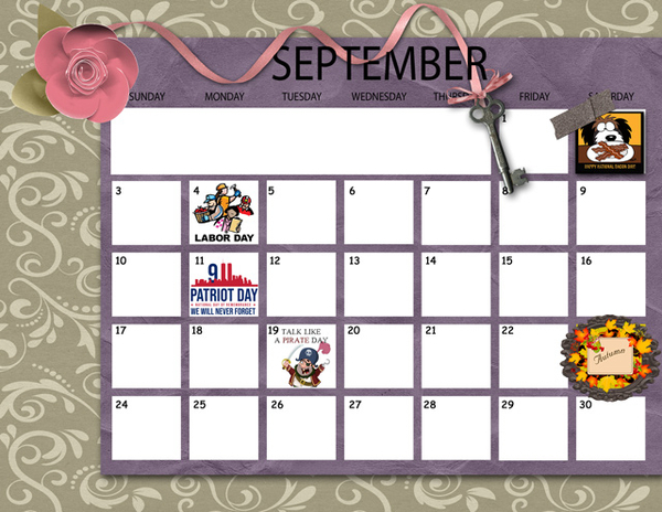
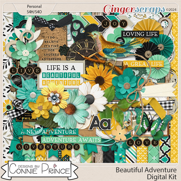
Today I have a selection of layouts pulled from the Daily Download Challenge Gallery. There’s a bit of a discrepancy between the Gallery and the Challenge thread in the Forum, so not all of the layouts posted to the Forum are here. Sorry! For those of you who are seeing a Challenge Spotlight for the first time, let me fill you in. On the third Tuesday of each month, I choose a Challenge from the long list of options we have here at GingerScraps and put the Challenge participants’ layouts in the Spotlight. Over time, each of us develops our own particular style, sometimes to the point that viewers know without looking whose layout is on their screen. My comments about each of the layouts I’m sharing will point out something specific that reflects the Scrapper’s Individual Style. What makes a Challenge well-suited for this type of Spotlight is that all participants are working from the same starting point: a kit, template, brush, mask, font, word art or image. Where there are too many variables, a Spotlight is a bit more difficult, but not necessarily impossible. Each of the layouts to come will be linked to the Gallery so you can take a closer look and leave a comment, if you’re so inclined. Just click on the Scrapper‘s user name and you’ll be whisked right to the layout in the Gallery. I chose the Daily Download today; this Challenge requires the participant to use the previous month’s Daily Download kit to create a layout, topic of their choice. Last month’s DD was supplied by Connie Prince and it looks like this:

Now, let’s look at how this kit inspired our GingerScrappers. Up first is makeyesup. She has created a minimalist desktop calendar, with what I think is one of the papers clipped to a grid brush. She has also clipped a coordinating paper to a font to create the month header. It has a bright, springy look.

This is the work of domino44. She’s added a solid white paper (included in the kit but not visible in the thumbnail) to her paper stack to provide her neutral background and changed the wording of the title tag. (I feel like that title needs some context. 😉 ) She’s shadowed the paper doily to perfection!

How eye-catching is that embossed brown cardstock lulumoon has used for her background? Her command of white space is stellar; her single photo is very much the focal point. I like that she clipped the same striped paper she framed her background with to the perforated heart; it pulls the layout together into a complete whole. If you look reaaaallly closely, she’s also threaded the ribbon through one of the heart-shaped punch-outs in the heart.

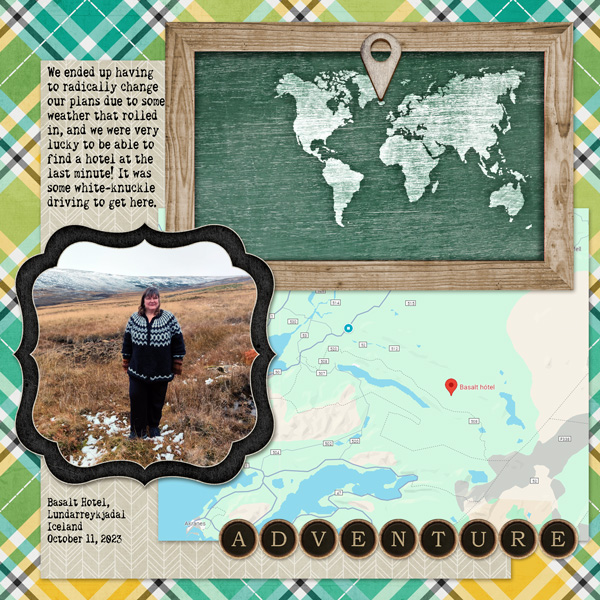
For her layout, katt chose to keep it simple… the maps, location pin, photo and title all tell the story suggested by her journaling.

Here, photocrazy has chosen patterned papers that read more like solids – I usually do that too! That choice lets all the spring elements draw the eye to her photo of hyacinths in bloom. I need Smellovision©!

I LOVE what austin_kellie has done with her layout! The kit coordinates with her photos so beautifully, and her use of the peeling painted wood paper background is brilliant. Her clusters compliment her photos without taking away from them, leading the eye around the page.

CathyS had me puzzling for a second, then I realized she’d used one of Connie‘s papers clipped to a mask for that cheery background – which I think is a blend of two solids, toning down the brightness of the yellow. Keeping the add-ons to a minimum makes that technique even more effective! I even thought she’d created an out-of-bounds look with the sunflower in the upper left… very skillful use and placement of the elements!

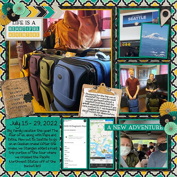
DianeInOz has created a beautiful travelogue with her layout. I think this type of layout is perfect for using bold patterned paper in the background. It holds its own with multiple photos but doesn’t distract. I have to give her family props for travelling at a time when COVID was still a major concern (not that it’s gone, it’s just laying low right now); I’ve only done short day trips by car. I’m too chicken!

Now THIS is genius! Look at how chigirl has turned patterned papers into ribbons, then wove them into a frame for the heart of her layout. Her clusters echo the brightness of her photos, making them pop off the page.

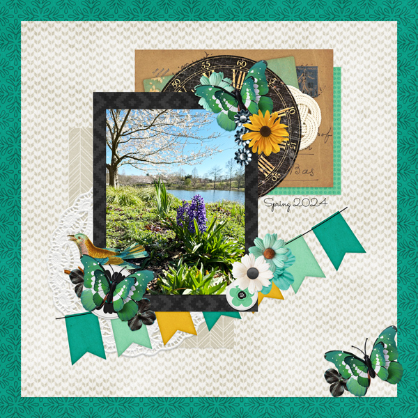
The simplicity of willow‘s layout is its strength. By decreasing the saturation of the green curly ribbon, she’s given it a supporting role. The mask she’s used is absolutely perfect with her almond blossom photo.

Clean-and-simple is how I describe alexandergirl68‘s style here. Her photos are driving the bus! The bright pops of yellow really bring the layout to life.

Pocket-scrapping is great for travel photos, or really, any layout with multiple photos. Kristi Martin‘s sparing use of embellishments keeps the layout crisp while the pops of yellow add warmth. The addition of white borders on all her paper blocks is intriguing. I may have to borrow that…..

To round out our baker’s dozen, this layout from trinanne puts a huge smile on my face. I’ve mentioned before that one way to achieve cohesion when your photos don’t quite work with your chosen kit is to convert them to black and white. I might have tried to keep the bunny ears in full colour, though.

There won’t be a Tutorial Tuesday post next week. I have some stuff going on that will need my attention. Details to follow…

Tutorial Tuesday (Dingbats)

Inspiration for the April Scraplift Challenge

I’m very literal (I know, I say that ALL the time) when it comes to the Scraplift Challenge. If I like a layout enough to emulate it, I’m gonna EMULATE it. So I was looking at the April 2024 Scraplift Challenge last night and what resonated with me was the abstract drawing Alexis used for her no-photo sample layout.

Then I started thinking about what I could use to emulate it. Do I have any doodle drawings in my stash? Will they work? What else could I use? And just about the time I fell asleep, it occurred to me that maybe using a dingbat could be an option. So I pored over the dingbat section at dafont.com and I found a few you might like. All the sets I’m showing you are 100% free for personal use; the bold name of the dingbat (font) is a direct link to the download. Let’s take a look.

First and most closely related to the image above is this collection called Woman Faces. Don’t be fooled… there are a LOT of options with this set that wouldn’t fit into the screenshot. 236 different glyphs, to be exact! Many of them are line-drawings, so very suitable.

If you like a less formal effect Cartoonabha might work for you. This one comes with 66 different options. some of them are very expressive!

This set contains the 12 constellations that make up the Zodiac. If you’re into that kind of thing, Constellations Ostia could provide your non-photo focal point. Or you could use the glyphs as background stamps.

The Goddess gives off a bit more of an esoteric vibe. There are 30 options in this one; the letter X is a fairy!

Art Nouveau Flowers offer a lot of possibilities. They can be filled with the Paint Bucket, Styled to look like wrought iron or lead, have papers clipped to them, or just be left as is.

For a more whimsical take, Country Cuties is your friend. Mostly line-drawn, there are some sweet kittens, cutie bears, a frog, and that hilarious pig.

For the Disney fans, there’s Disney family 1, with all the usual suspects represented.

If you’re more of an old-school Star Wars gal, check out Lucas characters. No Grogu… so if you’re looking for him, skip this one.

These Vintage Mixed vol1 dingbats remind me of print ads from the 60s. There’s even an image of Fred Astaire and Ginger Rogers for elegance. The pointing finger could work for quite a few topics, don’t you think?

I just love the gossipy image! Vintage Mixed vol2 has even more retro images; I think my fave is the cartoon bride and groom on the run.

If you’re in the Path of Totality for this month’s solar eclipse, this set called Galaxia might have something you could put into a photo-less layout. Or you could use the drawings for a border.

These just made me laugh. Smile 2 Me has a huge assortment of expressions; I love the one flashing a peace sign.

From the ridiculous to the sublime… Caligrafia Divina strikes a more elegant chord. The dragon is fabulous.

And last, since we do Takeout Tuesday at my house, there’s a food set called LMS Junk Food Junky. (Of course!) I could see myself creating a layout and calling it In Praise of Pizza.

I had one more for you but for some reason WordPress isn’t allowing me to attach an image of it. I’ve tried several different tricks and failed……… It has a selection of fairy tale images in it and is called Once Upon a Time2.

If you’re not sure you see anything you like, check out the other dingbats at dafont.com. There’s something for everyone there. These are just my picks for what would work as line drawings. (I won’t tell you how many I downloaded today. 😉 )

Before I let you go, I should explain how to use these dingbats as line drawings, shouldn’t I? Install your dingbat set; they take a little longer to install than say a script font, because of the added details. Then open Elements. Dingbats are essentially fonts, so the Text Tool will let you see what’s in the set. I usually run through the alphabet, looking at which image is attached to each letter. For this purpose, I’d use a huge size, like 200 pts. Then I’d Simplify the text (image) so it can be manipulated. Now it’s resize-able to whatever will work best. And then I’d work my layout into the canvas.

For sets that have additional glyphs you can’t access via the alpha keys, check out this tutorial Unlocking the Secret Extras in Your Font Files.

This might be fun!

Tutorial Tuesday (Individual Style)

Challenge Spotlight: Word Art

Whew! I wasn’t sure I’d get this tut out to you today. We started the day with an unplanned trip to the dentist – Adam lost a filling that had only been in there a short time and it was RIGHT IN FRONT!! He needs IV sedation for dental work and that adds a ton of time to everything. But in the end, he was awake enough to get him into the car before noon so here I am! I’ve chosen the Word Art Challenge this month; the Challenge is to use the provided word art as inspiration and have it on the page somewhere. The host for this Challenge is Cheré Kaye and this is the word art she created for us. There are so many ways this can be used!

March is a brutal month for choosing a Spotlight ChallengeScrap-a-Thon being in full swing. The Gallery is overflowing!! So, in a bit of a departure, rather than showing you every layout that has been submitted for March I decided to go with every OTHER layout. Otherwise we’d be here all week. 😉 The layouts are in the order they were uploaded, the GingerScrapper‘s user name is the direct link the the layout in the Gallery so you can get a closer look and leave a comment or two (I hope you’ll also look at the others, they’re awesome!) and I’ll be making my own comments as we go.

First up is Karen Diamond. She preserved the gradient colour of the word art, using it as her title, and took colour palette cues from it. It’s a little ironic that she chose the humble dandelion as her focus – they seem to “awaken” earlier than a lot of other plants.

This layout from jojores is a true original. The word art title looks a bit muted, but in the original gradient colours. I like the detail she’s added to the upper corners and how she included food-related elements to riff on the book covers in her photos.

For her layout demma_b13 also used the word art as is, and drew her palette from it. I can almost hear birds singing when I look at her layout, and don’t know how the woman in the photo can sleep through it!

Look at all the white space tillykaye has given us. The simplicity of her layout lets her photo shine. As the others have, she pulled colours from the word art for her palette.

Dhariana has given us more white space with her layout. She’s scaled everything down to draw the eye to the butterfly in her photo. I like the washi tape holding the photo in place. Against the buttery-yellow background the colours in the word art seem a bit brighter.

It’s interesting how the background colour can change the way our eyes see something, as biche57 shows us here. The gradient colours of the word art look more purple. It’s a perfect accent.

Let’s look at photocrazy‘s entry. See?! By putting the word art against a bright yellow background, the colours in the word art pop yellow too! She’s the first one (of this baker’s dozen) to use the wings that Cheré included with the word. The blue provides beautiful contrast.

AHA! AlyciaIN recoloured the word art!! Such a rebel. 😉 In the same way nature changes all the brown to green, she’s given the word art a lovely, shimmery look.

Jill went in a different direction with the “awaken” theme, and it works really well. Her shadows really give the brushes and paintbox realism and dimension. The word art colours appear in the paint splatters to tie it all together.

I like how greenfiend27 created contrast with the teal and blue elements to coordinate with her photo. Using a gradient paper in one of the shades in the word art is next-level thoughtful.

CathyS opted to recolour the word art to pick up the sandy, beachy look of her photos. Good choice!

Windswept has gone Easter-candy with her colour palette. The beautiful pink of her photo demands some drama. Clever girl, she used the same font to build her own addition to the word art, and she eliminated the white border around the words. Pretty!

Lucky 13 belongs to Zanthia. And her layout is stunning! She used the word art as created, pulled colour from it and reinforced the theme with her photos.

We’ve had four days of record-breaking warm days in a row here, and there are already two wildfires in the area. What will it take to awaken people to the climate crisis? I don’t know, but I’m really not looking forward to fire season. Please send rain!

Tutorial Tuesday (Individual Style)

Challenge Spotlight: Mixed Media

Today I’m showcasing one of the new GingerScraps Challenges for 2024. Interestingly enough, it’s hosted by a designer who was a guest at GS for many months before she made it her home: Sarapullka Designs. This is the inaugural month for the Mixed Media Challenge. So we’re seeing the very first layouts posted to the Gallery! Larisa (Sarapullka) has provided an artsy paper and a paper cut element as the foundation for this month’s Challenge; participants were welcome to add anything they liked, as long as it came from Larisa’s store. They are required elements, which makes this Challenge an ideal one for my Individual Style analysis.

Because this is a brand new Challenge, there were only 6 layouts in the Challenge Gallery this morning. I hope, by putting a spotlight on it, we can bring that number up before the end of the month – and we do have an extra day… As always, each layout appears here in the order it was uploaded, and is linked to the Gallery so you can get a closer look, and maybe leave some feedback for the Scrapper. Just click on the Scrapper’s user name and you’ll be teleported to the Gallery.

AJsRandom is up first. She used the paper in the background and turned the paper cut into a blended overlay. The layout is simple in its design and compliments her photo very nicely.

I really like how trinanne has used the paper cut element like a black stamp against the paper background. Then she used segments of the paper cut, recoloured pink and green, to frame her photo. The addition of several artsy brushes and a simple cluster in one corner pulls it all together.

This is truly a mixed-media layout from lm44west. A simple still-life with the paper cut used as a stamp in black, a handwriting brush with gold leaf foiled to it and some subtle shadowing round out the design.

Alasandra went green! I’m adoring the blended daisy photo she’s layered over the paper and the 3D effect on the paper cut.

Oh Mylanta!! This is stunning! Yvonne55 has popped a blue paper into the background, added some crosshatched brushes over the required paper and those adorable little chickadees to the dried-grass paper cut. The extracted photo is the icing on the cake.

And last, we have a layout from the Queen of Challenges, KatherineWoodin herself. To give herself lots of space for her diary entry, she greatly downsized the paper cut element and duplicated it to create a stamped border. She changed Blend Mode on the paper to bring out the pinks and blues hiding within. Her photos are works of art in and of themselves.

What do you think? Is mixed media a style you’d like to try? I think I might give it a whirl… I watched a Facebook Live on creating bokeh mixed media backgrounds for greeting cards earlier and feel quite inspired!

Tutorial Tuesday (Individual Style)

Challenge Spotlight: Pinterest

Over the last week I’ve spent a lot of time browsing Pinterest in an effort to put myself to sleep. I clearly don’t see the same boards that Lisa Minor, host of our Pinterest Challenge, sees… This image would give me the most crushing anxiety!

This is what she had to say about it: “This pin truly made me LOL! Do you have an office out of the home? Would you just go ‘buck wild and decorate like this? I would “like” to think I just might! This pin says to me “at the office, decoration, going overboard, gingerbread house, Christmas Village and candy” So what does it say to you?” I’m going to let the participants speak for themselves this time.

As usual, the layouts are in the order they were uploaded to the Gallery. Each is linked to its spot in said Gallery, just click on the Scrapper‘s user name and you’ll fly right to it so you can get a closer look, or to leave a comment.

First up is msbrad. I gather her granddaughter interpreted the Pinterest image as a play fort… “She created her own after I showed her the original inspiration photo here.

Next is DianeInOz. Her Pinspiration: “Office party, Santa’s village, Christmas!

Tamsin McAtee seems to be on the same wavelength with me! “Here’s mine.. this is exactly what it says to me, its so busy its almost painful for me to look at, I get really bad sensory overload and this is very overwhelming to me.

I also think pinklily has a bit of pleasemakeitstop! “When I think of people going overboard, the Wiggles comes to mind, so I made this layout.

Grace. posted hers without comment, but she’s taken her Pinspiration from the overall Christmasy theme.

Last we have this one from Jill. “The Pinterest photo brought my local doctors’ centre to mind with all the Christmas doors.”

It looks like I’m in good company being crazybusy right now, given that only 6 layouts have been posted. As you’re reading this, I’m driving home from my parents’ house, a little over 2 1/4 hour drive from my house. I like to make a flying visit around this time, to take them a CARE package containing some Christmas treats and a nice bottle of local wine, as well as to wish my dad a happy birthday (the 21st). Last year the weather didn’t cooperate and it was the second week in January before I could make the drive safely. It was a crushing disappointment!

For those who are interested, my son’s new hospital bed is a huge hit with him! He hasn’t figured out that he can reach the controller yet, so we haven’t found him folded in half or standing on his head. Maybe he won’t notice? Thank you all again for your understanding and grace last week.

If you’re celebrating Christmas, I hope you have enough. Enough time with the ones you love. Enough good food to fill your bellies. Enough opportunities to have some fun. Enough help with the dishes… 😉

If this time of year is difficult for you, I hope you find a quiet place away from the frazzle where you can be whatever you need to be. That you have someone you can turn to for solace. That you have understanding people around you who won’t press you to put on a happy face. I hope you’re comfortable using your scrapping to release some of your anguish. You have support here.

I’ll be back on the 26th with a Quick Trick, but don’t feel like you have to read it!

Tutorial Tuesday (Individual Style)

Challenge Spotlight: Scraplift

There are several great things about GingerScraps Challenges. They can provide inspiration when we might think we have no gas in our scrapping tanks. (That’s me right now.) They can get us out of our comfort zones. They can teach us new tricks or techniques. They can help us through tough times, through distraction or through acknowledging them. Some of the Challenge hosts provide us with free templates or minikits to use for our layouts. Other hosts offer participation prizes or coupons for their stores. (Were you expecting me to tell you which ones? Not today, Ray! I want you to go look at the Challenges!) Last, but definitely not least, there’s the monthly Challenge Reward kit, a collaboration between several of the GS Designers, that is completely free for simply completing 10 layouts. More about that later. This month’s Reward is this one:

My purpose behind the Challenge Spotlight is to let YOU, the lifeblood of GingerScraps, shine. This month I’m showcasing the Scraplift Challenge, hosted by Lena, aka LDragDesigns. This Challenge asks you to look at a layout created by a member of our Community, chosen by the host, and create your layout using the chosen layout as your inspiration. When I participate, I tend to be about 95% faithful to the exemplar layout, because why not? Others will be inspired by the colour palette, others by the way the clusters are arranged, still others by the subject matter. That’s what makes this such a great Challenge – we all have our own perspectives. So let’s look at how differently each Scrapper has interpreted the Challenge, shall we? [As usual, each of the layouts to follow is linked to the Gallery so that you can get a better look, and so you can offer some praise to the Scrapper. Just click on their user name and it’ll take you right there! Your layouts appear in the order they were uploaded to the Gallery.]

First, though we should look at the layout Lena chose as her exemplar. It’s from Cinna.

Firstoscartgrouch has the basic structure of the exemplar here, but she’s substituted 4 photos for the 2 Cinna used. Her clusters are larger but no less beautiful! She’s added texture to the background with brushes, a technique I love.

B2N2Scraps has the basic structure as well, but she’s used a journal card where the original has journaling; to make that work so well, her photos and journal card space are all the same size. I don’t think it would look as balanced had she made the journal card smaller to fit into the dimensions of the original. Another unique touch is the reversal of the colour palette. Well played!

GrannyNKy too has kept to the basic structure but has gone more minimalist. She’s used some confetti to add dimension without taking the attention away from her photos.

Grace. has the structure, and she’s replaced the journaling with a transfer (which I LOVE!) and embellished her title to emphasize her theme. I see she’s substituted a doily for the paper circle – I approve!

The bones are easily visible in chigirl‘s layout. She’s added some torn paper in the upper left corner, which coordinates well with her photos’ palette. Her title treatment sets her work apart as well.

This stripped-down layout by zanthia keeps the framework intact. Rather than complex clusters, she’s chosen themed elements to complement her photos.

Pups_r_Paps is one of only a handful of non-12×12 Scrappers. Her sense of humour is front-and centre here!

Jill has such vision! She has the basic blueprint here, but has really taken the Challenge seriously. Those paint splatters ground all the various elements of her work. This layout just bursts out of the Gallery… I think it’s the contrast between the blues, yellows and blacks, which draw from her photos. Love it!

For her layout, dhariana has gone stripped-down too. The muted colours of her papers and embellishments draw the eye to the bright kingfisher in her photo. There’s a lot of movement there too.

AJsRandom pulled the bones and the wooden background from the original, but chose a softer palette for her papers. The pops of yellow are very eye-catching. And of course, her heritage photos steal the show.

If you don’t smile when you see breoni‘s layout, you’re broken. Sorry. It’s true. She’s kept to the overall design of the layout, but those photos. Oh. My. Heart. The soft blues and golds are the perfect foil for them.

I’ve mentioned how much I admire KatherineWoodin‘s dedication to her daily layouts before. She always finds a way to create a layout that meets the Challenge criteria AND diarizes her day. She’s the only one to have made her journaling spot larger than her photos!

Our last entry is from 01lousmith. She really made the layout her own. She’s got the same number of different papers – 6 – and the same number of clusters – 3 – as the original and used a shabby painted wooden paper for her background. Double the photos. At first, I didn’t see that she’d also flipped the arrangement horizontally. Fabulous!

As I mentioned above, I want to talk about the Challenge Reward, because it can be confusing. Missi keeps a running total each month for each participant and she follows the rules. First of all, you earn the Reward in the month during which you reach 10 completed Challenge layouts, properly posted, since the LAST time you received a Reward. For example, if you completed 10 layouts in the month of September because you had some extra free time and lots of mojo, you’d qualify for the September Reward. Then October rolls around and you get really busy, so you only manage 4 layouts. That’s cool. It’s not a competition. In November, you’re pretty busy again so you get 4 more layouts done. Now you’re at 8 layouts toward your next Reward. December arrives and you’ve once again got some extra time (yeah, I know, right?!) and you’re super-productive, participating in 7 Challenges. Eeeerchhhhhhh! Only TWO will count. The other 5 don’t get carried over. Your counter starts over at zero on January 1st. I know I can’t be the only one who got caught by that, right? Right? Anyway, I highly recommend keeping track of your own count, and strategize your Rewards. Let’s face it, the Rewards kits aren’t ALL going to be attractive to you. If you don’t like the kit for a given month, don’t feel any pressure to hit your 10 layouts in that month. Simple!

Now… I haven’t created a single layout this month and it’s already the 21st. I have 6 in the can from October, so if I want this month’s Reward, I have 9 days to crank out 4 layouts. I should get to work!

Tutorial Tuesday (Individual Style)

Challenge Spotlight: Pinterest

This month, Lisa Minor chose this fall wedding photo as her Pinterest Challenge inspiration.

Her description of the photo is “it’s all about the colors!”, “floral fall colors” and her Challenge is to use the photo to scrap what the Pin says to you. So far, eleven scrappers have taken her up on it. They mostly seem to have chosen the same theme for their layouts, as you’ll see. As with each month’s Challenge Spotlight, these layouts appear in the order they were uploaded. I’ll point out the aspects that caught my eye, and each layout is linked to the Gallery so you can pop over and offer some praise. Just click on the scrapper’s user name and you’ll fly over to the Gallery.

First up is B2N2Scraps. She’s got the fall theme, the colours from the photo and the flowers. She didn’t miss a trick! Her simple layout puts the focus on the smiles in her photo.

KarenDiamond has the fall theme as well, with a bit more of the blue from the Pin. I see she’s anonymized the child in the circular photo as a silhouette. This technique works perfectly in a backlit photo, instead of just blurring features.

DianeInOz went for the colour palette, creating a whimsical layout with a clever nod to autumn. I love that wood-look cow cutout!

This stunning layout is from greenfiend27. Her choice of soft oranges and corals against a gray, dusty background, with ample floral elements, provides the perfect foil for that beautiful photo. The result is elegantly grungy. I think this is my favourite of the bunch.

Windswept has all the colours in there, and chose our major autumn celebration as her theme. Her focal photo is so cute!

The pocket style of zippyoh‘s layout works so well with all those pumpkin photos. The harvest/autumn theme is obvious but not in-your-face. She accents all the orange in the photos very nicely with touches of purple, gold and white. Aren’t those little foxes just too sweet?

For her layout, pinklily chose to document a week of her late fall activities from last year. (I’ve been to that mall… just sayin’. Winkwink!) The colour palette was what inspired her here.

Route66 pulled only 4 of the dozen colours in the Pin for her layout. Looks like somebody’s been playing with title tuts. 😉

The subject of this layout from gmae is a somber one. It could be seen as a play on “fall”, and a clever one at that. She has pulled a few of the fall colours from the Pin, and added some floral elements. Possibly the only flowers these resting places see these days…

Pippin went all in on individual style here. Her sole connections to Lisa‘s comments are her floral clusters and the pinks and blues from the Pin photo. This is a layout after my own heart.


Last up is this very autumnal layout from snojewel. She has some subtle hints of gorgeous teal stamped in her background. The oranges, browns, golds and burgundies complement her photos of Ben very well.

Next week I’ll have a Quick Trick for you. I haven’t decided which one from my little list of topics… we’ll all find out together!

Given what’s happening around the world these days, I hope this has given you a brief break from fear and worry. I also hope the people you love are safe and healthy. And that we all stay out of harm’s way.

Tutorial Tuesday (Individual Style)

Challenge Spotlight: Minikit

September is surely flying by, isn’t it? It’s already almost the autumnal equinox and the slow slide into winter here in the Northern Hemisphere, while our GingerScrappers down under are looking toward spring. And life goes on…

This month’s Spotlight Challenge is the Minikit Challenge, hosted by Joy of Memory Mosaic. As the name implies, the Challenge is to use the pieces of a supplied (free) minikit to create a unique layout. This type of Challenge showcases individual style very well, since all participants are starting with the same tools. This month’s mini is shown below.

Now I’m going to share each of the layouts that have been posted to the Challenge Gallery as of noon today PDT. They’re in the order they were posted, and I’ve linked each to the Gallery so you can get a closer look and leave some praise for the Scrapper. Just click on their Forum handle.

KAPOH has created a calendar with the mini. I see today is Talk Like a Pirate Day. I guess we should brush up on our “arrrhs”.

Alasandra has blended the papers to give herself some more options and flexibility, and flanked the ornate frame with two simple clusters.

As most of you know, I’m a sucker for heritage photos. I LOVE how trinanne has adapted the frame to encompass each of the people in her photo. The emphemera she’s added are scans of her aunt’s actual teaching diploma and license… precious!

MarilynZ has used the frame very cleverly here, with one being lightened without losing detail. The diagonal placement of the ribbon, with the key centred and the repeating small paper squares, gives the layout balance.

Pippin chose the perfect photo to coordinate with this mini! The purple sunset behind the house is a very close match to the purple paper. Her simple cluster and all that white space are very effective at drawing the eye to her photo. Brava!

NHSoxGirl has reversed the order of Pippin‘s papers to create a minimalist layout where the photo is the star. Good choice to go with black and white. The white stroke around the purple paper is brilliant.

This is something I would do! Those old keys in the photo play with the key in the mini so well. I see angbrey has also recoloured a flower and has used the frames as mats. Creative!

AnnieA has used everything but the tape, and kept her layout minimalist, with strong diagonals. I like the rotated purple paper, it’s exquisitely shadowed. Very eye-catching!

What an interesting layout PixyGirl has created, with a very vintage feel. The patchwork effect with the papers is beautifully executed. The slight tilt to the frame mimics the slight tilt of her great-grandmother’s head for a very effective focal point.

It took me a few minutes to deconstruct kabrak1207‘s layout. She has used additional elements and papers from the coordinating Buffet bundle from Memory Mosaic – totally allowed! – and has created an outstanding piece. That centre cluster is perfection.

CathyS has also added some elements from other designers in the September Buffet. I like how she’s faded the papers together and mirrored the brick behind the flowers in her photo with arty paint.

Oh my! Look at that beautiful dissolve/fade effect lulumoon has created with the papers!! The clusters provide a pop of colour and the entire layout is a showstopper.

The mini is cleverly disguised in nimble4u‘s layout. The only element from the mini that I couldn’t find is the tape. She’s added some elements from other kits, which are included in her credits.

Lastly, this layout from hkeith87 has included the whole mini, pairing it with a stunning sunset photo. The purple clouds in the photo look like they just merge into the purple paper strip. Beautiful!

It’s always a learning experience to browse the Gallery. Next week it’s Quick Trick time again. I’ll have to see what I can pull out of the ether to share with you all. Have a great week!

Tutorial Tuesday (Individual Style)

Challenge Spotlight: Inspiration

How is it already the third Tuesday of August? Of course, this month has FIVE Tuesdays, so we’re actually smack-dab in the middle of the month. The Okanagan valley in BC, where I live, is having a heat wave and we’re blanketed with wildfire smoke again. I feel very bad for the movers who are emptying a truck across the street in this heat and cruddy air. Our Level 4 drought is quickly moving to Level 5. Seems like it’s bad news everywhere. To all the GingerScrappers in Hawaii, you have all our love.

I chose the Inspiration Challenge for this month’s Challenge Spotlight because the Challenge Joy (Memory Mosaic) has tossed our way is something I love to do: take a photo from an “odd” perspective and scrap it. The alternate Challenge is to scrap a photoless layout from someone else’s perspective. When I looked at the Challenge Gallery, I was a little surprised to see only one person chose the photoless option. But what a great choice it was! Let’s have a look at the entries. As usual, they’re in the order they were uploaded to the Gallery and they’re linked to the Gallery so you can take a closer look, leave some praise or whatever. Just click on the scrapper’s user name and you’ll be right there. (I have participated in this Challenge, but decided not to include my own layout, because the focus of these Individual Style posts is on YOU!)

Here, greenfiend27 has two photos and perspective is a feature in both of them. These stainless steel balls see, to be everywhere these days and offer endless potential for interesting photos. They can be a lot like funhouse mirrors, right?

GrannyNKy has a really carefully-framed photo for her layout. There are millions of photos of Christ the Redeemer near Rio de Janeiro, but not many like this one!

Look at TBear‘s layout… the lone outlier! Here’s what she said about it: “DGD, who thinks outside the box as second nature, asked me what I thought an alien birthday cake would look like. I tried to create something from her perspective…outside the cake mix box.” I LOVE it! Kids are so clever.

I had to look very closely at this layout by MeleahG to decide where the “perspective” was… and then it hit me: the depth and breadth of variety! Shakespeare, Narnia, The Count of Monte Christo, The Witch of Blackbird Pond… I read that one when I was about 10 and had completely forgotten it.

For her layout, bumblebeee chose a photo taken from HER perspective of her family canoeing in an idyllic spot. Sometimes looking at the back of someone’s head can be magical. (This PICU nurse’s heart is happy to see life jackets on those precious babies.)

One of the cardinal rules of obtaining great photographs of kids and animals is to get down on their level. And Karen Diamond learned that one well! She also has an aerial view of the farm and a downhill shot of cows in a pasture, so she’s used many perspectives. Good job!

JAMSquared80 has skillfully used up-shots for her layout. That perspective gives a sense of just how tall those buildings are.

Here’s another good example of getting down on their level from photocrazy. Not only do we get better images this way, but they’re more natural and uninhibited.

I’ve NEVER seen a real peacock with its tail fanned out, never mind from the BACK! Props to gmae for this unusual perspective!

This makes it look like the subject of the photo is either walking on water or walking up a glass wall. It’s a bit disappointing to know it’s a glass balcony wall and gadawg83‘s subject is seated, don’t you think?

If you’re new to digi-scrapping, GingerScraps’ Challenges are a perfect way to find inspiration, learn new things and build up your stash. Several of our designer-hosts include freebies with their Challenges and there’s a Challenge Reward kit for completing 10 Challenges. (Missi keeps track of everybody’s totals. When you reach 10 completed you’ll automatically receive the download link for that month’s Reward via Private Message. However, the counter stops there until a new month starts, so if you hit your 10 layouts on, say, today – August 15th, but you keep going and complete 5 more layouts, those ones don’t carry over to September when the counter starts again. Clear as mud?) Here’s a look at the August Reward kit.

See you all next Tuesday!

Tutorial Tuesday (Individual Style)

Challenge Spotlight: Word Art

I feel like we’ve done a Word Art Challenge Spotlight not that long ago, but when I looked at the layouts in the Gallery, I just had to choose it for this month’s Spotlight. You’ll see why once I get all them all into this post.

Challenges are a great way to grow your scrapping skills. They encourage creativity and highlight individual style. They can also be a good way to break out of a slump by motivating us to think about what we have in our stash and how we could make it fit into a specific Challenge. Several of the Challenges at GingerScraps include freebies: #2023, Brush, Created with Rewards, Daily Download, Font, Jumpstart Your Layouts, Mini Kit, Memory Mix Up, Photomask, Template (there are 3!), Use It All and Word Art all provide you with some building blocks for zero dollars. (I’ve linked all of the freebie-included Challenges for you.) These are the Challenges that really offer the best insights into individual style because everybody is working with the same key items.

The layouts I’ll show you have been taken from the Gallery in the order they were posted. As always, I’ve linked each layout to its spot in the Gallery for those inclined to take a closer look or to leave some comments. Just click on the scrapper’s user name. Cheré has provided 2 separate versions of the word art, the teal one as shown above and a grey-scale that can be recoloured as desired. Let’s see how they’ve put Cheré‘s word art creation to use.

First off the hop is justpennys. Her layout is a photoless, minimalist one where her Top 3 are things she likes about herself. The teal word art is her choice.

KAPOH has recoloured the word art a vivid yellow to mirror the topic of her layout. It’s clear she’s a soccer fan!

Here, we can see that wvufan04 used the grey-scale version and left it as is. It works beautifully with the theme of her layout, favourite photos of  grandparents. I love that line drawing of the antique sedan.

For her layout, fontaine surveyed her family to list their Top 3 places they’d visited together. Glacier National Park got the most votes. She used the teal version of the word art and kept the layout simple to keep the focus on the choices.

Roller coasters would never appear on any list of mine, unless it was things I don’t like, but elfmaiden687 has her own Top 3. She also used the original teal word art, using it as the basis for her palette.

The grey-scale version works nicely with nimble4u‘s layout too. It seems to reflect the dusty olive green of her background paper.

Got2Scrap recoloured the word art to coordinate with the colour palette she chose for her white-space layout. Look at those clusters! Incredible.

This layout by lulumoon is deceptively simple. (Cluster alert!) She pulled the lighter teal colour from the original for her subtitles, which compliments the coral background to perfection.

I think Jill‘s layout is my favourite of the bunch. She chose the deep red of the flowers in her cluster to bring the focus to her title, which then leads the eye to her black-and-white photo. Her colours absolutely POP off the page.

Pixel Palette chose to keep the original teal for her philosophical layout. (She’s not wrong!) The focus of the layout is firmly on her photos.

Once again, I have to commend Katherine Woodin for (literally) documenting the good, the bad and the ugly of everyday life. I like how she’s divided the layout into perfect thirds and used the same paper in 3 different colours to reinforce the 3 aspect of the Challenge.

Grace‘s layout is a work of art in itself. Her colour choices relate to Klimt’s work in the best way. She recoloured the word art a golden brown that also reflects Klimt’s sort of grungy look.

The faith-based simplicity of dkane‘s layout is its strength. She opted for a beautiful deep green for the word art and it works.

For her layout, glee also kept the original teal and pulled it into her overall palette. I like the stencil look to the fern-and-leaf border and that her title tells the whole story.

Grey-scale for the win here! These are hichchei‘s Top 3 foods. Can’t argue with any of them!

I’ve thought about this Challenge a lot and still don’t know how I would meet it. I have 3 siblings. I have 3 children. I have 3 grandchildren. I have 3 best friends. I have 3 favourite wineries. It’s making my brain hurt! Maybe I’ll save it for later.

Next week’s tut will be another Quick Trick. With the announcement of GingerScraps‘ partnership with the Digital Scrapper and their suite of video tutorials, it appears I’ll soon be rendered redundant. Time will tell.