Tutorial Tuesday (Dingbats)

Inspiration for the April Scraplift Challenge

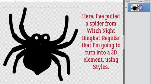
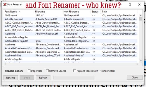
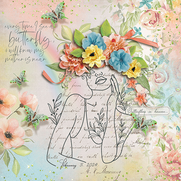
I’m very literal (I know, I say that ALL the time) when it comes to the Scraplift Challenge. If I like a layout enough to emulate it, I’m gonna EMULATE it. So I was looking at the April 2024 Scraplift Challenge last night and what resonated with me was the abstract drawing Alexis used for her no-photo sample layout.

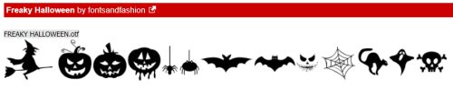
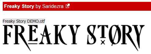
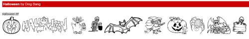
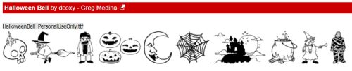
Then I started thinking about what I could use to emulate it. Do I have any doodle drawings in my stash? Will they work? What else could I use? And just about the time I fell asleep, it occurred to me that maybe using a dingbat could be an option. So I pored over the dingbat section at dafont.com and I found a few you might like. All the sets I’m showing you are 100% free for personal use; the bold name of the dingbat (font) is a direct link to the download. Let’s take a look.

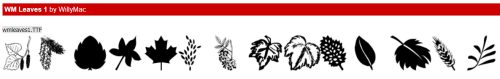
First and most closely related to the image above is this collection called Woman Faces. Don’t be fooled… there are a LOT of options with this set that wouldn’t fit into the screenshot. 236 different glyphs, to be exact! Many of them are line-drawings, so very suitable.

If you like a less formal effect Cartoonabha might work for you. This one comes with 66 different options. some of them are very expressive!

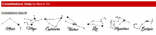
This set contains the 12 constellations that make up the Zodiac. If you’re into that kind of thing, Constellations Ostia could provide your non-photo focal point. Or you could use the glyphs as background stamps.

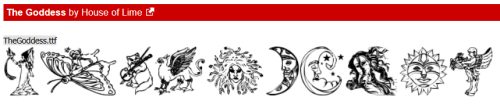
The Goddess gives off a bit more of an esoteric vibe. There are 30 options in this one; the letter X is a fairy!

Art Nouveau Flowers offer a lot of possibilities. They can be filled with the Paint Bucket, Styled to look like wrought iron or lead, have papers clipped to them, or just be left as is.

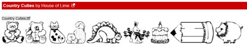
For a more whimsical take, Country Cuties is your friend. Mostly line-drawn, there are some sweet kittens, cutie bears, a frog, and that hilarious pig.

For the Disney fans, there’s Disney family 1, with all the usual suspects represented.

If you’re more of an old-school Star Wars gal, check out Lucas characters. No Grogu… so if you’re looking for him, skip this one.

These Vintage Mixed vol1 dingbats remind me of print ads from the 60s. There’s even an image of Fred Astaire and Ginger Rogers for elegance. The pointing finger could work for quite a few topics, don’t you think?

I just love the gossipy image! Vintage Mixed vol2 has even more retro images; I think my fave is the cartoon bride and groom on the run.

If you’re in the Path of Totality for this month’s solar eclipse, this set called Galaxia might have something you could put into a photo-less layout. Or you could use the drawings for a border.

These just made me laugh. Smile 2 Me has a huge assortment of expressions; I love the one flashing a peace sign.

From the ridiculous to the sublime… Caligrafia Divina strikes a more elegant chord. The dragon is fabulous.

And last, since we do Takeout Tuesday at my house, there’s a food set called LMS Junk Food Junky. (Of course!) I could see myself creating a layout and calling it In Praise of Pizza.

I had one more for you but for some reason WordPress isn’t allowing me to attach an image of it. I’ve tried several different tricks and failed……… It has a selection of fairy tale images in it and is called Once Upon a Time2.

If you’re not sure you see anything you like, check out the other dingbats at dafont.com. There’s something for everyone there. These are just my picks for what would work as line drawings. (I won’t tell you how many I downloaded today. 😉 )

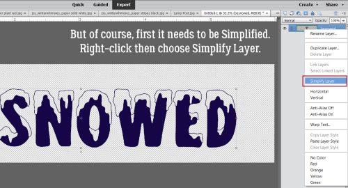
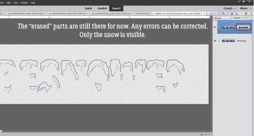
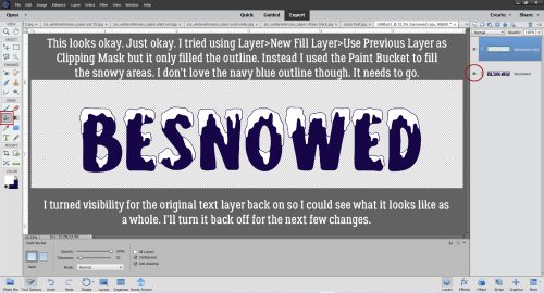
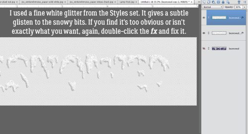
Before I let you go, I should explain how to use these dingbats as line drawings, shouldn’t I? Install your dingbat set; they take a little longer to install than say a script font, because of the added details. Then open Elements. Dingbats are essentially fonts, so the Text Tool will let you see what’s in the set. I usually run through the alphabet, looking at which image is attached to each letter. For this purpose, I’d use a huge size, like 200 pts. Then I’d Simplify the text (image) so it can be manipulated. Now it’s resize-able to whatever will work best. And then I’d work my layout into the canvas.

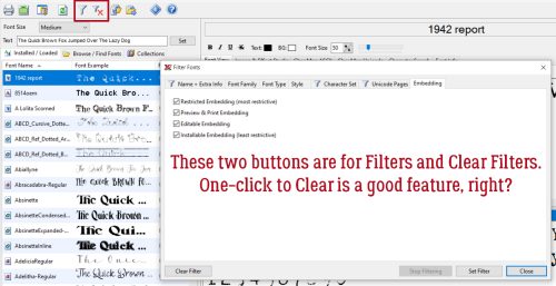
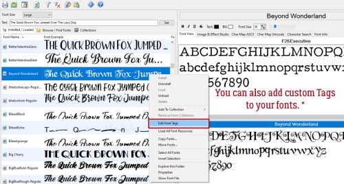
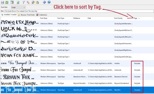
For sets that have additional glyphs you can’t access via the alpha keys, check out this tutorial Unlocking the Secret Extras in Your Font Files.

This might be fun!

Tutorial Tuesday (Dingbats)

Four Ways to Use Dingbat Fonts

PDF Version : https://bit.ly/3PVn7eh

After last week’s tutorial, Lisa commented, “now that you bring up dingbats I’d love a tutorial on how to really use them in a layout!” So today, I have four techniques to share. There are many more than four, but for now we’re just looking at four. These are all relatively simple techniques we’ve used before so I’m not going deep into the weeds with step-by-steps. If you think of other ways to use dingbats, I’d love to try them!

First, if you’re not using a font manager like High Logic MainType, and aren’t familiar with Wordmark It, figuring out which characters will give you the image you want means either searching your computer for “character map” or trying one character at a time. If you look at the screenshot, I’ve enlarged the character V for this spider from Witch Night Dingbat as shown on the Type Layer.

I think this spider would look a lot more scary with some glowing red eyes. So I added a New Layer to put the eyes on, then using the Elliptical Marquee Tool, set on Fixed Ratio 1:1, I dragged out a circle just slightly bigger than the eye hole.

Then using the Paint Bucket Tool, I filled the circle with red.

He’s got two eyes, so I Duplicated the red circle [CTRL/CMD>J], positioned the new circle over the other eye hole then Merged [CTRL/CMD>E] the two layers.

I intend to layer two Styles on the eyes, one a red acrylic Style that adds both a Bevel and a highlight, and a glass Style which will add some shine and a Drop Shadow. While it IS possible to layer Styles on a single layer, the two I plan to use won’t work that way. So I Duplicated [CTRL/CMD>J] my eyes layer.

The acrylic Style is opaque and changes the colour of what’s under it. The glass Style makes the layer it’s applied to transparent or translucent, depending on which glass Style you choose. This is why the acrylic was applied to the lower eye layer and the glass to the upper. I wasn’t totally jazzed by how the glass layer looked so I made some adjustments; I double-clicked on the fx symbol on the glass layer and moved the sliders until I liked the look. To put the highlight in the right spot, I changed the Lighting Angle. Once I was happy, I Merged [CTRL/CMD>E] the two layers and moved them under the spider body layer.

All that was left now was to add a Simple Scalloped Bevel to the spider’s body and it looks quite evil!

Dingbats are ideal for creating Brushes. The character for this black cat in Witch Night Dingbat is the letter O. Resize the image until it’s about 2500 pixels. Then click Edit>Define Brush.

My example is 1583 pixels, but can be enlarged when it’s used as a Brush. I gave it a name, Black Cat. A highly original name.

This part is just for fun. I want to add some dimension to the image, so I’m going to apply a Layer>New Fill Layer>Pattern Fill. Then I scrolled through the options in the Pattern Fill menu to Texture Fill and chose Denim. It’s the one that looks most like fur. Only problem is now the cat’s gray, not black. So…

I Merged [CTRL/CMD>E] the Fill Layer and the Brush Layer together. Then I adjusted Levels. [CTRL/CMD>L] I also filled the eyes with green and added a pupil, but that was for me! Now if I add a little Bevel, I’ve got a puffy sticker to add to my layout.

The third use I’ve got for you today is to use dingbats to create a border. I’m still using Witch Night, and the character that produces a pair of witchy shoes is either E or Y. All I did here was to type out a row of 13 pairs of shoes.

Don’t forget that dingbats are actually fonts where Elements is concerned. So they have to be treated like fonts. Before I can add Texture, Styles or do much of anything, the font has to be Simplified.

For the top of the border, I just Duplicated the base layer [CTRL/CMD>J] and moved it to the top of the canvas. Use your View>Grid (not shown)! It really helps with positioning and symmetry.

Now, I could have just Duplicated the base layer again and rotated it, but I decided I wanted to have the soles of the shoes all “touching the ground”. I knew there were individual shoe dingbats in the set, so I changed the Type Tool from Horizontal to Vertical then typed out a line of alternating Is and Rs. I ended up with one too many shoes, but that was easy to fix.

There. I have a border!

This last example is using both a traditional font and a dingbat. My favourite Bugs Bunny cartoons are the ones with the vampire, the witch, bats and the two-headed buzzards. In one, Bugs and the vampire have a spell-casting battle. So this just seemed to create itself. The traditional font is called Abracadabra (of course, what else could it be?) and the dingbat is from Alit Halloween. I typed out Abra ca dabra – with spaces for the bats, then Simplified the text. If I didn’t do that, when I switch to the dingbat, the font will change to it too. So nope!! I typed out the bats (character is b) on their own layers so I could tilt them. I wasn’t happy with the way everything aligned and fitted together so I Cut the “ca” out, Pasted it back onto the canvas then moved it into place a bit lower than the baseline. This could be used as a sticker by adding a white Stroke to it, or it could have a Style applied, or a paper clipped to it, or… whatever suits my fancy.

If you think you might want to reuse any of the things you’ve created from dingbats, make sure to Save As a PNG so the transparent background is preserved. I hope I’ve given you some ideas here. If the kit you’re working with doesn’t have that one special object in it that you’d really like to include, check out your dingbats!


Tutorial Tuesday (Fonts)

Autumn and Creepy Season Fonts

PDF Version : https://bit.ly/48Ay6lP

Have you chosen the font(s) for your October Signature Challenge siggy or Inspiration Challenge? Have I got some options for you! Now, Heather‘s instructions for the Signature call for a “beautiful font”, while Joy just wants 2 different fonts in the title. Since beauty is in the eye of the beholder, I think you’d be quite safe using a creepy/spooky font for the siggy, and anything goes for the other. I took a quick wander through the dafont.com collection of FREE fonts and found some I didn’t have but must… and I’m going to share them with you. Each font/dingbat’s name is linked to the site so you can quickly and easily download the ones you love.

I didn’t find any fonts that really proclaimed *AUTUMN*, but there are some lovely dingbats (little drawings). This one is called LCR Autumn Harvest Dings. The scarecrow sold me on it!

KR Fabulous Fall has some lovely leaves.

Next up is WM Leaves 1, which is literally all leaves, complete with the Canadian stylized maple leaf from our flag.

Autumn Days Clipart has a selection of solid symbols. Just look at that cute little fox.

I love the line drawings in Arboris Folium. They can be used like stamps or brushes and are filled with potential.

While we’re doing dingbats, let’s carry on into the Hallowe’en sets I found. Freaky Halloween has some classic images, like those creepy jack-o-lanterns.

I LOVE the frame in Alit Halloween. And the spiderweb, and the crow, and the haunted house… well ALL of them.

Look at the creepy witches’ hats here in Halloween Dreams Doodles!

This set, simply named Halloween, has more, very detailed line drawings.

Ooh, Vintage Halloween is really creepy.

Now on to some actual fonts. I’ve never seen this one before. Gnarly Skeleton has both an outlined alphabet and a bold version. That skull is in the glyphs section, along with an assortment of symbols and accented letters. No numbers though.

Halloween Guises is a bubble font with more of a cute look to it. There are numerals and a bunch of glyphs too.

Spoky Spider (not a typo) is both cute and creepy.

Halloween Party 3 has elements of both font and dingbat. There are numerals and glyphs galore here.

I feel like Spooky Halloween is my favourite of all today. It has upper and lower case alphabets and numerals but no glyphs.

Nightside is a bold, Gothic font that made me think of Tim Burton’s Nightmare Before Christmas. It’s a demo font, meaning only upper case alphabet, no numerals or glyphs.

Then I found Nightmare 5… which also made me think of Tim Burton, or maybe the Addams Family. It has no numerals or clyphs; to achieve the look in the sample, use alternating upper and lower case letters.

And THEN… I found Burton’s Nightmare! It’s not really scary or creepy, but definitely has a vibe. There are numerals, some accented letters and some punctuation.

Okay, so maybe Single Ghost is my actual favourite! It’s got it all, wrapped up in a very elegant package.

Last, I have Dracolas for you. It’s Goth, it’s vintage and elegant. It’s a bold, all-caps font with the lower case characters smaller and less fancy. And there are glyphs!

Did you see anything you like? Did you find Inspiration for Joy‘s Challenge? I think I might pair Nightmare with Single Ghost. I’ll have to go back and make sure I’ve downloaded all the ones I love.

Tutorial Tuesday (Potpourri)

X-Fonter – a Powerful Font Manager

PDF Version : https://bit.ly/3Z81CLe

First off, I apologize in advance for the lateness of the hour. I’ve had a MILLION interruptions today and am desperately playing catch-up. Now, on to the tutorial!

There has been a lot of chatter about font managers, both for digital scrapbooking and for Cricut users. I’ve used High Logic MainType for a few years and ran a tutorial on it a while back. Recently I got this PM from Kathi (aka granny5pics):

Hi Jan,
1) I have used the free version of X-Fonter for awhile and last month bought version 12.0.1 because I could no longer find it on my computer! Now I have forgotten how to load a font sample into a “Collection” I have created. Are you familiar with X-Fonter and how it works? Do you or designers have a font management program you like?

2) Why do some font folders show an example of the font and others do not?

3) Which is better to load–a .tff or .otf font file?

So, of course, I downloaded the free trial version and took it for a test drive. Let’s discuss.

1) The reason why Kathi couldn’t find X-Fonter on her computer is because it has a self-destruct after 30 days. Every time the app is accessed, it has a countdown timer and a reminder that if you plan to continue to use it, you have to buy it. The most recent version is 12.0.1, as she said, and today’s price is $35 (discounted from $40). Follow along for the Collection part.

2) Font folders on your hard drive may not always show a thumbnail of the font. I haven’t found an answer to why, but I looked at my own folders and there are quite a few that didn’t come with the thumbnail. So a font manager can be a handy way to see what those fonts look like before deciding to use them. Or try wordmark.it which will pull all your fonts and show them to you online. It doesn’t store any of your information so don’t worry about it being safe.

3. The difference between .otf and .ttf formats starts with where they originated. Microsoft/Adobe created OpenType.otf, Apple created Truetype.ttf. I always choose .otf format because the fonts are somewhat more complex, with all the glyphs and library options right in the file. TrueType has better screen quality so is more suited for electronic documentation while OpenType is better for print. The difference in file size is negligible. So it basically comes down to planned use and personal preference.

Now, how does this X-Fonter work? If you’ve used MainType you’ll see the interface is pretty similar, but the features are quite different.

I went through each tab and button one at a time to get a good look at what’s under the hood. Under View, the first two choices are pretty self-explanatory. Other than moving the boundaries of the windows, these are the only interface adjustments. First big advantage to X-Fonter is this! Font Compare lets you look at 2 fonts at the same time so you can choose the one that works best for your purpose.

The display windows are your access to the comparison. The first font you choose will automatically go in the top window. Click on the bottom window and choose your second font.

Options… hmm. There are Options? Browse Folders just takes you to your operating system’s directory.

Default Settings look reasonable to me. Check for Update on Startup keeps you running the most recent model.

Installing gives you control over what your computer does when you install fonts, either from a download or from a storage device. It might be worthwhile to Copy Files to an dedicated X-Fonter folder.

And then if you decide you’re never going to use a specific font again, you can Uninstall! By having a copy in your X-Fonter folder, you can load and unload without installing if you choose to later.

Under View Fonts there are several options, including what you want for your Preview Text. It’s handy having system fonts colour-coded so they can be skipped over easily.

Unless you’re a real IT maven, the Database tab is purely ornamentation.

This Settings tab is where you can customize what you see on your screen. You can change the Text Colour, Background Colour or leave it black on white.

Have a look at the Text menu. Another advantage to X-F! I use French text all the time and have memorized the most common ASCII codes I use, and others I look up on a table, but having this ability is huge!

This is what I mean.

But how do I get the ASCII character onto my project? Choose the character – let’s use a GBPound symbol – and right-click, then choose Copy to Clipboard.

Then with your Text Tool active, click on your project where you want your Pound symbol then Paste (CTRL/CMD>V). Easy peasy!

On to Pangrams. You can choose from 4 different sentences containing every letter of the alphabet.

Don’t you love Filters? You can winnow 1000 items down to a few dozen. Just be aware that when you end your X-F session by closing the app, all your filters will go too unless you Save Filter…

Aha! System fonts can be filtered out!


Are you familiar with Font Families? X-F uses Roman (Serif), Swiss (Sans Serif), Modern (Monospace), Script (Cursive), Decorative (Fantasy) and Unknown (Other) and will filter for either of those terms.

Font Type has already been covered above, somewhat. Raster Fonts and Vector Fonts are used by a range of text-based applications such as Photoshop and Cricut.

Then there are Font Styles… how handy is this?

These Tools aren’t typically applicable to digital scrapbooking, except maybe Duplicate Font Search…

I’m not sure why someone would want to rename a font, since the creator chose its name, but maybe changing it to something that makes sense to the user?

For the people who like to have hard copies, under the Print button you can print out all the fonts on your system, or only certain ones. You can choose just a sample of the font, or the entire character map. Hey… school supplies are on sale – grab a binder and some page protectors!

Next to the Print button is the Create Font Book button. Yes, you can group all your fonts into categories and create an online library of your Font Books.

Third from left is an Options button, and it’s identical to the Options tab.

In the middle are a Filters button and a Clear Filters button. Self-explanatory.

Now to Collections, as Kathi was asking about. Here, YOU decide what your descriptors are. I’m going to create 2 Collections, Creepy and Fairytale, as part of my test drive.

I scrolled down my font list until I found my first Creepy font. I right-clicked on the font’s name then chose Add to Collection>Creepy. Then I continued scrolling until I found another font that met the criteria, adding it, and so on. I ran into a snag with some of the fonts I have, because X-F wasn’t able to “locate the path*” to those fonts, which meant it couldn’t add to a Collection. I’m not sure how it found the fonts in the first place without a path, but what do I know?

That’s where Tags* come in. Font Tags lets me search for the type of font I’m looking for by yet another method. Edit Font Tags doesn’t mean the font already has a tag; it’s how you access the Tag process.

I chose this cute font called Beyond Wonderland to Tag with Fairytale by right-clicking on the font name and choosing Edit Font Tags then typed in Fairytale.

To use Tags to find my desired group, I had to push the boundary of the font preview box over until I could see the Tag heading, then click on it.

Now for the critique. I wasn’t able to get X-F to run on my laptop simply by opening it once I had it installed. I had to Run as Administrator. I shut it down when I was done with my screenshots, but wasn’t able to get it to run again. I got a message that I had 29 days left on my free trial, it read my font files then disappeared. Multiple times. Even after I added it to my Taskbar. I tried all the tricks I know to make it work, without success. Windows Troubleshooter declared it incompatible with my operating system (Windows 10) and tried running it in Windows 8. Again without success. So I’m doubtful I’ll pay $35 ($50 in Canadian currency) for it. It’s impressive when it works, but…

Tutorial Tuesday (Photoshop Elements)

3D Title – Paper Letters

PDF Version : https://bit.ly/3N838aO

Today’s tutorial is in response to a request from Glee. She’d seen a layout in a gallery created by biche57 that had a paper-letter title with the letters stitched to the background. The letters appeared to be lifted away from the background, sort of like butterfly wings. “How’d she do that??” Well, this is how JAN would do it…

I’m using the June Font Challenge font for my layout, and then Clipping papers to each individual letters. You can absolutely use an alpha to get it done faster and with fewer steps. The papers I’m using are from the GingerBread Ladies‘ collab Outdoorsy.

Here’s a little Quick Trick I just discovered. You can BATCH-SIMPLIFY all the text layers! To activate them all, click>shift click on the first and last text layers. Then right-click and choose Simplify Layer.

Here you can see that I’ve Clipped papers to each letter layer. Right-click>Create Clipping Mask or CTRL/CMD>ALT/OPT>G for Elements versions 15 and newer. For older versions the shortcut is just CTRL/CMD>G. To make each letter easier to manage, the paper and letter layers should be Merged. Activate the two layers then right-click>Merge or CTRL/CMD>E.

There! Now I have my paper title. Let’s stitch them down.


My granddaughter’s backpack is lavender, so I thought, why not use lavender stitches? You can put those stitches wherever you like; they’ll be your anchor for lifting the paper, so I felt it was best if I ran the stitches through the centre of the Bs.

We’re creating the illusion that those letters are lifted away from the background, and the easiest way to do that is to use custom shadows. For a lot of you this will be a review so feel free to skip ahead. I won’t mind! (I also won’t know. 😉 ) For those who haven’t seen the previous custom-shadow tuts, we start with Selecting the outline of the object we’re shadowing. To do that, CTRL/CMD>click on the letter’s thumbnail – that little picture of what’s on that layer – in the Layers Panel. That engages the marching ants and gets them doing their drill around the contours of the letter.

Now add a new blank layer UNDERNEATH the layer you’ve just selected. CTRL/CMD>click on the sheet-of-paper icon at the top left of the Layers Panel.

Over at the Color Picker, choose your shadow colour by clicking on the Foreground Color as shown. I’m using black [#000000] but a lot of people like a browner colour like #2c2801. It’s up to you. Then grab the Paint Bucket Tool and dump it into the outline.

Before Elements will let you do anything else, you’ll have to Select>Deselect or CTRL/CMD>D to stop the ants from marching.

The quickest, most effective way to simulate lifting the paper away is to use the Image>Transform>Distort Tool. This lets us change both the size and shape of the image in all directions. The only real limit is how far you take it. Remember to have your shadows all falling in the same direction; decide where your light source is so you can be consistent.

Click-drag one corner of the Bounding Box at a time until you get the shape you want. See how my Bounding Box isn’t symmetrical any more?

To hone the shadow and add realism to it, the shadow needs to be very narrow where the stitches are holding the letter down. I use the Smudge Tool for that. I push the shadow toward the letter at the stitches, and pull the shadow away where I want the paper lifting. The Smudge Tool also adds a slight Blur, but not usually enough to look real.

So… we’ll add a Filter>Blur>Gaussian Blur… to the shadow.

To be able to see a Preview of the Filter, click your cursor on the edge of your shadow. Then you can see up close how moving the slider softens the edges of your shadow. Remember, shadows are softer the more light is allowed to leak underneath an object – the farther away from the surface it’s sitting on it is, the softer the shadow. Hot Tip: you don’t have to go through all the Filter steps if you’re going to use the same settings for each layer. Just click CTRL/CMD>F and Elements will do the rest.

To be realistic, the background colour shows through the shadow. To achieve that requires changing the Blend Mode from Normal to Linear Burn.

To make it look less stark and harsh, decrease the Opacity of that shadow layer. Move the slider until you’re happy with what you see. I like 35% – for now – and it’ll be adjustable if I decide it’s too light or dark.

After each letter is shadowed, the stitches need shadows too. I just went with the same steps, but without the Distort and Smudge. I also used a much lighter touch with the Blur because the stitches are literally IN the paper so the shadows will be sharper.

Last thing is to make any tweaks you think will make your title really POP. I just use the Smudge Tool!

I know this method of creating shadows sounds complicated and labour-intensive. At first, it really is. But the more you do it, the easier and more intuitive it becomes. I don’t even really think about the steps now, they’re so familiar. It’s the shadows that really elevate a layout, so it’s worth practicing. Don’t forget to have fun! Next week we’re going to play with doodles.

Tutorial Tuesday (Fonts)

More Hearts and Flowers Fonts

PDF Version : https://bit.ly/3k05qOr

It’s been a rough week at our house, meaning no time for me to do anything really inspiring. But I’ve been seeing a LOT of inspiring Valentine’s Day projects so I had a thought… Surely there are some great new Valentine’s Day fonts and dingbats that y’all can use those Styles we talked about last week to make REALLY fabulous. And there are!! I’ve got eleven FREE fonts and six dingbats for your scrapping pleasure, from dafont.com. (If you want any of these, just click on the font’s name and you’ll be linked up.) Ready?

Couple Valentine is a fancy, all-caps font that would be perfect for pretty much any application. Titles, subtitles, journaling – all of it! I love that.

This romantic script font, Mybook Again, is another multipurpose gem. I could see this on wedding invitations, all kinds of wedding favours and Valentines. It’s beautiful, don’t you think?

I really love these bubble fonts like Romantic Love. There are SO many ways to use them and so many things you can do to zhuzh them up.

Pink Valentine is so retro and cute! It brings me right back to my teenage years when I still had rose-coloured glasses.

This font could be right out of a fairy tale. Lovaline Story is another versatile font that is suitable for any purpose.

Candy Kisses would make beautiful titles. Beyond Valentine’s Day and weddings, I’d probably use it for baby layouts.

Beauty Heart is a lovely farmhouse-type font. I’d love to see it with a glossy Style so it looks like candy.

I like the heart ligatures on Finding Love. It’s yet another all-purpose font with infinite options.

Ooh, here’s a swashy script called Jully Julia. It’s perfect for subtitles and journaling.

I don’t know that I’d use You Are My Valentine for journaling, but it would be good for titles and subtitles.

I was looking for dingbats when I found Quirky Love. It’s already pretty fabulous, and has potential to be even more so! Doesn’t it look like leather?

Now for the dingbats. Heart Salads is the first set I’ve found that has an anatomical heart in it.

I can see so many things that can be done with Romantine Dingbat. Yes, most of them involve hitting them with a Style… or three.

I love these heart emoji dings, don’t you? Fluffy Hearts Ding just makes me smile.

PW Little Hearts covers the gamut of things we love. That heart-with-the-ball-of-yarn would make a great element for a cat layout.

These are pretty romantic hearts in Vanlentines Day TBF. I think my favourite is the solid heart with the stars along the right side.

Last, but not least, we have Merciful Heart Doodle. I might use this one to create a border. What would you do with it?

Now I must run… gotta deal with all the errands I’ve put off for the last week while my son has been sick. Hopefully I’ll get ’em done before the rain turns to snow…

Tutorial Tuesday (Photoshop Elements)

It’s the Snowy Season! (Fancifying a Font)

PDF Version : https://bit.ly/3jf6vBS

If you’ve thought about taking part in the Font Challenge this month, you probably live in North America and have lots of snowy photos you can work with. Snowy Season is a showy font with lots of visual interest. It’s an all-caps font with scaled lower-case characters, a full set of numerics and the most commonly-used punctuation, which makes it a great title option. I think it would make for difficult reading as a journaling font though. Today’s tutorial will show you how to make the snowy parts of the font look like actual snow! Read on…

Before we get into the meat of the tutorial I want to welcome all the new GingerScrappers who have joined us in the last while and give an overview of Tutorial Tuesday. The first two Tuesdays of the month will focus on techniques that elevate our 2 dimensional layouts into 3D masterpieces. The third Tuesday is Challenge Spotlight day, when I share YOUR layouts and discuss what makes them special and interesting. On the fourth Tuesday, I provide a Quick Trick that will speed up your workflow. When I create these tutorials I want them to be achievable by anyone, with any amount of experience with digital scrapping. To that end, I typically provide both written and visual instructions of every step in the process I’m demonstrating. If you already are proficient you have my blessing to skip over all the extra instruction. I try to use free or software default fonts and styles wherever possible so you’re not having to shop before you can play. Most tutorials are for Photoshop Elements, which is the most commonly used software and what I work with. There are usually multiple ways to accomplish a task. I like to Work Smart, Not Hard, so I’ll show you the easiest/fewest keystroke ways, and include keyboard shortcuts where they exist. I work in Windows but recognize that there are a lot of Mac people out there. So any keyboard shortcut will include the appropriate function keys for both PC and Mac. For example, the keyboard shortcut for Merge Layers is CTRL>E for PC users and CMD>E for Mac users. So when I include Merge Layers in a tutorial it will look like this: CTRL/CMD>E. The other function keys that are part of keyboard shortcuts are the ALT (PC) and OPT (Mac) keys. Make sense? Now for today’s tut!

Our winter began a full 6 weeks early than usual and brought us a LOT of snow. I like to think outside the box when it comes to titles for my layouts and sometimes will do a Google search for related words, phrases or synonyms. That’s how I came up with this one. Notice the transparency inside the snowy bits. If I just used the font as is, whatever is behind my title will show in the snowy areas. Not what I want!

Before I can manipulate this title, the text needs to be Simplified. The actual text itself will no longer be editable so make sure it’s spelled properly and it says what you want it to say before you Simplify. One way to do this is to click Layer tab on the taskbar that sits at the top of your workspace then choose Simplify Layer. Or right-click on the text layer and choose Simplify Layer from the drop-down menu.

I made a Copy Layer of the title so I could work on a Copy and not the original. There are several ways of doing this. Click Layer>Duplicate Layer… on the taskbar. Or right-click on the layer then choose Duplicate Layer… from the drop-down menu. Both these will open another menu where you’re asked where the duplicate layer will go. In this instance, it’ll go into this project, so all you’d need to do is click OK on that pop-up. Or easiest for copying layers within the same project, CTRL/CMD>J will just do it all.

Here’s the pop-up I mentioned above.

Now I’ve made the original title layer invisible so I can see what I’m doing to the Copy Layer. Just click on the eyeball to close it.

I’m going to remove everything but the snowy areas from the title. I added a Layer Mask to it by clicking on the icon at the top of the Layers Panel that looks like a gray circle in a blue square. Why a Layer Mask? It lets you hide parts of a layer but not make them actually disappear. It gives you the most control you can have over what happens to your image. More later.

This is where Elements puts the Layer Mask. You want to be sure you’re working on the MASK and not the LAYER itself. When you look at the Layers Panel you’ll see a blue line box around the active part of the layer. Be careful to make sure you’re on the MASK.

Next, activate the Eraser Tool. You’ll have another reminder that you’re working on a MASK because the Color Picker will show black and white. It there are any other colours there, you’re NOT on the mask. If you remember “White REVEALS and Black CONCEALS” it’ll help with your task… but this mnemonic is referring to what’s BEHIND the object you’re masking. The magic of Layer Masks is that it lets you erase things, but if you accidentally remove a part you wanted to keep, it’s not really gone. For example, sometimes my track-pad sticks and my cursor goes haywire, erasing EVERYTHING it touches. To recover that stuff, I just toggle my colour from white to black and reveal it again by rolling my cursor over the oops. Toggling between foreground and background colours is easy, just click the X key.

Make sure your snowy areas are completely enclosed with a thin border of your font colour. It’ll save you a lot of grief later.

This is what you’ll be left with on the Copy Layer once you’ve concealed all the non-snow areas. Zoom in and go over all of it while you still have the ability to correct any little issues. Once you’ve moved on to the next step it’ll be too late…

Now, to be able to play with this layer, the Layer Mask has to be integrated into the layer by Simplifying it. Same steps as for the initial title.

As soon as your Layer Mask was integrated, your Color Picker will have returned to whatever colours you’d had there before. Set your foreground colour to white: you can either click your cursor on the upper left corner of the palette or you can type “ffffff” into the hex code # box.

Now to fill the snowy areas with white. I tried my preferred method of New Fill Layer>Solid Color>Use Previous Layer as Clipping Mask but all it Filled was the outline. In retrospect, that might have worked just as well as what I ended up doing. Keep that in mind as we proceed. I used the Paint Bucket to click-and-fill the snowy areas. This method is imperfect, sometimes leaving areas unfilled around the edges. That can be overcome by Filling again. As you can see from the screenshot, there’s still a navy blue outline that detracts from the look I want. Here’s where it might have been better to use the Fill Layer process, THEN the Paint Bucket. Live and learn!! Instead, I worked unsmart…

I essentially did the same thing that using the Fill Layer>Paint Bucket method would have done but with WAY more steps. I covered up the blue outline with a Stroke. Edit>Stroke (Outline) Selection…

To expand on the EXTRA steps I took, I had to experiment to find the right size and location for the Stroke. I settled on 6 pixels and Inside to conform to the contours of each snowy shape.

Okay, that looks a lot better. Still a few areas where the Stroke didn’t quite cover the outline – another reason to advocate for using the Fill Layer>Paint Bucket route.

Now to add some dimension! I experimented to find the right combo for this step. Click the Styles button at the bottom of the Layers Panel then go up to the drop-down menu at the top of the Layers Panel and choose Bevels. These are stock Styles that came with the software.

I got the best results with the Simple Inner Bevel as shown. I know it makes the snow look like toothpaste, but Styles are adjustable! Double-click on the fx icon on the layer to open the adjustments menu then push the Size slider to the left until it stops looking like it’s sitting in your bathroom sink. To reduce the glaring shadows, decrease the Opacity of the beveled layer to 66% or so.

Now make another Copy Layer of the snow. We’ll add some glitter to it so it glistens like real snow. CTRL/CMD>J. (Learn the keyboard shortcuts! They’re amazing!!)

Ugh. Let’s get rid of the glop. Right-click on the layer then choose Clear Layer Style. That’ll remove the bevel from the Copy Layer.

You may already have some fine white glitter loaded into your Styles collection. I didn’t have the one I wanted so I went to my Styles folder by clicking on the stack of lines to the top left of the Styles Panel and chose Load Styles. This is where your software stores Styles; if you’ve purchased some to coordinate with your kits this is where Elements will look for them. I’ll put together a tutorial on managing Styles later. For right now I’ll just give you the bare bones.

Here’s the result of applying fine white glitter, then decreasing the Opacity of that layer to 60% so the contours of the layer below are visible.

The finished title! I’m really happy with how it looks. Next time I’ll learn from my errors and skip a few steps!

See you next week. Which Challenge will be in the Spotlight?


Tutorial Tuesday (Fonts)

October-y Fonts

PDF VERSION : https://bit.ly/3MB8f2u

The calendar says it’s fall, although where I am it’s still quite summery – I’m wearing shorts and flipflops, which is very much NOT October in Canada. The leaves are changing and the nights have a chill to them. So much inspiration for layouts, right? How about we look at some autumn-themed fonts for titles and journaling. And some dingbats too. All of them are free, from dafont.com and are linked so you can go right to them if you choose to grab them.

Autumn looks a lot like a vine, and is legible enough for journaling. It includes numerals and symbols as well as some alternate characters.

Autumn Pumkin is a more streamlined script that is also very versatile.

I like Autumn Leaves as a title font. It’s all upper-case, with a bunch of alternate characters and can be customized in so many ways.

Sketchy Autumn Dingbats can be incorporated into titles, filled with colour and turned into stickers or just resized and used much like a brush. The dingbats attached to the upper-case characters are different from the lower-case ones, so there are 52 sketchy little pics.

I like the simplicity of A Day in Autumn. It looks a little twiggy, a little leafy and is very legible so suitable for journaling. It has numerals and punctuation but no alternate characters.

LCR Autumn Harvest Dings is a limited collection of sketches. The characters A-P have dings attached. Don’t you love that scarecrow silhouette?

Falling is just a nice, curvy, script font; the only flaw is that it doesn’t include numerals.

KR Fabulous Fall is another 26-dingbat collection filled with leaves and other symbols of fall.

I think Harvest Fall would be ideal for subtitles, journaling and wordstrips. It has numerals, symbols and alternate characters galore!

WM Leaves 1 is another A-S dingbat font that includes a perfect Canadian-flag maple leaf. Yes please!

Tanaestal Doodle Leaves 01 looks like folk art. It includes 54 different shapes – upper- and lower-case and the period and comma keys have shapes attached.

Now, let’s do Hallowe’en! CF Halloween is up first. It’s an all-upper-case font with numerals but no punctuation.

I think Halloween Witches Script it my favourite, even though it doesn’t include the witch’s hat, spider or ghosts. It’s elegant and can (obviously) be combined with dingbats to make really fun text…

Dingbats like these! Freaky Halloween has it all.

Freaky Story is both creepy and refined. It’s another all-caps font, with the special characters hiding in the lower-case keys. It includes numerals and punctuation too.

Halloween is another fabulous assortment of dingbats you could use to customize your other fonts. What’s neat with this one is that the B, C and P keys give you the word “Halloween” plus some ghosts, bats, spiders and drippy blood. And it’s the only dingbat set I’ve seen that also has images attached to the number keys. Check it out!

Halloween Bell has 26 more themed dingbats.

I can see Spooky Halloween as a title font, can’t you? Unlike the other fancy fonts, this one DOES come with the fancy characters and you don’t even have to hunt for them. Numerals only though, no punctuation.

Halloween Rules doesn’t include those funky little skulls. I think it’s a cute-but-creepy, legible option.

I like Tricky Night for titles or subtitles. But don’t exclude it from journaling – it has numerals, punctuation and a bunch of alternate characters.

Last but not least, Spooky Webbie is cute, but still Halloween-y. It’s also the full package so you can use it for whatever your little heart desires.

Did you see anything that inspires you? I hope so!! Next week is Challenge Spotlight time, so I’ll be doing a Gallery crawl as soon as I recover from Canadian Thanksgiving…

PDF VERSION : https://bit.ly/3MB8f2u

Tutorial Tuesday (Photoshop Elements)

Turning a Font into a Sticker: Reprise


PDF Version: https://bit.ly/3BgqBlm

Did you know that my very first Tutorial Tuesday Blog post appeared on August 30, 2016? Six years!! So I thought it might be fun to re-run that first post (with maybe some tiny updates) just to see how far we’ve come. Ready?

Aug 30 2016

GingerScrapper Heather requested some help with creating eye-catching titles, so this little lesson will focus on turning a font into an outstanding sticker. Over the next few weeks we’ll go into more detail on how to really jazz up your layouts, so stay tuned!

The very first step is to figure out what to call your layout. You want to choose something that works with the topic, but you don’t want it to be “Joey’s 8th Birthday”… where’s the excitement in that? Instead you could go with “Today He’s 8!” For the layout I created to help with this lesson, I looked up some surfing terms, looking for a hook. I came up with “Rippin’ the Foam”.

I like to build my titles on their own work space – there are fewer distractions and I can see clearly what I’m doing – so I always open a new file <CTRL/CMD+N>. (I use keyboard shortcuts, they really speed things up, but if you’re not comfortable with them, go ahead and do things as you usually do.) The size of the work space can be whatever you want, because you’ll be able to resize your title when you’re ready to use it.

As you can see, I’ve already chosen the colour for my title. I decided to work with the two fonts selected by Jennifer of Leaving a Legacy Designs for the August challenge, since I hadn’t done it yet. Using Sacramento I typed out “Rippin’” but found it to be a little anemic for a title. To beef it up a bit, I simplified the text <right-click on the layer and select Simplify Layer from the drop-down menu> then I selected the text by <CTRL/CMD+click> on the thumbnail (the little image in the Layers Panel). Once I got those little ants marching around my text, I went to the SELECT tab menu and chose Modify>Expand and put the number 3 in the box.

That pushed the line of ants out by 3 pixels, which was just enough. (Sometimes you have to play around to get it right, so don’t forget that CTRL/CMD+Z is your best friend.) Next I used the Fill Tool (the paint bucket) to fill in the space created in the last step. You’ll notice that there’s a very thin line inside the filled space so just keep moving the paint bucket around and clicking until all the space is filled in. Now I had a nice, fat word but it was a little umm… meh. So my next step was to change the foreground colour in my colour picker to a medium-dark gray.

In the EDIT tab menu, I chose Stroke (Outline) Selection

… set the value to 1 and chose Center.

2016-08-29 (9)

That puts a very thin gray line around the edge of the text. To continue on achieving the sticker look, I changed the colour of my foreground to white (ffffff) and I again selected the EDIT tab menu, only this time I put 6 as the value and selected Outside for the location.

And this is the result.

Now we’re cookin’! I changed the font to the other featured font for August, RNS Camelia and added the rest of my title in black. It needed a little nudging to get it where I wanted it – that’s part of the process. deciding what looks good. I chose not to include that part in the sticker because I wanted it to look like I’d written it on the layout.  At this point, I had two layers on my work space. With the Rippin’ layer selected, I added a Drop Shadow Layer Style and tweaked it so it was close to the sticker, sort of sharp and fairly dark. <Double-click on the fx icon on the layer in the layers palette, then use the sliders to adjust the size – sharpness of the edge, distance -width of the shadow and opacity – darkness of the shadow until it looks good to your eye.>

Once that was done, I merged the two layers together so I could move the title in one piece onto my layout. Now, knowing that I didn’t want my title to “float”, I selected the background paper layer of my layout to drop the title onto. It needed to be adjusted for size and placed where it looked best then ta-da! it was done! As you can see in the very first photo above, if I’d just used the font by itself, my title would have been lost against the patterned paper in the background. With a few simple steps, I made it so much better!

There you have one very basic method of adding interest to your titles. The tutorials to follow will build on this lesson and add a lot of cool techniques to your skill set. I hope you’ll continue to suggest topics for future lessons so you can grow your skills to match your imagination. (This part made me LOL. 273 tutorials and counting!!)

PDF Version: https://bit.ly/3BgqBlm

Tutorial Tuesday (Photoshop Elements)

Quick Trick: Transparent Titles

PDF Version : https://bit.ly/3oHPCP7

If it’s Quick Trick Tuesday, this must be Belgium. I mean, this must be the last Tuesday in July. (Lame joke for the Boomer set… it’s a riff on the title of a 1969 movie with Suzanne Pleshette. Sorry, I couldn’t help myself.) RESET RESET RESET! Today’s Quick Trick is truly quick, max only 5 simple steps. Check it out! My layout is built on a Seatrout Scraps template with GingerBread LadiesSunny Days collab.

This technique comes with two rules. For best results, choose a font that’s relatively simple but substantial, with smooth, unfussy lines. I used this month’s Challenge font, Garlic Shrimp, in my sample. Other good choices would be Impact, Comic Sans (if you must), Alef, Arial, Lucida, basically most of the system fonts pre-installed on your computer, or any purchased/free sans serif font. 9A lot of the Kimberly Geswein fonts would be perfect!) But having said that, don’t be afraid to try fonts you like – it won’t be that big a time suck. The second rule it that you must type your title in white.

Next, click on Styles at the bottom of the Layers Panel and choose Bevels from the drop-down menu.

Choose one of the Bevel Styles. You’ll see how it looks instantly so it you don’t love it, CTRL/CMD>Z it and try another. I like Simple Emboss for this. The default size for Bevels is 21 pixels, but don’t stress about that.

Now, change the Blend Mode for the text layer to Multiply. The Blend Mode picker is at the top left of the Layers Panel, as shown.

And it really is THAT easy! but…

Last, completely optionally, if you think you want to adjust the Bevel, double-click on the fx icon on the text layer as shown below. When the control panel opens make sure the lighting angle is the same as for the rest of the layout. It’ll really look weird if it isn’t. And then use the slider to make the Bevel bigger or smaller. I made mine a bit smaller. And that’s it!

Wondering about that “Version #1”?

Just for fun, I rearranged my papers to see how I’d like it.

And again…

Which version did I decide was the one I liked most? (There was a Version #4, but it was so awful I rejected it immediately.) You’ll have to check the Gallery tomorrow!

PDF Version : https://bit.ly/3oHPCP7