Titles with STYLE(s)
![]()
Today we’re going to play with titles again. There are so many ways to make our titles amazing and eye-catching. Using styles is one of those ways. Now some of you may be scratching your heads and asking me, “What the heck are you talking about?” and others might be thinking, “I know what they are but I don’t know how to use them.” That’s all about to change!
Styles are little scripts that tell PSE what to do to alter an object. They can be simple drop shadows, they can be glittery, they can be glossy and everything in between. Katie, the brains and talent behind Just So Scrappy and Ooh La La Scraps, creates a bundle of styles that coordinate with each of her brilliant kits; I’ll be using some of them in my example today. Katie’s bundles usually include styles that can make your object look like acrylic gel, cardboard or felt, cardstock, chipboard, chrome (I KNOW, right!!), dots, embossed, glitter, plaid, stars, stripes or wood. The possibilities are endless!
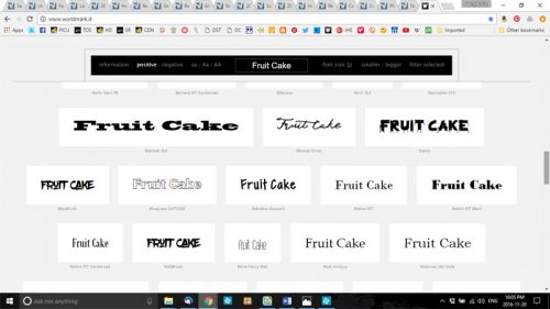
Since we’re talking about titles and using styles, obviously I’m not going to use the alpha that comes with the kit I used for my layout. I’m going to use a font. I know what look I’m going for so choosing the right font is very important. My layout, for the November Mix It Up Mystery Challenge revolves around my annual fruit cake ritual so I want my title to look like candied fruit, or hard candy. That means my font has to be a solid, hefty, rounded one. If you’re like me you probably have hundreds of fonts and dread having to search for the perfect one. That’s where Wordmark It comes in. It’s a website that shows you what your text will look like in every font you have on your computer, and it only takes a couple of minutes. The image below shows you what the screen looks like. I browsed through the exemplars and decided a font called Glasoor FF 4F Black would work beautifully. (Where do they get these names from?)
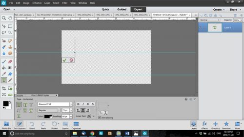
As I always do, I created my title on its own workspace. I wanted each of the letters in my title to be a different colour so I knew I’d have to put each letter on its own layer. This step isn’t crucial, but it helps to keep things organized. I pulled a horizontal guideline down to align my text on, and then a second one because I planned to put each word on a separate line. Don’t know how to pull a guideline down? I have the rulers visible on my workspace at all times but you don’t need it there to do this. Just put your cursor right up the very top of the dark gray workspace and then click-and-drag the line to where you want it. You can see mine in the image below, the thin turquoise lines. I put the text cursor on the line and started building. I used a 72 point size, which is big enough to see and manipulate easily.
It doesn’t matter what colour you use for the text at this stage. You’re going to cover it up with a style later. While I was playing with the base, I selected all 4 letters in “cake” and shifted them as a group, which is shown below.

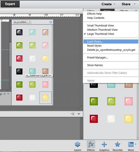
Then I selected the style set I wanted to use. Don’t know how to load styles? If you’re using PSE 10 or higher, it’s simple. When you open the Style panel using the Effects menu, at the right upper corner of the panel is a little icon that looks like several little horizontal lines with a tiny triangle just to the left of them. If you click on that, the following menu pops up. Click on Load Styles then find the folder you have your styles in. Then select the style you want to use and you’re in business.
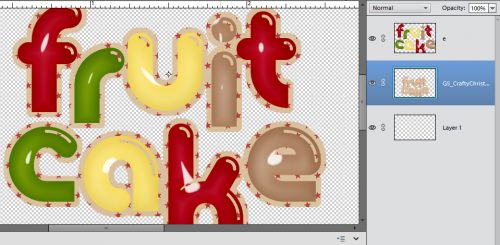
Once I’d done all that, I selected the acrylic gel style from Just So Scrappy’s Up on the Housetop bundle. (pssst… it’s on sale for $5 right now!) I applied a different colour style to each letter. It would have been more work to do it to each individual letter to select each one from a single layer and apply them, but not impossible. I’m all about working smart, not hard!
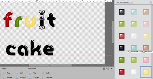
When I had the letters all styled up, I decided I didn’t like both words ending with red, so I right-clicked on the layers for the “k” and the “e” and selected Clear Layer Style. Then I swapped the red and brown around.

Here’s another advantage to having each letter on its own layer. Now I was able to move them around a little to make the title look more interesting.

Once I’d gotten all of that done, I wanted to get rid of the guides. So I clicked on the View tab and unselected Guides from the drop-down menu. (Did anybody notice I also had a vertical guide in this screenshot? I had thought to line up the two words, but didn’t like how it looked.)

When I was happy with how it looked. I selected all the layers (keyboard shortcut: click on the top layer, hold down the Shift key and click on the bottom layer) then merged them onto a single layer. (CTRL/CMD+E) I thought it looked pretty good, but was afraid it was going to get lost on my layout. So I decided to put a paper outline around it.

I dragged a paper onto my workspace, making sure it was underneath my title, then with my paper layer still the active layer, I held down the CTRL/CMD key and clicked once on the thumbnail for the layer with the title on it. That put some marching ants around the letters, as you can sort of see below. Then I clicked on the Select tab, chose Modify and Expand from the drop-down and fly-out menus. (You might remember that from a previous tutorial, if you’re a faithful reader.)

I wanted the paper border to be visible, but not ridiculously huge so I typed 10 into the Expand by:_ pixels box. That shifted the marching ants away from the edges of the letters.
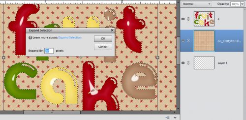
Then all I had to do was cut the rest of the paper away. To do that I first inverted the selection by clicking CTRL/CMD+X (the long way: right-click anywhere on the workspace and choose Invert Selection. Then go to the Edit tab, choose Cut.)
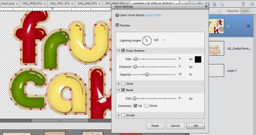
But I still wasn’t happy with it. I knew I needed to shadow the letters so they’d look more like candy. And I’d layered them on top of a piece of paper so there was a need for some definition. Then I decided to try a Bevel, which looked quite odd until I dragged the size down to 0. Then I liked it. I had to adjust the Lighting Angle because I was using a template (rotated and tweaked a bit) and wanted the shadows to agree with each other. That step isn’t shown, but it was discussed in last week’s tutorial on drop shadows.
One last thing I had to do before I moved my title onto my layout was to merge the layers so it would move as a single object. Remember how to do that? Select all the layers then click CTRL/CMD+E. Once I’d put it onto my layout I resized it and moved it around a bit, and was done!
That’s all for this week. Next week I’ll have some other tips, tricks and techniques for you. Keep your eyes open!
![]()
Jan,
I love your tutorials – I always learn something new! This was a great example of how to use styles. I was pretty familiar with them but when you added the part about the paper outline – love it! I have seen that and didn’t know how it was accomplished.
Thank you!
This was really fun to follow along! Did you finish your layout? I was hoping to see it at the end of the post to see how the title brought it all together! 🙂 My favorite part was when you talked about moving the letters around to group them instead of keeping them all lined up! That is perfect! I can never seem to figure out why i just don’t like how my titles look… and I think moving the letters into a group instead of a line will help a lot! Thanks!
Thank you so much! Steph, your comment tells me that I’m finding tips and tricks for even more experienced scrappers. Thst’s a good feeling! Winnie, I’m so glad you were able to follow along. That’s also a goal.
Winnie, I just reread your comment. My layout is linked in the tutorial post right near the end. It shows up as green text with a direct link to the gallery. I also posted it in the Mix It Up challenge thread.