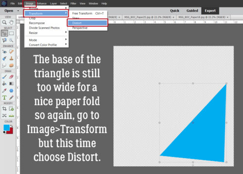
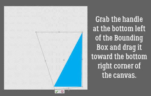
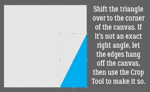
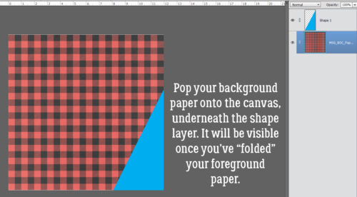
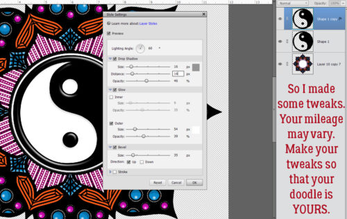
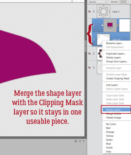
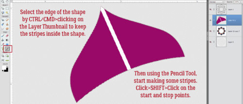
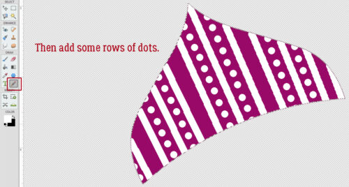
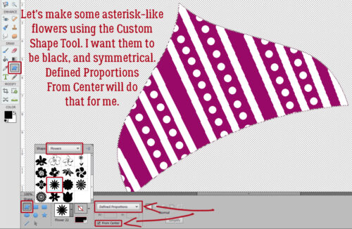
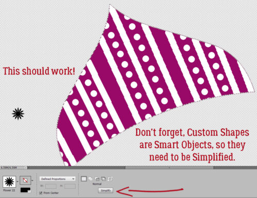
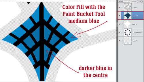
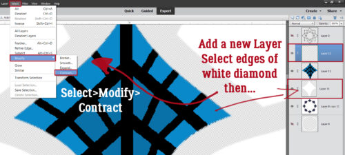
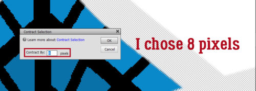
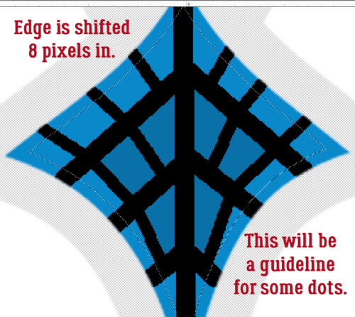
Challenge Spotlight: Memory Mix-Up
![]()
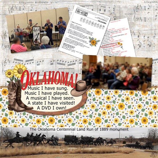
Before I launch into this month’s Challenge Spotlight… anybody else out there getting body-slammed by Mercury in retrograde? I don’t usually pay attention to that kind of thing, but this time it’s inescapable. I found myself suddenly locked out of half the websites I use for various purposes and was told the only solution was to change browsers. Which meant setting up a new one, complete with having to reset at least a dozen passwords – including this one. I’m over it!! With that on top of my suddenly garbage vision, I’ve hardly accomplished anything this month. However, I have persevered and DO have a Challenge Spotlight for you. And this month, it’s the Memory Mix-Up Challenge, hosted by Twin Mom Scraps. The prompt for this month’s Challenge was a phrase: a day at the zoo. So far, there are 9 layouts posted to the Gallery and I’ll share them all with you. As usual, each layout will be linked to its spot in the Gallery so you can take a closer look and/or leave a comment. Just click on the Scrapper‘s user name.
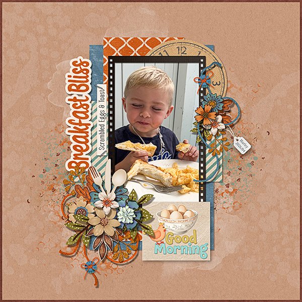
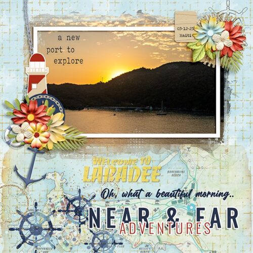
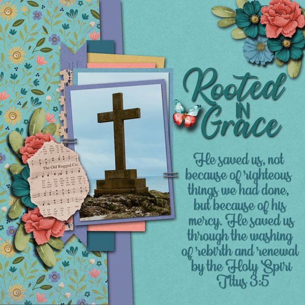
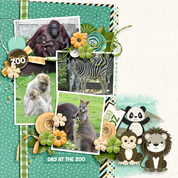
First up is this layout from scrapmevrouw. Her photos are precious! Each one shows a mom and baby pair. The layout itself is well-composed, with a strong diagonal aspect between the photos and the large cluster of animal elements. I like how the paint element behind the cluster grounds it perfectly.
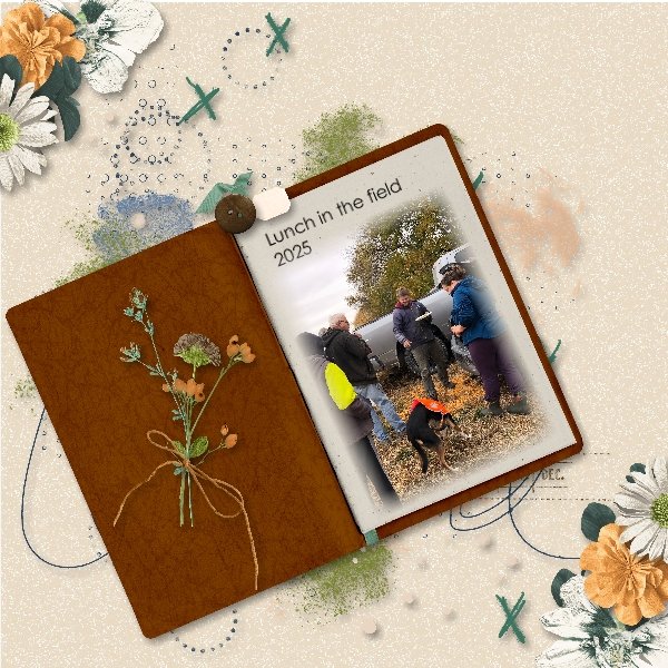
GrannyNKy has created two layouts for this Challenge. Her photo focus is on the family outing, rather than primarily the zoo angle, and that’s a perfect definition of scrapbooking right there… Preserving memories! To tie in with the prompt she has some prominent critter elements. LO 2 can be found here.
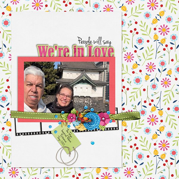
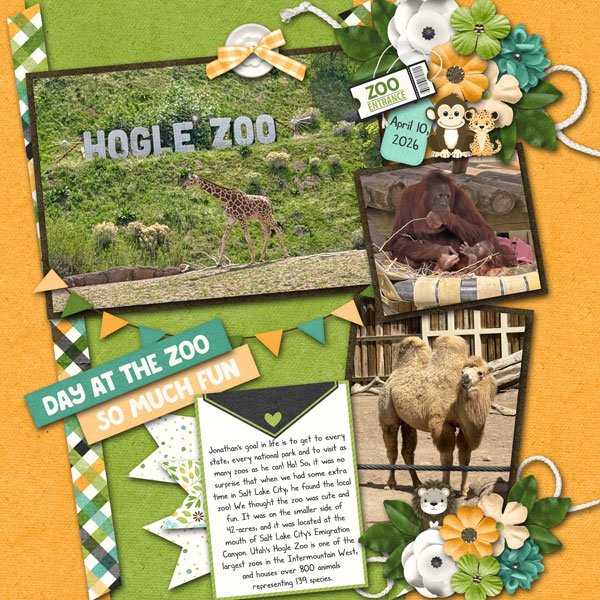
For her layout, jenniferl75 described how their visit to the zoo came to be, and included some exotic animal photos to document the event. She used the very same collection as the previous two Scrappers, a detail that escaped me until I took a better look. I like that she framed her photos with black, making them draw the eye.
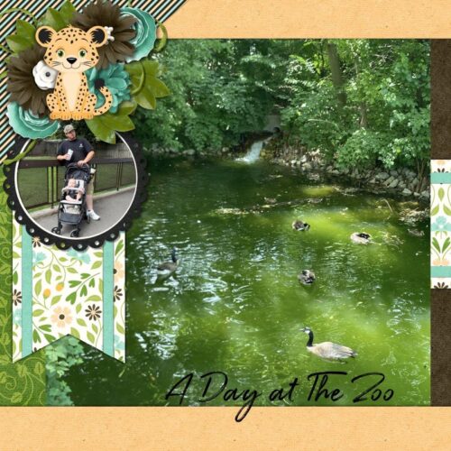
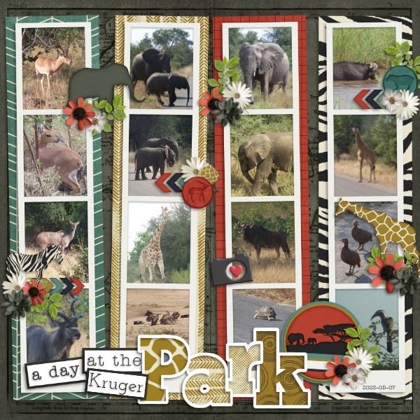
CathyS has created a grid-style layout filled with photos of the inhabitants of Kruger Park. Her title is smashingly well-done! And I enjoy how she’s used matching animal elements to draw attention to some of those inhabitants.
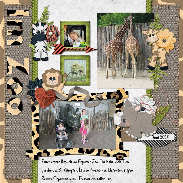
Look at the animal print papers sarahm172 has used to anchor her photos. They really carry the layout. Don’t you love that little rhino element?
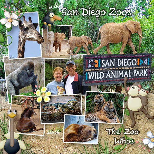
Tbear‘s layout is about a zoo I’ve actually seen with my own eyes. I appreciate the way she’s used a large photo as her background and has the elephants appearing to be walking out of another photo. The out-of-bounds treatment of the giraffe actually leads the eye to that little vignette. Clever!
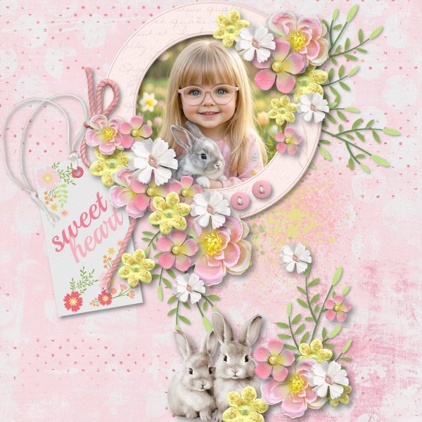
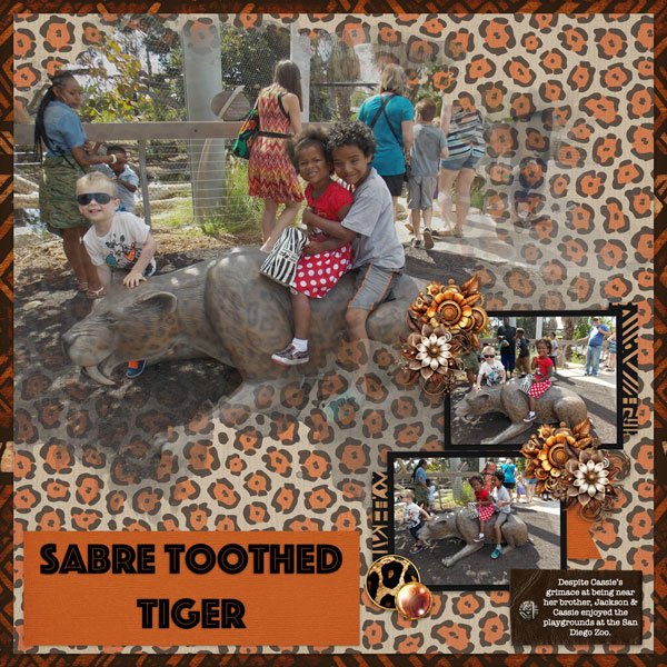
I’m glad RobynC included a bit of journaling to clarify which zoo has sabre-toothed tigers. 😉 The cheetah print background paper and small slices of other animal print papers definitely whisper “zoo”, don’t they?
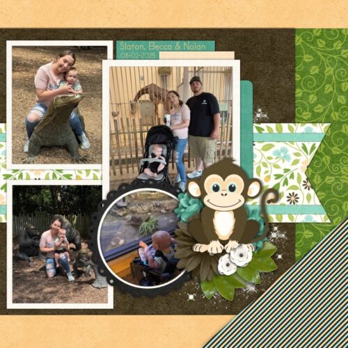
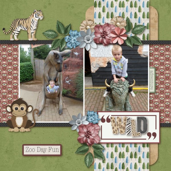
Our last layout is from twizzle. The little man in her photos enjoyed the inanimate animals a lot. I like the distressed animal print alpha she’s used for her title, but I swear I’ve seen that monkey somewhere before. 😀
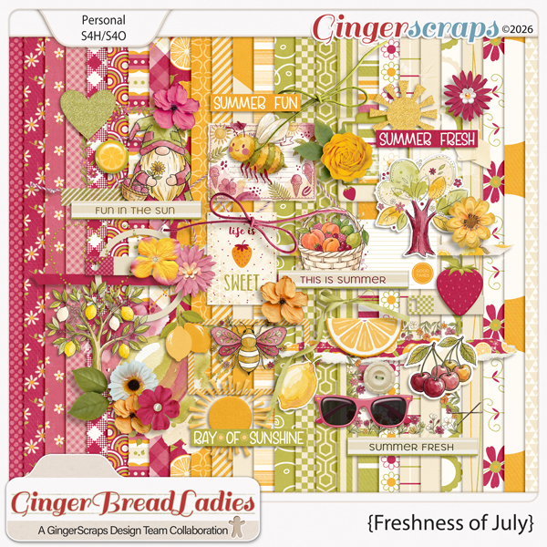
If you’re new to GingerScraps and haven’t participated in any of our Challenges, you really MUST check them out! They’re like an instant shot of inspiration and there’s a lovely bonus kit every month for everyone who completes 10 Challenge layouts in that month. This month’s Challenge Reward is this beaut…
![]()