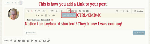
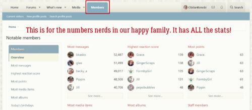
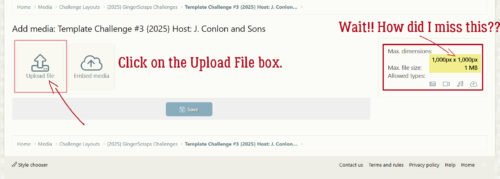
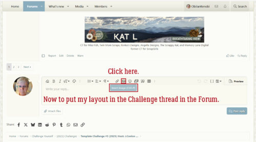
Quick Trick: File Details
![]()
And just like that, September is over. It’s been a bit of a gong show around my house today (as it has all over the place… 🙁 ), which is why I’m late (again) getting this out to you. Thankfully, the last Tuesday of the month is reserved for Quick Tricks. I have another Work Smart Not Hard little tip for you if you’re using Windows 11.
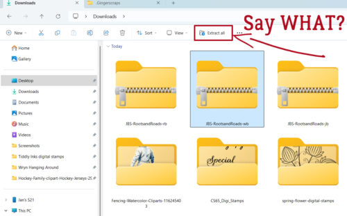
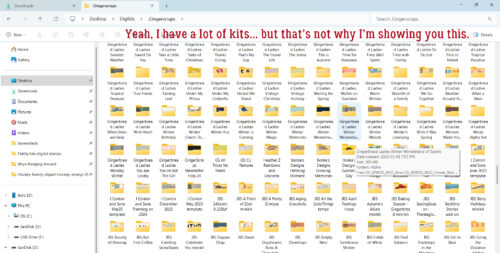
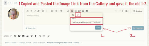
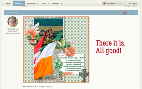
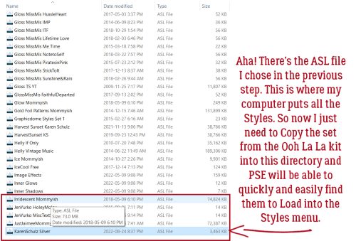
Remember I mentioned finding that folder labeled Downloads INSIDE MY DOWNLOAD FOLDER last week? Well, it had a bunch of free templates from the now-defunct A Love For Layout Templates Facebook group in it. And for most of them, the folder labels gave me no clue as to when I downloaded them. I NEED to know that so that when I use them I can credit them properly. So what could I do to sort that out? Well… I discovered a Windows 11 feature I’d been sleeping on. The Detail Pane.
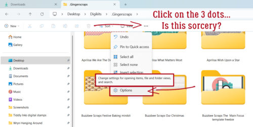
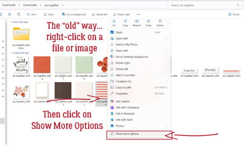
The “old” way to look at details about files in Windows requires a right-click on a file or object inside a file. This is the Windows 11 box that opens up when you do that. It has a few options that aren’t there in previous Windows versions and I won’t dwell on them. That’s not the point of this screenshot. Down at the bottom of the list is Show More Options. So that’s the second step.
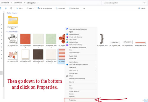
This is the More Options interface. It really isn’t all that helpful, but again, down at the bottom there’s a Properties button. Step Three!
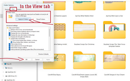
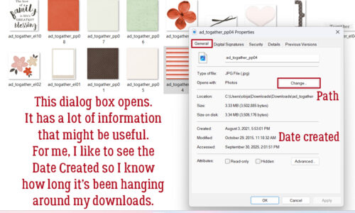
Yet another dialog box opens up. (This is where the name Windows comes from! 😉 ) It’s the General Properties pane and is helpful in a few ways. Here, you can Change the application used to open files like this one by clicking on that Change button. It shows the Path your system used to find the file, and it shows the Date the file was created. AHA! Now I can tell when this minikit was put together. (Yeah. I had files in that subfolder that are more than 10 years old. Gah.)
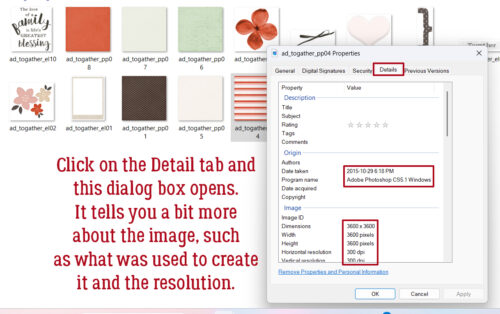
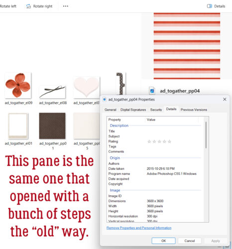
If I wanted to know even more, I could take Step Four and click on the Details tab in this pane. Here, I found information about that creation date and what software was used to create it, as well as size and resolution. To make it get gone, I can X out of it.
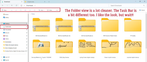
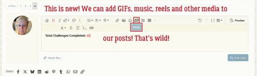
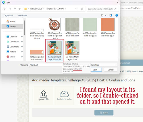
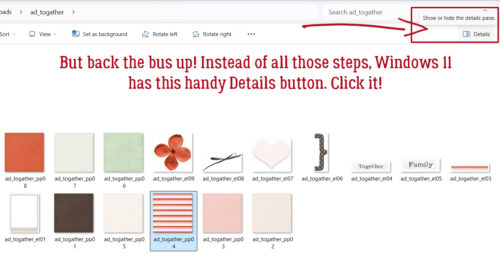
I was starting to flag a bit after about 10 hours of sorting through files, and was getting ready to pack it in when I noticed this little button at the top right of the screen. It says Details. When I hovered my cursor over it, the pop-up said “Show or hide the details pane“. So I clicked it!
The Details pane slides open from the right hand side of the screen. Holy cow… with ONE click, I can see the creation date and dimensions! If I want more info, I can click on the Properties button.
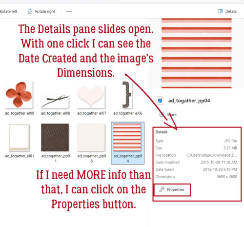
And it’s identical to the dialog box from Step FOUR above! Two clicks instead of four!!!
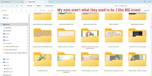
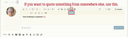
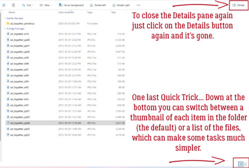
To close the Details pane, I just clicked on the Details button up there at the top right again and it went away. And that’s it! But before I close this up and post it, I wanted to share just one more little Quickie… Down there in the bottom right corner there are two little icons. The one on the left is a stack of lines and the other looks a bit like a flatscreen TV. You can toggle between a list of files in the folder – the stack of lines, and thumbnail images of all the files in the folder – the flatscreen! The “old way” has more steps…
I’ll be back in the next few days with Designer Spotlights for October. First up will be Joy and Memory Mosaic. Then I’ll chat with a newish GingerBread Lady, Cyndi, who is also known as Wetfish Designs. October’s Daily Downloads are going to be amazing!
![]()