Zen Doodling Wrap-Up
![]()
Once again, Best Laid Plans were scuttled… but this WILL post before Tuesday is over. Thanks for the grace you all provide me, it’s deeply appreciated!
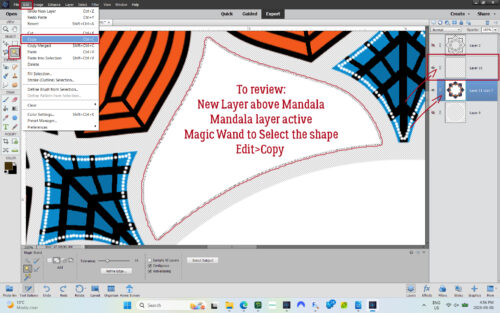
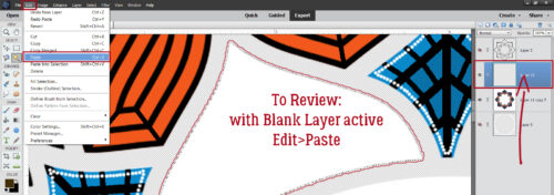
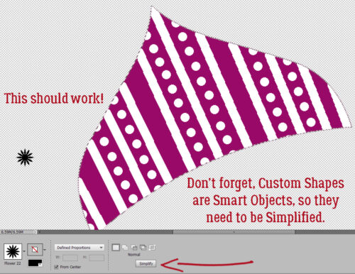
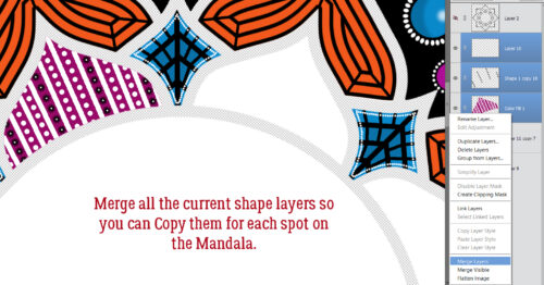
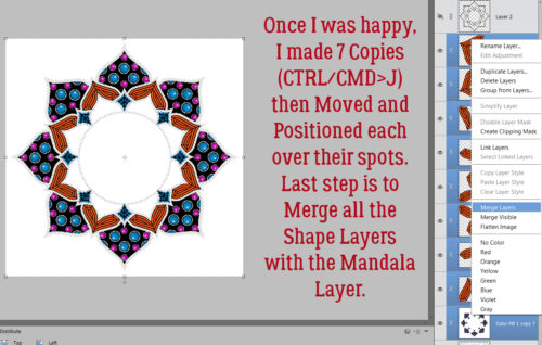
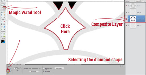
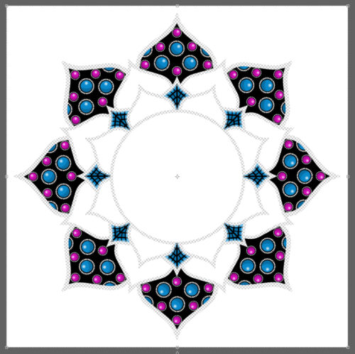
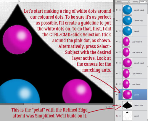
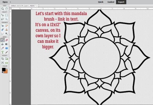
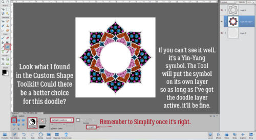
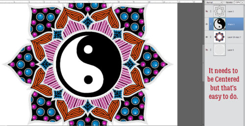
I’m finally wrapping up that Zen doodle project. Have you guessed what I put in the centre? Let’s see! This is where we ended last time. I acted on a hunch and took a look at the Custom Shape (aka Cookie Cutter) library. Whoa!! There’s a Yin-Yang symbol in there! To ensure it’s an actual circle, I selected Defined Proportions, which defaults to 1:1 and dragged out a symbol. Elements puts these shapes on their own layer, so once it’s been Simplified, it’s easy enough to resize and reposition.
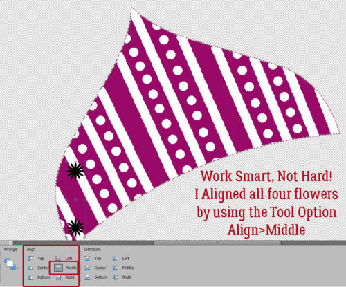
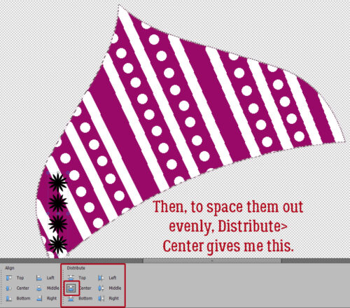
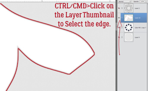
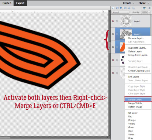
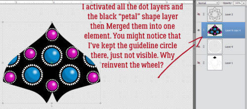
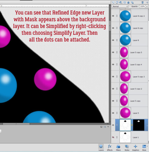
As you can see here, I have a doodle layer, a yin-yang layer and a black outline layer that has a Cloak of Invisibility on it at the moment. Centering an object is simple: activate the two layers (doodle and yin-yang) then Align to both Center and Middle.
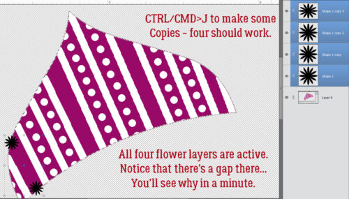
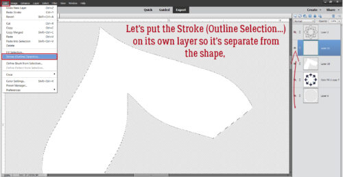
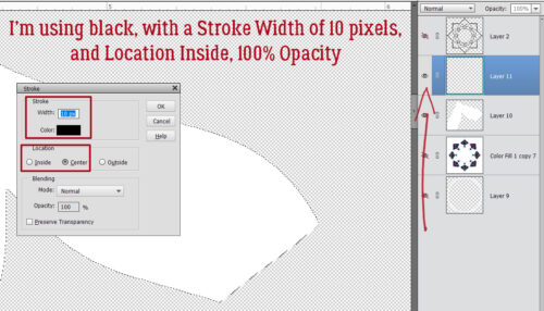
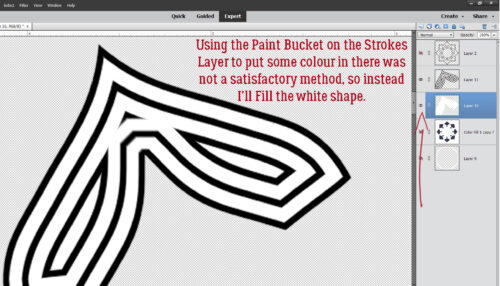
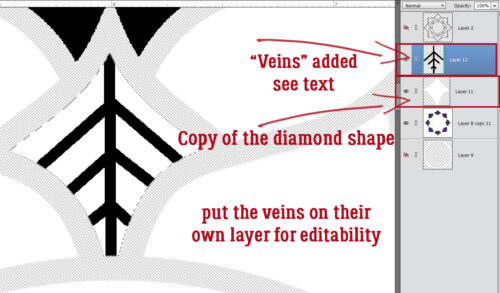
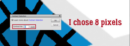
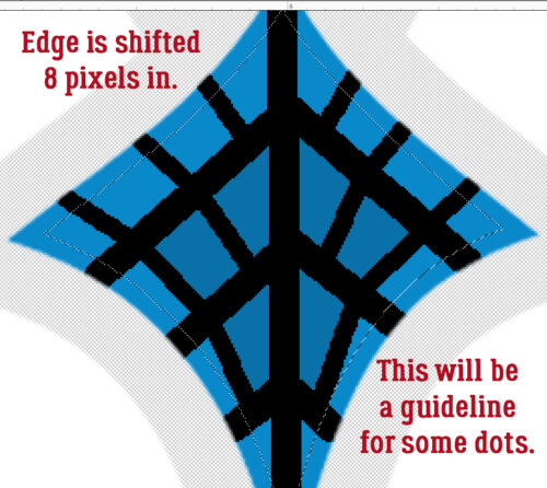
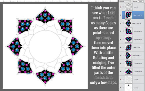
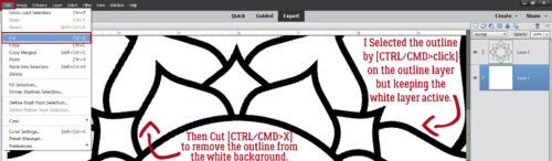
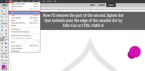
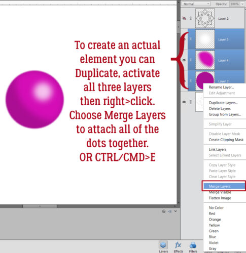
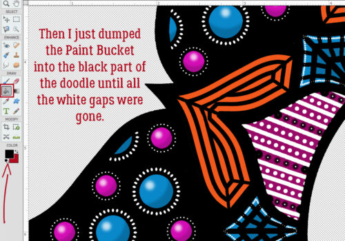
I should point out that the Brush I used for the basis of my doodle isn’t perfectly symmetrical. So when I Duplicated finished segments and moved them into place, they didn’t fit precisely over their spots. That means I have some… gaps. But… moving the black outline layer down to the bottom of the stack and Filling it with the Paint Bucket didn’t make them go away. What to do?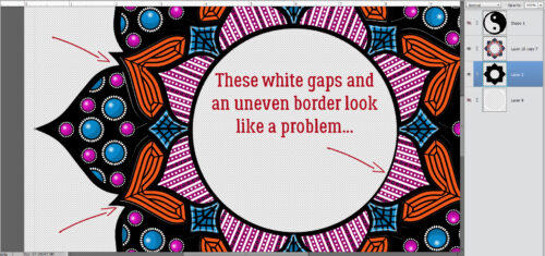
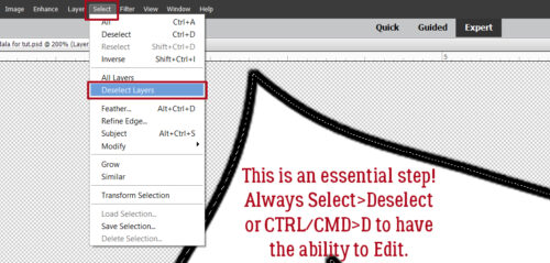
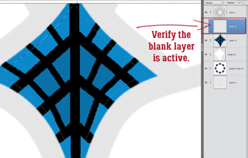
First I had to figure out where the problem actually existed.
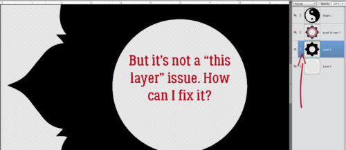
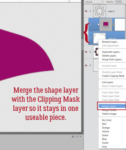
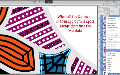
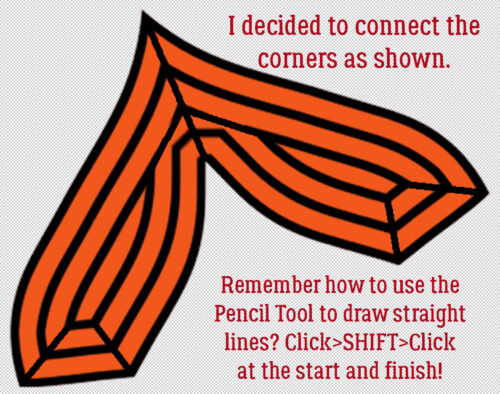
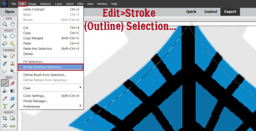
I tried a *few* things that didn’t work. Then I Merged the doodle and black background layers together.
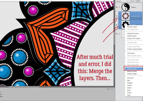
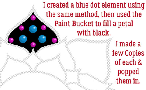
Then I just dumped black Paint until the gaps disappeared.
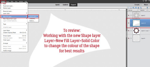
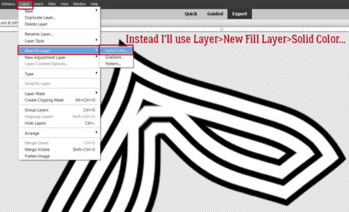
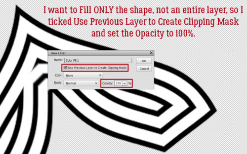
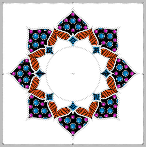
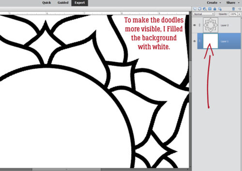
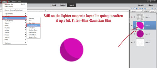
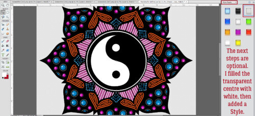
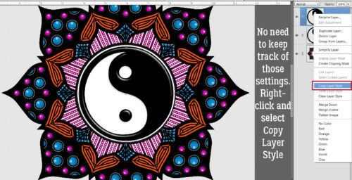
Other than Filling in the centre of the doodle with white, the remaining steps are completely optional. I wanted some catchlights and a bit of dimension so I went into the Styles menu and chose Wow Plastic. It’s one of Elements‘ core Styles that is part of the basic software. The one I’ve outlined in the screenshot is a CLEAR plastic Style so the colours below it will be unchanged. But… if you apply it to the actual doodle or yin-yang layer, the colour will disappear. So… Copy Layer it is!
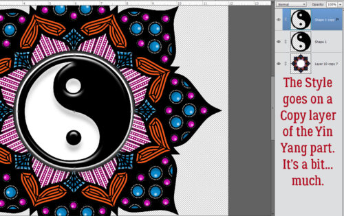
It’s not really obvious in the screenshot, but the effect is a bit much. Too much. So I’ll adjust it.
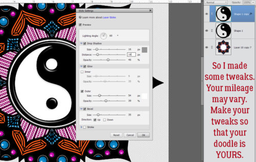
This is a good skill to develop. You can pretty much always make adjustments to Layer Styles. And you can see what you’re doing as you do it, which really helps. To get into the Style Settings menu, double-click on the fx icon on the right side of the Layer.
I changed the Lighting Angle to 60°, tweaked the Drop Shadow Size and Distance to 16 pixels each, lowered the Opacity to 46%, set the Outer Glow to 54 pixels at 39% Opacity and decreased the Bevel to 35 pixels. That gives it a nice 3D look without being overpowering.
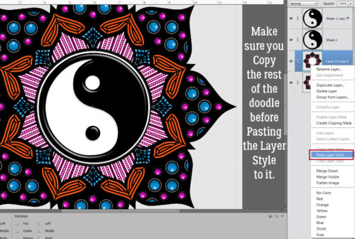
I think I’ll apply the same Style to the rest of the doodle. I don’t need to remember what those settings were, I can just Copy Layer Style to Paste it onto the doodle. But not THE doodle… a Copy Layer. To Copy the Style, right-click on the Styled layer and choose Copy Layer Style from the dropdown.
Making sure you’re on the Copy of the doodle layer, right-click again and select Paste Layer Style and Elements will apply those same settings to the doodle.
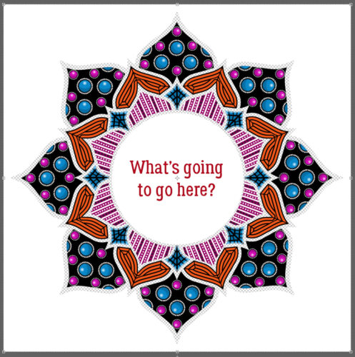
I Saved my doodle as a layered PSD file so I can make other adjustments when I decide to use it for a card or a layout. It can be a background, a frame (pop a photo into the centre instead of a yin-yang) or even a 3D element. For those purposes I’d want to Save it as a PNG file so the transparent background is preserved.
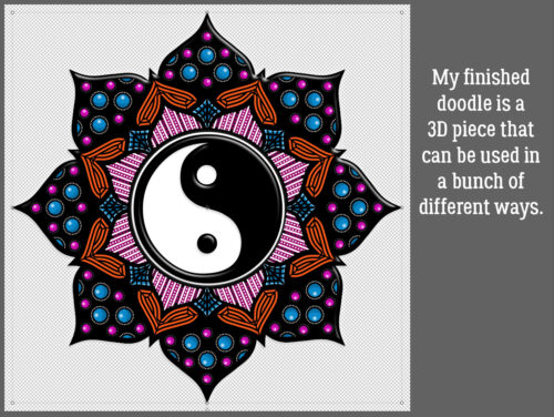
Now, you may NEVER attempt digital Zen doodling, but these techniques can be put into play in so many other ways. Don’t be afraid to experiment!! If something doesn’t look like you want it to, just Undo [CTRL/CMD>Z] as many steps as you need to (my fingers just find that keyboard shortcut naturally, from so much practice) and try something different. All you’ll lose it a bit of time. 😉
I’ll be back on Thursday with a July Designer Spotlight. Care to guess who that might be?
Happy Canada Day to all the Canucks out there. And happy 12th birthday to my first grandchild, Jonathan.
![]()