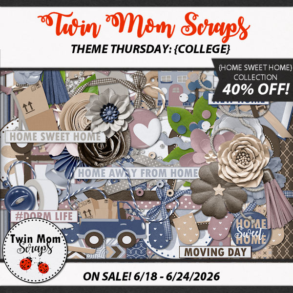
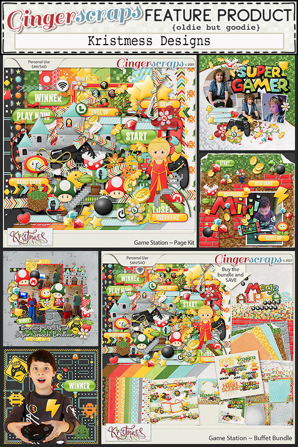
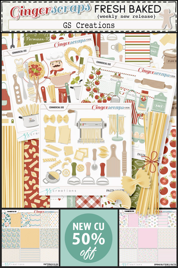
It’s a brand-new month at Gingerscraps, and we have so much in store for you! Be sure to check out our new Free With Purchase, Monthly Mix, Challenge Reward, and Daily Download. We’re also excited to welcome a new Guest Designer. Stop by and see all the wonderful new products, promotions, and inspiration waiting for you this month!
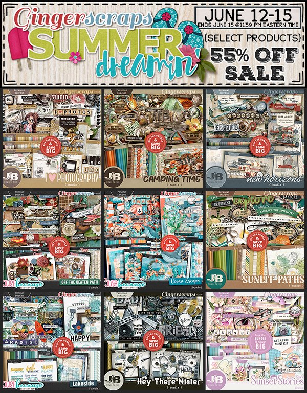
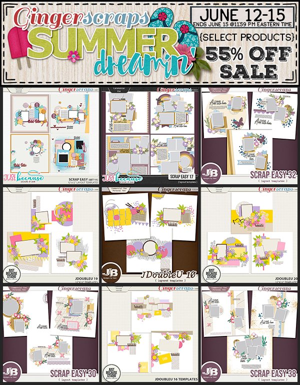
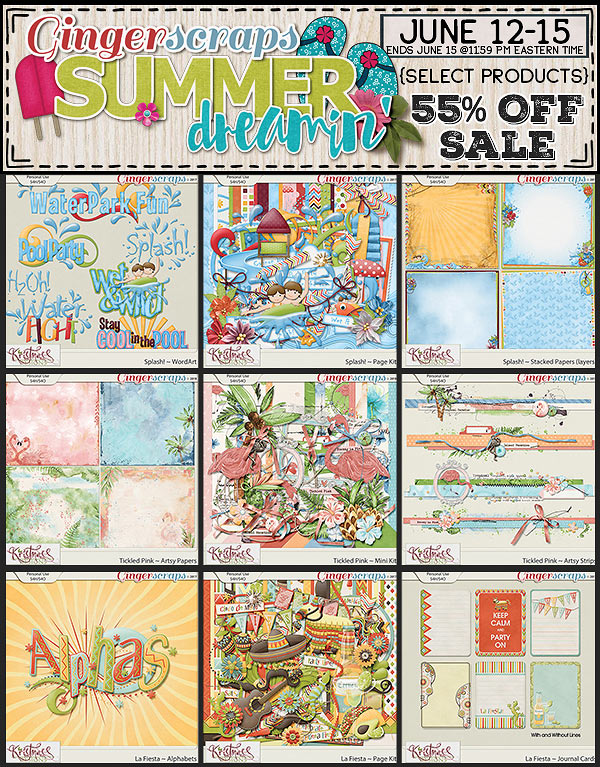
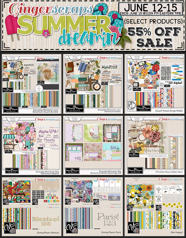
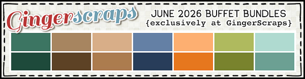
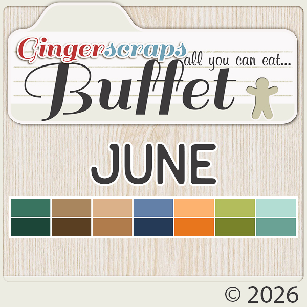
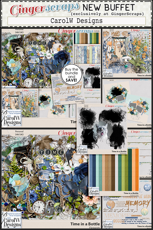
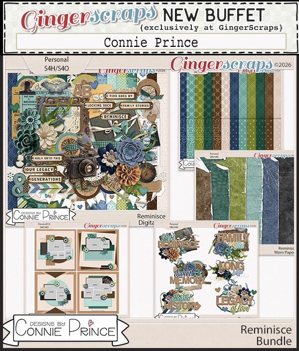
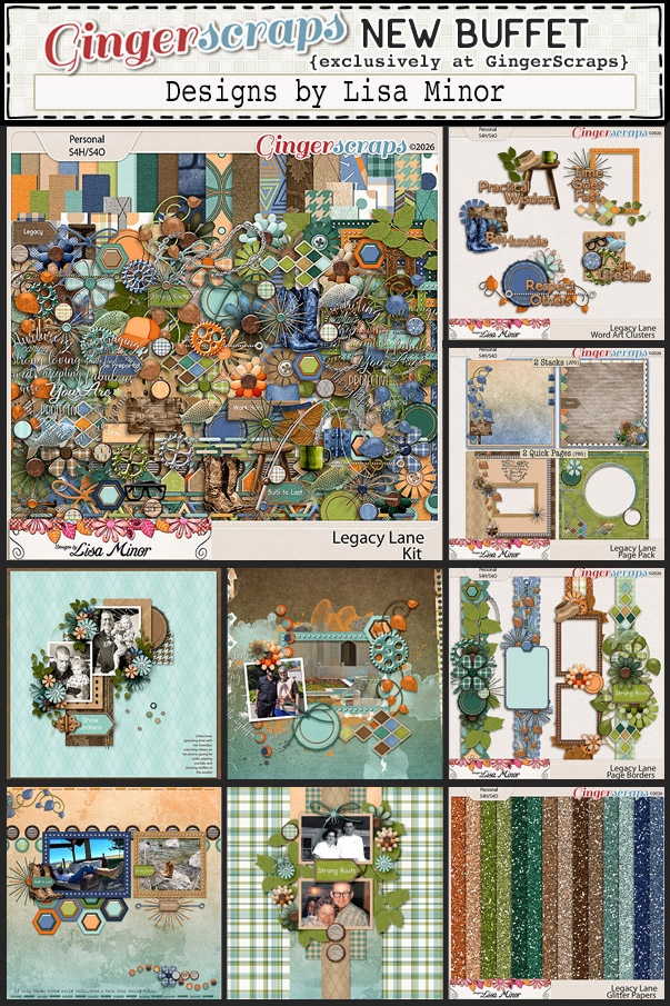
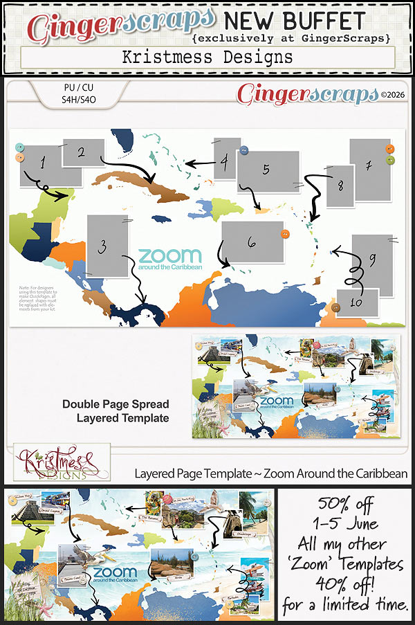
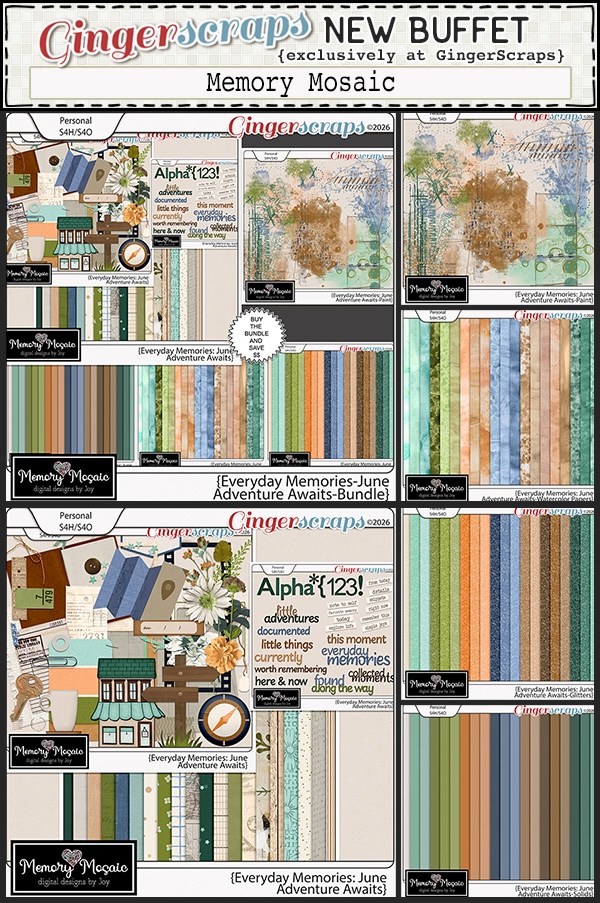
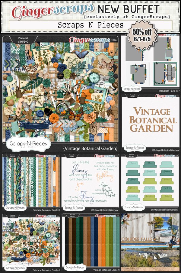
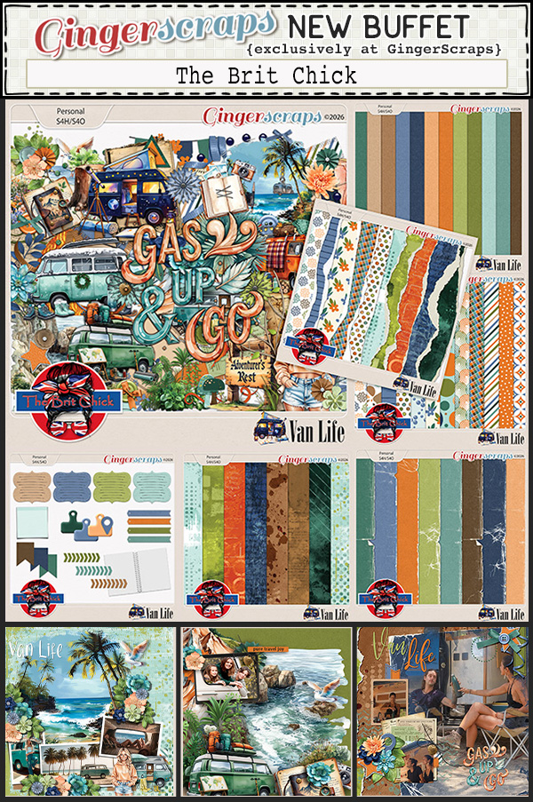
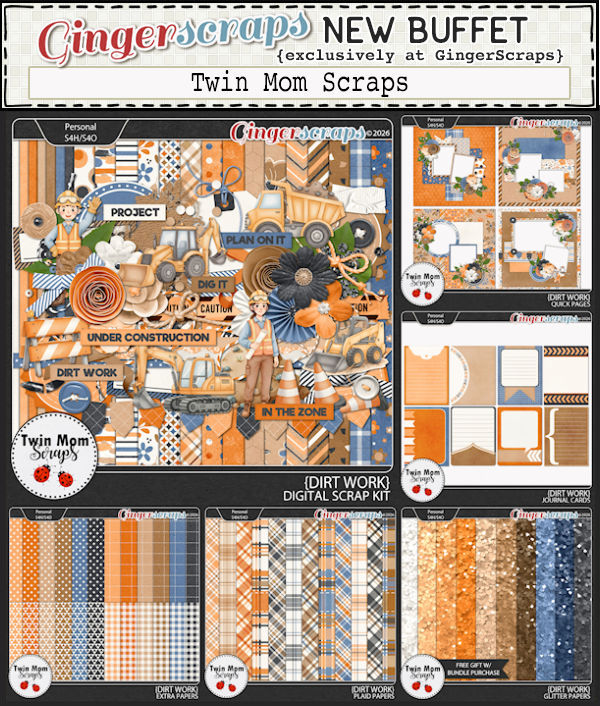
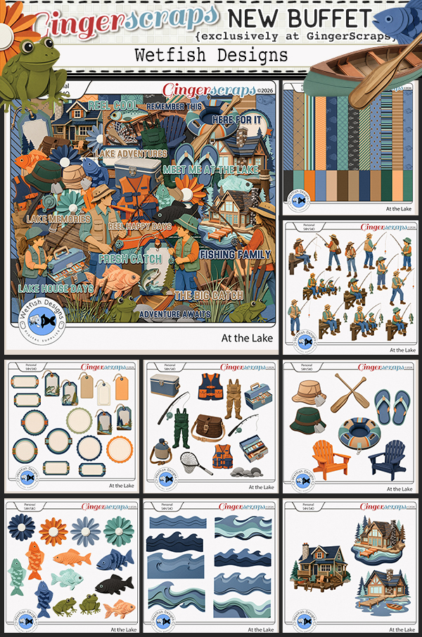
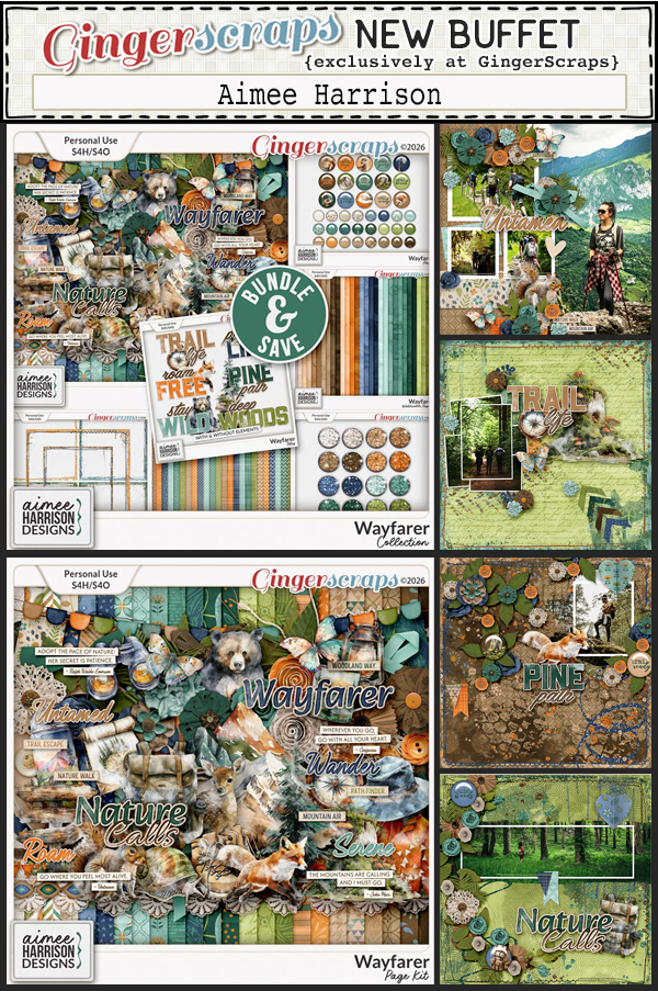
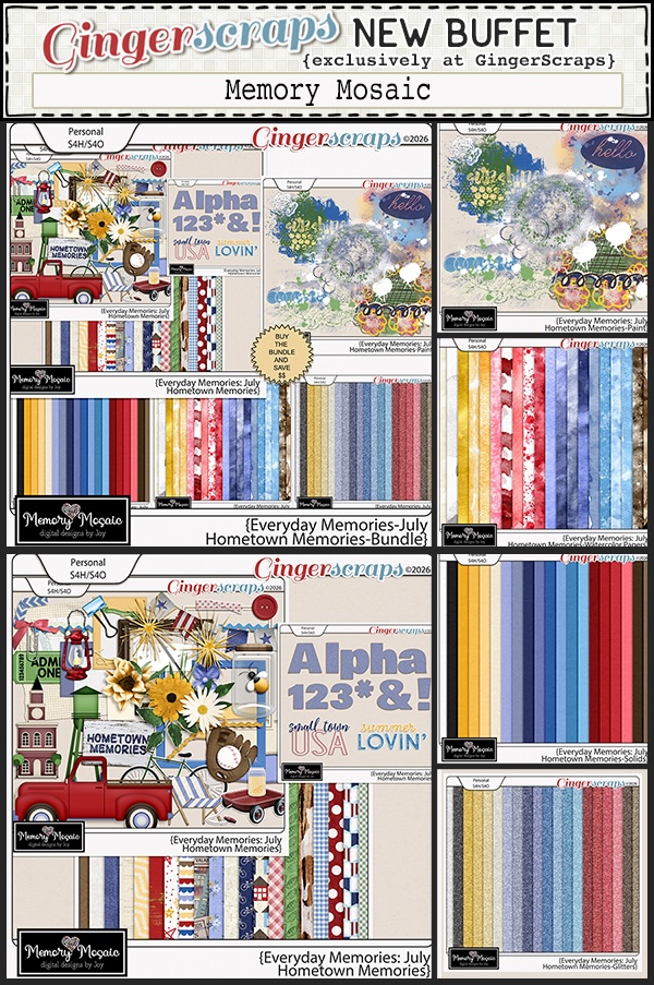
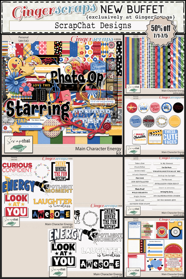
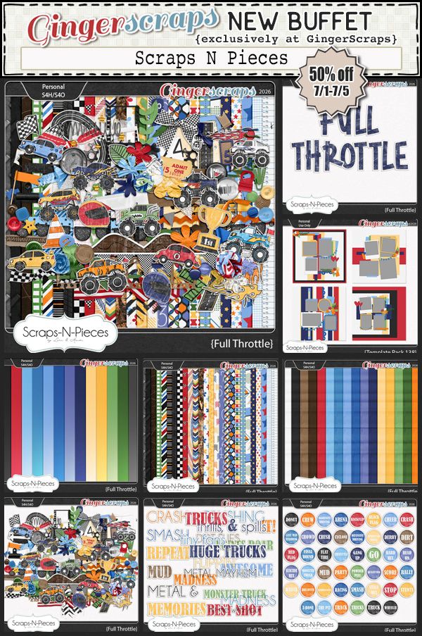
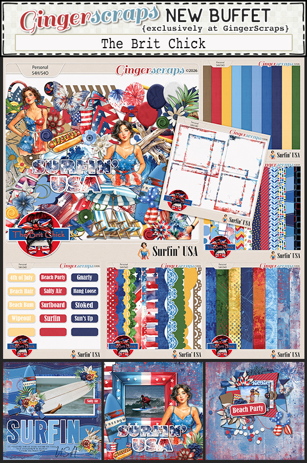
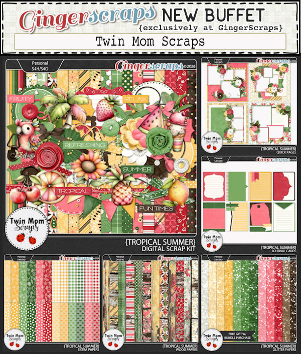
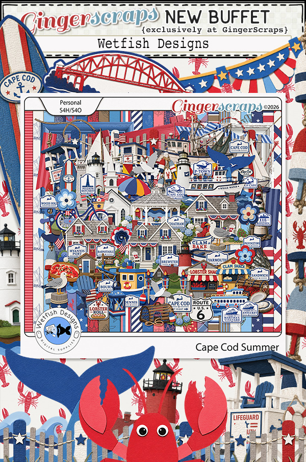
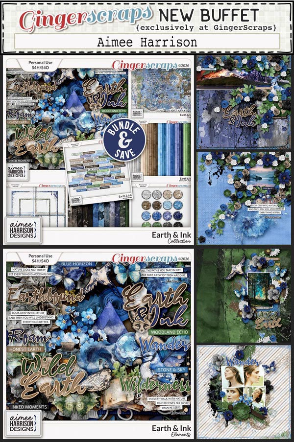
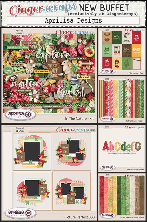
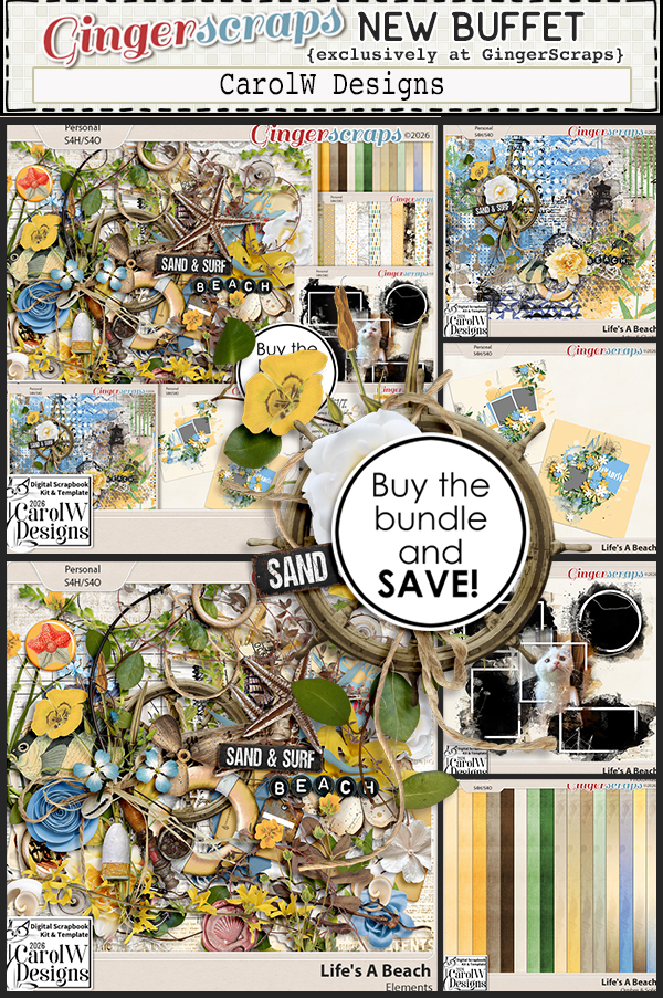
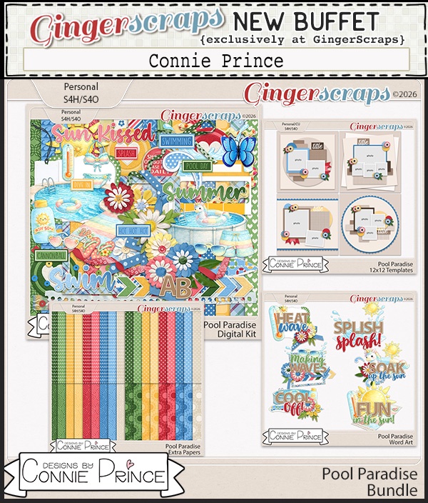
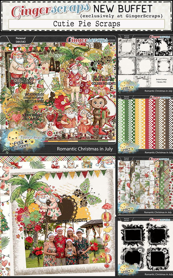
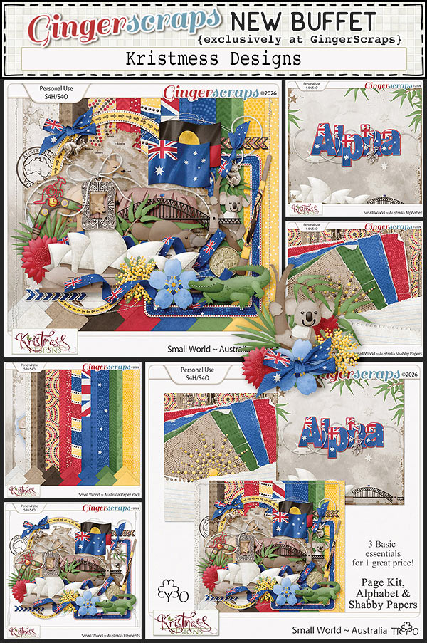
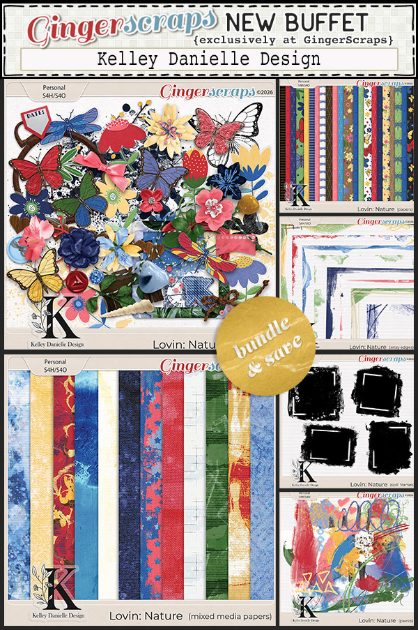
Next let’s look at the July Buffet. Don’t forget to check out the Buffet Bundles. One easy click to add bundles of Buffet goodies to your cart.
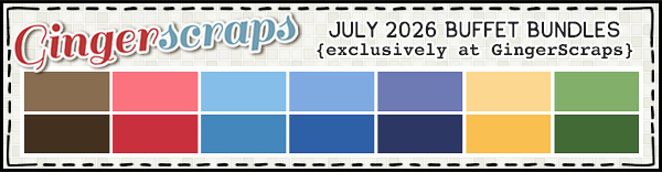
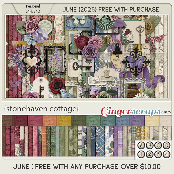
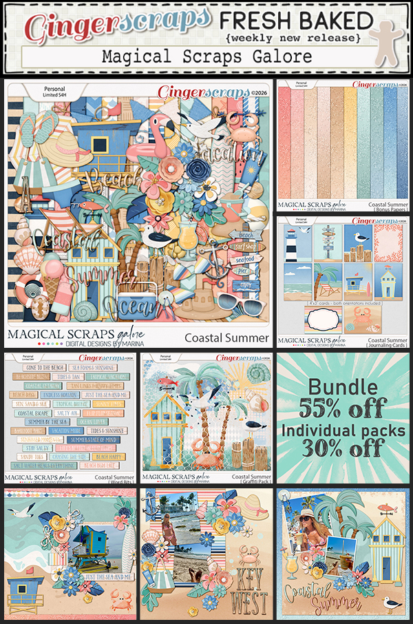
I just love these gorgeous colors for July.

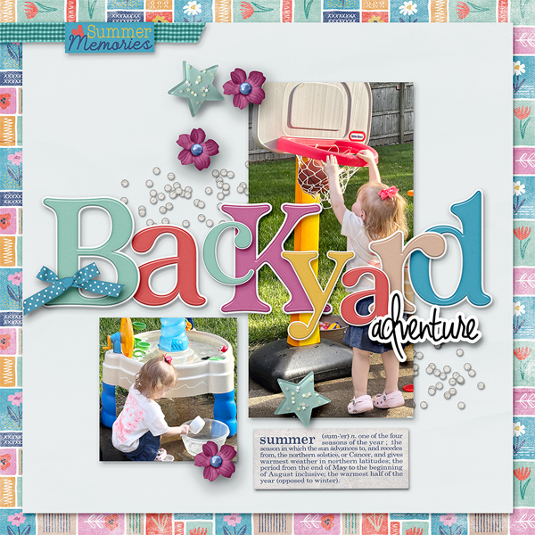
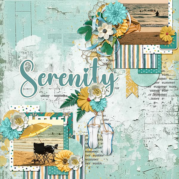
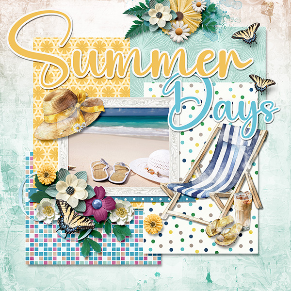
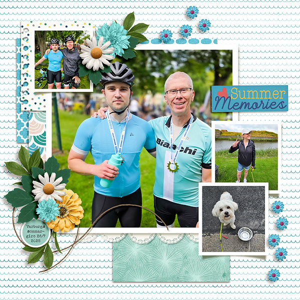
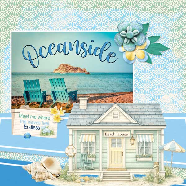
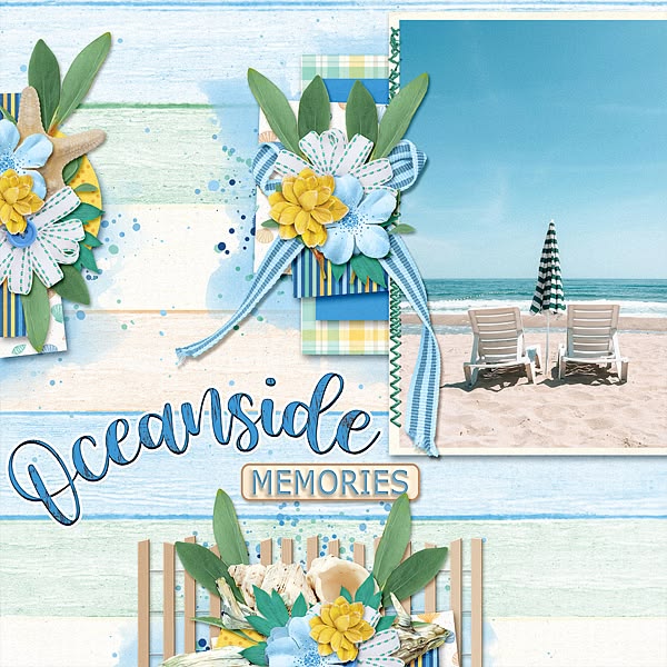
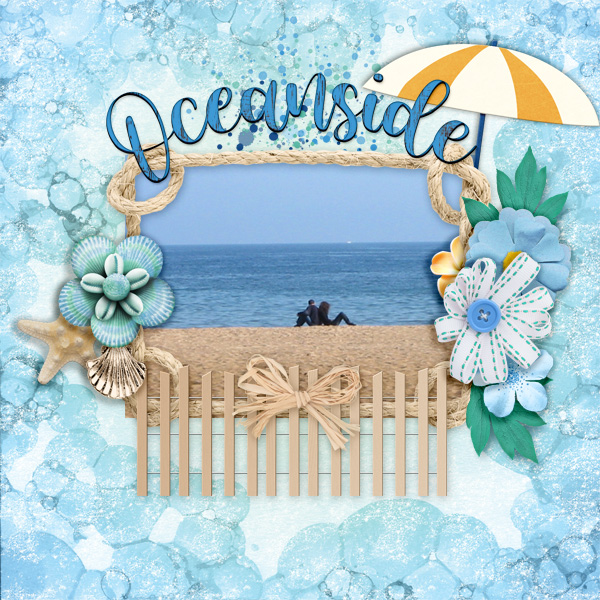
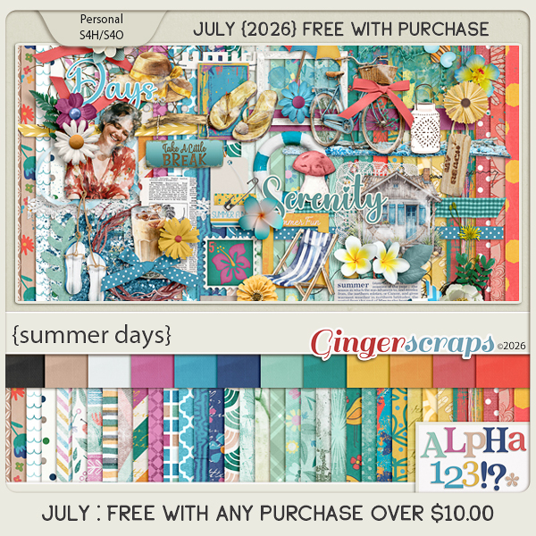
Summer Days captures the timeless charm of sunny afternoons and coastal adventures with a touch of vintage style. This bright and cheerful collection features old bicycles, sandy beaches, ocean waves, Adirondack chairs, colorful umbrellas, sandals, and other classic summertime favorites. Blending vibrant colors with nostalgic details, Summer Days is perfect for documenting family vacations, beach trips, boardwalk strolls, lazy afternoons, and all the memories that make summer unforgettable.
This collab includes: 1 Alpha {Uppercase, Lowercase, Numbers & Punctuation}, 47 Papers, and 84 Elements.
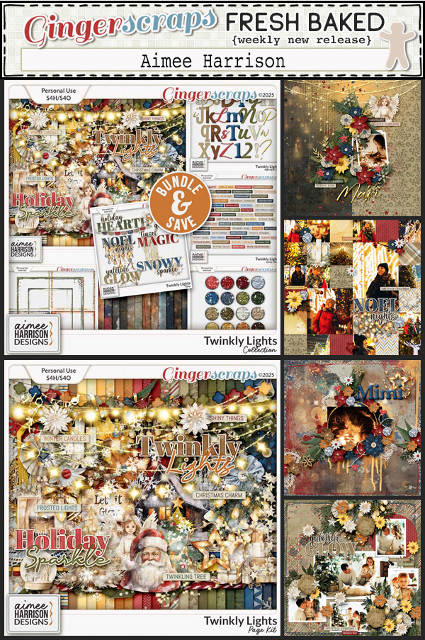
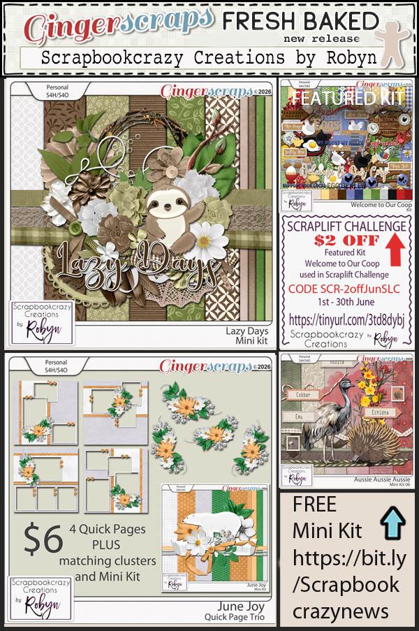
This Free With Purchase was created by Aimee Harrison, CarolW Designs, Cindy Ritter Designs, and Scrapbookcrazy Creations by Robyn.
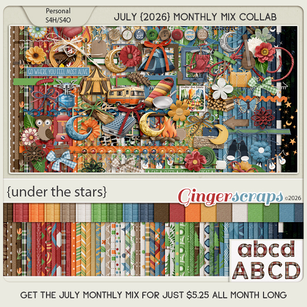
Under The Stars celebrates the magic of sleeping beneath a blanket of twinkling stars. Whether you’re gathered around a crackling campfire deep in the woods or enjoying a backyard sleepout with family and friends, this kit captures the wonder of outdoor adventures. Filled with camping essentials, woodland accents, cozy campfire touches, starry skies, and nature-inspired details, Under The Stars is perfect for preserving memories of camping trips, s’mores, hiking, late-night storytelling, and unforgettable summer nights spent under the open sky.
This kit includes: 1 Alpha {Uppercase & Lowercase} and 82 Papers.
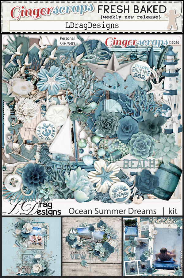
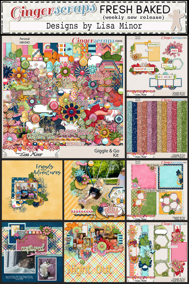
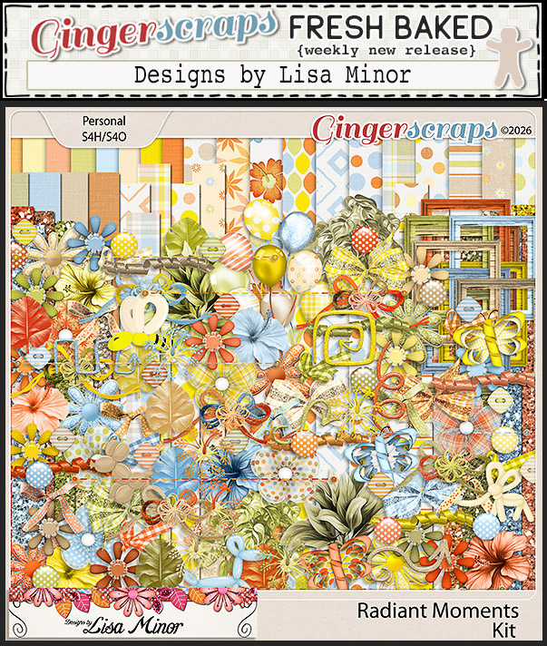
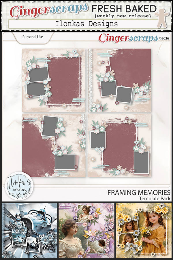
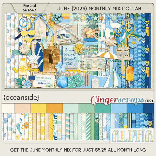
This Monthly Mix was created by Designs by Lisa Minor, Ilonkas Designs, LDragDesigns, Let Me Scrapbook, and Moore Blessings Digital Design.
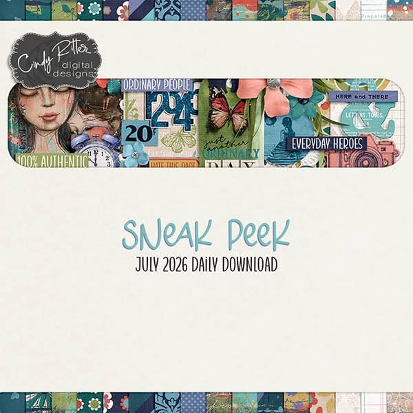
July’s Daily Download is provided by Cindy Ritter Digital Designs and Designs by Lisa Minor. Stop by the blog each day in June to collect pieces of these beautiful kits.
We are excited to announce we have a new Guest Designer starting in July.

BIO:
Hi! I’m Kelley! I’m a mom of 5 young adults (ages 18-24) along with a dog, 6 cats, and several reptiles. I discovered digiscrapping in 2010 and have been addicted ever since! Aside from scrapping and designing, I love photography, vegan cooking, sewing, soapmaking, junk journaling, happy mail – basically all things artsy or creative. I’m always adding new hobbies to the roster – my newest is sourdough baking. I also love gardening, camping, and visiting different parks to try out the hiking trails.
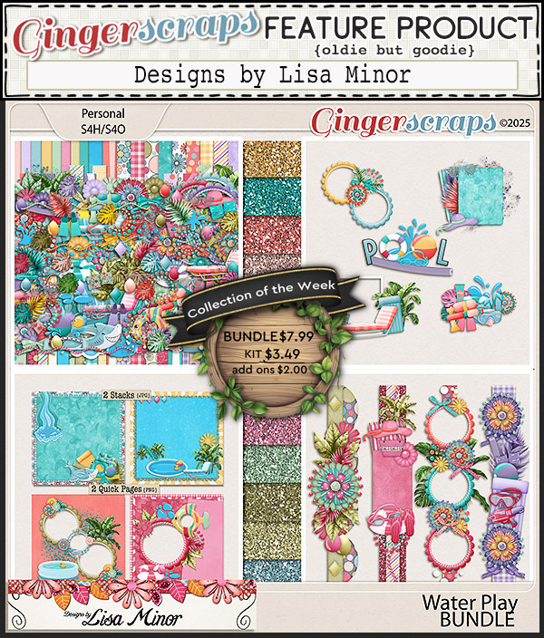
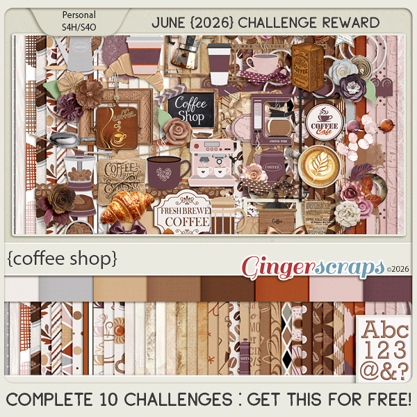
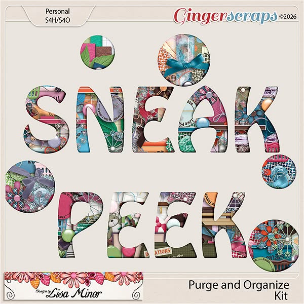
Take a look at the new challenge reward kit. If you complete any 10 challenges this month, you get this gorgeous collab (or a variety of other choices from previous challenge collabs) as a reward!
Freshness of July is bursting with the bright, carefree spirit of summer. Designed in a cheerful palette of sunny yellow, pink, and deep rose, this collection is filled with sweet cherries, zesty lemons, buzzing bees, and fresh seasonal accents that celebrate warm days and simple pleasures. Perfect for documenting picnics, farmers markets, backyard gatherings, sunny adventures, and all your fruity summer memories, Freshness of July brings a refreshing splash of color and happiness to every scrapbook page.
This kit includes: 1 Alpha {Uppercase & Numbers}, 36 Papers, 57 Elements, and 2 12×12 Template {png & psd formats}.
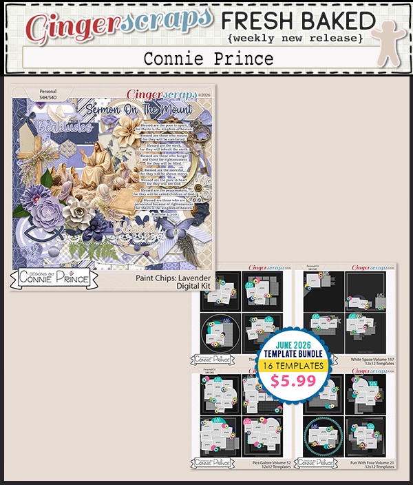
This Challenge Reward was created by Connie Prince, Craft-tastrophic, and Cutie Pie Scraps.

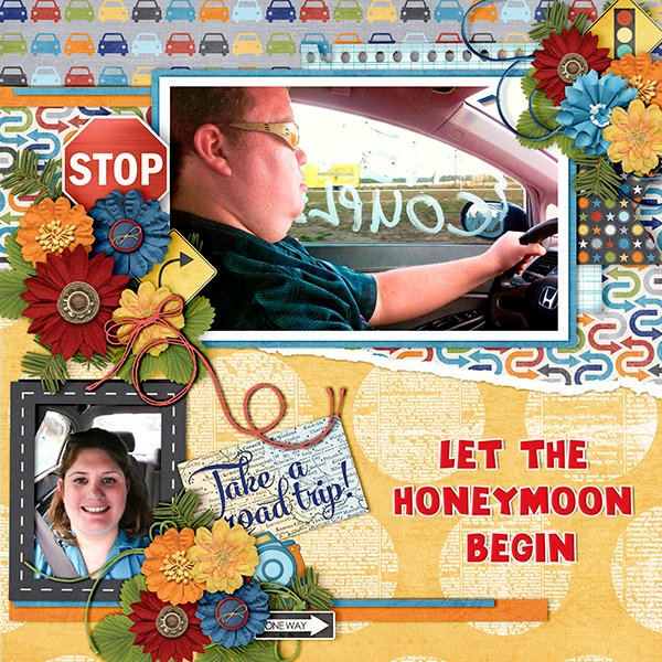
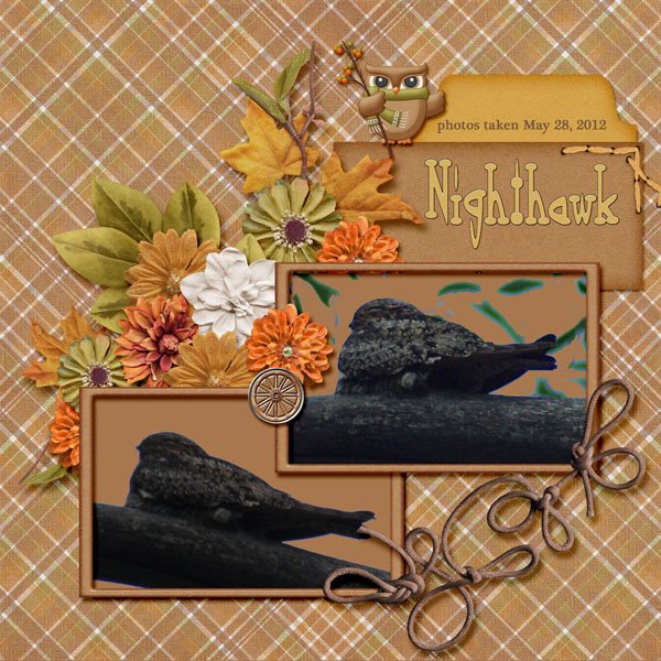
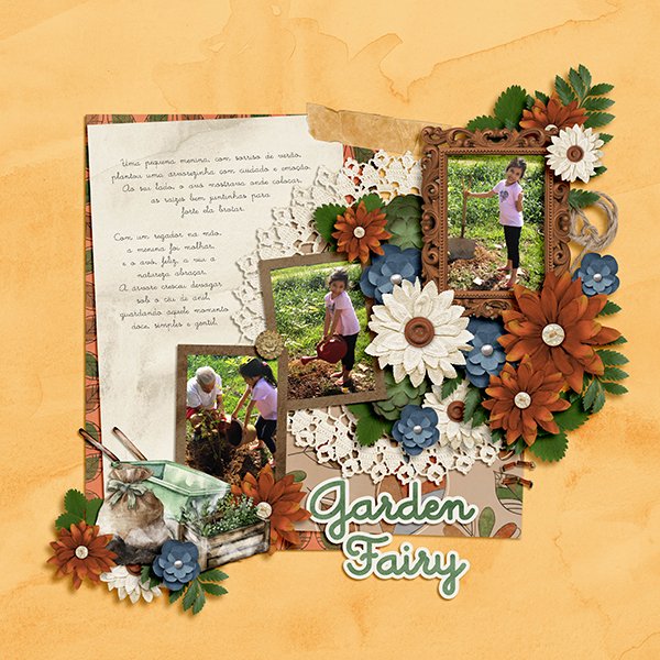
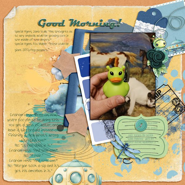
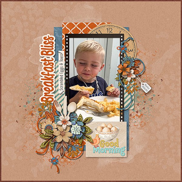
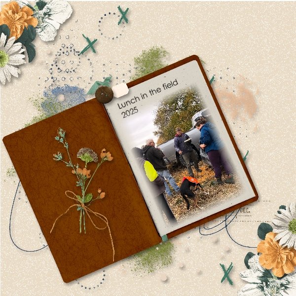
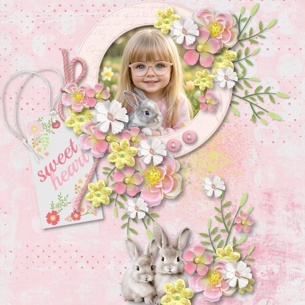
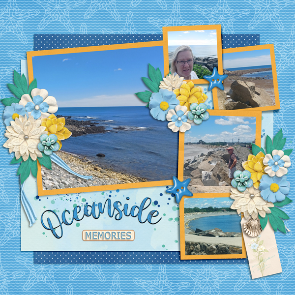
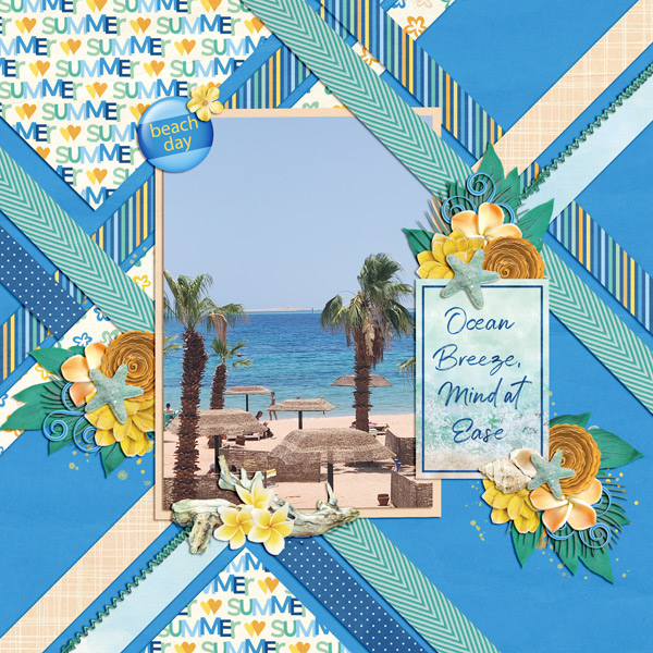
Take a look at these beautiful samples created by the GS Creative Team. These were done using the July Free with Purchase Kit Summer Days.