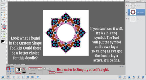
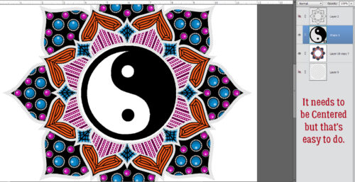
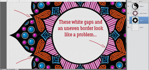
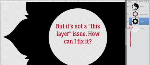
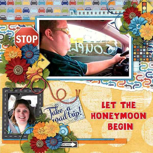
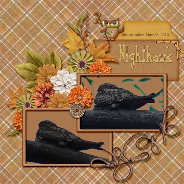
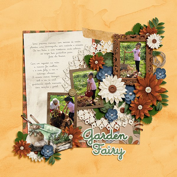
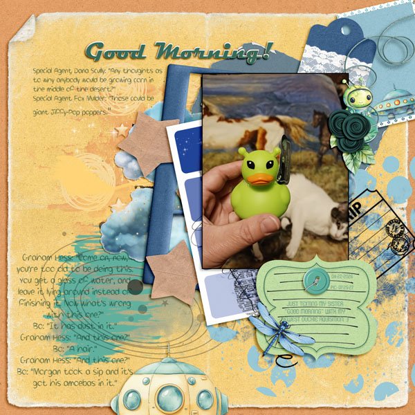
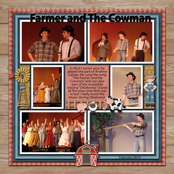
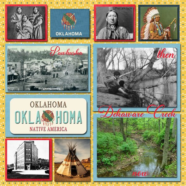
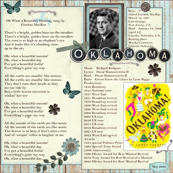
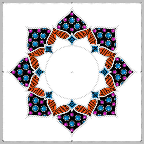
Designs by Lisa Minor

July. Already. Oy!! Half the year is gone. But I must say, things chez Jan are better now than they were this time last year, so I’m okay with time flying. I guess. Anyway… this month we have two Designer Spotlights. Part Two will appear on Saturday if all goes well. 😉 Because Lisa was a true early bird, visiting me back in May, she has the first spot. 😀 We decided not to talk much business this time, and went right for the fun. Check out Designs by Lisa Minor! <hyperlinked – look for the coloured, bolded, underlined text!>
J: I hope you don’t mind that I have some music on in the background, Lisa. I like a little something to drown out the golfer profanity from the second tee. We could sit on the deck, but some of those golfers lack manners and have weak bladders. ;( Nobody wants to see that! But on the topic of music, if you have a theme song, what would it be?
L: Good Riddance by Green Day
J: Hmm. There are so many ways one could take that. Green Day does have some accurate insights though. I think mine would be something by Ashley McBryde. Maybe Light on in the Kitchen. The people in her songs might be fictional, but I think we all know somebody that fits the profile. If you could spend a whole day with a fictional character, who would you choose?
L: Wolverine, but only if it’s Hugh Jackman all dressed up.
J: Ooh, he’s fiiiiiiine! I loved him in Real Steel (which I’ve watched far too many times), and The Greatest American Showman. Mad acting skills! But speaking of skills, we should talk a wee bit about design. Right? Do you have a favourite holiday or season to design for?
L: Spring. I love that everything around that time of year feels so fresh and new.
J: I love spring too, watching my garden waking up and seeing the birds return. Those rituals are comforting. Do you have any traditions or rituals you follow when starting a new collection?
L: I have a form that I fill out for each kit, so that anytime I think of an idea or get inspired by something, I can jot it down.
J: Oh, smart!! I’ve developed some routines for creating my tutorials, and for how I construct the other Blog posts I’m responsible for. It really helps to have that process. I’ve really enjoyed the tutorials, since they’ve pushed me to learn a bunch of new ways of looking at things, picking up new skills along the way. Is there some skill you don’t already have that you’d like to learn?
L: Honestly, EXCEL. I’ve taken the public classes, and I still use it with the skill of a Kindergartener.
J: Urk. No. Not me! I feel like it’d be teaching an old dog new tricks and I kinda like retirement. Although… it would be more fun if I had a younger body. Even just for a week. If you could be any age for a week…?
L: 30. Honestly, I would love to be 30 again and know everything I know now!
J: That would be AMAZING! There are so many things I’d do differently. I’d make sure I had more fun. Have you ever played a really great prank on someone? Or had one played on you?
L: I put Kool-Aid Mix in the shower heads at a women’s retreat. It was RED and did not go over well when they turned their showers on.
J: OMG. I just had a mental image of the prom scene in the Sissy Spacek movie Carrie. I think you know the one I mean. Can’t understand why they’d be irked. 😀 I’m guessing you weren’t invited back. Too bad you couldn’t have turned into a bird or something and gotten outta Dodge. If you could swap places with any animal for a day, which one would you choose?
L: A Sloth! I would love to be able to turn my brain off and just sleep.
J: I can definitely relate!
L: I could stay in pajamas, all day every day.
J: SAME! But my son’s Handi-transit bus driver might have questions. No visits from the RCMP please… especially now that I have a family member at the detachment. 😉 Which reminds me, I have a housewarming card halfway constructed. Car making has become my number one hobby. Is there a hobby you wish you had taken up?
L: Crochet. I wish I had paid more attention when my Grandma did it. My daughter taught herself and does a pretty good job!
J: Hmm. I can teach you! Do you think my daughter would like me to crochet her a housewarming afghan? HAHAHAHAHAHA! That would be a hard pass. Lisa, thanks for the chat! I’ll fill our readers in on what you’ve got going on for your Designer Spotlight and then I really do need to finish that card before it’s time to make dinner.
As usual, Lisa is providing us with a Daily Download kit.
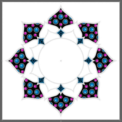
And she’s one of the Designer Spotlight Challenge hosts. To make it even more awesome, she’s done this!
And before I forget, she also hosts the Pinterest Challenge each month. Check it all out! So many opportunities…
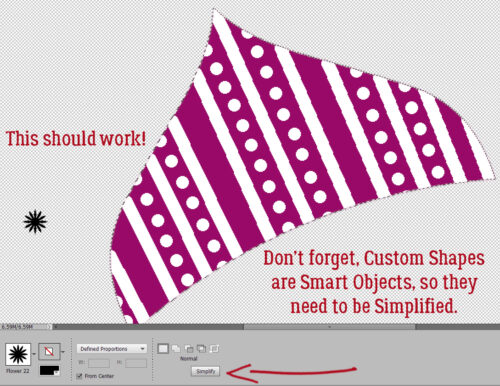
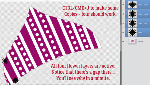
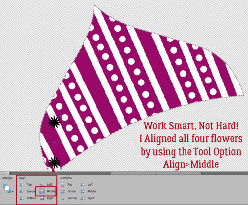
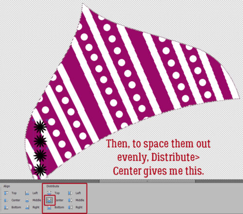
![]()