Tutorial Tuesday (Individual Style)

Challenge Spotlight: Recipe

It’s time again to shine the spotlight on all of YOU! But first… did y’all get your Prime Day shopping done? 😀 I paid my credit card off yesterday so I’d have a wide-open window. 😉

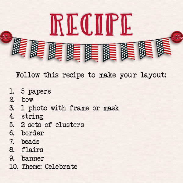
Let’s get down to business. This month the Challenge in the Spotlight is the Recipe Challenge, which is hosted by Sweet Pea Designs. It’s a good Challenge for a Blog post, since all the participants are working from the same set of required elements. So I’ll be taking a close look at each of the layouts to find each of the things on Penny‘s list. The layouts will appear in the order they were uploaded to the Challenge Gallery, and as usual, they’ll be linked to the Gallery so you can get a closer look. Just click on the Scrapper‘s name and you’ll be zoomed right to their layout. (Anything I underline will be a hot link!)

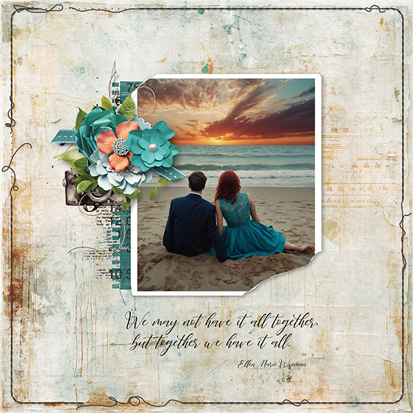
First up is this pretty layout from alexandergirl68. She’s definitely got 5 papers there, a tiny string heart, a ribbon bow and there are flairs on her title. banner Single photo, frame, 2 clusters and border, check. I had to zoom in to see that the heart on the frame is made of beads, check! And the theme is perfectly represented.

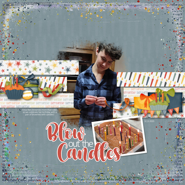
Let’s look at this one from snickels next. She’s used 2 photos, one with a thin white frame and one masked. Check! One of her 5 papers has been clipped to her border. Clever! Beads are all over the place, I’m guessing the string is holding up her birthday banner and she found a birthday flair to coordinate. Bow, yep; 2 clusters, yep; looks like all the boxes are ticked!

GrannyNKy‘s layout is so feminine! Like snickels, she has clipped one of her papers to an overlay. I like how she’s interpreted the “photo with frame” by putting the frame behind her photo. 10 points! I see 2 clusters, 2 bows – one of string, several flairs, a lovely banner, some paper borders and a celebratory theme. The beads are there, scattered under the larger cluster. Zoom in if you don’t see them. Full marks.

Katherine Woodin‘s clebration isn’t obvious, but it’s everywhere in her journaling. I had to look really hard to see all 5 papers, which is a sign of a crafty Scrapper. The rest of the required elements are much more easily spotted. That happy face emoji flair cracks me up.

I didn’t have to look too closely to see the theme for dj_w‘s layout. Every one of the listed ingredients is easily identified. Good job!

Macsandy had me squinting… she used a string of beads and I overlooked them 3 times! I love the stamped-heart border she chose and her clusters are perfection. This might be my favourite of the six layouts I found for this Challenge.

One thing I noticed about these layouts is that four of them have a similar colour palette, which has to be a coincidence.

I hope everyone is safe from all the weather-related events we’re seeing. Last night’s derecho was pretty frightening. We’re seeing quite a bit of smoke today, as we head into week 3 of 90+°F temps. I’ll be driving up to have what might be my last visit with my dad later this week… he’s tired of feeling unwell and is talking about being “ready to go”.  So if I miss a post, that might be the reason. Stay cool and stay safe, my friends.

Tutorial Tuesday (Individual Style)

Challenge Spotlight: Template

The third Tuesday is the day of each month when I take a moment to shine the spotlight on YOU, the GingerScrappers, and your individual styles. I spent some time browsing the Gallery and chose Scrapbookcrazy Creations by Robyn‘s Template Challenge for today’s Spotlight. Template challenges are perfect vehicles for this kind of spotlight because every participant starts with the exact same blueprint and can interpret it in their own way. And templates are great kickstarters for GScrappers whose mojo is nojo. As of this morning there were 29 layouts posted to the Challenge Gallery! No, I’m not going to make you scroll through 29 separate entries; I instead will show you every second layout, in the order they were posted. If you’ve participated and your layout isn’t here, it’s not because it isn’t worthy, it’s because it ended up being an even numbered entry, that’s all. I’ll offer some gentle analysis of each layout and link it to the Gallery so you can get a closer look, and maybe leave your own comment – just click on the GScrapper‘s user name and you’ll be whisked right to it.

But first, let’s look at the template Robyn has provided to each of us, at zero cost. It’s relatively simple, but with a great deal of potential.

You’ll notice that most of the layouts to follow are oriented exactly as the original template is – there’s nothing wrong with that – but look very different! In fact, there are only 3 layouts in the Gallery ATM that have switched up the orientation. Let’s go…

This layout by alexandergirl68 stays very faithful to the original template. Her colour palette is drawn from her photos, with the houndstooth paper mimicking the brick in the larger photo.

For her layout, domino44 chose to make her floral clusters larger and to keep the layout monochromatic. (Remember colour theory? 😵)

I like that dj_w has used a slightly larger, distressed paper behind her wildlife photos. She too used a colour palette inspired by her photos; keeping her clusters smallish and subdued allowed her photos to be the stars of her layout. That tree is a great addition!

Windswept has created a beautiful monochromatic composition that is perfectly colour-matched to the blues in her photos. The addition of a third cluster and the much larger title add a personal touch.

Alasandra’s layout is the first real departure from the basics. The mat behind her main image is more prominent compared to the template, and she’s created a floral border rather than a paper one around her smaller image – the one I didn’t even see until just now! The two watercolours seem to blend into each other. Lovely!

For her layout, larkd chose to rotate the template 90° to the left. She enlarged and shifted one of her clusters so it’s a bit more central and added some extra flowers. Her pastel palette puts the focus on her photos.

Did you all know Michi likes to travel? 😉 She kept the template in its original orientation, but that’s really it; she’s added some arrows to draw the eye to the map, expanded the lower cluster down into the corner with travel-related elements and added a subtitle.

O.M.G!! I love this layout by greenfiend27. It has so much depth and texture with those frames. Clusters are perfection! She simply rotated the template 90° left and ran with it.

Here, jenniferl75 has kept things simple, letting her photos tell their story – the first things I see are those smiles. The nautical colour scheme supports the subject matter.

Here’s a departure from the basic! I like that fontaine has added two more photos that echo the template’s photo blanks, and that she scaled down the clusters to keep the layout from being too busy. The paint behind the photos and the wordstrip set her layout apart.

Pixel Palette has moved a few things around – the title and subtitle are replacing the clusters, which have moved underneath the photos.

I’m so drawn to that large photo! Using coral as a foil for the desert colours in the plaid paper ties the layout together for trinanne. The addition of the dolies to the clusters gives them an elegance.

Perfect picks on the patterned papers, Got2Scrap! They both mimic the dimples on the dome in the large photo. I also like how she’s chosen elements in the same colours as Stitch – the two blues, the soft purple and the pink really work.

Who doesn’t love photos with cute kids getting Grandpa to make funny faces? RobynC has kept the masculine aspect of her layout with her choice of elements.

And last, we have this soft and lovely layout by andastra. Her upper cluster forms a perfect photo corner, and rather than creating a cluster in the lower left area of the layout, she’s shifted it to the centre. The little happy face flair is so sweet!

Great work, ladies! See you next week when I’ll have a Quick Trick for you.


Tutorial Tuesday (Individual Style)

Challenge Spotlight: iNSD Mini Kit Challenge

Yep, I know. May is 2/3 over already. It seems Spring is a little behind for us this year; it’s quite cool and damp – I can’t complain about rain though, given the extreme drought we’re stuck in here. But I digress. This month I’m taking us on a bit of a different path for the Challenge Spotlight. Rather than going with one of the usual monthly Challenges, I chose the iNSD Mini Kit Challenge, hosted by CarolW. This was part of the week-long (inter)National Scrapbook Day celebration and it was VERY well-received. The kit Carol provided for the Challenge is beautiful! [editor’s note: There’s an entire BUNDLE that matches the mini in Carol‘s store…] The mini was so well-received, in fact, that I had to stop snagging images from the Gallery when I hit 20. Can’t lose the audience, you know! The layouts appear in the order they were posted to the Challenge thread.

As always, I’ll be linking each of the layouts to the Gallery so you can get a closer look at them and leave some comments, should you wish. Just click on the Scrapper’s user name and you’ll be zoomed right to her layout. Now let’s look at how each Scrapper has used the exactly same mini kit to create a very individual layout…

First up is this clean-and-simple layout from deej. She’s kept her focus on the photo with her minimalist use of papers and embellishments.

Katherine Woodin‘s a scrappin’ machine. She participates in EVERYTHING while also documenting all the moments of her life. She’s augmented the mini with bits and pieces from the full kit to create her layout. By blending her desaturated photos into the background paper, she was able to use photos that might not coordinate colour-wise with the kit while reflecting the theme. I like the precision of her perfectly-spaced button border.

LovelyMissKait makes her first Challenge Spotlight appearance with this beaut! [Welcome!!] The design of her cluster is perfection. The shadows on those papers… the paper looks like it’s lifting a bit in spots. Very effective.

For her layout, greenfiend27 blended some of the papers, threw some paint splashes on, then clustered the elements to draw the eye to her images. That star bokeh adds an almost mystical look. The quote is the perfect addition.

The yellow patterned paper is surely a hit! Here, aquaris has used the wire heart as a frame, anchored by her floral cluster. [Should I tell her I see hummingbirds out my living room window all the time?]

Ah! The grungy, gesso-smeared paper takes its first starring role! The photo of the crocus was a brilliant choice, andastra; it coordinates with the kit’s colour palette beautifully.

There it is again! But this layout looks very different – individual style, amirite? That tumble of paper rounds created by pagefrocks provides movement anc keeps the eye traveling across the page.

And we’re back to the yellow patterned paper again. But that’s the only similarity to the other yellow layouts. KarenDiamond has chosen a photo that coordinates perfectly, then blended it over a paper frame. Her use of brushes and word art to draw the eye while remaining true to the theme is quite skillful.

I see mum23ms has used elements from the full kit for her white space layout. Can you pick them out?

What an artsy look dhariana has given her layout. That grungy paper is the perfect background for this style. She’s made expert use of white space and created a strong horizontal aspect with the arrangement of her elements.

This just screams JOY at me! LidiaG has designed a gorgeous cluster to anchor her photo, and is the first to use the most neutral of the papers for her background. On (much) closer inspection I see she’s also used a mask to blend in the striped paper with a very subtle touch. Love it!

It’s so interesting that two Scrappers can use identical backgrounds and yet have such unique looks. I can see where trinanne got her inspiration – the carriage flair! So far she’s the only one whose extracted the hummingbird from the ephemera.

Cool!! Look at how the way jenasz used the star bokeh sparks her photo! It adds such a magical touch – almost like fireflies. The other unique touch is how she’s twined the vine all the way around the photo, like a frame.

Ooh, where do I start with this? The splotchy ink is gorgeous, the masked photo is perfect and to be honest, it’s really hard to tell where the photo ends and the elements pick up. This is a masterpiece, biche77!

I adore how bagheertje has blended her papers for the background. It looks easy, but getting it right isn’t! She too has extracted the hummingbird and used the loop of twine as a frame, but brings her own style to that beautiful central cluster.

There’s the star overlay again, but with a completely different look. Pippin‘s spray of flowers draws the eye to her photo beautifully blended into the ink splotch. See how the hummie ephemera almost seems like an extension of the ink?

I think this is the first layout to make prominent use of the raffia twine loops. I very much like the font demma_b13 chose for her title – it has an old-world feel, evoking thoughts of European colonization in the late 15th century. The yellow flowers bring a sunny warmth.

How clever is wvufan04? Using the ink splash as the background for some word art in a font very similar to the one on her male subject’s t-shirt… so smart! I like the tiny pops of pink too.

I like how jirsev has amped the ink splashes against that grungy paper. Her layout pops right off my screen.

Our last peep is muted and filled with luscious white space. AJsRandom opted to emphasize the yellow end of the colour palette for her layout and kept her cluster very simple. Lovely!

If you participated in this Challenge and your layout isn’t shown above, I apologize for the omission. It doesn’t mean your layout isn’t stunning and deserving, it means I ran outta gas! I’m functioning on very little sleep ATM and just couldn’t go beyond 20 today. I feel like my brain is melting… But I’ll pull it together and come up with a Quick Trick for next Tuesday!

Tutorial Tuesday (Individual Style)

Challenge Spotlight: Jumpstart Your Layouts

It seems we’ve come full-circle! The first Challenge Spotlight appeared on September 21, 2021 with Jumpstart Your Layouts. Since then we’ve looked at how scrappers’ individual style is demonstrated by how they meet the challenge of using a specific kit, brush, mask, template, theme or set of instructions. The Challenges we haven’t examined are too broad to meet the criteria. <winks>

Now we’re back at the beginning. Sheri, the creative mind and hands known as Jumpstart Designs, has had some rough personal crises to deal with lately, but she still managed to bring us a super-cute mini to Jumpstart Our Layouts. It’s SO super-cute in fact that I’ve had to use the very egalitarian method of selecting every second layout to showcase today… otherwise this post would go on for a lo-o-o-ng time. As usual, I’m going to link each layout to its spot in the Gallery so you can see it in greater detail, and hopefully leave some words of praise for the scrapper. Just click on the scrapper’s name and you’re there. But first, let’s look at the mini itself. [Sheri always makes a bundled kit to go with it, so if you like it*, grab it!]

I’ve downloaded the mini but haven’t yet done anything with it. Lucky for you, we’re going to look at a BUNCH of ways to use it!

The very first scrapper to post to the Challenge Gallery was KAPOH. She always creates these 5×7 masterpieces. She’s turned the floral paper into a rounded, wrapped frame. I love how the little girl’s feet (from the add-on kit) are hanging over the edge. So simple, and so sweet!

Next up is makeyesup. Her photos of a child sleeping in a swing are framed with the included frame element, sandwiching a cluster both simple and sweet. I like how she’s used the coral-dotted paper as ribbon dividers.

Alasandra has also used some of the papers in small strips. Her diagonal design draws the eye to her photo (how do kids and cats sleep with their heads up like that?). The circular cut in her background paper backed by the yellow striped paper looks like a crescent moon. Strong work!

There’s so much to see in this layout from lulutoo. She’s used the ombré paper as her background, and applied a sketch filter to a photo of the sleeping child over the blue side. The mini’s papers are in narrow strips, anchoring her photo and look how she’s got the bears’ heads together in slumber. A+!

Here, demma_b13 has used more than just the mini, although it’s very well-represented. Her clusters are divine!!

I love everything about zotova‘s layout. I struggle with using patterned papers as backgrounds, but she clearly doesn’t! Her nearly-identical but casually NOT-identical clusters frame her photo and add visual interest.

The way dhariana has sliced her photo and plaid paper swatch is intriguing. Her layout is one of those clean-and-simple ones I can’t manage to emulate.

This layout from lulumoon doesn’t use any part of the (free) mini – she went for the whole enchilada! I think she may be trying for the prize* Sheri promised. 😉 Her arrangement of elements on the diagonal give the impression they’re holding up the hammock. Genius!

Is there anything more heart-warming than a baby and a daddy napping together? I’m pretty sure linweb knew she’d melt hearts with her simple layout focused on those photos.

What do you do when you have a photo you want to use but it doesn’t really work with the colour palette of your chosen kit? You do what loonyhiker did… turn it into a black-and-white! Then you can do whatever you like.

For this layout, Pups_r_Paps has bent the rules a little. She’s used some of the elements from the mini and added some elements from an unrelated other of Sheri‘s kits.

Every parent knows this feeling! The simplicity of andastra‘s layout represents that bone-deep fatigue exceedingly well.

NHSoxGirl has created a digital spiral-bound memory book with her layout. The repeating circles tie the layout together beautifully.

For her layout, granny5pics has added quite a few interesting touches. She elongated the paper frame into an ellipse, clipped the blue-starred paper to it and cut a scalloped border on the ombré paper. Oh, and she put her date into the word art using a very similar font so it looks like it has always been there. Well done, Kathi!

Last, but not least, there’s this beaut from willow. That babe is communicating very clearly – DON’T BUG ME! I like that the large-and-in-charge photo is subtly blended into the blue-starred paper and the cluster is positioned perfectly.

* Here’s the scoop on the prize I mentioned earlier, in Sheri‘s own word… “WIN WIN WIN! I have also decided to add another reward for those who purchased the Limited Edition KIT from my shop during the month. After the month is over I will do a random drawing from the list of challenge customers who bought the KIT and THREE people will WIN the next month’s Limited Edition KIT FREE! Be sure to check your PM’s here at Gingerscraps so see if you were one of April’s winners!”

What do you think? Will you be in the running? I’m ver-r-r-r-y tempted!

Tutorial Tuesday (Individual Style)

Challenge Spotlight: Minikit

Hey GingerScrappers! It’s time for another Challenge Spotlight. This month I’m going to take you through the October Minikit Challenge Gallery. This challenge is hosted by the Polka Dot Chicks, Tammy and Shelby. The Challenge revolves around a minikit they design and provide to participants at no cost. Participants can use all of the kit, or only part of it, and are allowed to use a template. Here’s a look at the October kit, which coordinates with this month’s Buffet colour palette.

Let’s have a look at the layouts that have been posted up to now. The layouts are in the order they were posted to the Gallery and are linked through the member’s user name so you can pop into the Gallery and leave them some praise, if you should so desire.

First up is sparky_mom with a special event announcement. She’d used the entire kit, tucking part of the wavy string under her photo strip and using the large circles on her background as journaling blanks. Congratulations, family!

NHSoxGirl went minimalist with her layout, using the paper with the huge circles as a border for her large-and-in-charge photo.

Alasandra has used the whole kit, with a large-circle paper divider and the paper with the triangles on it cut in triangles to repeat a theme.

MarilynZ has added a word cloud, a soccer ball flair and a silhouette to her minikit. She slightly recoloured the photostrip. Using the large-circle paper as her background compliments the soccer theme.

The big-circle paper is pretty popular! Branma has it in her background too. She’s created a sweet little cluster with the flower elements and anchored her photos with the brads. Cute pup!

AnnieA has a cute series of photos in her photo strip. She’s used everything, with the big-circle paper forming more of a border around the tiny-heart paper. The cluster in the centre ensures the eye goes right to the photos.

I LOVE dhariana‘s use of white space here. I can see she resized the papers, adding a border mask to the tiny-heart paper in the background. There’s only a single photo, and every piece of the kit is visible. Very pretty!

The only part of the kit fontaine didn’t use was the paper with the triangles on it. She recoloured the photo strips and used them as ephemera, using the Paint Bucket to fill her background with the russet colour from one of the big circles. And her photo is masked so it spills over onto the paper behind it.

I so admire people who can use bold prints like these with such great results. Big, bold prints scare me! But not willow… she’s used them very nicely here, and turned one of the circles into a frame for her title.

PixyGirl has used it all, cutting the sides of the photo strip off, recolouring them yellow and using them as paper strips to anchor her photos. The photo strip makes another appearance, but separated into three independent frames.

I’ve never seen this effect jenazs has created before. It looks as though she’s turned her elements into overlays, allowing the papers’ patterns to show through. She has recoloured some of the flower elements with colours pulled from the papers and her photos and turned the brads into flair. Very interesting.

There’s a good amount of white space in this layout by mum23ms. She’s added some ricrac (maybe created using one of our tutorials?) and some splotchy paint behind her photo cluster. She clipped the big-circle paper to the photo strip – it took me several looks at it to figure that out!

Last but not least, we have this very inventive layout from Tbear. She’s used the whole kit, but in some unusual ways. The triangle paper has been snipped into tiny triangles, and scattered like confetti with some super-shrunken brads. The twine has been turned into stems for the flowers. The tiny heart paper has been desaturated somewhat and the big spot paper has been made smaller, duplicated and laid end-to-end to create a border along the bottom. I think this is my favourite of them all.

The first half of October has been unusually summery here in the Okanagan valley. But I see the forecast is showing a sudden descent into much chillier weather, bringing rain with it. I’m actually looking forward to it!

How many of last week’s fonts did you download? I picked up 14 of them! See you next week with a Quick Trick.

Tutorial Tuesday (Individual Style)

Challenge Spotlight: Back It Up with ADB Designs

PDF Version: https://bit.ly/3R85Xdc

Today we’re going to dig into the Back It Up Challenge brought to you each month by Diane of ADB Designs. She likes to remind us to BACK UP our photos so they don’t disappear into the ether and has built this challenge around that reminder. Each month, she chooses a theme for participants to think about while they’re reviewing their files. This month the theme she chose is “reflection”. There are two main definitions for “reflection”, the main one being the concrete “image seen in a mirror or shiny surface”. The other is  “serious thinking or careful consideration”. The layouts you’ve created for this Challenge very closely conform to one or the other of those definitions, as you’ll see. As usual, each layout is linked to the Gallery so you can offer the scrappers your praise. Click on the scrapper’s name and you’ll zip right into the Gallery.

We’ll start with the shiny surfaces. Branma‘s layout doesn’t actually SHOW a reflected image, but she describes one pretty clearly in the text she added to her post in the Challenge thread, “My sister’s and I all favor each other and our lovely mother, even facial recognition program mistake us for each other. It’s funny to catch a glimpse in the mirror and think one of my sisters has come to visit.”

If there’s anything more beautiful than a waterlily, it’s a waterlily AND its reflection, as kabrak1207 shows us here.

I love how mary-lynne has this photo of reflection that she’s both blended and cleverly overlaid on her title. That’s running away with a theme right there!

I don’t know anybody who doesn’t love seeing autumn’s best colours reflected in still water. kimberlyschiehahn lets those colours take centre-stage here.

This layout by TheLethargicPoet (aka Shilo) is stunningly gorgeous. And it covers both definitions!!

Katherine Woodin‘s layouts are ALWAYS given serious consideration; she documents all the minutiae of life in Project 52-style. With this layout she’s also giving a nod to images in a shiny surface.

And then we have gnana96. She’s been very creative with her title here, creating a reflection of it, as well as showing off the reflected images of these flamingos.

basketladyaudrey has laid out the process of choosing which of her son’s t-shirts deserves a spot on his quilt, which was through serious consideration of their merits.

This lemonade stand was the subject of some serious thinking for Kristi Martin. Probably both before and after the fact. 😉

Rhewko chose the lyrics of a song to act as her journaling for this wedding layout.

Weddings seem to trigger a lot of reflection! Daydreamer reminisced about her own wedding while looking at her sister’s wedding photos.

And what is more likely to bring about reflection that our relationships with the Creator, as etycz has documented?

I often find myself giving serious consideration to what needs doing in my garden. much like grannyNky does with her layout.

I feel like pjm117 is sending us all a message about finding the silver lining in the COVID cloud.

And finally, ranchcreations takes the most literal reflective approach to a quote to derive some inspiration and guidance.

Wow. This is the 10th Challenge Spotlight post. Do you find them interesting? Have you seen something you’d like to emulate? Are you inspired to bring your own Individual Style to a challenge? It always amazes me the different ways each scrapper interprets a Challenge. Awesome!!

Remember, if there’s something you’d like to learn and can’t find a suitable tutorial, you can reach out to me via Private Message any time. Here’s a link to my mailbox: ObiJanKenobi  I get email notifications that I have a PM waiting, so I’ll see it right away and can start planning for you!

PDF Version: https://bit.ly/3R85Xdc

October Challenge Wrap Up

Can you believe October is coming to an end? Here is a wrap-up of the great challenges we have had this month. There is still a few days to get your layouts uploaded.

Ivonne of Craft-tastrophic Designs gave a wonderful fall tree brush to work with for the Brush Challenge. I love how lisar layered it on top of her photo.

There are always so many good layouts in the Buffet challenge. I love anything pumpkin, so this layout from meagan43 caught my eye.

This month for the Color challenge we were asked to use purple and yellow. This layout from Pippin really caught my eye. I just love that cluster.

The Daily Download for September is used for October’s Challenge. We had two fabulous kits from JB Studio and LJS Designs – Class is In. I love the photo in this layout from KAPOH. So cute.

This month’s Spotlight Designers were Mandy King and Pixelily. I love this simple block layout from mdusell using kits from both designers.

Pretty in Green hosted our Desktop Challenge. I love the way Minena used an opaque full photo with the full color elements on top.

CathyK gave us a cute typewriter type font to use for the Font Challenge. Scrapolina has used some beautiful pictures in her layout.

This month the Hybrid challenge (hosted by Just So Scrappy) was to make bag toppers and chocolate bar wrappers. This group by andastra is so cute.

Seatrout Scraps gave us a picture to use as in inspiration piece for the Inspiration challenge. Sheri Catherine was inspired by the hearts and submitted this awesome layout.

For the Journaling Challenge, Dani (JB Studio) gave several prompts to use. This layout from gethane is great.

Little Rad Trio gave us an adorable Halloween Mini Kit for the Mini Kit Challenge.  This layout by shellbyj is so cute.

Tracey of Clever Monkey Graphics gave us instructions of the slow scrap type to use in the Mix It Up Challenge. I really like how Elizabeth used a black and white photo in her layout.

Marina of Magical Scraps Galore gave us a list of items to use in the Recipe challenge. This layout by Pachimac just jumped off the page at me.

Ginger of Dandelion Dust Designs posted a beautiful layout for us to use in the Scraplift Challenge. I just love this layout from Glori2.

Connie Prince challenged us to make a signature celebrating Halloween for the Signature Challenge. I just love the tagline gduncan added to hers.

Kimberly of Leaving a Legacy Designs gave us a cute template to use for the first Template Challenge. I love all the photos Janytime was able to get on her layout.

Dear Friends Designs gave us a fabulous template to use for the second Template Challenge. I just love the blues in this layout from khannen.

JoyLynn gave us wonderful fall words to use for the Word Art challenge. This layout from DianeInOz is just fabulous.

And this is just a sampling of the awesome layouts submitted this month. Each is linked, so please go leave them some GS love.

You still have a few days to get your layouts done to get this month’s collab.


Spotlight – Journaling Challenge

Hey there. Just popping back in here to feature another of the fabulous GingerScraps challenges. Today we’re spotlighting the Journaling Challenge hosted by Dani of JB Studio.

Each month Dani challenges us with a different focus to get us journaling our memories. For October, this is what she gave us:

  • My favorite story from today…
  • Today I want to remember…
  • A challenge I/you/we tackled today…
  • Something I love about you right now…
  • My favorite moment/time of the day…
  • Around the room… (capture a room in your house – kids rooms are her favorite for this)
  • Document your day… (scrap the facts and then add in some feelings)

Let’s see what some of our members came up with:

Aren’t these wonderful. Each layout it linked to the gallery (just click on it). Head on over to the gallery to leave some love on these wonderful layouts.

Remember, it only takes 10 challenges complete to get this great collaboration:

GS_footer_Stephanie

Spotlight – Hybrid Challenge

Good evening everyone. I thought I would pick a challenge to spotlight that a lot of people just scroll by, but can really be fun.

We’re going to look at the Hybrid Challenge. Katie of Just So Scrappy has a wonderful Halloween Hybrid project for us (but as you can see from the layouts, it doesn’t have to be Halloween).

Katie provided a template to use to make Hershey Bar and Hershey Nugget wrappers. This is what she designed with the template:

Let’s see some of the ideas submitted by our members:

How much fun are these? I would love to see what you can come up with as well!!

Remember, this challenge counts for your 10 for the monthly challenge reward.

See you next week for another spotlight!!

Spotlight – Word Art Challenge

Hey y’all. Today I’m spotlighting the Word Art Challenge. Tracey of Clever Monkey Graphics gave us this word art to use this month.

Let’s see all the ways this was used.

Aren’t these all awesome. Head over to the forum to see some of the other layouts posted.

Don’t forget, 10 challenges gets you this fab collab.

GS_footer_Stephanie