Challenge Spotlight: Jumpstart Your Layouts
![]()
It seems we’ve come full-circle! The first Challenge Spotlight appeared on September 21, 2021 with Jumpstart Your Layouts. Since then we’ve looked at how scrappers’ individual style is demonstrated by how they meet the challenge of using a specific kit, brush, mask, template, theme or set of instructions. The Challenges we haven’t examined are too broad to meet the criteria. <winks>
Now we’re back at the beginning. Sheri, the creative mind and hands known as Jumpstart Designs, has had some rough personal crises to deal with lately, but she still managed to bring us a super-cute mini to Jumpstart Our Layouts. It’s SO super-cute in fact that I’ve had to use the very egalitarian method of selecting every second layout to showcase today… otherwise this post would go on for a lo-o-o-ng time. As usual, I’m going to link each layout to its spot in the Gallery so you can see it in greater detail, and hopefully leave some words of praise for the scrapper. Just click on the scrapper’s name and you’re there. But first, let’s look at the mini itself. [Sheri always makes a bundled kit to go with it, so if you like it*, grab it!]
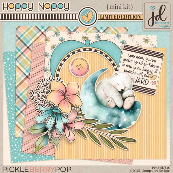
I’ve downloaded the mini but haven’t yet done anything with it. Lucky for you, we’re going to look at a BUNCH of ways to use it!
The very first scrapper to post to the Challenge Gallery was KAPOH. She always creates these 5×7 masterpieces. She’s turned the floral paper into a rounded, wrapped frame. I love how the little girl’s feet (from the add-on kit) are hanging over the edge. So simple, and so sweet!
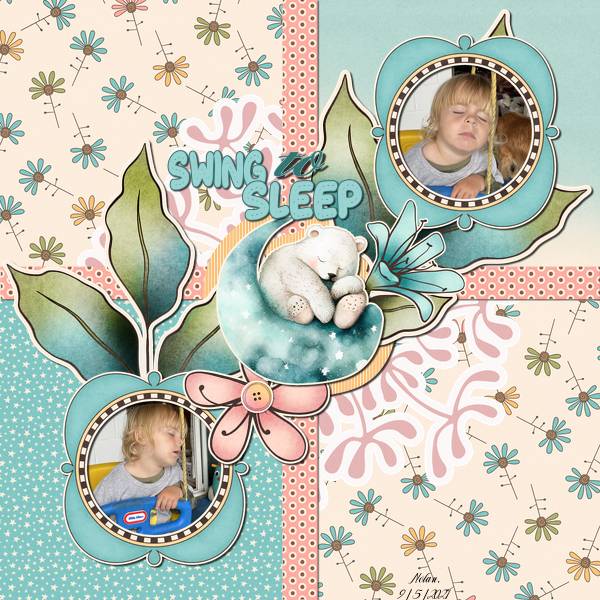
Next up is makeyesup. Her photos of a child sleeping in a swing are framed with the included frame element, sandwiching a cluster both simple and sweet. I like how she’s used the coral-dotted paper as ribbon dividers.
Alasandra has also used some of the papers in small strips. Her diagonal design draws the eye to her photo (how do kids and cats sleep with their heads up like that?). The circular cut in her background paper backed by the yellow striped paper looks like a crescent moon. Strong work!

There’s so much to see in this layout from lulutoo. She’s used the ombré paper as her background, and applied a sketch filter to a photo of the sleeping child over the blue side. The mini’s papers are in narrow strips, anchoring her photo and look how she’s got the bears’ heads together in slumber. A+!

Here, demma_b13 has used more than just the mini, although it’s very well-represented. Her clusters are divine!!

I love everything about zotova‘s layout. I struggle with using patterned papers as backgrounds, but she clearly doesn’t! Her nearly-identical but casually NOT-identical clusters frame her photo and add visual interest.

The way dhariana has sliced her photo and plaid paper swatch is intriguing. Her layout is one of those clean-and-simple ones I can’t manage to emulate.

This layout from lulumoon doesn’t use any part of the (free) mini – she went for the whole enchilada! I think she may be trying for the prize* Sheri promised. 😉 Her arrangement of elements on the diagonal give the impression they’re holding up the hammock. Genius!

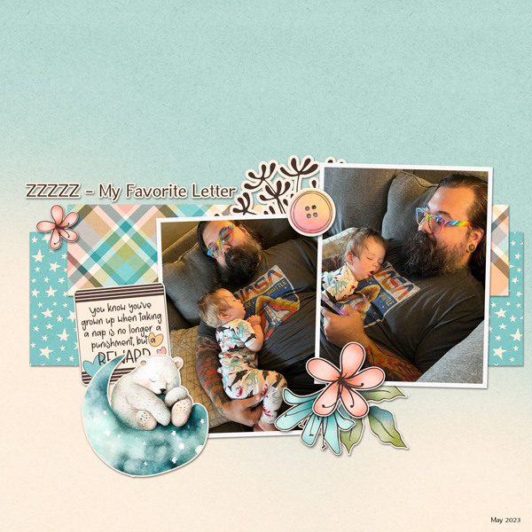
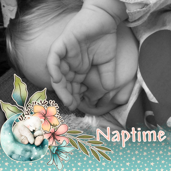
Is there anything more heart-warming than a baby and a daddy napping together? I’m pretty sure linweb knew she’d melt hearts with her simple layout focused on those photos.
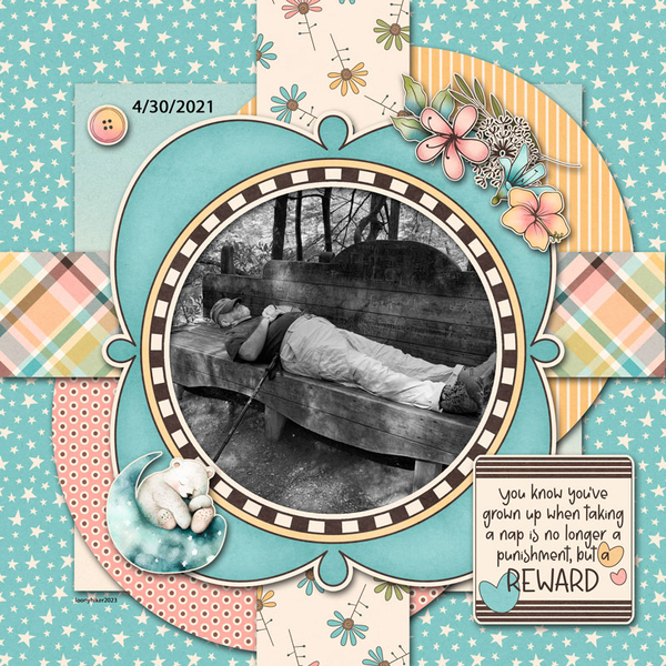
What do you do when you have a photo you want to use but it doesn’t really work with the colour palette of your chosen kit? You do what loonyhiker did… turn it into a black-and-white! Then you can do whatever you like.
For this layout, Pups_r_Paps has bent the rules a little. She’s used some of the elements from the mini and added some elements from an unrelated other of Sheri‘s kits.

Every parent knows this feeling! The simplicity of andastra‘s layout represents that bone-deep fatigue exceedingly well.

NHSoxGirl has created a digital spiral-bound memory book with her layout. The repeating circles tie the layout together beautifully.

For her layout, granny5pics has added quite a few interesting touches. She elongated the paper frame into an ellipse, clipped the blue-starred paper to it and cut a scalloped border on the ombré paper. Oh, and she put her date into the word art using a very similar font so it looks like it has always been there. Well done, Kathi!

Last, but not least, there’s this beaut from willow. That babe is communicating very clearly – DON’T BUG ME! I like that the large-and-in-charge photo is subtly blended into the blue-starred paper and the cluster is positioned perfectly.
* Here’s the scoop on the prize I mentioned earlier, in Sheri‘s own word… “WIN WIN WIN! I have also decided to add another reward for those who purchased the Limited Edition KIT from my shop during the month. After the month is over I will do a random drawing from the list of challenge customers who bought the KIT and THREE people will WIN the next month’s Limited Edition KIT FREE! Be sure to check your PM’s here at Gingerscraps so see if you were one of April’s winners!”
What do you think? Will you be in the running? I’m ver-r-r-r-y tempted!
![]()
[…] 302. Challenge Spotlight: Jumpstart Your Layouts II […]