Greatest Hits: Abstract Meets Graphic Art
![]()
For this month’s Perfectly Paired Challenge, Dani wants to see your artsy side. That made me think of this tutorial from 2017. I think I might do exactly this as the basis for my Challenge layout. Then, of course, I’ll have to combine bits from two kits to fulfill the rest of the Challenge requirements. I’m sure I have some kits in my stash that have brushes, overlays, paint and other artsy elements in them that I can massage into a cohesive layout. Wanna give it a try? (If you’re impatient, by all means scroll down to the end to see the finished product. 😉 )
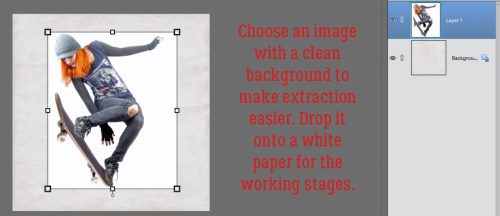
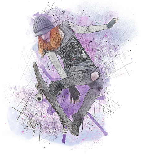
To begin, you’ll need a great photo with a relatively plain background, because the image will be extracted. This photo of a skateboarder from Pixabay was a great choice for my example since my inspiration for the tutorial came from an image of a skateboarder. I dropped it on a white paper for the initial steps to make extraction easier.
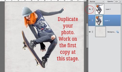
I used the Magic Wand tool to extract my image. This tutorial will provide a refresher for you if you’re still getting the hang of extracting images. You can duplicate your photo now, or wait until you’ve got your extraction complete or the line of marching ants in place. But you will need to duplicate your photo. Make your duplicate layer invisible.
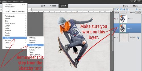
Working on the extracted photo, I clicked on the Filter menu, selected Stylize and Find Edges as shown. Remember when I showed you how to do this?
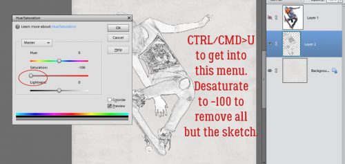
Once the image has been filtered, some of the colour from the image is still visible. Right now, I don’t want that. It looks a bit odd.
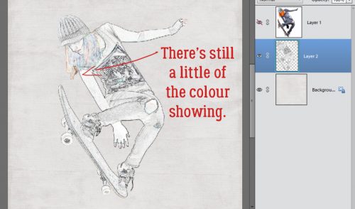
So to remove that hint of colour, I chose Enhance>Adjust Color>Hue/Saturation (CTRL/CMD>U) and pulled the Saturation slider all the way to the left. That leaves only the sketch.
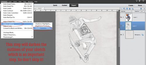
We didn’t do this in the Sketchy tutorial, but for this one it’s a vital step. Enhance>Adjust Lighting>Levels will take you to the menu shown. What this step does is dramatically darken the lines in the sketched image.
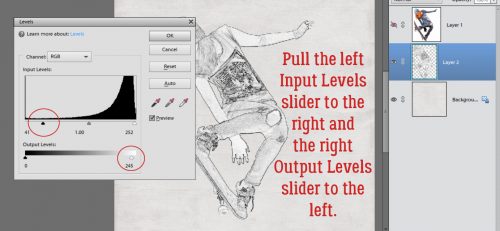
The histogram shown below is part of the adjustment menu. You can adjust both sections simply by pulling the sliders. Make sure you can see your image so you know when you’ve gone far enough. If you need to move the dialog box, click and hold the gray bar at the top of the box then drag it up, down or to one side so you can see what’s underneath it. I wanted my background area to stay bright white and my sketch to be darker and more detailed. The changes I made are shown in the dialog box.
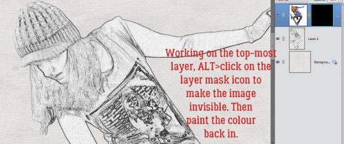
Now I have what looks like a charcoal drawing of the skateboarder. I want to have some of the colour from the original image in there, so I selected the topmost layer and added an adjustment layer mask by ALT>clicking on the Layer Mask icon (the divided circle icon above the Layers panel). The image disappeared but was really still there. I just had to reveal it.
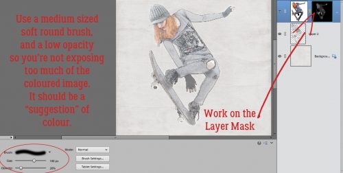
I used a medium-sized soft round brush from the default brushes PSE comes with to paint back the colour, working on the Layer Mask. By using a low opacity (20%) I was able to build up colour where it naturally would appear darker and keep other areas much lighter. When you hold down your mouse button as you paint, you can overlap your brush strokes and have no visible overlap. Once you release the mouse button, the tool resets and areas of overlap will be darker. You want to brush over the whole area in one step to avoid those overlap spots. Keep that in mind as you go so you don’t end up with streaks.
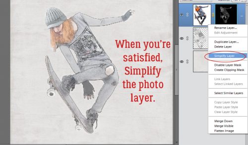
Once I had the colour the way I wanted it, I Simplified the layer. (Right-click on the layer in the Layers panel and select Simplify Layer.) That step merges the mask with the image and prevents me from messing it up.
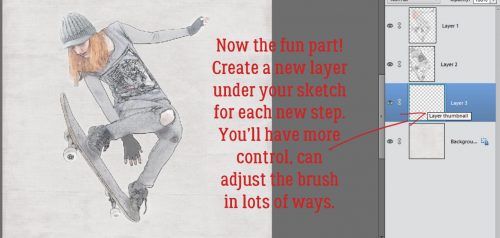
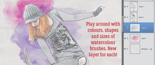
Now for the really fun stuff! I added a new blank layer underneath the sketch layer then used a watercolour brush at 100% Opacity from my collection of free brushes. I had an idea what colours I wanted to use so I just played around with both colour and brush selection until I liked what it looked like. By putting each brush on its own layer I can resize it, reposition it, decrease the opacity of it, increase the opacity by duplicating the layer, position it above or below my sketch and photo layers and whatever whim enters my head.
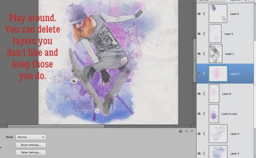
I experimented with lots of different watercolour and grunge brushes, deleting the layers that just didn’t work.
If you look closely you’ll see I’ve made a lot of changes by adding and subtracting, shifting and overlaying layers. You might also notice that the original photo colours are darker in this image. I duplicated the topmost simplified colour layer from the Layer Mask step then adjusted the opacity of that duplicate layer until I liked it.
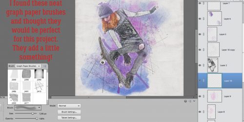
To add a little more grunge and graphic feel I chose a gray colour and used a free graph paper brush that I duplicated and rotated. One layer is above the sketch and one is below it.
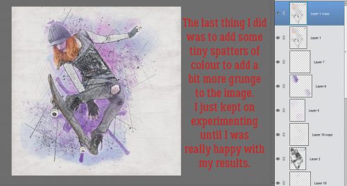
For the finishing touch I added some tiny gray splatters on top of all the layers and some below. The process is one of playing with your stash and experimenting with things you never thought you could do.
I saved the finished image as a .png file for even more versatility. This is what it looks like with no paper behind it.
Now to find a good photo, decide on a theme and get to work!
![]()


 Aimee
Aimee