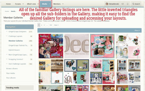
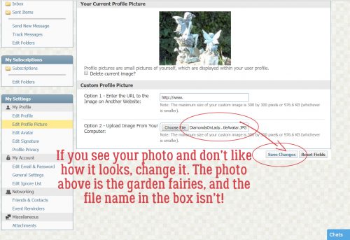
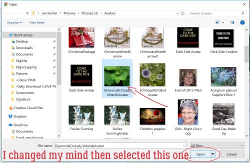
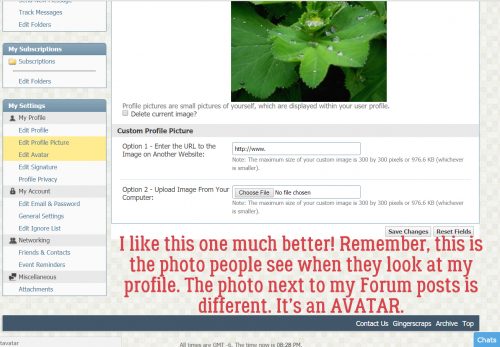
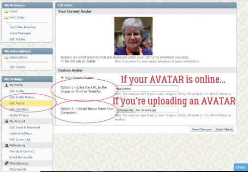
Greatest Hits: What’s Your Digital Style?
![]()
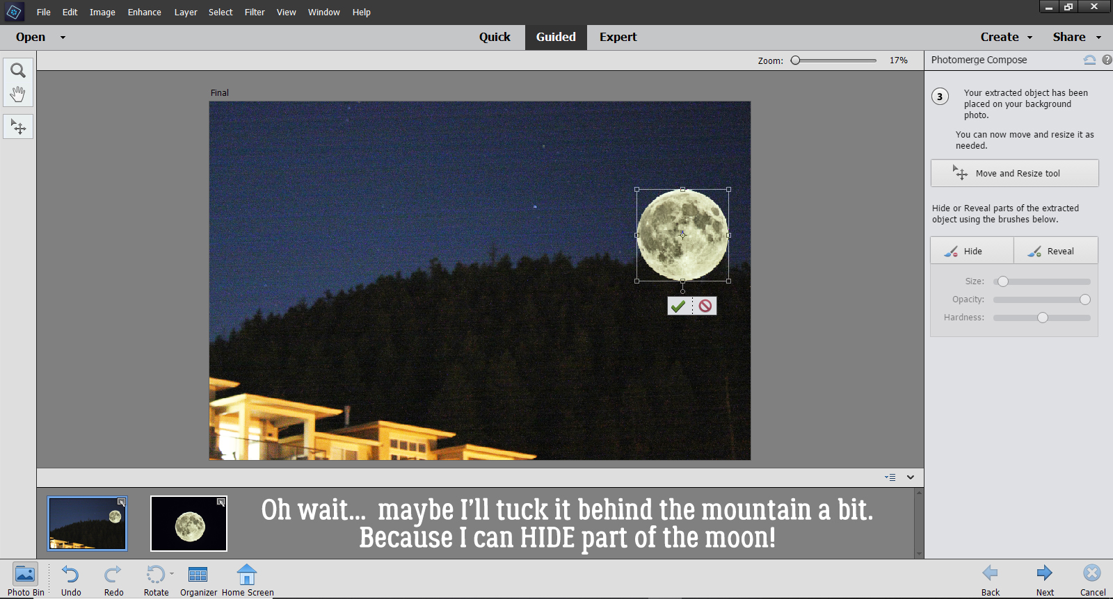
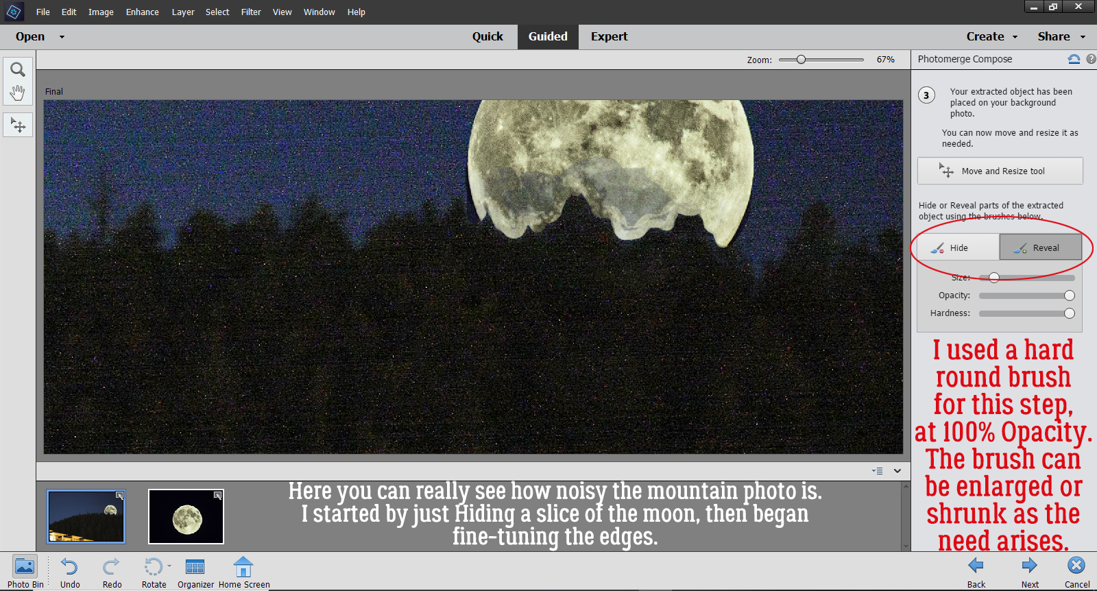
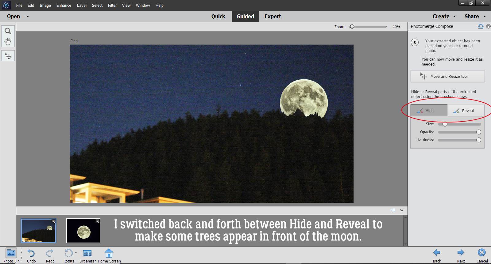
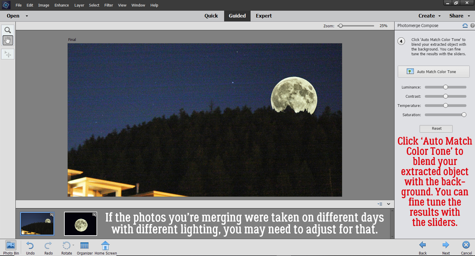
Can we talk about style for a minute? I’ve been giving this a lot of thought lately, as I think my personal style is evolving somewhat. This tutorial originally appeared in October 2019 (as you’ll see as we move through it) and I’ll bet many of you are also seeing a gradual shift in your individual style. Perhaps it’s a function of expanding skills, or maybe an expanding stash ( 😉 ) or even something as simple as maturing. There’s no right or wrong in creating art, so don’t feel like you need to find a niche to be shoe-horned into, do what makes you happy. And if you’re feeling really adventurous, step outside your box and try something new!
We all have a certain style, a concept of ourselves and our environment; that style is reflected in the way we dress, the way we decorate our homes, the way we interact with others… and how we scrap our memories. If you spend any time wandering through the Gallery you’ll know exactly what I mean. There are scrappers whose style is instantly recognizable – you don’t even need to look for the scrapper’s name. But have you ever thought about the basic underpinnings of style? Let’s discuss!
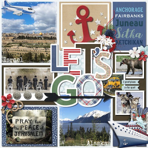
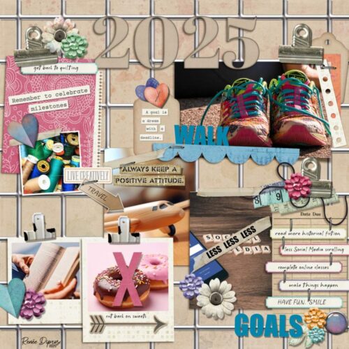
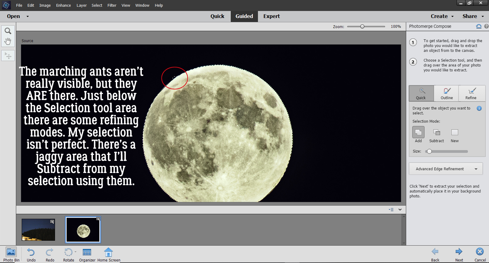
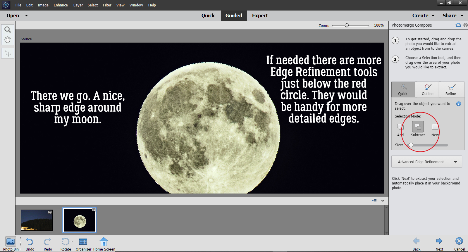
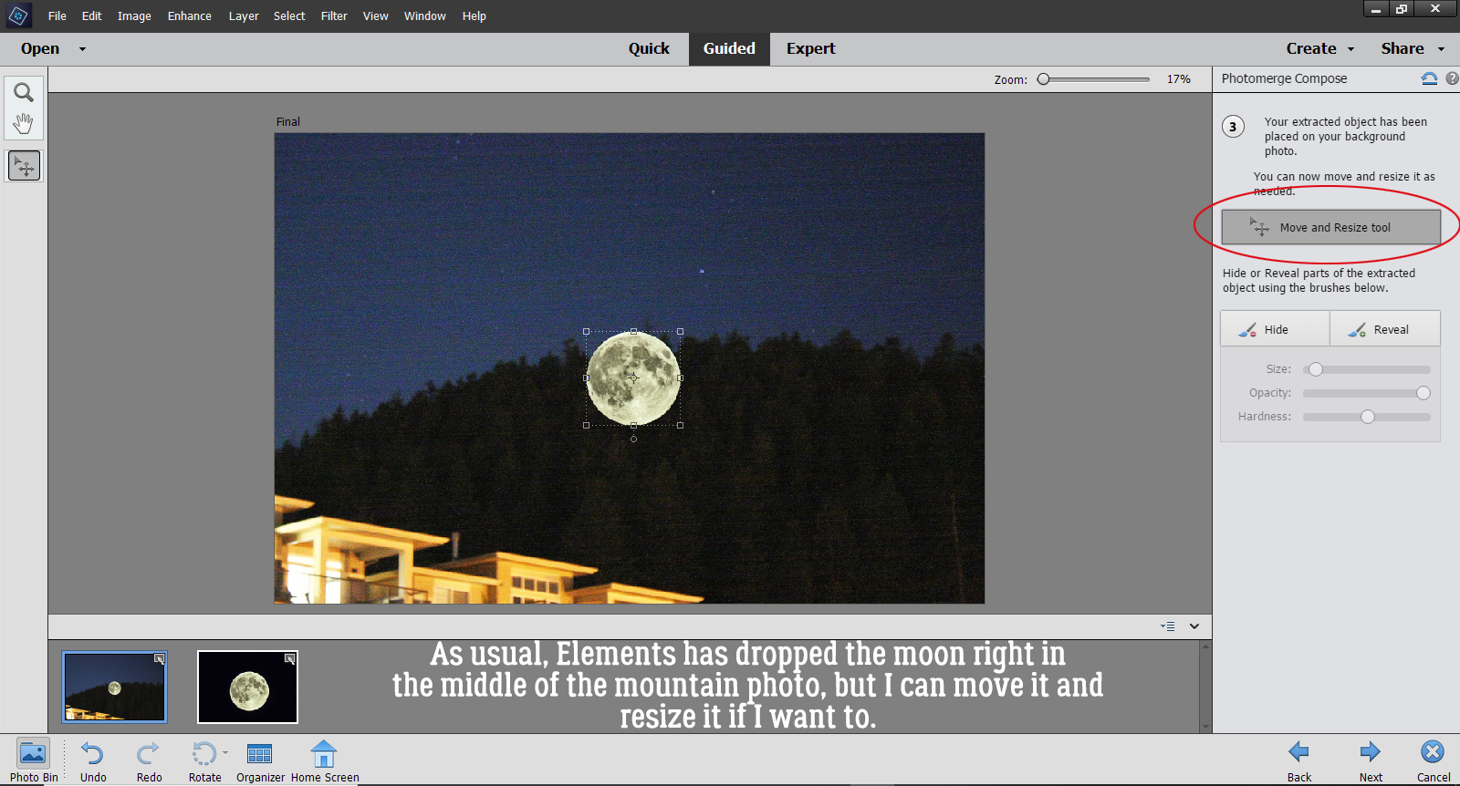
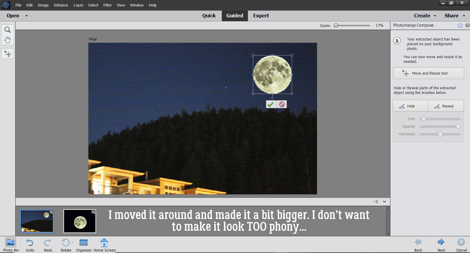
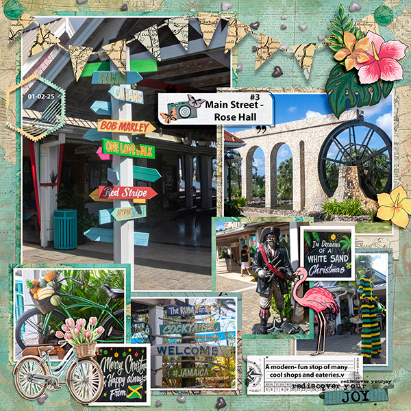
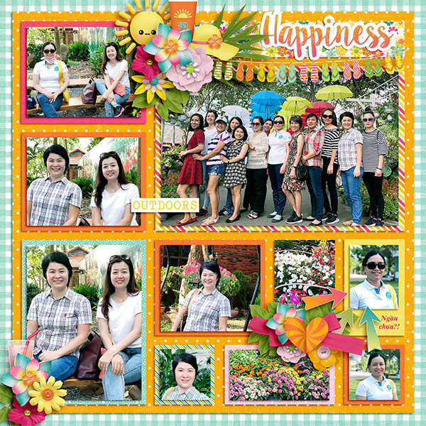
First let’s look at the very popular Pocket Scrapper style. This layout from the GingerScraps Gallery is by ngocNTTD. Pocket scrapping is organized and photo-oriented. It’s one of the most basic of paper-to-digital styles out there, having emerged from Project Life and the various other daily, weekly and monthly project formats. Pages in this style document day-to-day and special events in a clean, grid-based arrangement. Any embellishment will be limited so as not to obscure the all-important photos. As you can see, ngoc has included 10 photos in her layout.
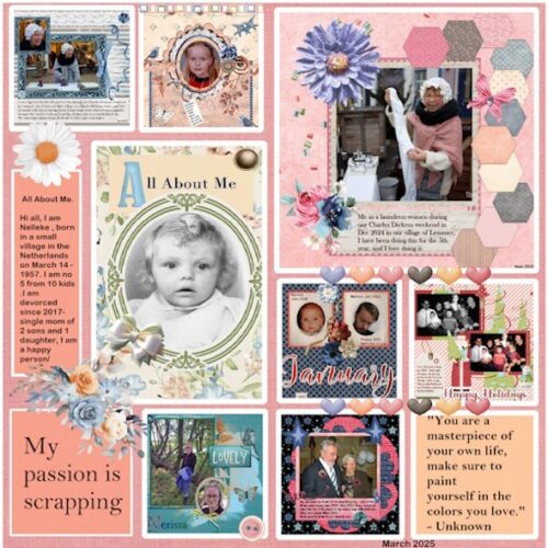
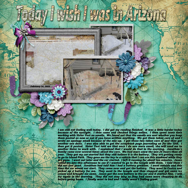
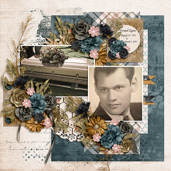
Heritage scrapping is a very popular style, especially for those of us interested in genealogy. Who doesn’t love vintage photos of our ancestors? There’s something very powerful in documenting our past in this way, as craftytam has done in her layout below. These layouts focus on history through the use of muted colours, with a slightly distressed look. Information relating to the life of the subject is a must for these pages, which may be as simple as vital statistics or as detailed as a complete life story. Journaling in hand-written fonts is characteristic.
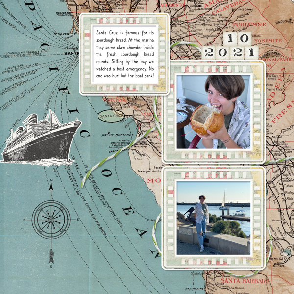
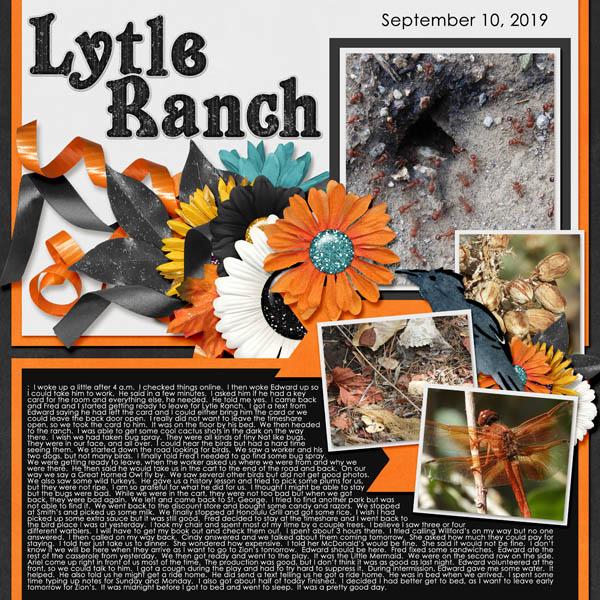
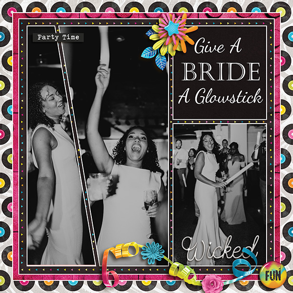
A combination of these two is the Storyteller style. KatherineWoodin‘s layouts are such perfect examples of this style. Each page tells of a specific event; photos aren’t a requirement but if they’re used, they’re integral to the story being told. There’s a heavy emphasis on journaling, as you can see below. The use of embellishments is dictated by the feeling the scrapper wants to convey.
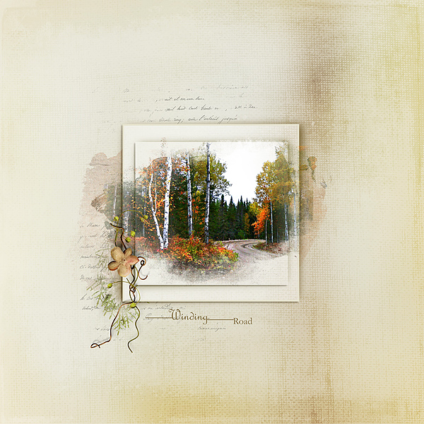
Classic scrappers rely on clean lines, limited embellishment, precise placement and precise use of words. Layouts are conservative, in several senses – paper scrappers might default to this style because it doesn’t use a lot of “stuff”. In this layout by gethane, the classic style is obvious.
And that leads us to the Modern style. Glori2 has solidly incorporated this style as her own. Modern layouts are the ultimate in clean and simple, which refers to minimalism and not the use of texture and grunge. Embellishments are few, and very carefully chosen. White space is vital to this style, giving the eye many options to rest.
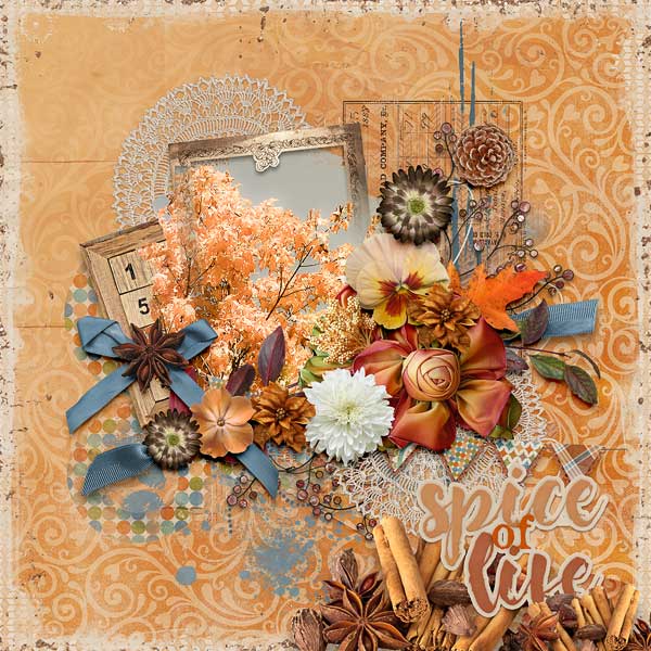
I suppose the opposite of Modern is the Shabby Chic layout. This layout by kabrak1207 is a stellar example of Shabby Chic… muted pastels, vintage elements and ephemera, brushes and worn paper come together to create a visually appealing whole.
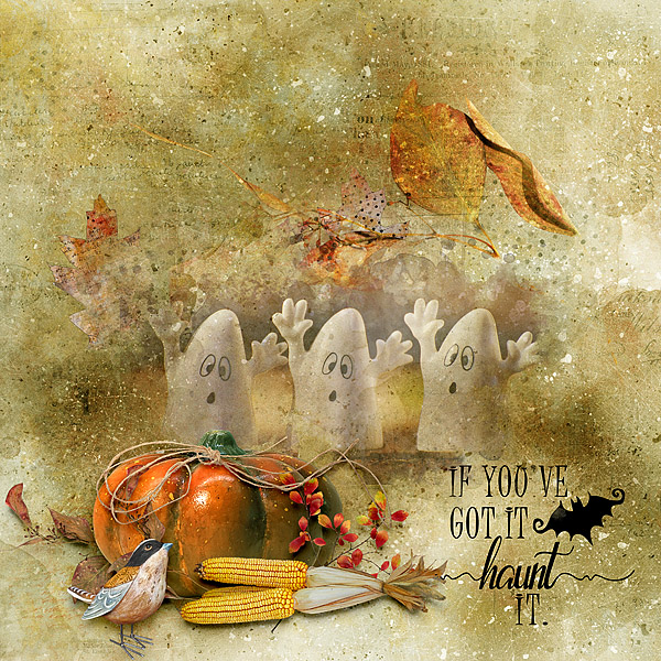
The Artist scrapper focuses on the overall image, using paints, brushes, blending and a multi-media approach. Kythe uses a deft hand here, blending not only the photo but also the leaves into her background. Those little ghosts look ethereal and are grounded by the vignette in the foreground. Artist-style layouts don’t rely on journaling to tell a story, and may not include a title either.
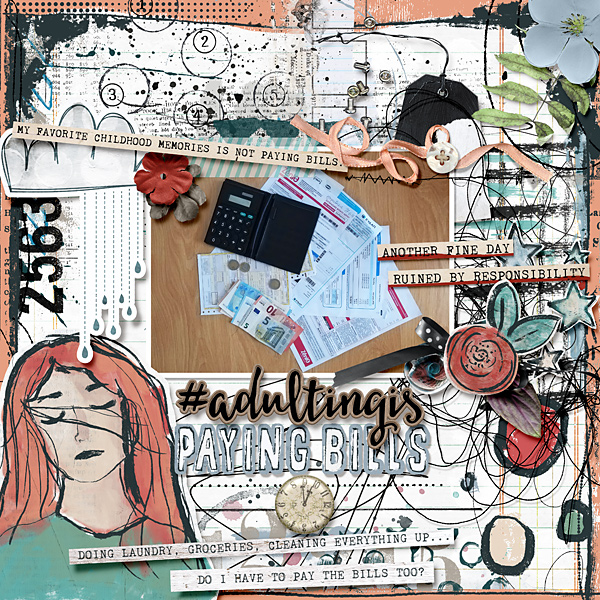
The last style is an art-form all on its own. Art Journaling conveys emotion through imagery. There really are no rules in Art Journaling, other than to use it as a way to express things we might not be comfortable expressing in any other form. Rather than putting a feeling into words, the use of word art, word strips, doodles, brushes, paint and textiles are used to tell the story. Intensely personal, this might be the most difficult of all styles to integrate into one’s repertoire, but cinderella has no problem!
I’m still working the kinks out with the new laptop, finding out which files I haven’t transferred when I go to use them and I’m having some trouble getting comfortable with it… and Windows 11. It can only get better, right? But at least my finger works again!
![]()