Chalking it Up to Inspiration
![]()
Greetings faithful readers! Today’s tutorial builds on several previous lessons so if you’ve been paying attention, this one will be a breeze. I’m going to show you how to create your own chalkboard journal card. Choose a motivational, inspirational or humorous phrase to match your layout and let’s get at it.
Do you remember how to make a rounded rectangle? (The link will take you to the tutorial if you don’t.) Journal cards use typically a 2:3 ratio so I’ve made my canvas 4×6 and then filled it with my rounded rectangle. It really doesn’t matter what colour you use to make your shape because you’re going to clip a gray or black paper to it.

Remember the tutorial on tools? I showed you two ways to Simplify those shapes.

Chalkboards are typically black or charcoal gray, but may also be green. You can use whatever colour you want, though. Just make sure you choose a solid paper. I used a gray one from the May Daily Download kit Grateful from Blue Heart Scraps and Luv Ewe Designs. If you missed it, you can grab it in the shop.
CTRL/CMD>G clips the paper to the rounded rectangle. Or you can do it the long way by right-clicking on the paper layer in the Layers panel and then selecting Create Clipping Mask from the drop-down menu.

Once you’ve positioned your paper just so and clipped it to the rectangle, you want to Merge the two layers. CTRL/CMD>E does the job. Or…

Then you need to open the Color Picker and choose a light gray colour for your chalk. Or you can go with any pastel colour you want, because chalk comes in LOTS of colours. To change the hue of the sampler, click on the rainbow strip just to the right of the sample box then make tiny adjustments until you get the colour you want. I used a light gray.

Then it’s time to choose your first font. If you’ve organized your fonts in MainType and tagged them for easy sorting, this part will be pretty easy. I have a category called Chalk/Crayon and started by looking at those fonts. I typed what I was going to put on my journal card into the preview (Pangram) box so I could see what it would look like. I also used the tag Handwritten/Printed in my search. Quick and easy!

Oh wait!! What would a chalkboard journal card be without a flourish, curlicue or some other fancy bit to jazz it up? I have a collection of dingbat fonts I bought for a buck a piece years ago that have come in very handy at times. To have both a header and a footer I duplicated the flourish shown and rotated it 180° to create a mirror image. This step just adds a finish to the project.

If you’ve used a separator/flourish/curlicue make sure you Simplify the layer right away, and Simplify EVERY layer AS YOU GO because if you don’t do that, when you select another font for the next line, Elements will change the lines you’ve already typed out to that new font too.

Once you’ve chosen your font for the first line, go ahead and type it out. As you can see in the screenshot below, I haven’t yet Simplified the first line of text. If you’re not sure how to align things and centre them on your journal card, the screenshot shows you how. Select all the layers in your project. (WSNH: Click on the top layer to select it then Shift>Click on the last layer and all layers will be selected as shown below. To select random layers, use the CTRL/CMD key instead of the Shift key and click on each layer you want selected.) Then in the Tool Options panel, where it says Align, click on Middle and everything will line right up and be perfectly centred.

I didn’t screenshot the font I used for “Relax”… it’s called The Goldsmith Vintage. The second line’s font is from Lettering Delights and it’s called Soccer Mom.

The third line of my message was one I thought should be arched, so once I typed it out (using a font called Alphabet Pony Regular) then went to the Text Tool options and clicked on the Warp Text tool as shown below.

The Warp Text menu looks like this. The Style button offers several choices for the shape your text will assume, and you aren’t committed to anything until you click on OK so you can try them all if you need to in order to find the one that looks right. [Move the menu box (click and hold on the gray bar at the top of the box to move it around) so you can see your text as you adjust it.] Then you can adjust the Bend, Horizontal and Vertical Distortion to suit your purposes.

It wasn’t quite how I wanted it, so I went to the Image tab>Transform>Distort to modify it even more.
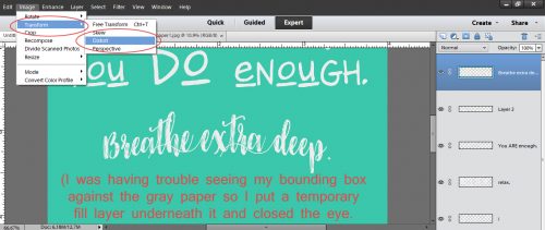
I turned on my grid (which I’ve set to have a darker line every inch with 8 subdivisions per square inch) so I’d have a guide for the degree of skewing I was doing. CTRL/CMD>’ turns the grid on and off. Or you can do it the long way by clicking on View>Grid. To get the effect I was looking for, I stretched the line of text vertically a little then pulled the upper corners toward the centre just a bit.

I used Belepotan for the 5th line and Malina for the 6th.

Watermelon Smile Fancy seemed to be the right style for the 7th line. I’d really love to know how they come up with these names! The very last line is Font in a Red Suit. Yeah, it’s a Christmas font, but it works here.

When all the lines of text had been typed and sized appropriately, I aligned them all to the centre of the card then merged them. I didn’t merge the text to the paper yet though. You’ll see why in a minute.

The text was just too crisp and sharp to look realistically like chalk. So I distressed it a little by using a free snow brush I got from Brusheezy and the Eraser tool. I lowered the Opacity of the brush to 45% so it wouldn’t completely erase the areas I touched with it and then I just stamped my brush randomly over the text until it looked… well… more like chalk.

After I had all of that done, I looked at the finished card for a minute or two and decided it needed a thin stroke around the outside as a finishing touch. Do you remember how to do that? It was way back in the photo recolouring tutorial. To refresh your memory: Click on the layer thumbnail for the shape to get those ants marching around the edge. Then go to Select>Modify>Contract and set a number in the box. I used 20. That moved my marching ants 20 pixels toward the inside of the card. Then I used the foreground colour – light gray – to apply the stroke. Edit>Stroke (Outline) Selection>Width 4 (pixels)>Inside>OK. Remember?
When that was done and I liked what I was seeing, I merged all the layers and saved my journal card in the folder for the layout I created it for. The layout turned out just as I saw it in my mind’s eye. Have a look and see if you can pick out all the techniques I’ve used to create it.

Remember, if you’ve used a technique from these tutorials, post your finished layout in the GingerScraps Facebook Tutorial Tuesday Challenge Gallery for an opportunity to have YOUR chance to challenge me. If you’re not a Facebooker, you can post a link to the layout you’ve created with the tutorial you used in the comments section here on the Blog. I’ll get a notification and will then enter you into the draw. The first week of each month I’ll have a random draw of all entries and the winner will be announced at the end of the first tutorial of that month.
![]()
Thanks so much for this tutorial, I’m sure it will be fun to create. I would love to see any hints or ideas for using Alphabets. I have many of these but never use them. They time consuming to find, and then select,and they never line up so I just use a font and enlarge it. Would love to have a way to put them to good use.
Mary, I’d be happy to do a tutorial on using alphas. I can throw some tips on organizing and finding your alphas in there too. Personally, I love them and use the a lot. The layout I created this journal card for has an alpha and a font in the title. “Sea” and “free” are the alpha that came with the DD kit. I wanted them to lean to the right so I used the Distort tool to make them lean. There’s so much you can do with them! Now I’m plotting… stay tuned!
https://gallery.gingerscraps.net/showphoto.php?photo=303805&title=marathon-dam&cat=945
Here is my layout using your tutorials. I used a couple different ones on this layout. To start with, I have 2 lousy photos of the Marathon Dam in Greece and with scanning them, even worse! I used your tutorial on saving photos and they are better even if not perfect! I also used the tools tut you did for me. I wanted a column for my pictures of when I lived in Greece. Currently I do not have any in any of my kits so, using many different shapes, I created my own. (Chose the simplest column to try to create.) I Put multiple shapes together and multiple types of shapes. Used some bevels and I was hoping to use multiple patterns. (I wanted marble but there is none with the default. I did choose to use the Greek Key you used in the tut and an ancient stone pattern on it. Although I can see where improvements can be made, All in all I am happy with my first attempt! Looking forward to see what you have in store for the alpha’s!
Ellen, the columns you created for your layout look great! ! They look very professional & the addition of the Greek stamp makes them look more so. Wonderful layout!!
Jan, thank you for today’s tutorial which brings together tutorials from the past. I love the chalkboard look & how you’ve achieved that look using regular fonts — this opens up so many possibilities! & thanks for linking back to the original tutorials. Looking forward to the tutorial on alphas. I love the look, but it is so much faster to use a font that I often just skip them. I’d appreciate some tips on sizing — my screen is small, so it is hard for me to tell if a title is too big or too small. Thanks!
I’ll make sure to incorporate some tips on sizing, Pam. I’m glad you’re finding my tuts helpful. Along the way I’m learning some new tricks too, so it’s a win-win all around!