Ahead of the CURVE
![]()
Happy New Year, GingerScrappers! I hope you’re all recovered from the holidays and ready to get back to work… at scrapping your memories, of course!
This tutorial was inspired by a comment left by Glee on the layout shown below. Can you guess what she mentioned? Yes, it was that curved, diminishing title.

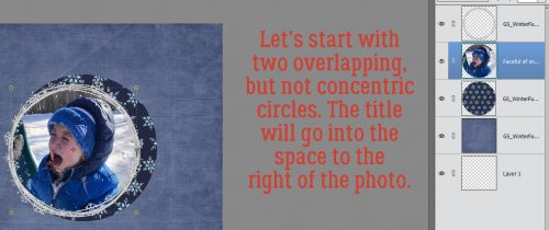
I haven’t quite decided what the right side of this two-page spread will look like, but I know I won’t be using the same template, just a similar basic arrangement. I created two circles, overlapping but not concentric, with the photo smaller than the paper layer.
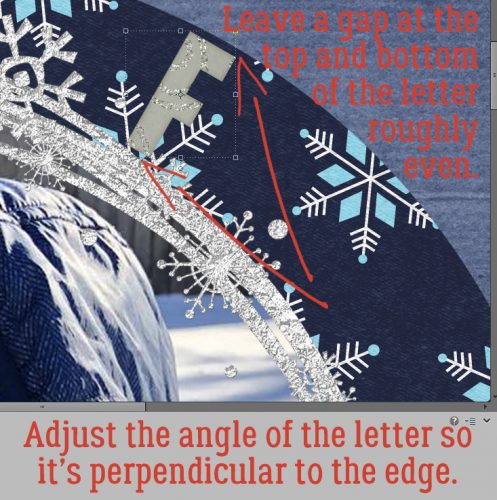
Using the alpha that came with the kit my papers and doodled fram
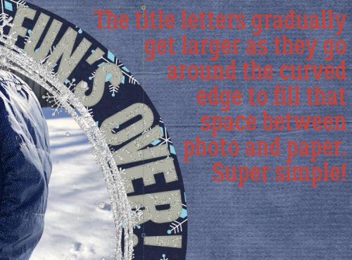
e are from (GingerBread Ladies Winter Fun) I started to add in my title. The letters must be resized to fit into the space between the edge of the paper and the edge of the photo. Having the doodled, glittery frame there might help… or not. The letters also must be tilted to follow the curve of the paper, with the axis of the letter perpendicular to the edge.
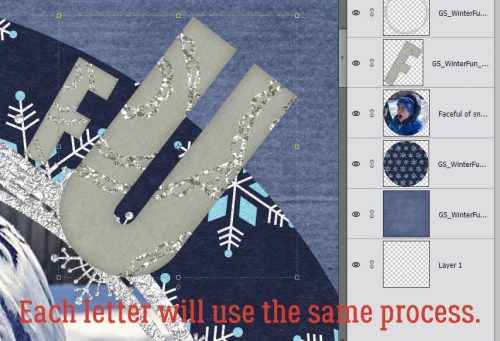
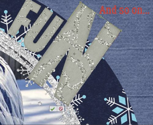
I added in each letter and made the same adjustments.
I was eyeballing the gap between the top and bottom of each letter and the edges of the paper and photo.
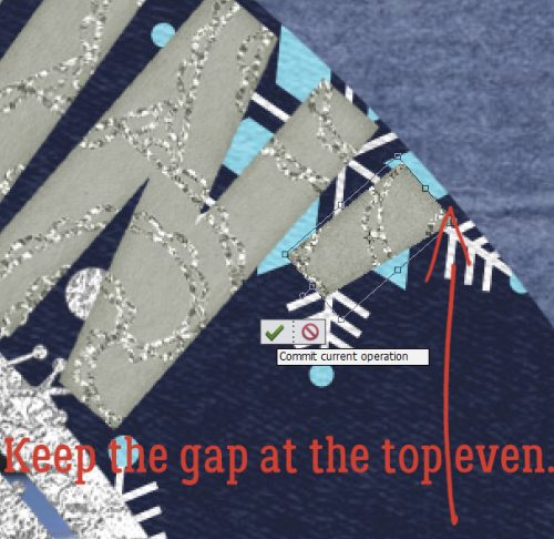
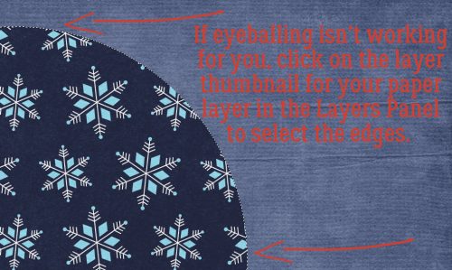
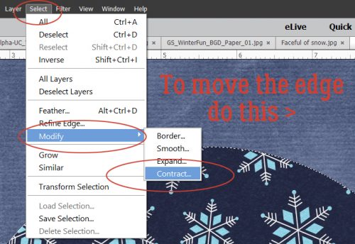
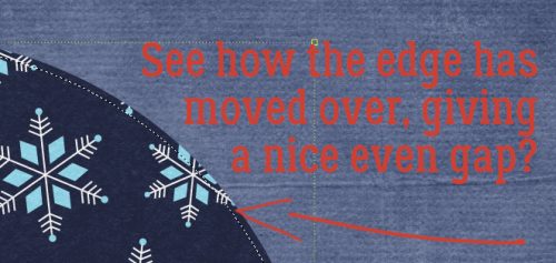
If you’re not confident in your ability to eyeball the gaps, I have a way to make it easier. Select the edge of the paper circle by clicking on the layer thumbnail in the Layers Panel.
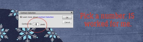
Then click on Select>Modify>Contract… which will move your marching ants toward the centre of the paper circle.
I randomly picked the number 15 for my amount of shift.
There you can see how that 15 pixel shift has moved the edge inward.
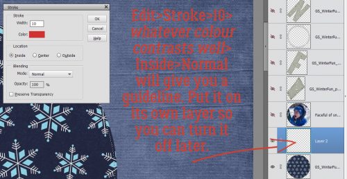
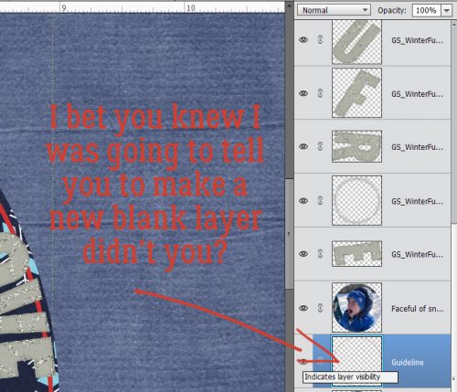
Before you go any further, create a new blank layer over top of your paper layer so the outline will be separated from your paper. You don’t want to leave it active at the end so make it stand alone. Then click Edit>Stroke>10>(choose a contrasting colour like red)>Inside and leave the other adjustments at the default settings.
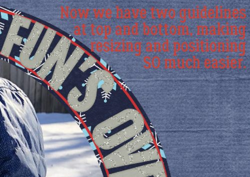
Now there’s a nice obvious line to follow that will help you offset your letters enough to make them prominent.
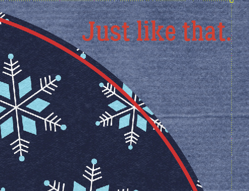
If you zoom in you can use this guideline to help position your letters.
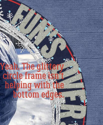
I like the doodled, glittery circular frame, but it’s making lining up the bottoms of the letters more difficult. I might have to turn the visibility off.
Wait!! Maybe we should have a second guideline to make it easier.
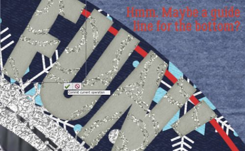
You guessed it!
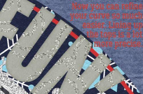
Click on the photo layer thumbnail, then Select>Modify>Expand>15 and commit the operation. Add your stroke to the outside this time.
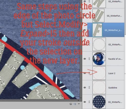
And now there are two guidelines with the same distance from the edges of the photo and paper circles.
Once I had my title in the space and positioned just so, I moved the doodled, glittery frame on TOP of the letters, which helped to anchor them to the photo.
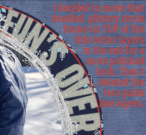
In this example, the letters gradually get bigger from beginning to end, whereas in my original layout they gradually got smaller. With the two guidelines deleted, the tops of the letters look sharply positioned. Easy peasy!
I’ll be looking for YOUR curved titles in the gallery!
![]()
Happy new year, Jan!!! Hope you had a nice holiday!
Thanks for today’s tutorial — I love the information on how to create the curved guidelines. I don’t use alphas very often; I guess I should start trying them out.