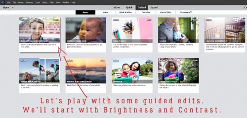
Transforming the Ordinary to the Extraordinary!
![]()
Here’s a look at the little monster who’s been robbing me of sleep and keeping me from being productive. She’s lucky she’s cute! But we’re now halfway through Day 4 with no puddles in the house, and she actually slept all night last night. So there is a light at the end of the tunnel!
When I took a good look at this snapshot I caught with my phone, I thought it was pretty special. But it could be even better, so I thought, “Why not play around with some more of those Guided Edits in PSE and see what happens.” The results are below. I could have stopped after any of the steps I took, so don’t think you’d ever have to do all of these adjustments to make your photos more amazing. You don’t!

The first one I used was the Brightness and Contrast Edit. Guided>Basic>Brightness and Contrast.
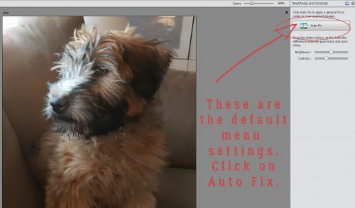
The menu looks really simple, and it is! Clicking once on the Auto Fix button is perhaps all your photo might need. The sliders are automatically set as shown.
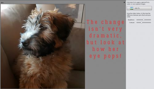
This is how it changed with just one click. It’s not all that obvious, but I think her eye pops a bit more.
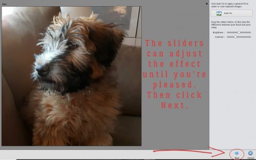
I moved the sliders just a tiny bit, decided I was happy then I went down to the lower right corner of the screen and clicked on Next.
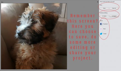
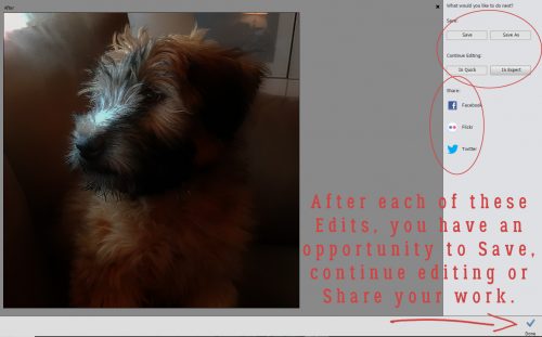
The menu shown below opens up, offering the options of Saving the image, Editing some more or Sharing it with your friends on social media.
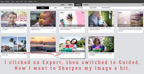
Of course, I wasn’t done experimenting. So I clicked on Expert under Continue Editing, and then selected the Guided tab again. Next I chose Sharpen from the menu.
The menu for this edit is simple too. I clicked on Auto Fix.
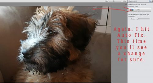
And there’s a visible change. You can click the Auto Fix button multiple times, or manually adjust the sharpening by using the slider. When you’re ready, click on Next.
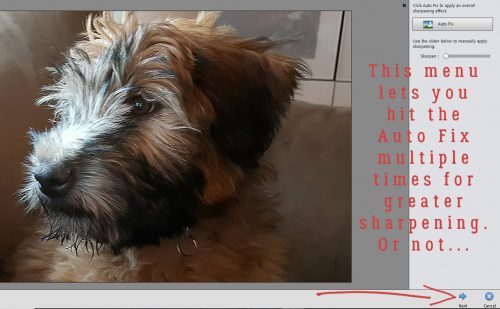
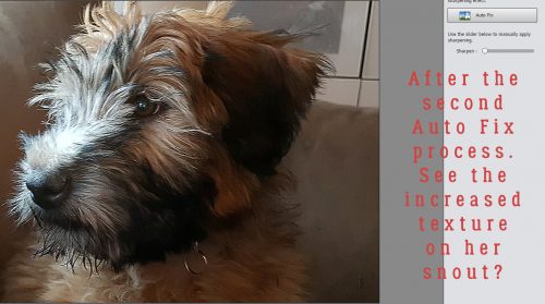
After I clicked on Auto Fix a second time, there was an increase in texture in the hair on her nose.
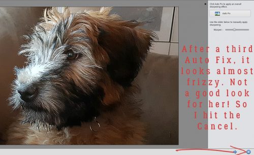
So I hit it again. I think it’s just a little too much though, looks artificial. So I clicked on the button beside the Next button, Cancel.
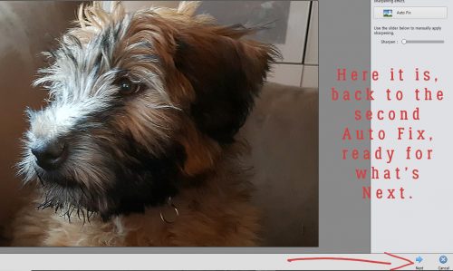
Yeah, that’s the best look. So Next…
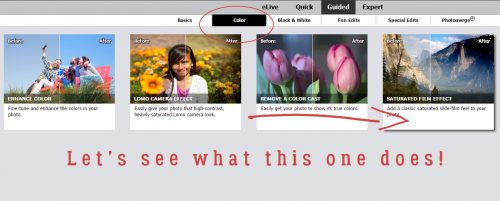
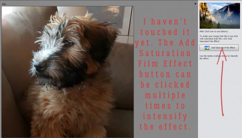
Now I decided to try one of the Guided Color Edits. Let’s see what Saturated Film Effects looks like.
I wanted to show you the menu for this edit before I made any changes. The Add Saturation Film Effect button is another one you can click on multiple times to intensify the effect.
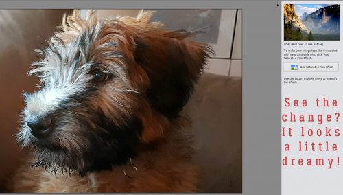
I think this image looks a little brighter and a little softer but keeps the eye in focus.
So on to the next Edit! Anyone know what the Orton Effect is? According to Wikipedia, “Orton imagery, also called an Orton slide sandwich or the Orton Effect, is a photography technique which blends two completely different photos of the same scene, resulting in a distinctive mix of high and low detail areas within the same photo. It was originated by photographer Michael Orton in the mid 1980s.” Some purists feel that the effect has been overused, especially in portrait photography. But we’ll look at it any way. (I’m not much of a conformist!)
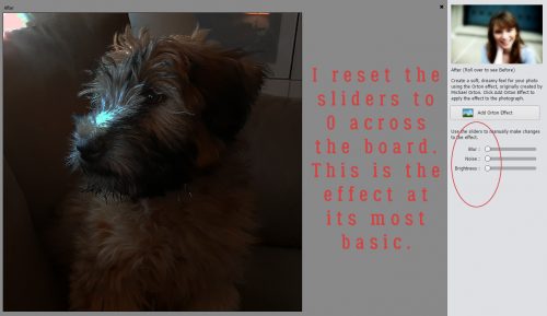
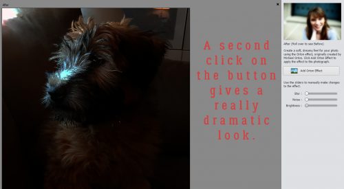
The Add Orton Effect button has 3 sliders for further adjustment. I pushed the sliders all the way to the left to see the effect at its most basic.
It’s another Edit that can be duplicated multiple times. Here’s what it looks like after two clicks. It’s very dark. But I haven’t given up on it!
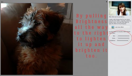
I played with the sliders. I pushed the Brightness slider all the way to the right.
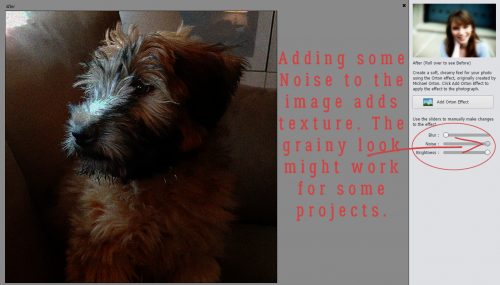
Then I added some Noise. It adds quite a grainy look to the image, and that might work really well for some purposes.
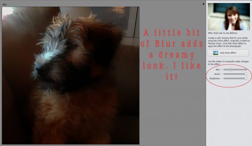
Now a little Blur… just a bit, to add that dreaminess the Orton Effect is known for.
And I could stop here. But you know me by now… I’m not done yet!
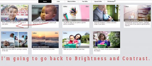
I’d like to go back to the Basic menu and hit it again with Brightness and Contrast.
Now I think it looks a lot like a painting by one of the Dutch Masters of the 17th century. It’s the light…
It’s only looking more and more beautiful!
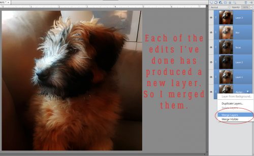
I’m sure you know I chose to continue editing. When I went to the Expert workspace, I discovered that each edit had created a new layer. So I merged them all together.
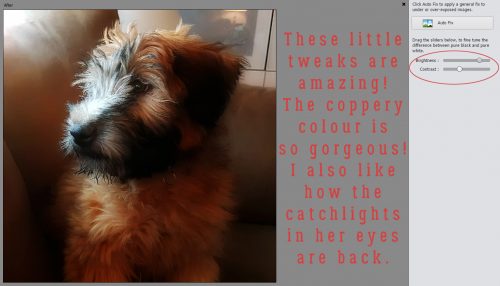
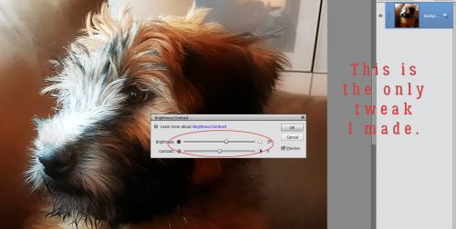
I wanted it just a little brighter still, so I chose to go the Enhance>Adjust Lighting>Brightness and Contrast route.
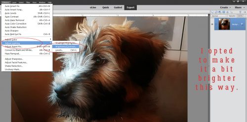
All I did was shift the Brightness slider a little to the right.
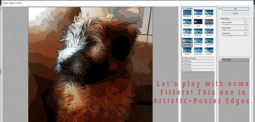
Okay. At this point, I absolutely LOVE what I’ve done with this photo. I saved it as it looks right now so I don’t have to recreate it later, because now we’re going to play with some filters. The image below shows Filter>Artistic>Poster Edges. It’s pretty cool! Think about how you could use this filter to create a caricature effect on your portraits.
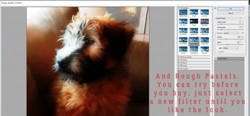
I didn’t layer the filters, trying them individually to see how they each look by themselves. This is Rough Pastels.
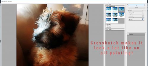
Crosshatch adds to the Old Masters effect!
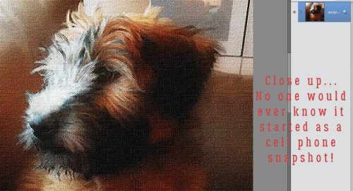
Let me zoom in on that one.
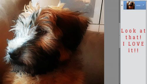
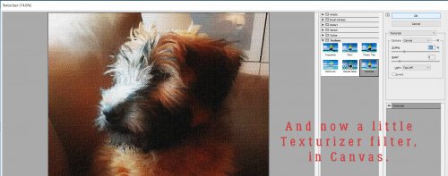
I’m so thrilled with how it looks that I’m almost done. I want to just add a little texture to it to push the oil-painting look a little more.
Who knew I was channeling Rembrandt?
My challenge to you is to use any or all of these edits to create your own masterpiece!
![]()
First of all … what a cutie! Second … what version of PSE did you use?
the finished product came out great but i also love some of the steps along the way!
What a beautiful pic of your little pup! Thanks for showing us each individual step … sometimes when I apply these steps, I have a hard time seeing the difference unless it’s really dramatic — old eyes I guess. I love your final outcome!! Thanks, Jan, for showing us all of this!
First I want to thank you for all the tutorials that you give us. I have learned so much from these. I have to admit I am not a dedicated digital scrapper. I still use paper and scissors,but I do incorporate some digital into my pages and have printed out some digital ones. My question is about brushes. How do I keep them without installing them and how do I use them. After using them are they then automatically installed,or do they just stay in a folder on my desktop.
That was a super fun tut, master! And a very adorbs pic to demo with.
muchas gracias!
Thank you for so much detail in this tutorial. You included so many different effects. I can’t believe you were able to stack so many and have such an amazing end result. Wow!
I used PSE 15, but all the Guided Edits I showed you are included in 13 and 14 as well.
I just caught that “cutie” digging a huge hole in the back yard… she’s SO lucky she’s cute!
I have old eyes too. I use the zoom a LOT when I’m working through these tuts, to make sure there IS a change!
You’re all very welcome. As I’ve said before, I’m learning a lot myself!
You can create a folder to hold all your brushes, naming it so it’s easy to find, an putting it somewhere on your computer where you can access it easily. Then when you want to use one, you’d load it into Elements. When you click on the Brush tool in the toolbox and the menu opens, click on the brush picker and look for an icon in the upper right corner that looks like 4 parallel lines with a little arrow to the left of them. Click on that and select Load Brushes. Then go find the brush set you want to use. When you’re finished with the brush set you can follow the same steps to delete the brushes. They won’t be deleted from your computer, just from the Elements folder, so you can go back and use them again later. Leaving them loaded in Elements really slows it down, much like a large list of fonts, so that’s one way to speed things up.
De nada, Glee.
It’s really amazing, right? I’m hoping to shift you out of your comfort zone a little and entice you into experimenting a little. The fantastic part about digital scrapbooking/photography is that nothing is really EVER undoable! If you don’t like something you’ve done, CTRL/CMD>Z takes you right back. I always work with a copy so the original is untouched. And I have fun playing around, trying new things.