Text Talk – LETTERPRESS!
![]()
Hey, all you Gingerscrappers! It’s Tuesday again and time for another little lesson to take your layouts up a notch. Glee posted a comment on one of my layouts in the gallery and she mentioned that my text looked like letterpress. She’s got a great eye… it’s the digital equivalent and it’s super-simple to do. I knew I was going to need a quick topic for this week because of the hectic, crazy schedule I’ve had at my real job and her comment just fit the bill perfectly. So let me show you how to turn text into letterpress.
For those who aren’t sure what that means, it’s how print looks when it’s typed with an old-fashioned manual typewriter on soft paper. It’s indented and the edges appear quite crisp. Maybe you’re wondering why you’d want to create this effect. Well, it makes your journaling more visible. It has some shadowing and texture, it adds depth and detail to your text and catches attention. It’s something people who were paper scrappers will love to see in the gallery. And perhaps most importantly, it GROUNDS your text. Text should never “float”… it can’t float when we paper scrap, and it must not when we do it digitally. For this reason, your text layers should be on the layer immediately above the paper or tag or label or whatever you’re applying it to, otherwise it’s going to look odd. And we don’t want that!
I like to use this technique on typewriter fonts like Typical Typewriter (used in the example), F25 Executive, Underwood 5 and similar fonts. But it also looks great with handwriting fonts, especially if you use an inky blue – it looks like you’ve scribbled it down with a ball-point pen. I know you’re going to try this!

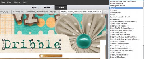
Once you’ve typed out what you want to transform, you’re going to click on the Styles tab and select Bevels.
As you roll your mouse over the little thumbnails a label with the type of effect the style will create will pop up. You want to select Simple Emboss.
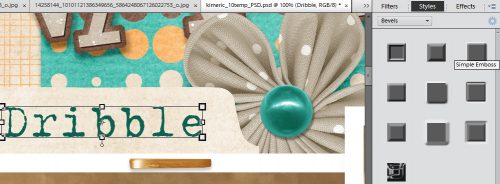
This is what it looks like. Downright horrible!! This is where the magic happens…

Double-click on the fx icon on your text layer. This box will open up. You want to grab the slider for Size and drag it to the left.

The default is 21 pixels. I like to go down to about 5 or 6. But you can go all the way to 0 and it will still alter your text visibly.

Then click on the box next to Down and look! It’s now “debossed” and looks dramatically different. That’s all there is to it!

I wanted to have the labels on all three of the tabs on my layout looking alike, so once I had my text typed onto the appropriate layers, I right-clicked on the layer where I’d already “pressed” the text and selected Copy Layer Style as shown.

Then I selected my new text layers and right-clicked on them. Then I selected Paste Layer Style and all my tabs looked alike.

This handy technique literally takes only seconds once you’ve done it a few times. What are YOU going to use it for?
The layout I’ve screenshotted for this tut was created with the Daily Download kit Just Be from Laurie’s Scraps and Designs. There are links posted here on the blog every day that let you pick up the pieces of the kit. If you’ve missed the first half of the month, the full kit will be available for sale in December. It’s got a wonderful colour palette and I enjoyed playing with it. Laurie is in the Designer Spotlight this month and is hosting the Designer Spotlight Challenge. Check it out!
Til next week, GSers!
![]()
[…] Tutorial Tuesday (Photoshop Elements) – 1 freebie(s)? […]