Turning a POSITIVE into a NEGATIVE
![]()
I just got home from a short visit with both one of my dearest friends and one of my daughters… and I’m so behind! Thankfully I still have a few days left of the month to get my challenge layouts done. I’m sure some of you can relate…
This week’s tutorial isn’t specific to Elements 15, like the last few have been. This can be accomplished with pretty much every version. It also might seem familiar to some of you, but I’ve added some new twists. The inspiration for it came from a layout I saw posted on Facebook yesterday, but I can’t remember whose layout it was. What caught my eye was a big “negative” maple leaf and the same leaf used in another spot on the layout. So I thought about it for a bit (the 3 hours it took me to drive home this morning is a bit, right?) and this is what came from it. I was looking in my stash for a paper with a really prominent texture to it when I came across this one in Aprilisa Designs’ Shining Stars September Buffet kit. I like the woodgrain look.

The leaf is from the GingerBread Ladies‘ collab Turning Leaf. It has a lot of serrated detail along the edge so it’ll be perfect for this.

Then I decided what colour I wanted to use to create my effect and then selected the Brush tool.

I have a big collection of brushes (mostly free from Brusheezy) and love to use brushes for lots of purposes. I chose a relatively symmetrical spray brush from this group, set it to its largest Size and 100% Opacity.
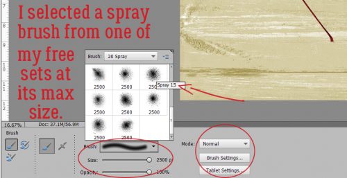
If you’ve read my tutorials before you’ll remember that I always recommend putting your brushes on their own layer so you have infinite control of the size, the angle and the position it takes on your layout. It also makes it possible to duplicate the brushed layer, which is a great option. For this technique it’s an absolute IMPERATIVE. So I created a new layer by clicking on the single-sheet-of-paper icon at the top of the Layers panel.

I bounced my brush over the leaf so that the paint extended past the edges, but didn’t completely hide the leaf.

Then I copied the paint layer. You can either right-click on the layer then choose Duplicate Layer from the drop-down menu, or you can use the WSNH* keyboard shortcut CTRL/CMD>J.

You want to be sure you’re working on the paint layer immediately above the leaf layer for this step.

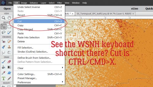
“Select” the outline of the leaf. To do that, click on the image thumbnail in the Layers panel. When you see the ants marching around the edge of the leaf, then click on Select>Inverse or use the WSNH keyboard shortcut CTRL/CMD>Shift>I.

You won’t notice that the marching ants have moved from what’s inside them to what’s outside them, but when you invert your selection that’s what happens. Now you’re going to Cut the paint that’s OUTSIDE the leaf away by clicking on Edit>Cut or CTRL/CMD>X.
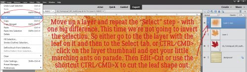
If you look at the Layers panel you can see that you have the red leaf, a gold leaf and the spray painted layer.

Now go up to the second spray paint layer and repeat the Selection, but this time we’re not going to Invert, we’re just going to Cut.
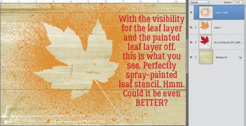
If you turn off the visibility of your red and gold leaf layers, this is what you’ll see. But let’s keep playing with it.
There was a tutorial some time ago where I talked about Blend Modes. They’re great tools, and are fun to play with. I dabbled a bit to see if I could bring out the woodgrain a bit more. I ended up with Darken mode at 76% to achieve this look.

I touched briefly on Filters in a couple of tutorials; these tools are a lot of fun too. Today I’m going to show you the Texturizer filter and its options. I thought I’d WSNH and apply the same filter to two layers at the same time, but was rudely awakened to the reality that it isn’t possible. Darn.

However, there’s a WSNH workaround for that! As you can see in the screenshot, I was working on the topmost “negative” paint layer to start off. I clicked Filter>Texture>Texturizer. There are several options on top of the basic filter and that’s where the magic happens.

Once the Texturizer filter menu opened up, I chose Sandstone, set the Scaling to 200%, the Relief to 25 and the Light to the top left. Boom! I looks like someone dumped wet sand on top of the leaf…. before it was moved.

I wanted the same wet-sand look on my gold-leaf-layer, and guess what… Elements remembers the last settings used in the Filter menu! So I just had to click on that top-most option, or CTRL/CMD>F.

Now it all looks like it’s been buried in wet sand. But I know there’s more we can do with this.

Hmmm, let’s swing the red and gold leaf layers over and rotate it a bit.

Okay. Wait a minute. That doesn’t look right. I don’t want it to look like that! What the heck?? Oh. Yeah. The “negative” layer is on top. It needs to be underneath. So I moved it down.

There. I like that.

Let’s jazz it up a bit by putting a Blend mode on the sandy-gold-leaf layer. This time I liked Lighten at 69%. The red shows through a little more, the veins are visible and the sandiness is still visible too.

At this point, I wanted to do some more tweaking but I didn’t want to mess things up, so I Merged the sandy-gold-leaf and red leaf layer together. WSNH = CTRL/CMD>E

Now to enhance the realism of this sandy-leaf look. The sand would add weight and depth to the leaf, right? But as the sand layer dries, it will distort the leaf a bit at the tips. So I created a shadow layer using the technique I showed you in my second shadowing tutorial, which has quickly become my favourite way to customize my shadows. Then I Smudged it a bit to make it look natural.

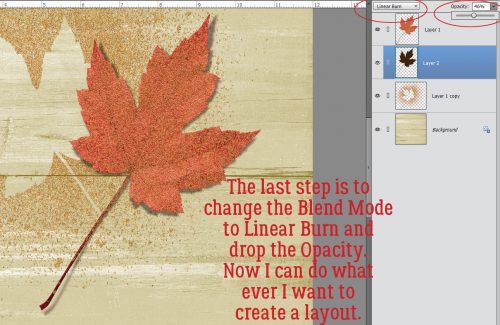
The last step I took was to change the Blend mode on the shadow layer to Linear Burn and decrease its Opacity to 46%. Now I have a neat look I can exploit on my layout however I choose.
I hope you give this a try and love your results!
- WSNH = Work Smart Not Hard
![]()
This is fascinating! I wonder if you might let us know How/Where this would be used now that it’s finished…?? (- since we didn’t see the layout you saw…) I’m learning so much, but still have lots to learn. I appreciate ALL that you offer here! ;-} Thanks!
I’m not sure what I’m going to do with it yet. I have LOTS of fall photos that I could use with it. When I figure it out I’ll post a link.
Thanks for the kind words. 🙂
Thank you Jan for this Tut. I’m sire this will come in handy for this season. I always love reading your thoughts and ideas in Photoshop.
I love this!! I like the sandy look. I’m wondering if there is a way to get it to look as if water drops have fallen on it?? Anyway, I’m bookmarking this one, so I can play with it later. Looking forward to seeing how you use it on your layout! Thanks, Jan!
Pam, your wish is my command! I’ll figure out how to do water droplets for one of my upcoming tuts.
Incredible tut ObiWan; thanks so much!! And Pam’s suggestion is awesome, looking forward to that in the future. aloha!
Awesome, Jan!! I’m looking forward to it! 🙂