A(nother) Way with WORDS
![]()
I think we’re all becoming a little pressed for time right about now. The countdown to the holidays is on and there’s always so much to do! So I’m keeping this tutorial short and sweet.
Once again, my inspiration came from an image that popped up in my Facebook newsfeed. Julie’s gorgeous layout, using a kit created by Fayette for PickleberryPop, first caught my eye because of that fabulous word art “Believe”. I HAD to use something similar and thought it might make a good, quick tut. So here it is!
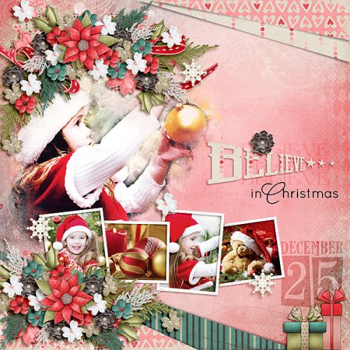
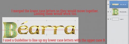
I still have photos from my 2014 trip to Ireland that I haven’t scrapped with yet. When I saw Heartstrings Scrap Art‘s The Bigger Picture 9 collection of templates, I knew right away that I had perfect photos for them. So of course, I used Magical Scraps Galore‘s Be Brave kit for its Celtic flavour, with the addition of a couple of flowers from Heartstrings’ Nature Captured (to pull the colour of the rhododendron from the photo), to scrap a layout using one of the many photos I still want to showcase. The alpha that came with Be Brave worked well for this, but any font or alpha you like will also work. Just remember if you’re using a font, you’ll need to Simplify the layer to give you flexibility in altering it. I arranged my alpha for my title with the initial capital larger than the rest. Then I merged the lower case letters, but you could just link them together by selecting all the letters then clicking on the little chain icon between the eyeball and the thumbnail.
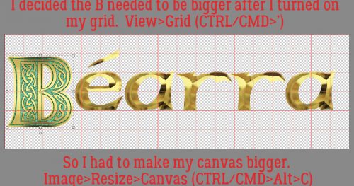
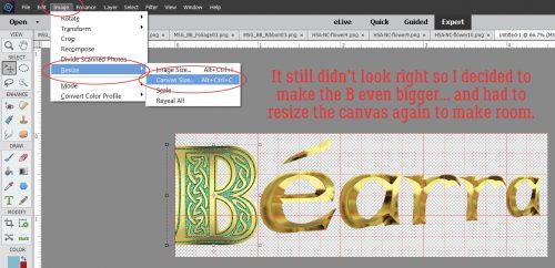
I applied a Grid over my image by using the WSNH (Work Smart Not Hard) keyboard shortcut CTRL/CMD>’. The B still wasn’t big enough for how I wanted my title to look. So then I had to Resize my Canvas. Image>Resize>Canvas [CTRL/CMD>Alt>C] Below is another image showing these steps.
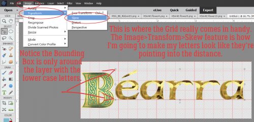
Now for the magic! Image>Transform>Skew will let me shrink my title into a wedge, just like the word art in Julie’s layout. I decided I was only going to shrink the lower case letters, but you can do whatever makes you happy. Using the grid’s lines as reference points. I moved the corner handles at the far right of the Bounding Box toward the centre. I kept the two corner handles on the same vertical line.
I still wasn’t satisfied with the size of the B so I went through the Image>Resize>Canvas steps again to give me room to make it bigger.
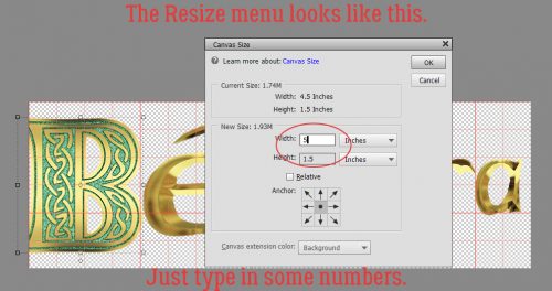
When the menu box opens up, you can simply type in the new dimensions of your canvas. If you want to enlarge the whole canvas by the same amount in both height and width, click on the Relative box and it’ll automatically do the math for you.
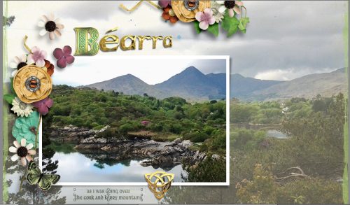
This is what my title looks like on my layout. It gives a sense of distance and movement, don’t you think?
So you see, quick and easy doesn’t have to also mean plain!
![]()
What a cool effect on the title — yes, it does give it a sense of movement, depth & dimension — I love it!! Your layout is beautiful!! Using the big picture templates does your gorgeous photo justice. That must have been an awesome trip! Thanks for another great tutorial!!
AMAZing! The Layout – and the Tutorial! Thank You! ;-}