Cuttin’ It Out – Old-School
![]()
Since I’m essentially house-bound while my husband recovers from his knee injury, I’ve started a decluttering project – something my daughter would say is LONG past due. (She calls me Queen of the Hoarders, which may be a slight exaggeration. Slight…) I’ll never be a minimalist, but a girl’s gotta start somewhere right? So as I was flipping through some back issues of Canadian Scrapbooker (to see why they hadn’t already been recycled), I found some paper layouts that I thought could make interesting digital techniques. The paper scrapper (Erin Morehouse of Beaconsfield, Québec) who created the layout shown below used a Silhouette Cameo to die-cut the letters from her background paper. I’m going to show you how I scraplifted her layout digitally; it’s my Designer Spotlight challenge layout for November, using pieces-parts of several kits from JoCee Designs.

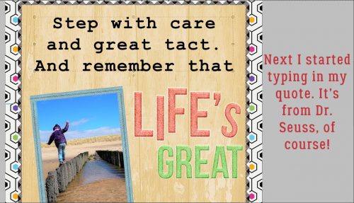
First I had to find a photo and a quote that would work together. Then I collected up my supplies.

Once I had the bare bones in place, I added in the alphas I wanted to use. They form a message all by themselves, don’t they?

Then I went on to choose a serif font with enough presence to work for the die-cut technique. It was a lovely surprise to see I could use a system font, one that’s accessible to everybody. Courier New Bold is perfect for this.

I had an idea how the text should look, so I typed it out as you see it below. I went BIG.
But it was a little too sprawly for me, took up too much space on my layout. So I adjusted it by squishing it a bit – still the same height, but not as wide.

That was much better. Before I went on to the next step, I Simplified the text. Otherwise I ran the risk of messing it up when I used the Type tool again. And I needed to be able to beef the letters up a bit.

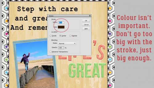
The easiest way to make these letters more stocky is to apply a Stroke to them.

Colour isn’t a factor for this part, because the text is only temporary. So use whatever colour you want. The stroke needed to be big enough to give me the effect I was looking for, but not so big it blunted the text. And it had to be centered on the edges of the letters so it would follow the letters’ contours exactly AND be connected to the text.
My text now has good bulk, without obliterating the open areas in each letter.

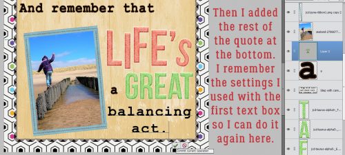
I went on to add in the rest of the quote. I used the same tweaks on these text layers for conformity. See the difference between the free-standing letter ‘a’ and the ‘a’s in “balancing”?
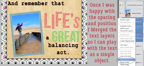
After I had my text positioned where I wanted it, I Merged the text layers so I could continue to play with the text as a single object.
Next I moved the text layer underneath the background paper layer. (This step isn’t necessary, I did it to show you how the process will work from this point.) I Selected the text by CTRL/CMD>clicking on the layer thumbnail in the Layers panel. See the marching ants? Then I Edit>Cut (CTRL/CMD>X) the paper away where it overlies the text.

The text layer is visible again.
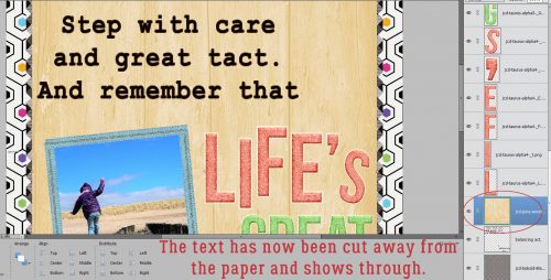
If I turn off the layer’s visibility, the gingham paper behind it shows through. (Unreadable as it is…)

So I no longer needed the text layer, and could just Delete it.

I had a number of patterned papers in my layout folder so I started adding pieces of them behind my words. Some needed to be resized to work correctly.

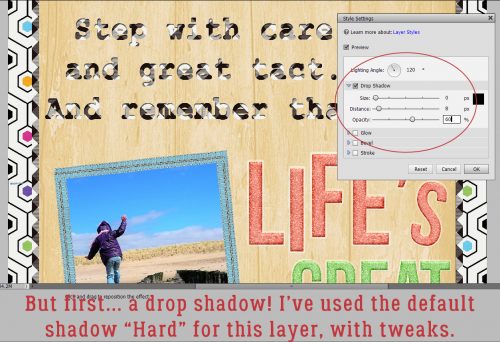
But to see the full effect, I opted to add a Drop Shadow to the woodgrain paper layer. No fancy footwork here, just a simple, Hard default shadow. I made some little adjustments to the shadow by double-clicking on the fx icon to the right of the layer in the Layers panel.
Now, when I added in my patterned papers, I could see the shadow and gauge the way it all looked together.
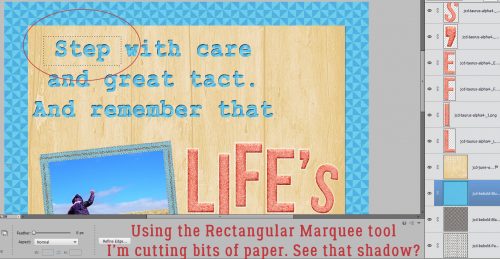
I only want this blue paper behind “Step”, so I used the Rectangular Marquee tool to select an area of the paper that would completely fill the word. Then I Inverted the selection to cut away the excess paper. Select>Inverse or CTRL/CMD>Shift>I…

then Edit>Cut or CTRL/CMD>X.

There we go!

I did the same steps for each word, although I worked randomly, until I had all the words backed with patterned paper.

Then I took another look at the original layout and realized I hadn’t removed the little bits from the open letters that would be impossible to work with using paper and a die-cutter.

So I erased all those little areas.

Then all that was left was to adjust the drop shadow again. Pretty cool!

Now, if you were expecting to see my finished layout here, I’m sorry to disappoint you… My laptop froze just as I finished up my screenshots and I had to do a hard reboot. (There seems to be some sort of instability with PSE 15 and Windows 10 because this freeze happens unpredictably, but frequently, when I have PSE open.) I have to start my layout over from scratch, but I have these screenshots to help me out. Then I can get back to purging…………
![]()
As my hubby would say ” I see you have forgotten where the save button is” LOL. I too have had this happen to me with a number of programs and an older laptop. I have even closed it myself and forgot to save. I set a timer to remind me every 15 min. and after about 3 months it became a habit and now I don’t need the timer.
So that is the first thing I thought when I read your comment. Thanks for all the great tutorials you do for us.
Have an awesome week 🙂
I’ve tried reminding myself to save every so often but it has never become a habit. When I’m in the throes of a tutorial, I’m simultaneously working on the project, taking screenshots, doing and undoing, flipping between screens and juggling so many things. You’ll be happy to know that redoing my layout took only about an hour; you might notice also that I made some changes to it.
You are all very welcome! It makes me really happy to know people are enjoying my feeble offerings.
I love the cut-out text!! Thanks for showing us how to do it!!
I use PSE also maybe we could ask them for an autosave !! Maybe it already possible, I will look around and see what I can find out. If I find anything interesting I will let you know. Sorry I have never thanked you before. I never actually realized before that there was a comment area at the top. Old eyes and small laptop 🙂 I love that your tutorials are easy to follow.
It would be a lifesaver if PSE had autosave!
When I was asked if I would write tutorials for the GS Blog, I knew I would want my lessons to be easy for anyone at any level of proficiency to follow. That’s why I use so many screenshots and put the instructions on both the screenshot and in the text. Because I’ve worked in pediatric critical care for 23 years, I’ve learned how to explain complex concepts in simple terms – knowledge is power!
Great tutorial, I love the cutout text. I’m going to have to try this out! Thanks
You do a great job of step by step instructions and screenshots. Thank you for sharing all you know!
When I want to bold a text, I have put a stroke on it, or I duplicate the layer then offset it by 1 or 2 spaces down and over. Usually works pretty well.
Thanks Kathi. I do the same things with text! Offsetting can be REALLY great for bulking up cursive fonts, as long as the up- and down-strokes aren’t really skinny.
I love the look of cutouts! Very fun tutorial and very well done. Thank you.