Any Way You Slice It
![]()
After last week’s tutorial went out and I posted my Possibilities layout there were several comments about the photo treatment I used. Well, I actually stole it from a paper layout I saw in an old issue of Creating Keepsakes. Sort of. The digital version is a lot less labour-intensive and creates no mess or destruction. No glue either. So I thought that might make a suitable topic for today’s tutorial!
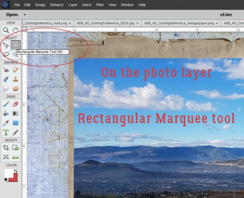
I started out by adding a new blank layer above my photo layer. That can be done simply by clicking on the little piece-of-paper icon at the top of the Layers Panel. Then I activated the Rectangular Marquee tool. (CTRL/CMD>M)
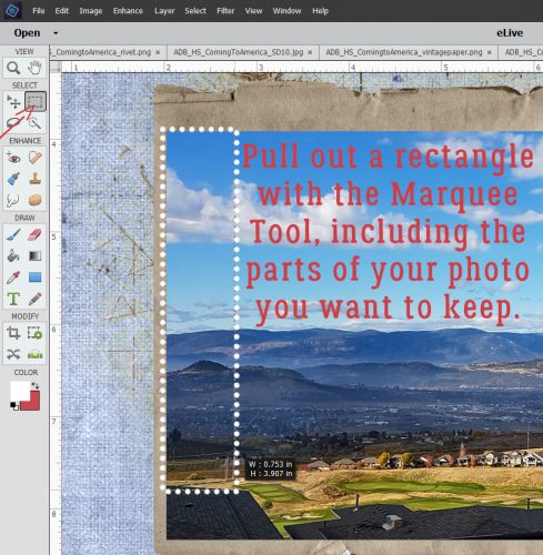
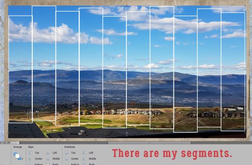
Next I pulled out a narrow rectangular selection along the left edge of my photo, including the parts of the photo I wanted to keep and excluding the part I didn’t – who wants to look at a roof?
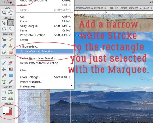
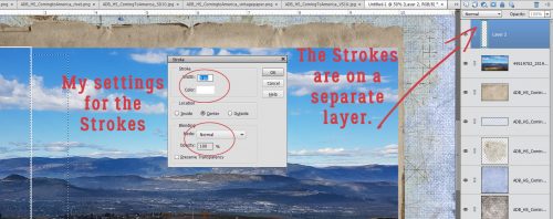
Then I added a narrow white stroke around the selected area.
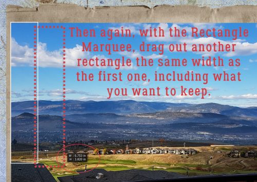
Then I dragged out another rectangular selection from my photo. See that little dialog box with numbers in it? That’s a great tool! It tells you the dimensions of whatever shape you’ve dragged out, therefore allowing you to keep the width or length of your selection identical. (Or you can just CTRL/CMD>J it and make an identical copy that you can then adjust to whatever dimensions you want…)
These are the settings I used for all my strokes: 5 pixels in width, centered over the selection, white and 100% visible.
I made a bunch of copies of my second rectangle and moved them over, which let me really WSNH (Work Smart, Not Hard) by skipping a lot of steps. I left the width the same but stretched or shrunk heights as I went. Once I had the whole photo “sliced” up, I Merged the frames.
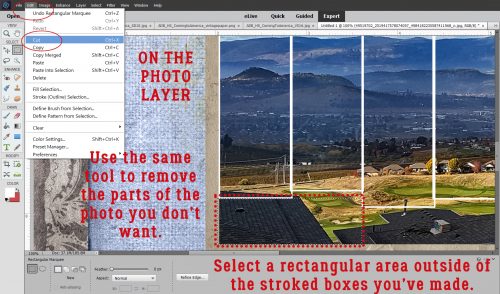
Then I moved back to the photo layer and, still using the Rectangular Marquee, I started selecting the areas of the photo I didn’t want to keep. Then I Cut those areas away. (CTRL/CMD>X)
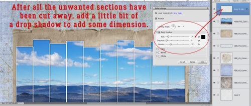
All that was left was to apply a hint of a drop shadow on the frame layer to give the whole thing a little dimension. The shadow settings I used were Angle: 90°, Size: 16 pixels, Distance: 0 pixels and Opacity: 18% with the colour being black. I didn’t add a shadow to the photo itself.
It’s really that easy!
![]()
I love the look of this technique! I never remember to use it and your method is easier than others I have seen. I need to use it soon so I remember how fun it is!
thanks!
You know my goal is to make things as easy as possible!