Quick Trick: Twisted Template
![]()
What do you do when you really want to create a layout, can see it in your head, want to use a template but don’t have one that matches the layout you see in your mind’s eye? You alter one to give you what you want! Let me show you.
I had a vision of how I wanted to use some seaside photos I took on my first trip to Ireland. I wanted a blended/masked area for the lighthouse and two horizontal photo spots for the other photos I wanted to include. I went through my templates, using the keyword search technique I shared with you many tutorials ago. But alas, I didn’t have anything in the dozens and dozens I looked at that would work. But I DID find one that could be twisted to my purposes, so I went with it.
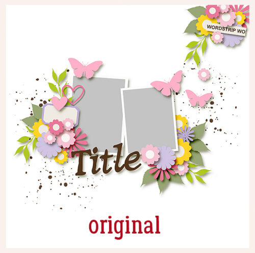
This is what I chose. It’s from JB Studios’ JDoubleU V.29. It doesn’t have a blended/masked area, but it does have potential white space where I could add one. And the photo spots are vertical, but that’s fixable too!
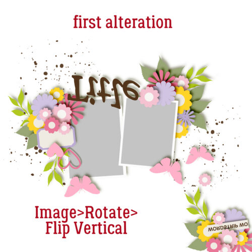
The first thing I did was to decide how I wanted the page to be oriented, then made some decisions about how to get there. I clicked on Image>Rotate>Flip Vertical. (I know… still not horizontal, but give me a minute!)
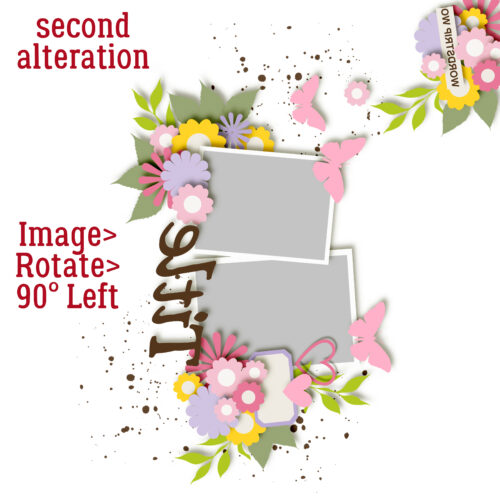
Here’s how I got them oriented correctly. Image>Rotate>90° Left. There’s still no white space for my masked photo, but don’t worry! It’s coming!
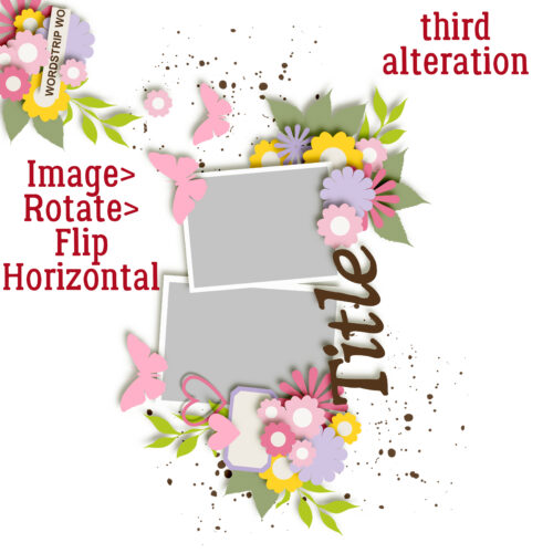
But first, I had to put the clusters toward the centre of the page, not the left edge. So I clicked Image>Rotate>Flip Horizontal. Getting close now!
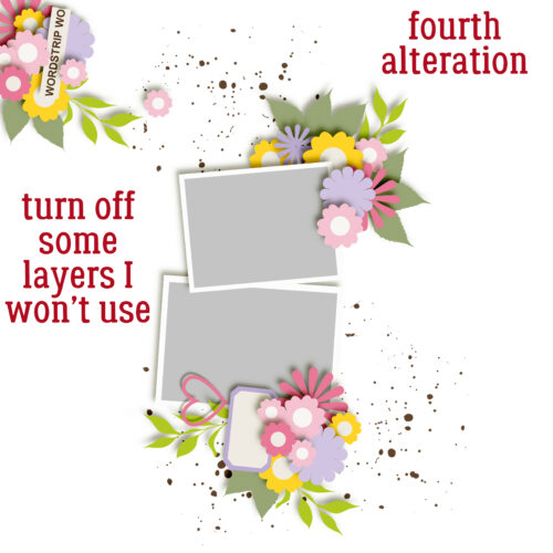
I decided there were some elements there that I wasn’t going to use, so I just made them invisible. Now I can get things sorted.
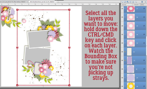
I wanted to move that entire centre block of photos and elements over to the left of the page. I could do it one item at a time, but that’s not my schtick! So I Selected all the layers I want to shift by holding down the CTRL/CMD key and clicking on each layer, one at a time. It sounds time-consuming but it takes little more than a minute or two. I kept one eye on the Bounding Box so I could avoid including things I didn’t want in there. Once I had all the desired layers Selected, I just… moved them over!
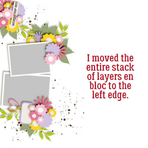
I also nudged it up a bit. The cluster in the upper left corner could stay there, but I don’t think that’s what I want. I’d like to have a cluster in the lower RIGHT corner!
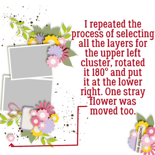
So I used the same process to Select all the layers there, and moved it too. There was one random little flower left out in the field, so I moved it down. Now to create a layout…

I used a mask from Prelestnaya-P, who was a GingerScraps designer once upon a time but isn’t currently. You might notice that the lower of the two horizontal photos has been made a bit wider; I wanted more of the waterfront in there. I’m quite pleased with the result. It looks nothing like the original template, and it was easy to achieve!
The next time you hear from me, it’ll be Designer Spotlight time again! August’s a two-fer and you’re going to love what I learned about these two ladies. See you later!
![]()
Speak Your Mind