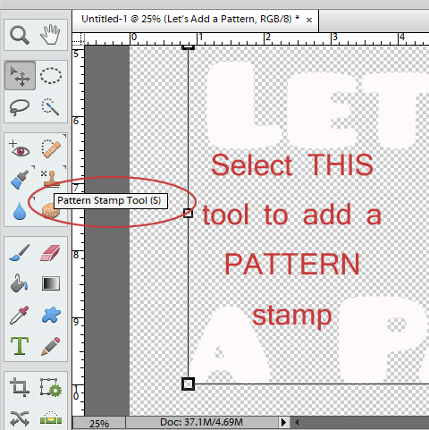
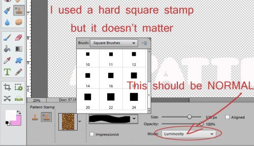
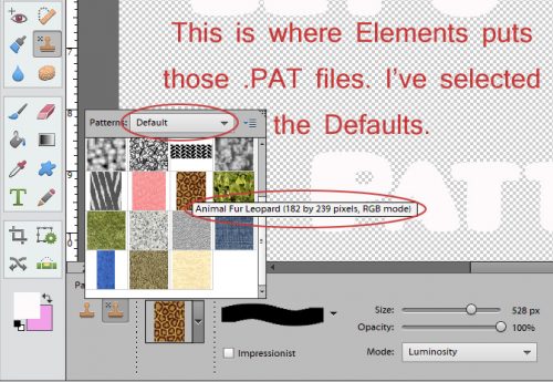
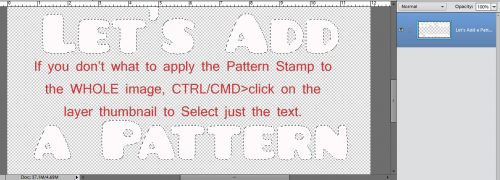
How’d You DO That?!! Fontography Demystified
![]()
Have you ever looked at a magazine layout or a scrapbook layout and immediately been captivated by the combination of fonts used? Or, alternatively, looked at one and thought, “Wow… that looks… umm… really weird”? And what about all those Pinterest pins that show font combinations… how were they arrived at? After I put together the tutorial on chalkboard art, I had several people comment on how the fonts I chose looked really good together. But I’d never really broken down the process of choosing font combos. So I’m going to share some basic thoughts about how to pair fonts to make your layouts look pulled together, appealing and well-designed.
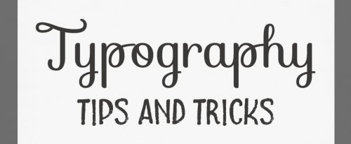
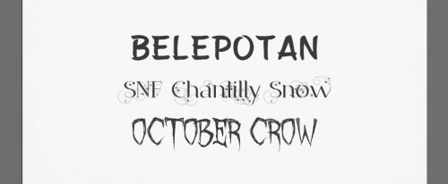
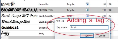
The fonts I’ve combined in my examples will be named in the screenshot following for each of these tips. Here’s the first combo.
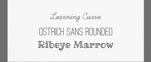
When you’re thinking about pairing fonts, the first consideration is choosing fonts that compliment each other AND your topic. Think about the layout you’re designing and the mood it creates. Does it have a strong personality? Look for fonts that match the mood and personality of your photos, elements and arrangement. The sample below has two Art Deco era fonts in it. See how they work together? They’re from the same general era, so they should look like they belong together.
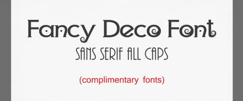
These are the two fonts I combined for my sample. They make me think of the Roaring 20s, flappers and bathtub gin.
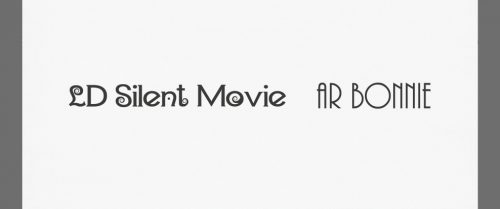
Now see how the wrong pairing can just look odd? They’re of similar weights (more about weight in a minute) and are both bold fonts, but they have nothing else in common.
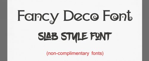
Even the names the designer gave them aren’t complimentary!
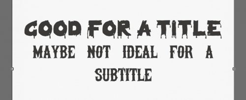
Next you want to consider something called “visual hierarchy“, which is a $10 phrase meaning “Who’s the boss”. In my sample below I chose a heavy slab-style creepy font for the title and a somewhat less weighty, condensed font for the subtitle. You can easily see that had I done it the other way around, the title wouldn’t command much attention.
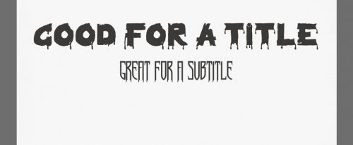
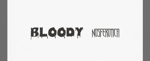
I love Hallowe’en so I have a selection of these gnarly fonts for my related layouts. (Sometimes the names the designers give them are a little risqué.)
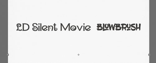
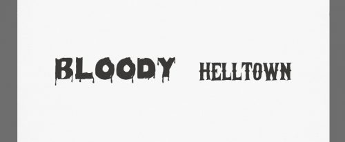
Here’s another combo, one that isn’t quite right. The two fonts, although they’re both similar in mood, don’t work as well together. It’s not horrible, but it wouldn’t be my first choice. This is where your judgment and your “design eye” come in.
Great names!
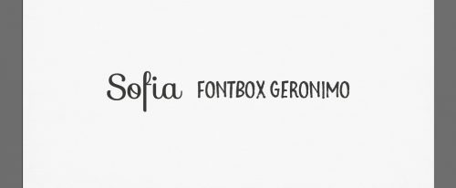
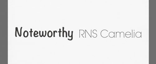
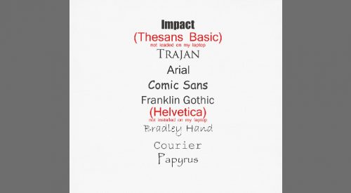
Let’s talk a little about context. In this case, the definition we’re going to use is this one: “the set of circumstances or facts that surround a particular event, situation, etc.“. I touched on it briefly when I talked about complimentary fonts. But there are some other aspects that need attention too. For example, subject matter; the first font in the screenshot below would work beautifully for a layout about building a new home, or racing motocross, or even one about guys doing guy stuff. But it wouldn’t do for a wedding layout, or one about a tea party with your grand-daughter.
Another aspect is what you’re communicating with the font. The swirly, curly, girly font on the second line isn’t readable when all caps are used. It would be perfect for a title or subtitle on a tea party or wedding layout when used appropriately. So always think about how you’re going to use the font, and about readability. If you use a tiny, condensed font like the third line it may be difficult to read. For journaling you’re going to want it to be a clean, easily read style in a size that doesn’t require a magnifying glass, particularly if you’re going to print your 12×12 layouts in a smaller size, like 8×8.
These are the fonts I used in my sample above.
This concept is pretty simple. Serif fonts are the ones with those little extra bits that extend from letters as shown in the top sample, and are absent in fonts described as sans serif. (“Sans” means without in French.) You can think of them as a little bit more formal for serif fonts and a little more casual for sans serif fonts.
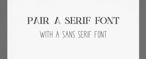
These are the fonts I paired above.

Alternatively you could pair a sans serif font with a serif font as I’ve shown below.
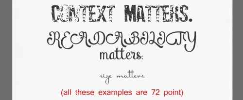
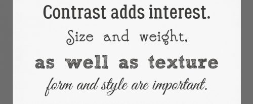
Next, let’s talk about contrast. The four fonts I’ve chosen for this sample all actually work together. Size and weight are important when you’re thinking about both context and contrast. I’ve used a 72 point font for all these samples so you can get a feel for these concepts.
The first example is a middle-of-the-road font with a medium size, a medium weight and a solid texture.
The second example is an attractive, light-weight, thin decorative font.
The third example is a formal, serif-style, weighty and highly textured font.
And the last example is a scripty, balanced medium-weight font.
What makes them work? They’re different, but complimentary styles. Their relative sizes vary, even though they’re all 72 point. They have different weights – you can almost feel the pressure they exert on the paper. Their forms are different too; look at the relative length of the parts of some letters that descend below the baseline. Although they’re all quite distinct, they have a similar curviness to them that tie them together. And they have variable directions of movement.
See one you liked? These are the fonts I used.
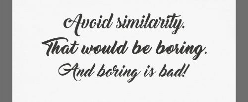
Now, having said all the preceding things, you still have to avoid conflict. See what I mean?
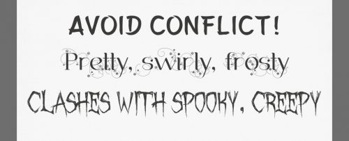
Individually, they’re all great fonts. Together, they’re a mess!
While you’re avoiding conflict, remember to avoid using fonts that are too similar. See how this example breaks all of the rules we’ve looked at so far?
Again, beautiful fonts, but just a little too close for comfort.
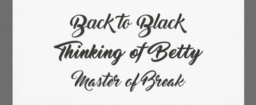
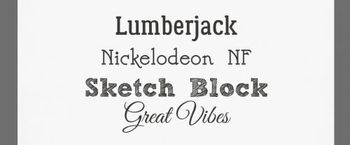
One way to be very sure of your font choices is to use fonts from the same family. The designer has created them to work together by varying their weight, their size and their texture, but sticking to a single form. Many of the fonts your computer came with are bound in families like the ones below.
Again, these examples are all the same point size, but they’re just different enough from each other to keep things interesting.

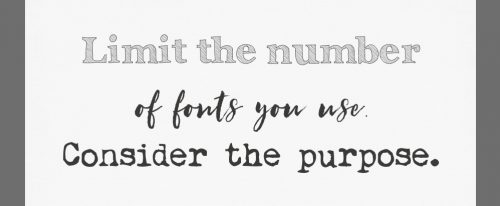
Don’t go crazy with a dozen different fonts on one layout. There needs to be some unifying quality to them and they need to suit their purpose. A good rule of thumb is to keep them to about 3. No more than 5… except when you’re creating subway art. When you’re journaling, this might help you choose. Serif fonts are better for reading quickly because the characters sort of flow one into the next with those little extra bits they have. But when the primary place your creation will be viewed is on a screen, you might want to choose a sans serif font, for their simpler, cleaner look. And remember that your journaling must be legible!
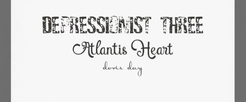
These three look pretty good together. See if you can figure out which rules they follow.
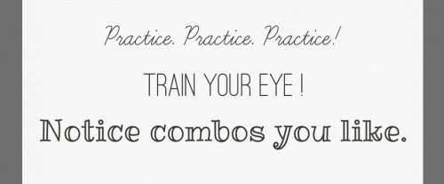
And lastly, PRACTICE! This is the only way to develop that “design eye” that lets you move from novice methodicality to intuitive, flying-by-the-seat-of-your-pants creativity. Consciously look at font combinations everywhere. Magazine layouts, product labels, memes on Facebook, Pinterest boards… the possibilities are endless. See what combinations you find pleasing and which you find jarring. Over time, you’ll find you’re not quite so indecisive about which fonts go together like milk and cookies and which are more like chalk and cheese. I actually play a little game in my head sometimes, trying to guess which fonts the designer has used, and I love it when I recognize a font, or a designer.
These are quite different from each other, but I think they look good!
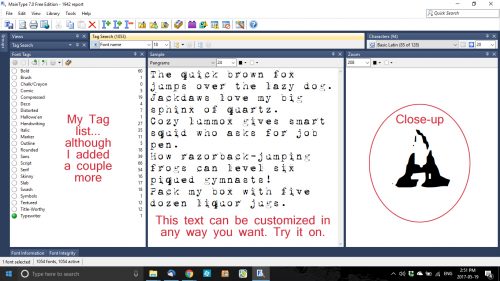
Before we wrap this up, let’s talk a bit about the fonts you should forget about… This isn’t my list; it came from Douglas Bonneville at Smashing magazine. I’d add a couple, such as Bleeding Cowboys and Myriad Pro. For the article I found this list within, and the author’s reasons why, click here.
Here’s a handy little diagram with these rules all in condensed form. It came from Creative Market, a great source of wonderful fonts at discount prices.
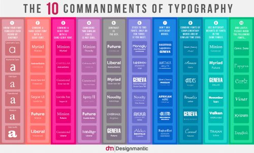
To see a larger image, click here.
Credits: Janie Kliever ; Creative Market
Have fun with your fonts! There really is no limit to how creative you can be.
![]()


