Direct Your Own SCRIPT
![]()
Wow, it’s Tuesday again already! This has been another one of those no-time-for-anything weeks, between my 48 hour work week, house-training a puppy who likes to get up 4 or 5 times EVERY night and the rest of the usual routine. I’m happy my dogs are bonded to each other, but the running in and out every 10 minutes is making me a little short-tempered. They’re worse than toddlers… but at least I don’t have to put them in snowsuits. I really haven’t had much time for scrapping since we brought this puppy home one month ago today. But I did manage to fit in a quick layout (about my dogs, what else!) for this month’s Font Challenge. I love fonts, and the Font Challenge makes it so easy to pick up new, fun ones. But I gotta tell you, I was a little unnerved that this month the featured font was in script. Don’t get me wrong – script fonts are fabulous, especially for journaling where the text is personal and emotional. But there are some script fonts that just don’t look as good on paper as they do in the font browser. You know the ones I mean. The ones where there are a lot of unnatural breaks in the flow of the text. You look at your journaling and you change the font because it just looks awful. Those of you who’ve been reading my tuts from the beginning will know I’m a little bit Type-A, a little bit OCD… things have to LOOK right to BE right. And those fonts make me totally cray-cray! Well, there’s a way to get around that!
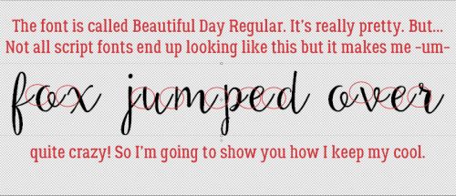
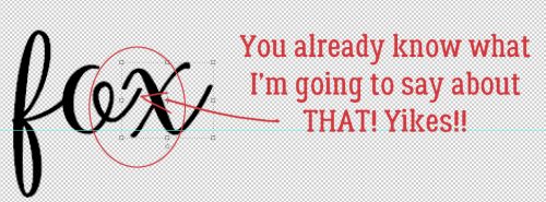
Fortunately, KG Eyes Wide Open isn’t one of those fonts that drive me crazy. It flows nicely, one letter to the next, so I got my layout finished without a melt-down. Beautiful Day Regular is an example of one that sets me right into a tailspin.
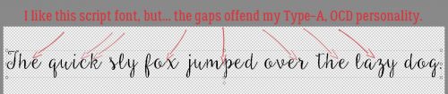
See the gaps and malaligned strokes? I like my script text to look like someone took a pen and wrote it out; not too many people have that many breaks in their penmanship unless it’s an affectation.
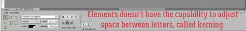
Elements is great software, but there are some things it can’t do. While it’s possible to set the Leading of one’s text (the space between lines of text) but there’s no adjustment for Kerning (the space between letters). If I’ve chosen a font that ends up offending my eye (and my personality) I delete the text and start over. The first thing I do is make a new document/project on my workspace.
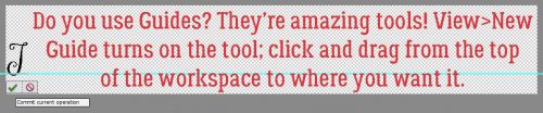
I pull a Guide down to where I want my baseline to be to make the actual process less work. Elements has Guides that are easily dragged into place; put your cursor into the space at either the top of the workspace or at the far left of it, then click and drag it to where you want it. (My workspace has the Rulers visible, so I just put the cursor on top of the ruler and drag.) Another way of dropping a Guide onto your project is to click View>New Guide. This will allow you to tell Elements where you want the Guide to go. Be aware though that unless you Clear All Guides every so often, you’ll have a confusing array of lines popping up on your workspace seemingly at will.
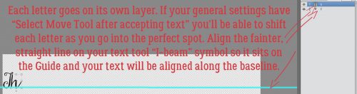
To make the process as simple as possible, I align the horizontal line of the Text Tool‘s “I-beam” cursor, a facsimile shown below, right on my Guide then click to activate it.
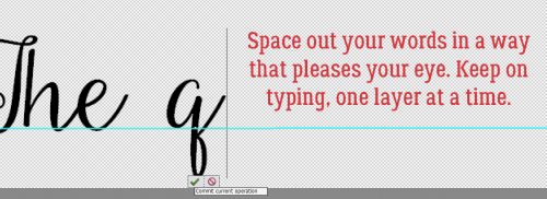
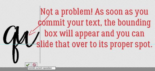
Each letter of my text will go on its own layer. I have my Preferences set so that in the General settings menu, the Select Move Tool after accepting text box is ticked. This setting turns the bounding box on as soon as I Commit current operation. Then I can move that letter into its desired spot immediately.
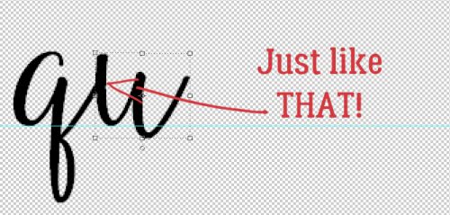
I keep typing my text out, one letter per layer.
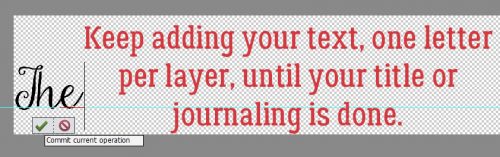
Nudging them into place right away saves a lot of time and effort.
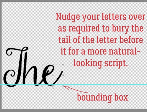
I put just enough space between the last letter of one word and the first letter of the next to make it look right.
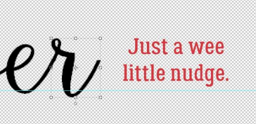
If I don’t get the next letter into quite the right place, it’s no big deal.
I give it a little nudge using my right- and left-arrow keys.
Of course, if you’re not all that bothered by script fonts that don’t flow, you’ve already stopped reading.
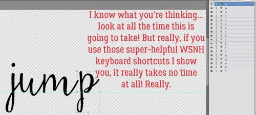
I’m sure you won’t believe me when I tell you this, but it took me less time to get to this part of my text, typing it out one layer at a time and nudging than it has taken you to read this tutorial up to now. But it’s true. I use the keyboard shortcuts I show you to make it so much quicker. To engage the Text Tool for each successive letter, I click on the “T” – just the “T” – and it opens up. Then I click on my baseline, type my letter, click OK and nudge it. 5 seconds.
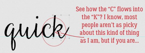
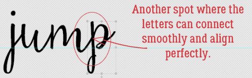
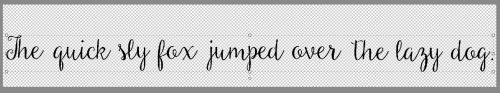
I’m so particular about how my text looks, I make sure the strokes for each letter line up.
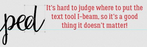
It’s hard to know exactly where to put the Text Tool cursor on the baseline, so it’s a really good thing that it doesn’t matter at all!
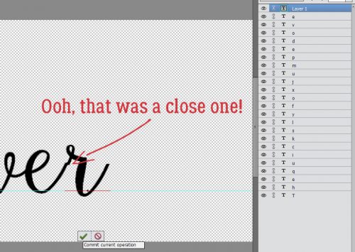
Sometimes I get lucky!
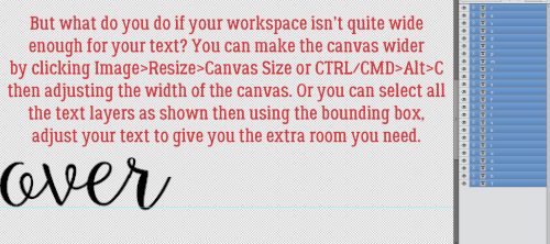
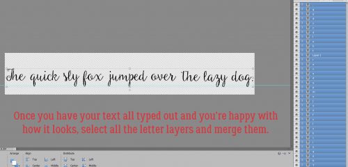
Okay, so. If you’re anything like me, you find yourself with not enough room to say what you want to say in the way you want to say it. If you need more room there are two ways to accomplish that. One is to make the canvas wider, the other is to make the text smaller. Image>Resize>Canvas Size or CTRL/CMD>Alt>C will open up the menu to make your canvas bigger, in whatever direction you need it to. Or, you can select all the letter layers in the Layers panel, and shrink them to fit.
After I was finished typing out my text and had it looking the way my mind says it should, I selected all the letter layers and Merged them. That can be done by right-clicking and choosing Merge from the menu, or with CTRL/CMD>E.
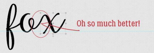
Perfect!!
I’m so happy that my tutorial on unzipping files was so well received. When I sit down to write my tutorials, I’m never sure if I’m giving you, the GingerScraps community, information you can use. Sometimes, it seems, I get it right. Please do offer me suggestions on topics for future lessons… I appreciate the feedback!
![]()
Akkk! No kerning, no way! Gotta have the kerning. This one letter, one layer will do for a title, but argh, for journaling, no. Or only really short journaling. You gotta really real LOVE that font too go one by one. As always Jan, you amaze me. But, patience I have not. At least I know that about myself.
Aloha, friend.
And why does swipe always put too when I swipe to? Strictly rhetorical.
;)g
Thank you. I don’t know if I was aware of the little cross line on the I-beam! Duh!
It sure helps!
I too have been bothered by fonts that leave the space between letters! Why, oh why, would they create it that way?? I have to say, you must work really fast because this sounds like a long process to me. And I am so slow as it is … Question? You should us how to do this with one sentence; which would work for short journaling or a title. But have you done this with a block of journalilng? How would you do this if you have a small journaling spot; or the journaling takes several lines? How then do you set it up on your blank canvas, or how do you get it to fit the spot when you take it over to your layout? I can think of ways to do this, but I’m wondering what the quick & simple way is.
Thanks for the tutorial, Jan! I really love this one. Maybe someday they will add the kerning capability to PSE!!!!
I agree, it would be an incredible amount of work for a long story. I typically use this technique just for titles, subtitles, tags and captioning.
I would love it if they’d add kerning to PSE. As I said in my reply to Glee, it’s far too labour-intensive for lengthy stories. If I WAS to use this technique for more detailed journaling, I’d make my canvas proportionally the same dimensions (height x width) as my journal blank and just type in the same manner as I’ve described. Once I’ve got the text looking the way I want it, then I’d resize it to fit into the constraints of my journaling spot. Another way of doing it would be to create a new layer above the journaling blank then turning visibility off to the journaling blank while I typed my text. Gotta say, I’d really have to LOVE the font to go to all that effort.
Thanks for the tips! Generally, I’m not into a lot of journaling. I tend to keep it short & sweet, but you never know!
I love reading your tutorials. I have learned so much from them. Occasionally, a tutorial really excites me: this one did! I am also a very picky person, so I have avoided using many lovely fonts because of poorly aligning letters. I usually create my own greeting cards, which usually only involves a few sentences at best; therefore, this tip is a great discovery for me. Thank you for all of your hard work presenting these tutorials to us!
Thank you so much for your kind words. I’m happy to hear that people enjoy my tuts and will be able to put the lessons to use. I think greeting cards will be the perfect application for this one.