The TutOR Becomes the TutEE
![]()
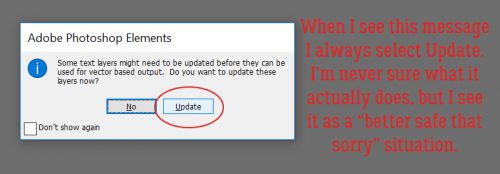
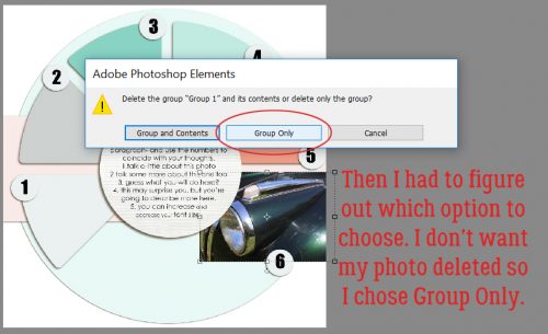
I finally did it. I upgraded from PSE 12 to PSE 15. And discovered there was a significant learning curve to jumping over 2 editions!! But coincidentally it allowed me to figure out a problem brought to me by Lisa (slfam), who uses PSE 14. She had downloaded a free template and was diligently following my instructions for clipping photos and papers to the various shape layers, only it wasn’t behaving for her. I downloaded the same template so I could see exactly what was happening and maybe help her out. Her first question related to this pop-up.
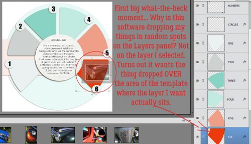
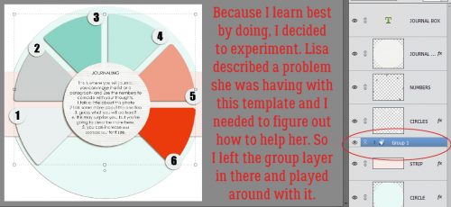
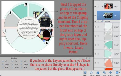
I opened a bunch of photos to play with and started working my way through adding some photos, which was the root of Lisa’s second issue. And almost right away I had a problem. When I dragged my photo onto the template with the layer I wanted to clip to selected in the Layers panel, it didn’t go where I expected, but landed in some random spot nowhere close to its target destination. And it happened over and over and over. Totally random, at least to my eyes. Geez Louise! Off to Google I went. There I learned that in order to have an item go to the layer you want, you have to drag it over the area where that layer shows in the template. In the screenshot you can see the grayed-out photo sitting over the #6 photo spot. When I did that, it went onto the layer where I expected to find it. The software still dropped it right into the centre of the workspace, but it was on the right layer.
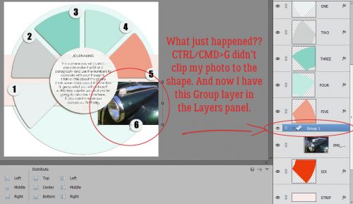
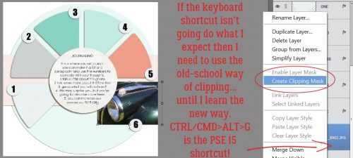
Being a WSNH scrapper, I used the (CTRL/CMD>G) keyboard shortcut I’ve been telling y’all to use to create a clipping mask, only to have THIS happen. It seems Adobe added some features that have always been available in the full Photoshop to Elements in version 14, and now that shortcut, rather than clipping, creates a “Group” of layers. I wasn’t sure how this was going to make my life better, and for the moment it was really a pain! (I’ll also confess to some confusion – no one had mentioned to me in the comments that there’s been this shortcut overhaul.)
The easiest cure for that was to CTRL/CMD>Z my way back to safety, but I thought, “Why don’t you see what else can happen here?” So I right-clicked on that Group layer.
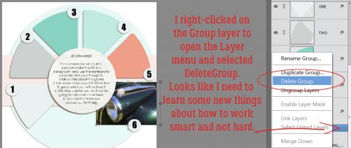
Faced with the menu shown below, I had to decide how to proceed.
Once I’d gotten rid of the Group, I used the more-steps method to clip my photo to the spot, right-clicking on the photo then selecting Create Clipping Mask. It worked. But I like my keyboard shortcuts, so I went into the Layer menu tab to find it. And there it was, CTRL/CMD>ALT>G … and it worked! So now I need to teach my fingers some new moves.
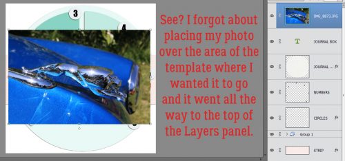
The next photo I dragged and dropped went to the top of the Layers panel because I forgot to hit the target with it. Heavy sigh.
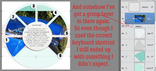
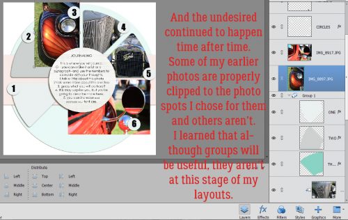
And look, I’ve got another Group layer in there. So even when I used the CORRECT shortcut, I ended up with something I really didn’t want. Gah!
Time to get serious. Lisa had described using the CTRL/CMD>G shortcut then right-clicked for the Clipping Mask on photos she’d stacked above the Group layer and having bits of other photos overlapping onto several photo spots. To figure out how to correct that, I had to first make it happen.
I did what it sounded like Lisa had done, adding more than one photo to the Layers panel then clipping them. And now I knew what was happening, because it happened for me too.
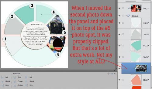
Once I had it figured out my next task was to figure out a work-around. And that meant a lot of extra steps, moving photos down the stack of layers to the spot I wanted them in and then clipping them. Um. No.
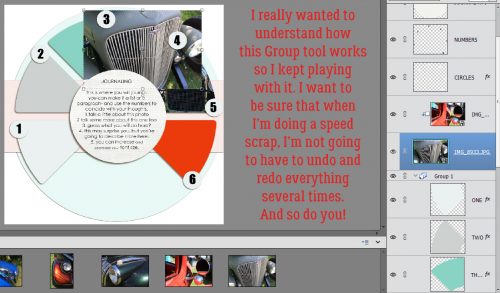
Since I was taking this opportunity to learn some new things, I just kept trying different things. (I play Words with Friends the same way. And make some really weird words just by trying combinations of letters.) I love a good speed scrap and I hate having to start over because something I wasn’t expecting has happened. Neverland Scraps is hosting one on Thursday, so I had to get this sorted out.
Of course, there were bumps in the road that I had to puzzle through. I did some research into Groups and found that they are very useful, especially when you’re working with LOTS of layers. You can select all similar layers – let’s use a paper stack as an example where you’ve clipped papers to shapes – and then CTRL/CMD>G Group them into a folder. They’re all still there but they’re not all individually taking up a spot on your Layers panel. However, in the early stages of working with a template, Groups‘re only in the way.
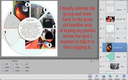
After I deleted the Group layer, taking what I’d learned about positioning my paper/photo/element over the spot on the template where I wanted it to go, I placed all of my photos successfully onto the template.
I was back in charge!
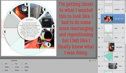
From that point on things went the way I wanted them to, the way I was used to them going. I felt confident that I could go on to work with a much more complex template and git ‘er done.
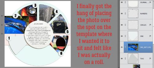
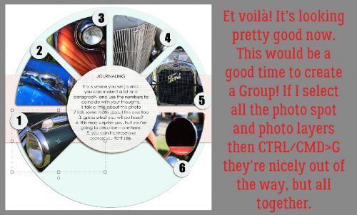
All my photos are place and cropped to their best advantage and I’m happy. Now I could Group all those photos and photo spots together so they take up less real estate on my Layers panel.
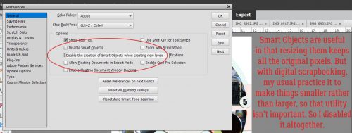
I know there’s a lot more I’m going to learn as I get comfortable with PSE 15; there are new options in the Preferences menu now so let’s look at those. To get there you’ll click on the Edit tab then choose Preferences from the drop-down. In the first General Preferences menu there’s an option that says Disable the creation of Smart Objects when creating new layers. Smart Objects can be resized without losing any of the pixels in the initial image. That’s important when you’re shrinking an object then want later on to enlarge it again. For me though, I found Smart Objects to be a major PITA. Dragging from the Project Bin onto the Workspace in PSE 12 made every item the same size as the canvas… 12×12 buttons, for example. Then I’d need to shrink to fit. The work around for that was to drag them OFF the Workspace and onto the layout in the Project Bin. Extra steps. Most of the time I’m shrinking things and not making them bigger, so in PSE 15, I disabled Smart Objects.
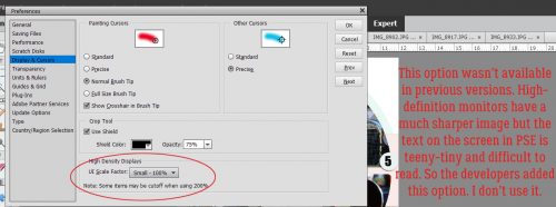
Skipping down to the Display and Cursors menu, another new option appears. It’s for high-density display users. My new laptop has a high-resolution monitor and the recommended setting is 1920×1080 pixels. But software created before the advent of high-resolution monitors shows up with all the text in an itsy-bitsy-teeny-tiny-hard-to-read size that can be a big problem for people not really familiar with their Workspace. (You might have noticed that in last week’s tutorial. I didn’t know how to fix it… now I do.) Adobe added this option to increase the UI Scale Factor to 200% to make the text easier to read. I find the enlarged images worse, so I don’t use this option. I know where things are on the screen so when I’m scrapping for me, I leave it as is. If I’m working on a tut and want you to be able to see what I’m doing, I change the screen resolution in the Control Panel to 1600×900 while I’m working, then put it back when I’m finished.
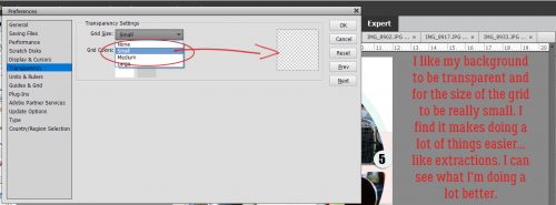
For the Transparency setting, I chose the smallest grid size available. It’s less distracting and makes a few tricks easier to perform. I always work with a transparent background – you do what works for you.
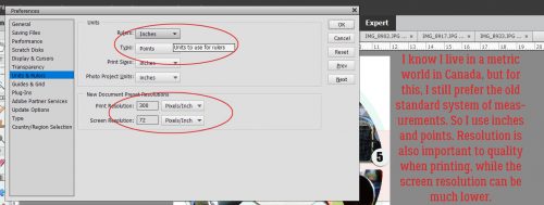
I still prefer to work in Standard measures for most things; although I’ve almost always lived in Canada and we went officially metric decades ago, I find myself doing conversions in my head all the time. So I’m glad Elements gives me the option of setting my Units and Rulers to inches. I use Points for text because it’s easier to understand than pixels. And Resolution is important for printing when you want the crispest, clearest images possible so most people work at 300 pixels per inch. For working purposes though, 72 pixels per inch – what you see on your screen – is good enough.
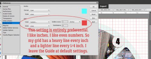
This menu is for the more… er… particular scrapper who likes symmetry, geometry and order. It also is handy for speed scrapping where the instructions might say, “Place your large photo 1/2 inch from the left edge of your layout and 2 1/4 inches down from the top.” I’ve shown you how to use the Guide before.
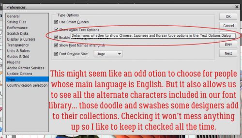
Last but not least, if you’re interested in trying some text modifications, make sure you’ve checked the Show Asian Text Options box. That will let you warp text and also to use the alternate characters included with some fonts.
And then there are the Guided Edits! Even the Basic ones can be quite handy.
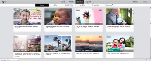
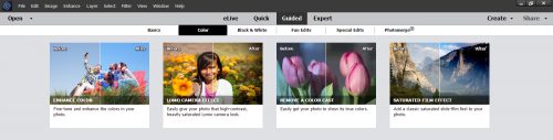
These ones offer some quick ways of improving the colour of our photos with only a few steps.
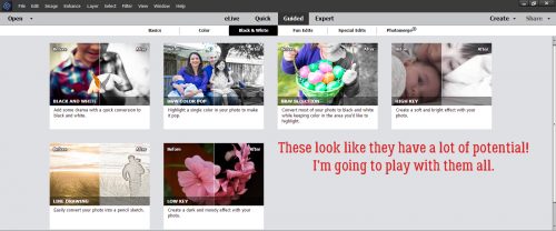
Can’t forget about Black and White! Sometimes a black and white photo has much more visual interest than a colour one. It’s also a good choice when your photo’s colours don’t work with your layout.
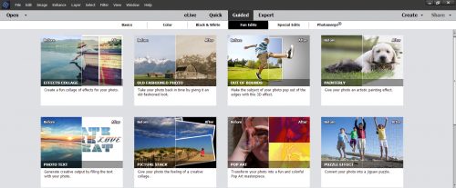
More quick-and-easy edit options! Fewer steps, great outcomes… the essence of WSNH!
Stunning visual effects! Awesome for those artsy layouts.
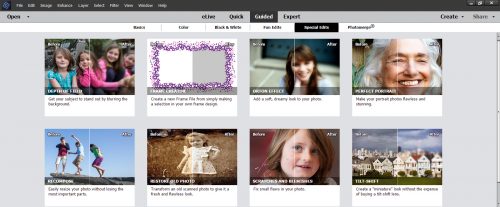
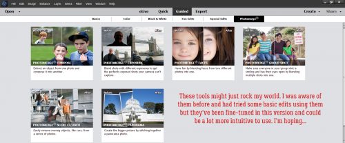
This set of tools will really let your photos shine. They’re especially good for those sightseeing photos where you just can’t keep people from getting into your shot. You can take several shots a second or two apart then merge the unobstructed portions into one clean image. Or you can take those group shots where everybody but Uncle Joe looks good and merge them with that shot where Uncle Joe looks great but cousin Mary has her eyes closed. The possibilities!!
I can see lots of ideas for future tutorials here while I teach myself to use these powerful tools! If there’s something you want me to try, let me know and I’ll take it on.
*Note* The template used in this tutorial was created by ForeverJoy Designs https://www.foreverjoydesigns.com/2017/08/15-minute-memory-challenge-august.html
![]()