More FUN with FOTOS
![]()
I hope everybody’s having a good week. I’ve been crazy-busy almost every day of my “vacation”, which around here just means I don’t go to my job. This time of year there’s always so much to do and I’m tired of looking at leaves. All over the yard. In the flowerbeds. On the sidewalks. On the porch floor. Stuck to my dog… But for today, I’m going to pretend I love them. (I do, when they’re in photos!)
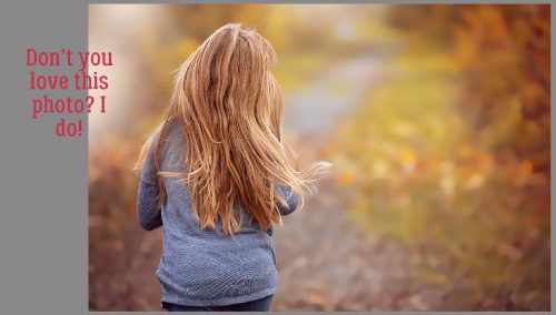
This week we’re going to play with another Fun Edit menu in the Guided Edits tab of PSE 15. I originally planned to do something with the Out Of Bounds menu, but really wasn’t happy with the results so I scrapped that and chose to go with Painterly. Don’t be alarmed by the number of screenshots in this tutorial. The technique literally takes minutes to achieve fabulous results. (I know, I’ve redone this one about 6 times.) Here’s the photo I played with, courtesy of Pixabay.
In Guided Edit section, I went to the Fun Edits tab and looked at my options. The neat thing about this version is that if you roll your cursor over the images in the menu you can see each of the effects in action.
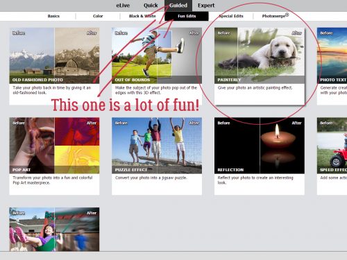
The Painterly menu looks like this. We’re going to work through the technique step by step, starting with the Paint Brush. Down at the bottom of the menu there are two buttons, a Next and a Cancel. DON’T use the Cancel button to undo something you don’t like, because it will undo EVERYTHING and close your photo!

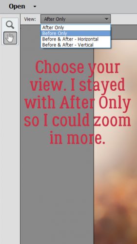
Depending on the size of your screen and your personal workflow, you can choose the view you’ll see as you work. Because I work on a 15 inch laptop I like to zoom in and out a lot and I like to see what’s happening as it happens, so the only view that really works for me is the After Only setting. Play with them and see what works best for you. To Zoom you can use the Magnifying Glass or CTRL/CMD>+ or -.
With this technique you can work from either a negative or positive effect. That is, you’re either revealing (Show) or concealing (Hide). I opted to Show the parts of the photo I wanted to have the focus. The software then applied this mask to the photo.
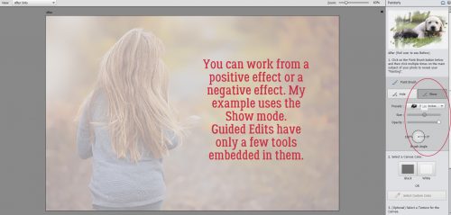
There are only a few tools available to you in these menus. Painterly uses a handful of brushes you can adjust for Size, Opacity and Angle. The first brush on the list is called Bold Strokes. The settings I used are shown below.
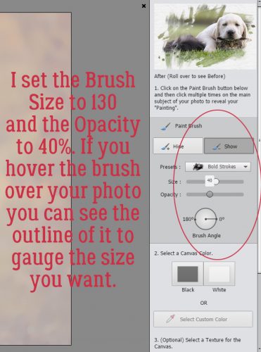
Then I just randomly clicked the brush over the areas of the photo that I wanted to reveal. I like to go with a lowish Opacity so I can build the effect as I go along. It’s a lot easier to achieve a soft look if you take your time.
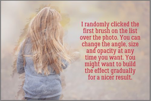
I selected the next brush on the list and uncovered more of my photo. Don’t move on to the next step until you’re sure you’re done.

Make good use of the few controls you have.
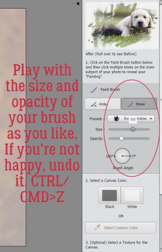
I worked my way down the list of brushes, adjusting the size and opacity as I went. If you do something that looks funny, Undo it with CTRL/CMD>Z.
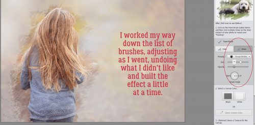
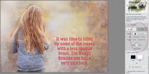
Each brush does something a little different. I had the little girl revealed with a soft, moody look. It was time to bring up some of the leaves. For that I used the Rough Bristles brush with a lower opacity.
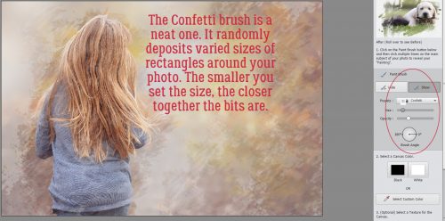
The next brush on the list is called Confetti and I love it! This is where you really start getting an artsy look. This brush randomly places squares and rectangles of your chosen effect over your image. I just scattered random clicks over the whole photo.
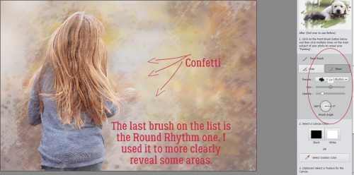
The Confetti effect isn’t obvious but it really adds something to the overall image. The last brush is called Round Rhythm. It’s not perfectly round, like a Basic Brush is, but neither is it grungy, so use it judiciously. I took it over areas of the photo that I wanted revealed almost completely.
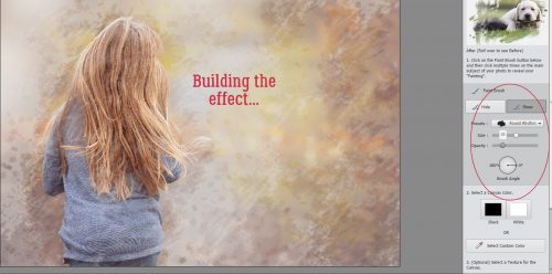
You’re thinking right about now that to get to this point had to take hours. But it took mere minutes!
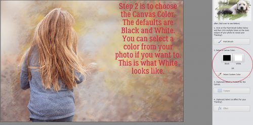
The second step in the technique is to choose a background colour. The defaults are Black and White. You can also choose a colour from your photo simply by clicking on Select Custom Color then clicking on an area in your photo. You’ll see instantly what it looks like. This is what White looks like.
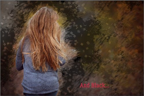
Black could be really effective for certain images and moods.
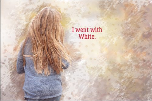
For my example I went with White. When I redid it (laptop froze in the middle and I lost the whole shebang) I chose a colour from the photo, as you’ll see in my finished layout.
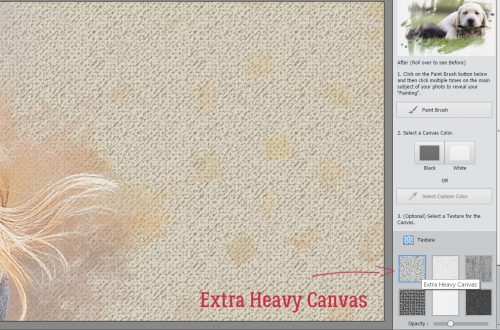
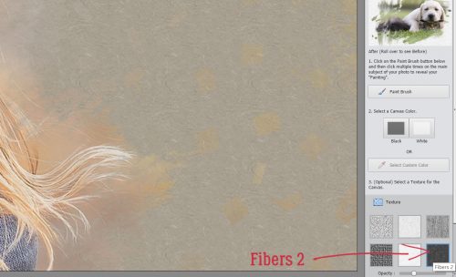
Step 3 lets you add Texture to the image. If you don’t want to add texture, just go to the bottom of your workspace and click on Next.

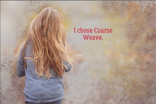
The next 6 screenshots show what each of the textures look like at 30% opacity. You can see the Confetti effect a lot better in these ones!
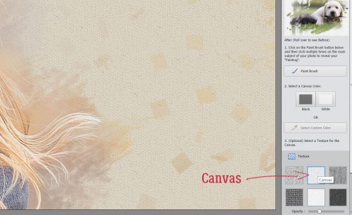
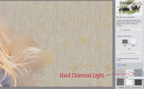
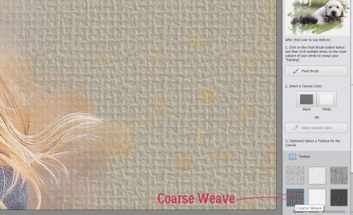
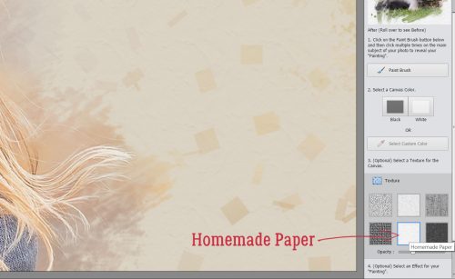
Step 4 is to add some Painterly Effects.

There are again 6 choices for Effects. Hovering your cursor over each one will show you the label for the effect.
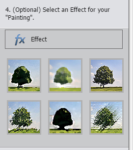
The next 6 screenshots show you what they look like.
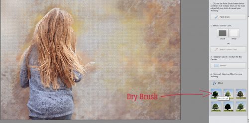
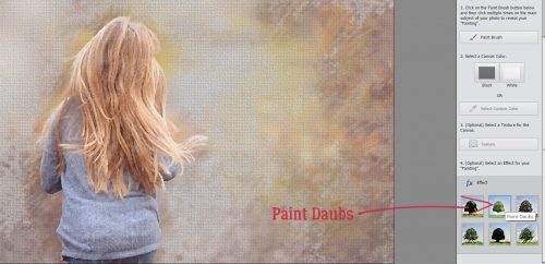
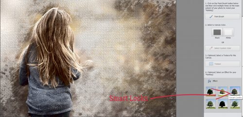
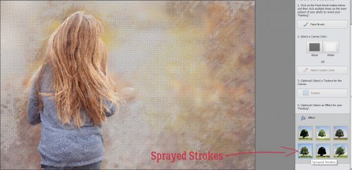
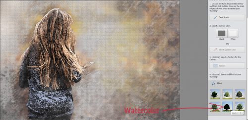
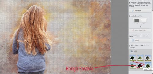
Each of the effects changes the image noticeably, some very obviously. I chose Rough Pastels for my layout, but I can think of ways to use all of them. When you’re satisfied with the way your image looks, clicking on Next will take you to some options for using your masterpiece. You can Save it, Save As something specific, change to another Edit mode or Share it. Then click Done down at the bottom of the workspace.

Once you’ve selected Expert edit mode to use your creation for a layout, you can see what the software has done with the original photo. There are 5 layers here, and you can manipulate each one further. Feel free to play around with them, because you can always Undo. When you’re happy, you can Merge the layers, or leave them as is so you can make more adjustments within your layout. If you choose to do that, I recommend creating a Group with the layers so they don’t get separated accidentally. To do that, you first have to Unlock the Background layer by clicking on the little padlock icon on the layer. Select all the layers then either click on the Group icon (a stack of papers, second from the left at the top of the Layers panel), right-click and select Group From Layers or CTRL/CMD>G. (You know how I do it…)
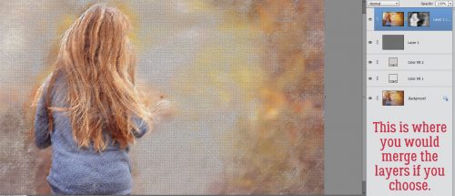
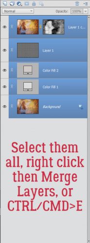
If you don’t want to make any more changes to your image, select all the layers as shown below then right-click>Merge Layers or CTRL/CMD>E. Then you treat it just like any other photo.
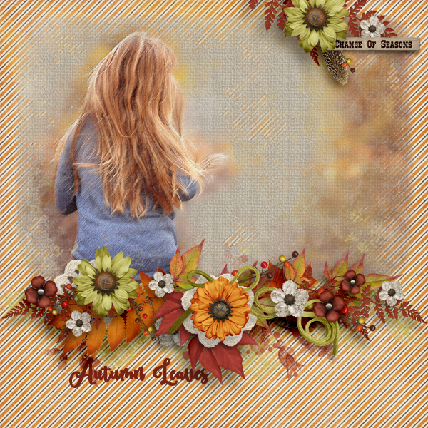
I used my finished sample for my October Mix It Up Surprise Challenge layout. The theme this one is Change, which this photo captures in several ways. I used a template (with some modifications) from Heartstrings Scrap Art‘s Mix It Up V.5 collection (not found in the store) and Ooh La La Scraps‘ beautiful Falling Slowly kit that I got through the Bake Sale for $1 (!) You can get it for $1 too, if you hurry… the sale runs until midnight MDT on October 20th.
Oh wait. I bet you want to see my layout. Right? Here you go!
![]()