More Fun with Fonts – Die-Cut!
![]()
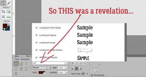
Recently I had an image that kept popping up on my Facebook (one of course I can’t find again now that I want to…) showing this great die-cut paper title where the centres of the letters were cut out and the edges were tack-sharp. If I recall correctly, it was an ACTUAL paper title, not a digital version. But since we’re all about the digital here, I set out to find a way to replicate it. Before I get into that, I wanted to share something that I discovered accidentally, since it didn’t work in PSE 12. Did you know that in PSE 15 you can go directly to the font you want to use (if you know what it’s called) just by clicking on the font box as shown below and starting to type the name. I’ve been using Lumberjack Regular for the captions on my screenshots for these tutorials since I made the switch to 15 and this discovery is such a time-saver!
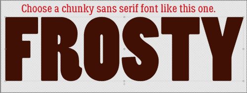
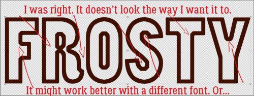
First I opened a new file on my workspace. It can be any size you want – I like BIG – because you can resize it later. The colour used for the font doesn’t matter – you can always change it. This technique works best with a chunky san serif font (did you use those tags when you set up Main Type?). The font shown below is called Haettenschweiler Regular. I’m not sure about that capital “R” so let’s see what happens…
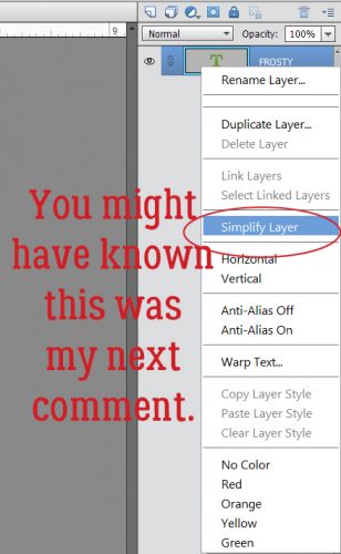
I think those of you who read my tutorials regularly could predict my next instruction. Simplify the type! Just make sure you don’t have any spelling boo-boos because once it’s simplified you can’f fix it.
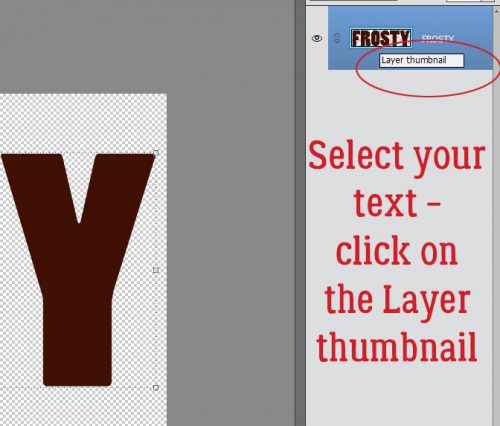
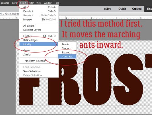
Now you want to Select your text by clicking on the Layer thumbnail in the Layers panel. There are the magic marching ants.
There are some adjustments you can make to that selection by clicking on the Select tab along the top of the screen, then choosing an option from the dropdown menu. In this case, you’re going to select Modify>Contract. What this does is move the marching ants toward the centre of the selected area. Expand would move the selection outward.
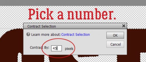
This is where you’ll need to experiment a little. Enter a number in the box and click OK to see what your altered text looks like. If you’re not happy, Undo (CTRL/CMD>Z) it and try again until you find the one you like.
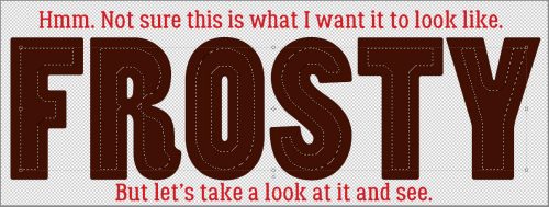
Here’s what it looks like Contracted by 45 pixels, and it’s NOT what I wanted. See how the marching ants overlap each other on the “R”? I changed the number I put in the box and carried on. I still didn’t like what I was seeing. For the sake of a learning experience, let’s keep going.
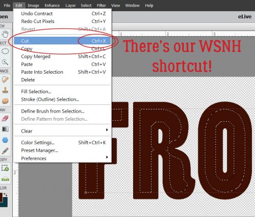
To remove the area outlined by the marching ants, you can click on Edit>Cut or use the WSNH (Work Smart Not Hard) shortcut CTRL/CMD>X.
And I don’t like it at all. Not even a little. The cutout area isn’t smooth and doesn’t follow the contours of the font the way I want it to.
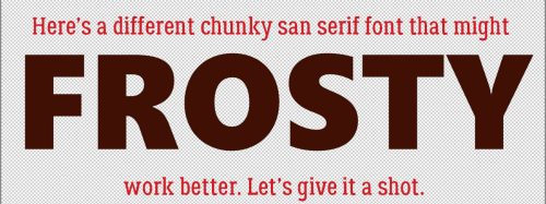
So there are a couple of ways to resolve that issue. One is to use a different font. This one below is called Segoe UI Black and it will work much better. Other default font possibilities are Arial Black, Bauhaus 93 Regular, Britannic Bold Regular, Copperplate Gothic Bold Regular, Ebrima Bold, Konga Pro Regular and Poplar Standard Black.
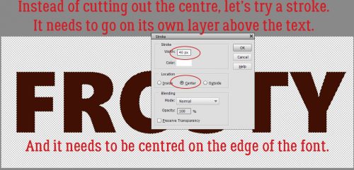
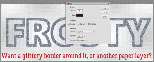
The second way to resolve the issue is to use a stroke, rather than cutting out the middle. Create a new layer above the font layer to put your stroke on. That gives you a lot more flexibility. Go bold, with a BIG stroke and have it centred on or inside the edge of the font. If you put it on the outside you might end up with a similar look to the failed one above.
I know this image is difficult to see. It wasn’t when I was working on the screenshots. Honest!
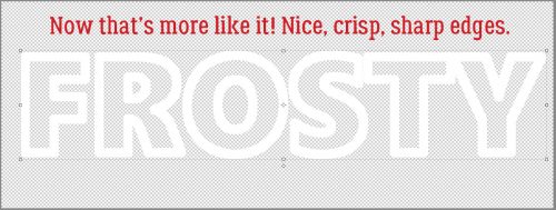
Here it is with a patterned paper clipped to it. Nice, crisp, sharp edges. If you want, you can move the letters around and have them overlap a bit. Just remember to merge the layers so they’re moving as one.

There are more ways to play with this. If you want to add a glittery layer or appliqué your die-cut letters onto another paper, you would use the same steps as for creating the outline, only you’d create the new layer UNDER the font layer. Add a stroke of an appropriate size to the outlines. Then you can apply a glitter style to the stroke!
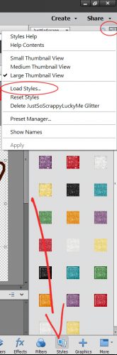
It occurred to me that some of you may not know how to load the awesome layer styles designers like Aimee Harrison, Magical Scraps Galore, Miss Mis and Just So Scrappy/Ooh La La Scraps create. So here’s a quick little tut-within-a-tut. After you’ve unzipped the style files, you can rename them if you like. I’ve done that so I can find them more easily. Then copy those files into the Adobe folder on your computer. Program Files>Adobe>Photoshop Elements #>Presets>Styles. That puts them all in one place. Then in PSE, click on the Styles tab down at the bottom of the Layers panel. Once that panel opens, look at the upper right corner of the panel where there’s an icon that shows a stack of 4 little parallel lines with a tiny arrow to the left of them. Click on that icon. It opens a menu as shown below.
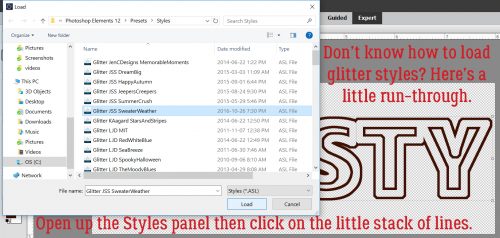
Click on Load Styles and PSE will open up that folder you just filled up with presets. Then you can select the style collection you want to load. Easy peasy!
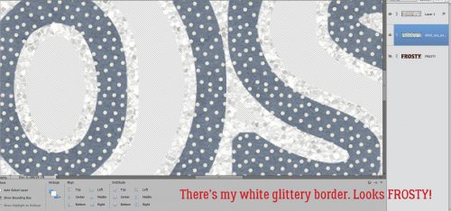
Okay, so now I’ve created a stroke underneath my title and hit it with a white glittery style.
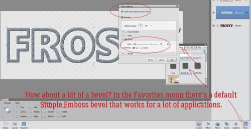
Looks good, but a little blah. So maybe a Bevel? There’s a fast way to find the Simple Emboss bevel style and that’s to click on the More tab down there next to the Styles tab. Inside the Favorites menu there, PSE has very kindly put a shortcut to the Simple Emboss. A quick double click and there’s a nice bevel on my die-cut.
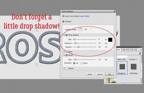
Don’t neglect a drop shadow for your newly beveled diecut!
Here’s what my finished title looks like on the layout. I used a lovely kit from our November guest designer Day Dreams ‘N Designs called A Snowy Adventure and a template from Dagi’s TEMPtations (her store closes soon).

I hope you give this one a try!
![]()