Throwing the BOOK at Glee
![]()
[This tutorial is for advanced-intermediate and expert users of Photoshop Elements.]
Awhile back I got a private message from Glee asking if I had any tips for making text look more like it’s really sitting on the page when using a book element, rather than floating above it. I didn’t have any tips but thought it might make a good tutorial. Boy, did I bite off a big chunk of what-the-heck-can-I-do-here! The following images represent hours of experimenting and starting over, and I wasn’t completely successful. But I learned a lot in the process so that’s a good outcome, at least for me.
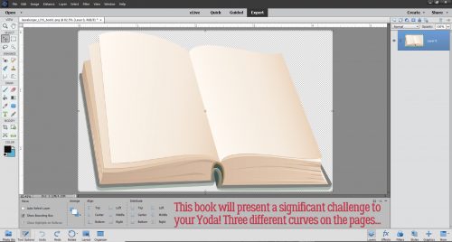
I scoured through my stash for a book that looked similar to the one Glee used for her layout and this was the only one I have. So I went with it, even though the left hand page presents some serious challenges due to perspective.
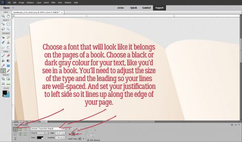
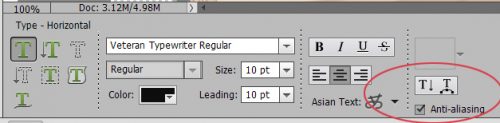
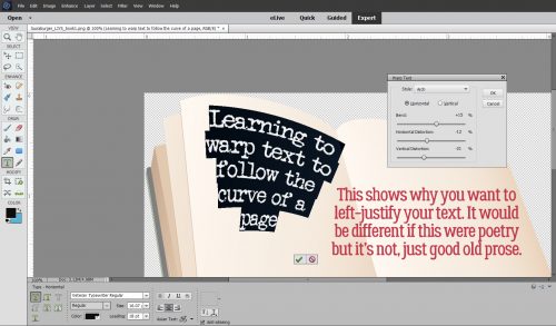
First things first. You want to choose a font that looks like it would be used on the pages of a book – a typewriter-style font. The colour of your “ink” should be black or dark gray. Adjust the size of the font to be suitable for your pages and your leading should be sufficiently wide to allow all the uppers and lowers to have space. Also, ensure you’ve got your justification set to the left. Justification is the alignment of the first letter on each line. When you choose Center, your text will automatically adjust itself so that each line is centered with the one before. That’s NOT what you want for this purpose. Your text needs to line up with the left edge of the page, or the margin. Please note… I didn’t do that in several of the images to follow and lived to regret it!
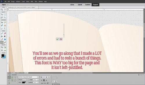
Yes… lots of mistakes! But let’s run with it to start off so you can see why it’s important.
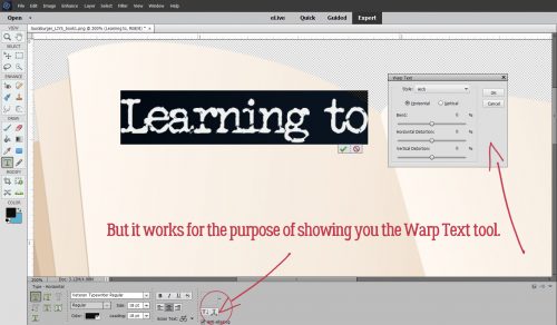
The Warp Tool isn’t available until you’ve put your cursor on the page. You can activate it then, or you can type out some text and then deploy it. It’s the right-most little box with the T sitting on top of a curved arrow when you’ve got the Tool Options open. There are several options with little pictograms showing you the basic shape of each Warp.
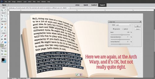
For the top of this left hand page, the Arch Warp will work. Play with the sliders, moving them to the left and right to see how they work, then decide which ones you need to move to shape your text.
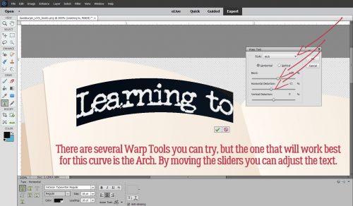
Here’s a tip… when you’re moving across the page toward the spine, perspective demands that the text gradually gets smaller the closer to the spine it gets. To adjust that with the Warp tool you’d move the Vertical Distortion slider to the LEFT. You can also move the text box around using the Move tool, moving it to the angle it needs to sit properly on the page.
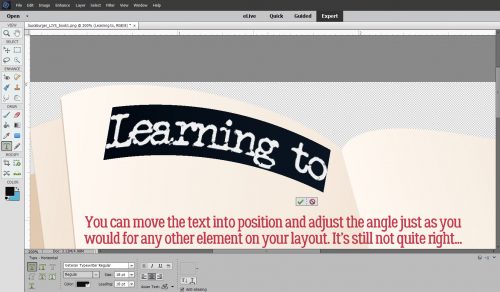
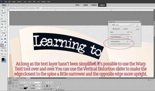
Here you can see the way the Vertical Distortion adjustment works. As long as you haven’t Simplified the text layer, you can use the Warp tool as many times as you need to.
The image below shows very clearly why left-justification is important. If you’re using a poem as your text, you can leave it centered and it’ll be fine but for prose, not so much.
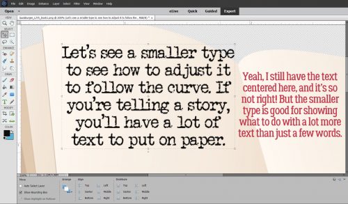
My next efforts used a smaller size on my font. It’s still much too big, but it still lets me show you some more tweaking.
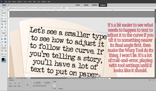
I learned that it’s easier to make the Warp adjustments look right if I angled the text box to follow the upper edge of the page first. Please ignore the typo in the red text below…
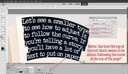
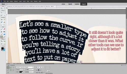
The Arch Warp worked here, sort of. I used the Vertical Distortion slider too.
It still doesn’t look quite right. There are other tools that can be used to adjust the text’s shape.
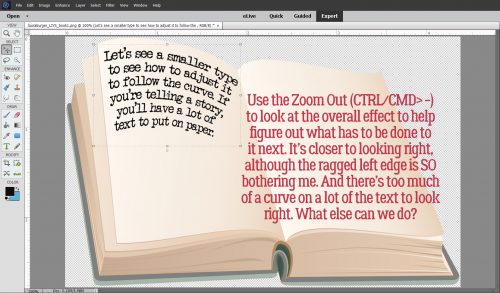
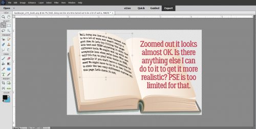
I like to zoom in and out while I work so I can see the overall effect of whatever I’m doing. Zooming in tight lets me see it up close for those little tweaks, zooming out shows the whole image and shows where I need to make bigger changes.
So, have I mentioned that I don’t love this left-side page? I played with this area so much and hated everything I did with it.
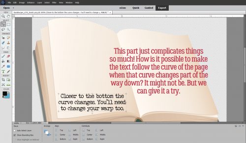
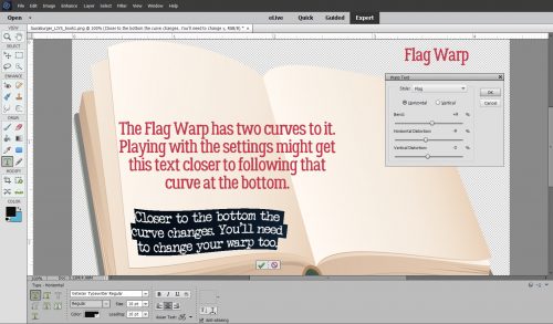
It looks like the Flag Warp should work. But it’s going to need a lot of massaging.
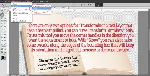
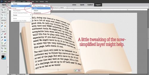
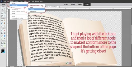
There are other tools to alter the shape and size of layers. With text layers that aren’t simplified, there are only two ways to Transform the layer, Free Transform (which never seems to do anything I want it to) and Skew. If you’ve never used these awesomely useful tools, I highly recommend them.
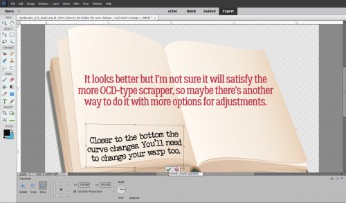
I did a little Skewing, but although it looks better, I’m not sure it will make the more… erm… particular scrappers out there happy.
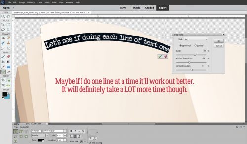
Then I thought, well, it’s not working so great doing big blocks of text all at once, and with two different curves, it would need more than one block of text anyway, so maybe if I did one line at a time…
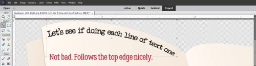
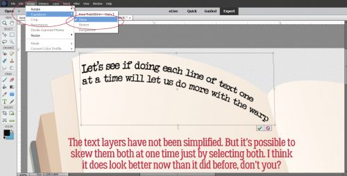
I was cautiously optimistic when I saw how well the first line worked out. I used Arch and adjusted the Vertical Distortion.
The second line seemed okay too. I selected both layers at the same time so I could skew them at the same time. It was important to keep the space between the lines of text uniform.
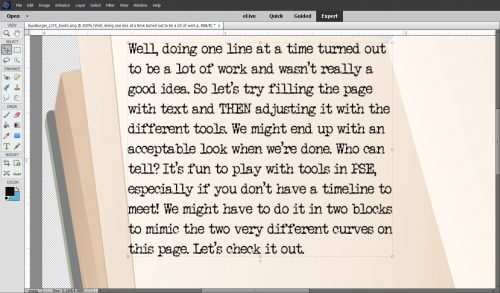
Aaaaaaaannnnd then, I abandoned ship. It was taking a lot of time and it wasn’t really working any better. So I typed out some text that filled about 2/3 of the space. I knew I wouldn’t be able to make one single block do all the things I needed it to do.
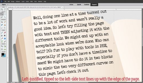
First I made sure the left-justified text was parallel with the edge of the page.
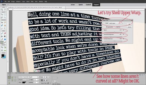
Then I tried a couple of options in the Warp Text menu. I tried Shell Upper first. Do you see what I see?
Yeah, that didn’t work. So I tried the Wave Warp. Whoa!! That’s BAD!
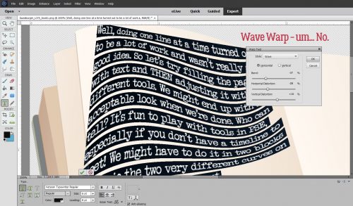
So I reversed my tactics and SKEWED first and THEN Warped.
That looks okay! Sort of. The bottom is still not making me light up.
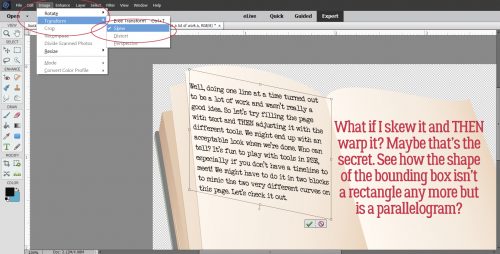
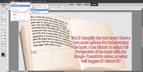
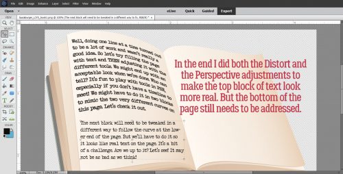
As long as I left the text box as a text box and not a Smart Object all I could do with it is Skew it. Already tried that. So I Simplified the layer. Then I went back to the Layers>Transform menu and tried both the Distort and Perspective tools. (See the bounding box?) That made it a lot more right.
Then I added a block of text at the bottom.
By now I was feeling like this just wasn’t going to be good. The Arch Warp looks okay, but still not YEAH!
I tweaked some more. The Skew doesn’t look right either, when I zoomed out.
I did a LOT of things trying to get it right. I even cut and pasted individual words in the last line to see if that would help. Alas, no.
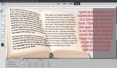
So I surrendered. The other page was always going to be easier, and in retrospect, if I were to do anything with the pages in this particular book, I would put photo or image on the left-side page (oh wait… a poem could go on this page, couldn’t it?), leaving a big margin around it to disguise the imperfect adjustments, then Skew/Distort it to look okay and leave it alone.
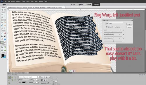
So I filled that right-side page with left-justified text then hit it with the Flag Warp. That was almost enough!!!!
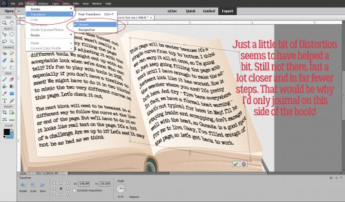
Really, just a wee bit of Distortion almost had it right in just three steps (FlagWarp>Simplify Layer>Distort).
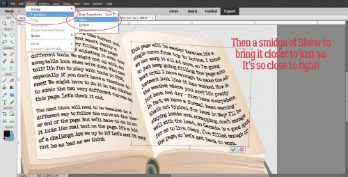
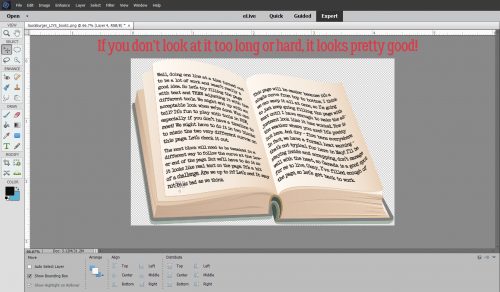
A little bit of a Skew and now it looks great!
The final version isn’t awful, if you don’t look too closely or too long!
I hope I didn’t lose you along the way. That was a complicated one! (I even tossed out about 15 of my screenshots.) I really can’t encourage you enough to experiment with the things Elements can do. You might discover something no one has ever done before, and then you can teach the rest of us!
![]()