Save me!!
![]()
Right after last week’s tutorial appeared, a comment from one of our members, lilholmes6 (aka Lynn), appeared, asking why her layouts were so blurry and the journaling was unreadable. I sent her a private reply and carried on… then Ginger (our genius GingerScraps owner) messaged me. She wanted to know if I’d written a tutorial on saving layouts for the Gallery; she’d also gotten a request for help from a member, apparently one in a long string of them and didn’t want to reinvent the wheel. So today we’re going to talk about saving layouts for our highest possible viewing pleasure.
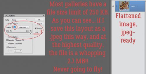
The first thing to know about saving your layouts for Gallery purposes is that online galleries have a limit on the maximum size an image file can be, most stipulating images 600×600 pixels and a file no larger than 250 KB. Now, to get our images to fit into those parameters, the file has to be compressed a bit. Or a lot… some template designers create absolutely gorgeous templates that stimulate creation of even MORE gorgeous layouts, but they turn into HUMONGOUS files. (Heartstrings Scrap Art is a favourite of mine and a former GingerBread Lady.) What happens when I scrap using one of her templates? Lemme show you…
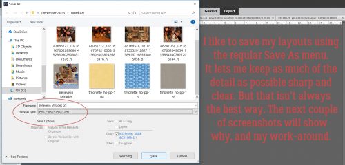
First I resize the layout to that 600×600 pixel limit and then I try (and fail!) to save the layout as a .jpeg using the File>Save As menu. Because I save my layouts as .jpegs in two sizes, I change the name of the one destined for the Gallery by adding “GS” to the layout’s name as you can see below.
Hmm… At the highest possible quality, this layout weighs in at a ginormous 2.7 MB!!
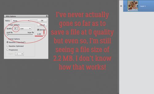
So I pushed the Quality slider to the LEFT. All the way to 0. Now, I’ve never actually tried to save a layout with a quality of 0, because really, what’s the point?! But what really is interesting here is that this image would still have a file size of 2.2 MB. How is that even possible?
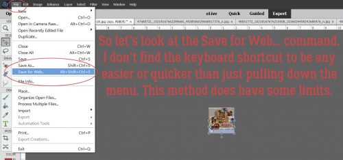
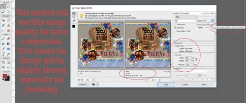
Time for Plan B, the Save for Web option. I don’t use this method for saving my layouts except as a last resort, because there’s a lot more compression of the image, and loss of clarity, or what’s known a pixelation. That’s what makes journaling turn into squiggles.
The user menu looks like this. You have the original on the left, the compressed version on the right and some adjustments you can make on the far right. The default here is a resolution of 72 pixels per inch, pretty fuzzy. (For the best images for printing for example, you’d want a resolution of 300 pixels per inch, which is MY default setting.) Within the menu, just below the compressed image on the right is where you find the file size at that resolution. As you can see here, there’s a little wiggle room.
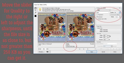
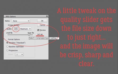
So I took it! I nudged the Quality slider to the RIGHT until I got the sharpest image that still was under 250 KB. You can see the final version in the Gallery right HERE. Not too shabby!
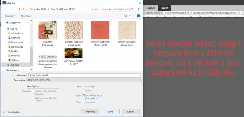
Now I want to show you my USUAL method of saving my layouts for Gallery posting. This layout is built on a template from our own Aimee Harrison from her Singular Volume 1 set. I select Save As (CTRL/CMD>SHIFT>S), rename my layout and select .jpeg as the format.
Now, this is the real bonus. The file is under 500 KB right off the bat.
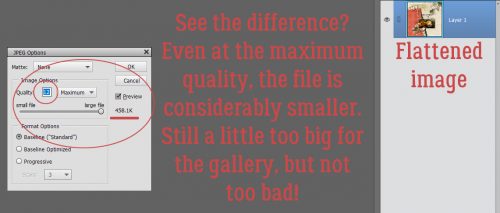
Just a tiny nudge of the Quality slider gets me right into the zone. <whispers> (I’ve found these numbers to be a tiny bit inflated, so you might get away with a few KB over 250. But don’t tell anybody.)
In the spirit of the season, here’s a little add-on for you.
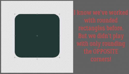
As you might remember, I’ve been looking at old scrapbooking magazines and this technique got a ton of attention back in the day. Lots of layouts had papers or photos with only the opposite corners rounded. We’ve looked at how to use rounded rectangles, so I thought I’d take that a step further. Fire up that Custom Shape toolkit!!
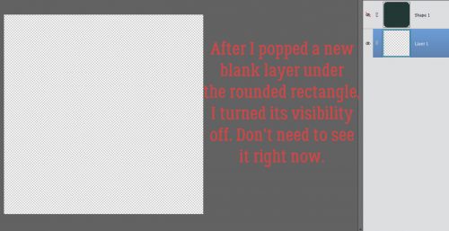
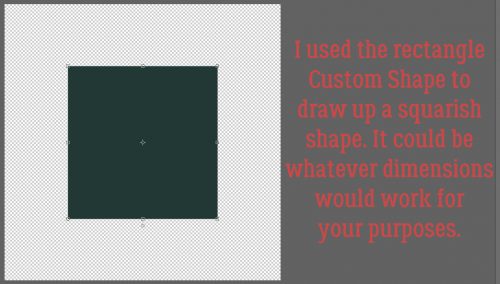
My example is more squarish, but that’s cool. I popped another layer just underneath it then made the square invisible.
Then I changed my tool to the Rectangular shape tool and dragged out another squarish shape. That’s what worked for me, but you of course can do whatever makes you happy.
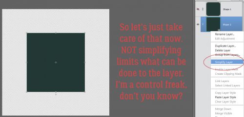
You know how I keep hammering you about Simplifying your text and shape layers? It’s a vital step for maintaining control. When you’re looking at text layers, you’ll know it hasn’t been Simplified if there’s a “T” on the layer in the Layers panel. For shape layers, there’s a little square box in the lower right corner of the image on the layer in the Layers panel. You can see it here.
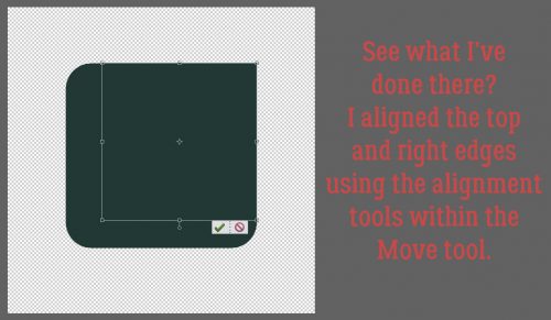
Now, I KNOW you can see what I’ve done. I simply aligned the top and right edges of the two layers using the Alignment adjustments within the Move tool.
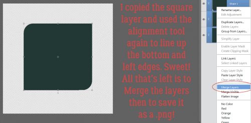
Next I just made a copy of the square layer and aligned the bottom and left edges. All that was left was to Merge the layers and save the resulting shape as a .png so I can use it as a clipping mask later. One thing about this shape though… resizing it will change the contours of the curved corners unless the proportions are constrained (identical). If you want it to be more rectangular than square you’ll need to start there. An oblong rounded rectangle as your base, then two rectangles with squared corners for the rest.
Since next Tuesday is Christmas Day, I’ll be taking the day off to be with my husband and son… as I’m sure all of you will be doing as well. I’ll see you all New Year’s Day with something new for you to do while the men watch bowl games!
![]()