Another Font-to-Alpha Option
![]()
The idea for this technique came to me while I was using Nyquil to fight off a cold and was probably not really coherent. But it seemed like a stroke of brilliance at the time so I decided to try it. It didn’t work the way I saw it in my mind’s eye, but I like how it came out in the end.
When turning a font into an alpha, bevels are very handy style tools but they don’t always give the look I want, being more sharply, blockily cut. I wanted to create a more curvy but smooth alpha with a paper clipped to it. So when it occurred to me that I could try using a rounded, beveled Style on my text then clipping the paper to that, I HAD to try it! Alas, it didn’t work the way I expected… I still ended up with a flat, 2-dimensional image. So I went back to the drawing board.
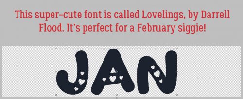
This font, called Lovelings (by a designer named Darrell Flood) was found at 1001 Free Fonts. It’s got that solid, curved look that makes great alphas.
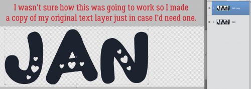
I’ve started to automatically make a copy of my original text layer before I make and adjustments to it, just in case I need an untouched one later.
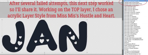
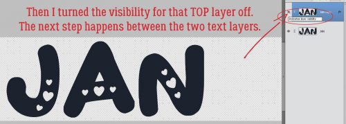
Then I started trying my idea out. And failing. Miserably. More than once! But then I tried this and it worked, so you get to see it. On my TOP layer, I added a Layer Style from Miss Mis Designs‘ Hustle and Heart.
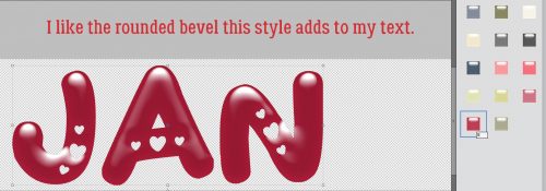
I used the cherry-red acrylic style and didn’t make any adjustments to it at all. It looks pretty great, but it isn’t the effect I was after.
So I turned the visibility for that layer off and went to the BOTTOM, original layer.
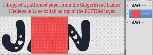
Then I dropped a patterned paper from I Believe in Love on top of the text. PSE in its later incarnations has an unfriendly habit of scaling objects to a single dimension (height) of the canvas, so it’s a pretty minuscule little swatch here.
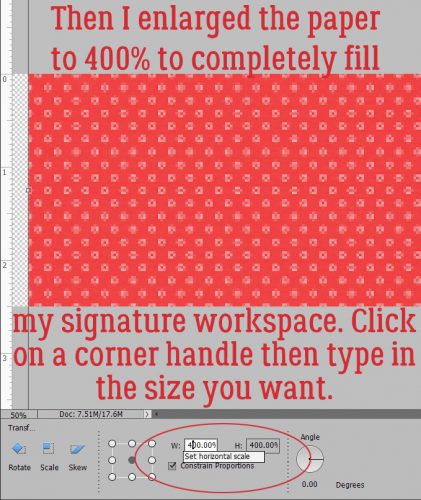
To overcome that I resized the paper to 400%. It’s easy to do precisely by clicking on one of the corner handles of the Bounding Box, which opens up the Transform menu, then simply typing in the dimensions I want.
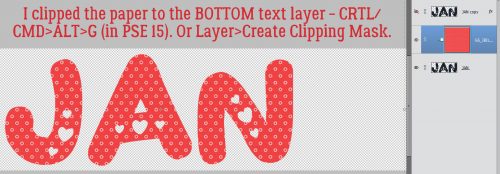
Once I had the paper big enough to work with, I Clipped the paper to the layer below it. CTRL/CMD>ALT>G is the WSNH shortcut, or Layer>Create Clipping Mask works too.
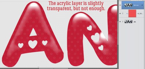
As you can see, the acrylic layer (visible again) is a little bit transparent and lets the paper show through. But not enough.
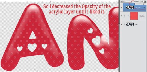
Easy enough to lighten the top layer some to let the paper show, but without losing the curvy, round effect of the acrylic altogether. I only decreased the layer’s Opacity to 80%.
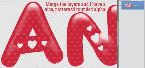
All that was left was to select and Merge all the layers (CTRL/CMD>E or right-click>Merge) and I was ready to create the rest of my siggie.
I’m going to keep trying to get a rounded bevel on a font that stays put when I clip a paper to it, and if I succeed, I’ll show you how I did it.
![]()
I love how the final version turned out!! Thanks for showing us how you did it! && I love the font, too!
well well well … this is one font i didn’t really care for BUT after seeing how it turned out as an alpha … i’m in love! i can’t believe you’re so sick to take Nyquil and be thinking of fonts … that’ s a true fontaholic! thank you for this … i’m going to try it!
Very fun lesson! I need to give this a try. – thanks.
There are lots of fonts I don’t like for most purposes, and then there are fonts like this that are perfect for alphas.
You’re most welcome!
You’re welcome!
ok … i used the font Hole Hearted (for the february font challenge) and used your technique … worked out PERFECTLY!!! Thank you!!!
https://gallery.gingerscraps.net/showphoto.php?photo=408794&title=waffle-love&cat=1014