Anatomy of a Paper Stack
![]()
I don’t often give a lot of thought to the process of creating layouts, but a comment I received from becky_a on a layout I prepared for Katie of Just So Scrappy and Ooh La La Scraps with her August Buffet collection Live Life started me thinking about it. The two layouts I created for this collection were a little unusual for me, because I didn’t use templates for either of them. (I just couldn’t find one that I liked enough!) The layout becky_a commented on is this one:
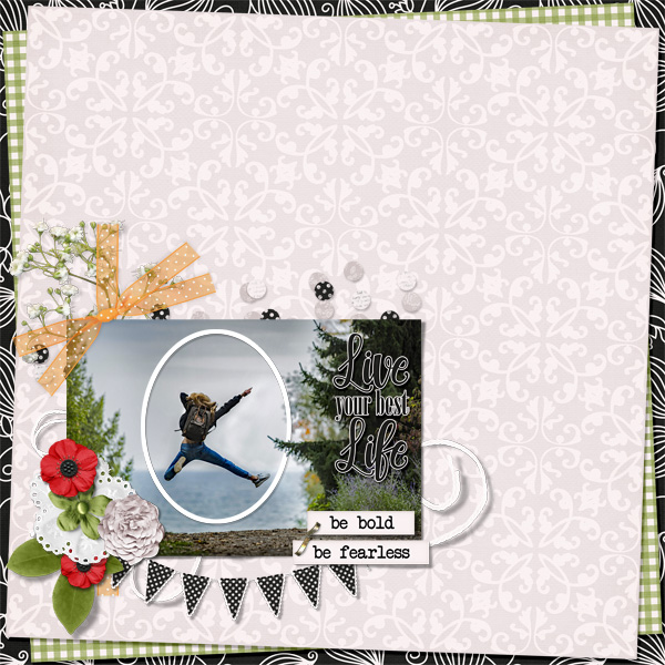
… and this is what she said: “I love stacked papers like this and I have the most difficult time making them look right, lol. You make it look so easy.” I had to go look at the layout because I wasn’t sure what she meant! And then I thought maybe it might be worth talking about.
There are no rules for paper stacking. None. It’s pretty much a free-for-all! You can use whatever papers you like, mixing patterns and colours, shapes and angles to suit your whims. Let’s talk first about choosing papers. I’ve always struggled with boldly-patterned paper. They don’t often work with my style of scrapping, but using them in a paper stack like this is one way I can feel comfortable using them. As you can see, that black and white patterned paper is pretty bold! But it’s black and white, so it can work with pretty much anything. I like the paper closest to the photos and elements and largest by area to be relatively neutral, so it doesn’t draw the eye away from the meat-and-potatoes part of the layout. If I’m not planning on journaling ON that paper, patterns can work. I also like to mix up scale. A bold paper needs to be balanced by some smaller patterns or solids. But that doesn’t mean you CAN’T use another bold pattern, because you can resize to so it works well with your other papers and what you’re doing with them. This is pretty much how I approach paper stacking all the time, whether or not I’m using a template; I like to contrast bright with neutral, bold with subtle, pattern with solid and to have some visible difference between them. But that’s how JAN stacks papers. I’ve seen lots of fabulous stacked-paper layouts where the scrapper has used a monochrome palette, mixed lots of patterns together or only used solids, so as I said, no rules!
Let’s look at this layout, also with the same collection and sans template. I use the Marquee tool and Inverse (Select>Inverse or CTRL/CMD>Shift>I) to cut my random shapes. To make concentric circles or ovals, I make a copy of the first oval then use the Select>Modify>Decrease path, typing in a pixel count to make the new oval smaller. Clip a paper to it and move on.
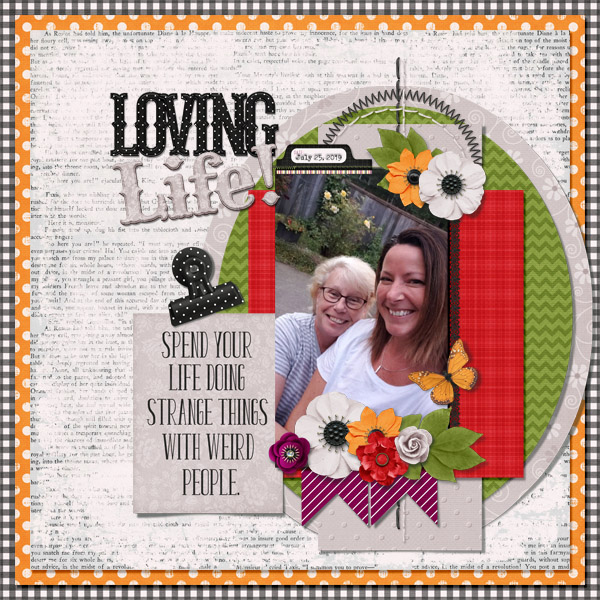
(My daughter and sister might not like to know I’ve called them both weird people. Or maybe they’d take it as a compliment. IDK!) When talking about colours, I often pull colour from my photographs. OR… I go for contrast. Here, the photo is pretty neutral, so the red, orange, purple and green from the kit all work together. You can see that I’ve mixed in some ovals and rectangles, some pennants and the square background papers. I’m going to tell you how I do those backgrounds, which might be news to those still learning digi-scrapping but is probably old hat to the more experienced in the group.
First step is to choose your papers. Then open a new 12×12 (or your favourite dimensions) canvas on your workspace. Decide which paper will be your main background, the one you want right under your elements and photo(s). Decide on the order of your other papers, keeping in mind the aesthetics of the layout as a whole. I usually use 3 papers for these stacked backgrounds because, as my dear friend Sandy Scott likes to remind me, 3 is an aesthetically pleasing number. You can drop them all onto your layout, turning visibility off to the topmost ones so you can see what you’re doing as you climb the stack. Or you can add them one at a time. Whatever suits your workflow. I’m showing them all piled on at once and in the screenshot after this one, you’ll see that the topmost paper is invisible.
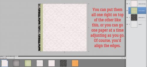
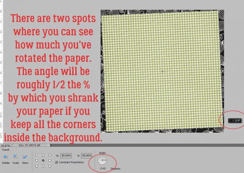
To make a visually pleasing rotated stack, you’ll want to make the upper papers a bit smaller than the background paper. (Or not. Remember, no rules!) The easiest way to do it is to click on one of the corner “handles” on the bounding box, then either pull that handle in toward the centre, or take the quick-and-lazy route and type a number into that box I’ve shown you here. That keeps the papers centered one on top of the other. Just make sure you’ve got the Constrain Proportions box checked so it shrinks the paper in both horizontal and vertical planes.
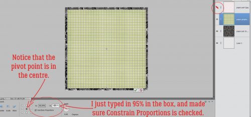
Then rotate that second piece of paper. The Pivot point selected is the centre one – the default. The angle will be half of the percentage by which you’ve shrunk your paper, unless you want your corners to extend off the page. There are two spots where you can see the angle you’re rotating to, the black pop-up box and down in the Tool panel. I usually just eye-ball it.
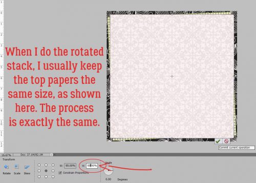
I like to keep the papers in a rotated stack, other than the actual background, all the same size. It’s obviously not required, it’s just my OCD-ness. Shrinking the paper is done in exactly the same manner.
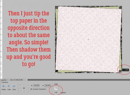
Then I tip the next/top paper in the opposite direction, to about the same angle. And that’s all there is to it! Shadow those babies up and you’re ready to move along.
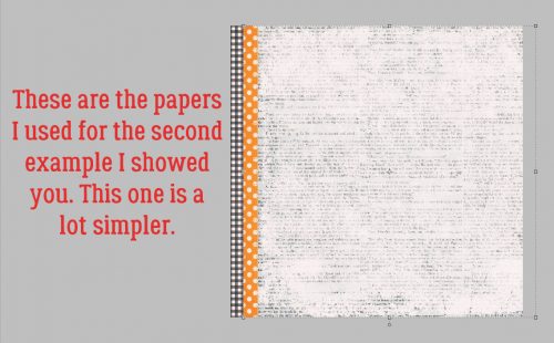
The second example is even more straightforward.
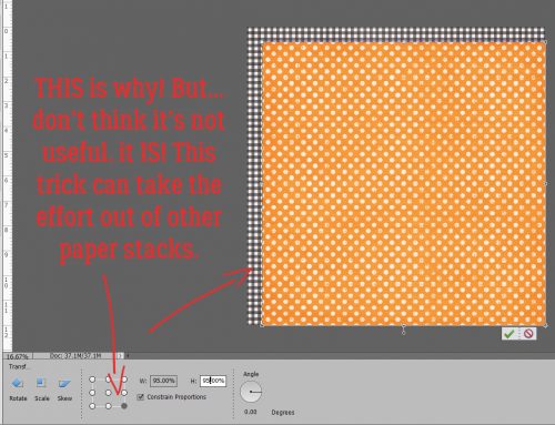
When you’re doing this kind of stack, if you want a symmetrical border of the background paper visible, make sure your Pivot point is in the centre. It’s important! Typing a number into one of the dimension boxes – either one is fine, as long as you’re Constrained – is quick.
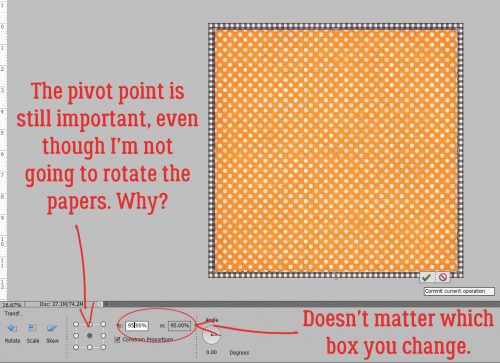
But if your Pivot point is in the lower right corner, for example, when you type in your number, this is what will happen. It’s not necessarily a bad thing, because there are ways it can make your workflow more streamlined if you want to work from a corner out. (You can tell this screenshot was an after-thought. Sorry!)
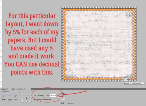
Here, you can see what decreasing the paper size by 5% for the first one and 5% MORE for the second one will look like. You can use any amount you like; if you want a wider border of your very bottom paper, go with a bigger drop. If you want one border wider than another, choose a smaller or larger decrease. A nice solid paper with a narrow gap looks really good. Oh, and you CAN use a decimal in that box. You don’t have to go with whole numbers.
All of these tips can be applied to any stack of papers you might contemplate, either as part of a template or freehand. Give it a shot becky_a, you’re probably underestimating yourself a LOT!
![]()
Normally when I stack papers, I don’t angle them. I usually just keep them straight. I’ve always had “issues” with angling anything. LOL Another great tutorial~
I found this article very useful. I have never stacked a paper digitally and I now feel comfortable enough to give it a try. It’s great when you give us a brand new idea about doing something but I must admit, I like the articles when you go back to the basics. It’s fun to be reminded how to do things that you learned about a while back.
I’m so glad I could help you with that! Everybody has their own style and when I talk about the basics, I’m obviously going to reflect on my personal style. But if I’ve given you some tips that help you spread your digi-scrapping wings, I’ve done my job. Now then, do you have any other ‘basics’ you’d like to see me talk about?