Unlocking the Secret Extras Hiding in Your Font Files
![]()
So… I think this might be a great tutorial… for all you Fontoholics in the room. If you’re already using MainType by High Logic to organize and preview your fonts, this is for you. If you’re NOT using MainType, this might be your impetus to grab it and go. For those who aren’t familiar, MainType is a very versatile, fully customizable font manager. It allows the user to create descriptive tags for all the fonts in their collection, which makes searching for that perfect font for a project much simpler. It has a number of ways to preview the fonts and characters within the font. There are two versions, a free one that will handle up to 2000 fonts, and a standard edition you pay for if you need more capacity. (I use the paid version.) And I thought it was pretty great BEFORE I learned this little trick. Have you ever seen cool projects on Pinterest with fancy, swirly, curly tails and embellishments, only to find the font they used, but no fancy, swirly, curly tails and embellishments? They’re there, you just have to know how to find them!!
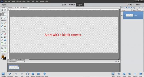
Over the weekend I was scrolling through Facebook and came across a link to a video on how to access extra glyphs (those extra characters some fonts include) and use them with Cricut Design Space. I don’t have a Cricut, and I almost didn’t look at the video. But then I thought, maybe I’ll learn something I can use. Well. It turns out Photoshop Elements will do exactly what was shown on the video, so now I’ll share it with you! Start with a blank canvas of whatever size will give you room to work.
Using the font viewer in Elements (or use MainType if you prefer) find the fancy, swirly, curly font you want to use. I have a large collection of fonts, many of them free ones. Many free fonts don’t include “extra” characters, like punctuation, numbers and @#$%… But you’d be surprised how many not only have all the usual characters but a bunch of extras too. I’ll show you how to tell which is which later. For now, I’ll tell you I used a purchased font in my sample, one called The Eye Catcher Regular. I paid $11 USD for it. If you’re interested in where I got it, comment or PM me and I’ll give you the details.
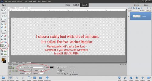
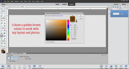
I set the size to the largest default of 72 points and selected a colour that would coordinate with the layout the title was being created for.
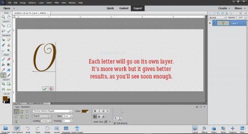
Here’s where I may lose some people. Each letter has to go on its own layer. It’s a bit more time-consuming and labour-intensive but it’s worth it!
Here are all the letters, sort of lined up.
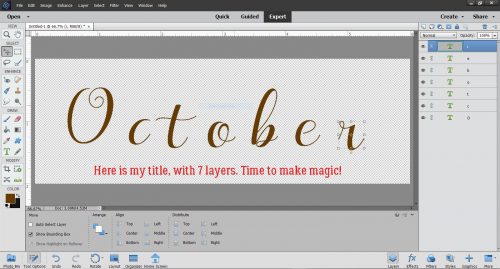
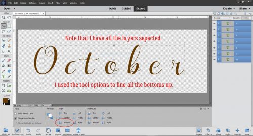
Then I selected all the layers and used the Tool Options to align the bottoms of all the letters.
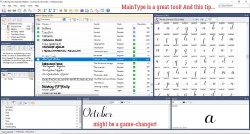
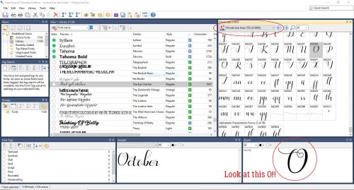
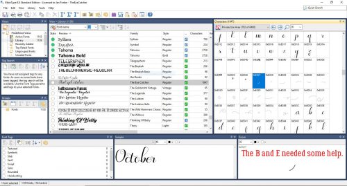
Then I went (back) to MainType, where my font was already chosen. I had typed in my title and now I was ready to make it fabulous. Remember I said I’d tell you how to know if your font has extra characters. Look at the blue-highlighted line in my screenshot. If you look at the far right of the blue area, it has 1047 characters, so you KNOW it’s a goldmine!
The Characters map on the right below has a pull-down menu that shows the character sets within the font. If you scroll down this menu you’ll find the Private Area. That’s where the fancy stuff hides.
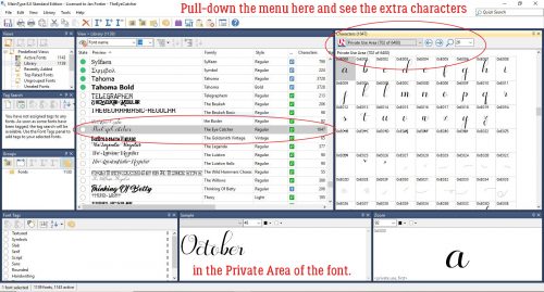
I’ve circled the spot where you’ll find this pull-down. These are the upper case extras. Just look at that O!! But how can I get it into my title? It’s so easy…
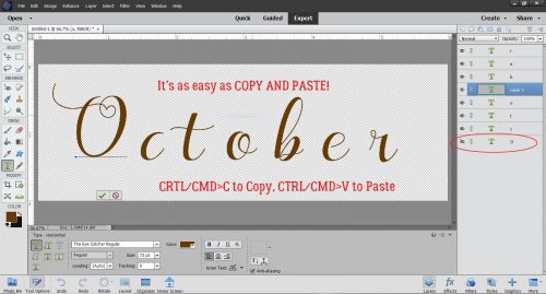
All I did was Copy and Paste!!!!!! As my faithful readers know, I use keyboard shortcuts: CTRL/CMD>C to Copy, CTRL/CMD>V to Paste. To move the O from MainType to Elements, I Copied in MainType then opened Elements and Pasted there. I just toggled between screens.
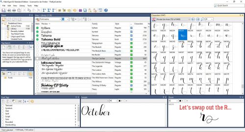
Then I decided to swap out the R for something with more panache.
Oh yeah!!
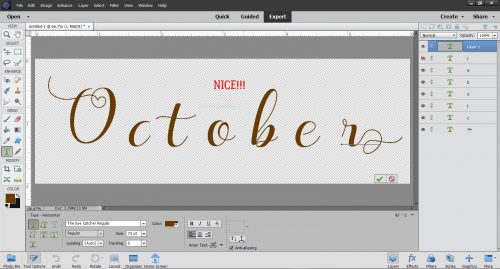
Then I started closing the gaps between the letters. But I wasn’t happy with the way the C and the T weren’t quite connected. So…
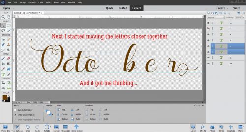
I went and found a C that would work better. The tail is going to need some adjustment but it’ll do.
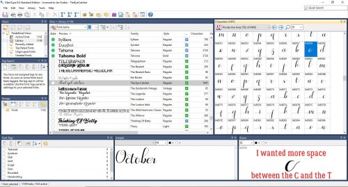
If you look at the Layers panel on the far right, you;ll see that I’ve turned visibility for the original layer off, and once I’m sure I like the new option, I’ll delete that original layer.
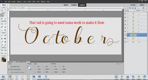
Did you notice that the sample in MainType didn’t look quite the same as the text in Elements? There’s more of a swoosh on the T. So I found THAT T and swapped it out.
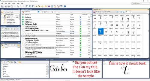
Now to try connecting the letters again. See where the tail on the C intersects with the T? I’m going to Erase some of the tail.
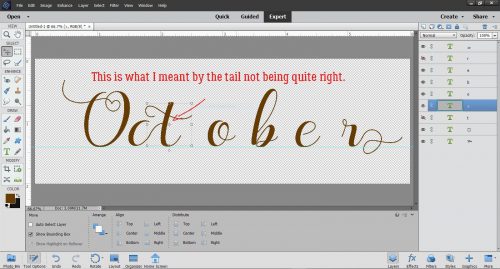
I moved over the rest of the letters to see where else I might need to make some tweaks.
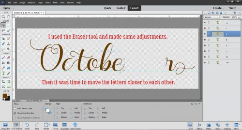
The B and the E weren’t quite right. But this fancy font also has a bunch of swashes that can be added to any of the characters so I picked one. See it down in the lower right?
The tail on the B needed to be shortened a bit to make the swash fit.
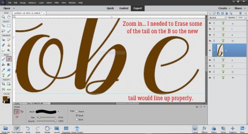
See in the Layers panel where two of the letters look different? I Simplified those two layers, the C and the B, so that I could Erase bits of them. Text layers can’t be altered unless they’re Simplified. (Don’t worry, Elements will remind you!)
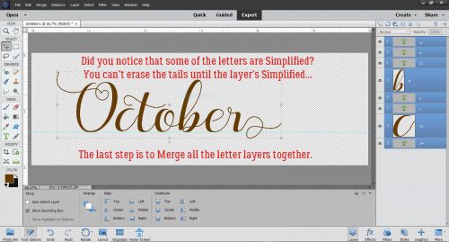
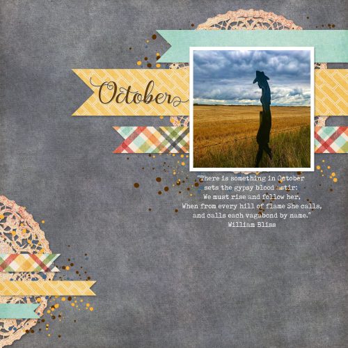
My title is done! Before I added it to my layout, I added a narrow black stroke to make it more defined, then a white stroke to turn it into a sticker. It looks great!
![]()
Great timing Jan, how’d you know I spent most of the weekend organizing the fonts I’ve been collecting for a couple of years, many languishing in their zippered folders. This is yet ANOTHER terrific tutorial!!! Thank you!
I am definitely a fontaholic … I have been amassing a collection of free fonts, but I have not installed the majority of them on my laptop. Does MainType only work if you have the font installed? Is there a way I can organize fonts that I have yet to install? (right now I have them in folders from the places where I have downloaded them; i.e. dafont, 1001 fonts, creative market, fontbundles, etc).
Anyway, thanks for this tutorial. I think I will try out MainType — I do have a few purchased fonts, but wasn’t really sure how to use all the extras. Game changer!! Thanks, Jan!
what an amazing tut! will be using it very often LOL Thank you!!!
That’s awesome, Jeanne! I didn’t know you’d spent all that time (and I know it was a LOT) organizing your fonts, but my timing was impeccable. You might have noticed that I have NOT done that on this new laptop. I just haven’t had time. But I’ll get to it. Eventually.
You don’t have to install your fonts for MainType to be able to find them. Along the left side of the Library box there’s a circle next to each font’s name. There’s a colour code for those circles: White means the font isn’t installed or loaded. Green is both installed and loaded. Blue shows that the font is loaded through MainType and can be unloaded. Yellow = installed but not loaded. Red indicates the font loaded through an external service and MainType can’t find it or unload it. And gray signals that there’s a font family, of which at least one of them is loaded. Loaded and installed mean different things. You can copy all of your fonts into a separate folder, call it whatever you want then add that folder to the MainType library. Then those fonts are easily found by MainType and you can install and uninstall to your heart’s content. Since you have yours already in folders, just add them to the Library and the software will find them for you.
That’s great to hear! I think I’ll be doing it a lot too!!
Thank you for the tip about this font manager. Have been using Nexus Font and it no longer picks up some of the latest fonts I’ve placed in my font folder in Windows. Time for something that works!
Thanks, Jan! That sounds perfect for me; as I don’t want to install too many fonts — my system is getting a bit slow.
Thanks for a wonderful tutorial Jan! Too bad Main Type doesn’t work on a Mac though since that’s what I got. 🙁 I would love to know if there is anything like this for Mac!
Watch for an update! I think you’ll be happy…