Another Take on Titles
![]()
I can’t be the only one who’s noticed the trend of templates featuring gigantic, block-letter titles with cardstock borders. And I KNOW I’m not the only one who’d like to use them but the titles offered aren’t working for me. So today I’m going to show you how to make your own jumbo titles that you can customize to your heart’s content. My inspiration was some photos of my granddaughter that were taken in August. She’s absolutely fearless and is already showing great promise as a gymnast, and I’m convinced she could be a worthy American Ninja Warrior even at her young age. I knew I wanted my layout to have a prominent title and that it should be feminine, because she’s wearing a dress in most of the photos… such a contradiction she is. The gigantic-block-letter-cardstock-bordered title appealed to me so I started by looking at my fonts for suitable candidates. There are lots of commercial fonts that are “layered”, meaning they have a a set of characters that provide a border that could work, but they tend to be fussy, and I wanted this to be accessible to everyone, so we’re not going to use one of those!
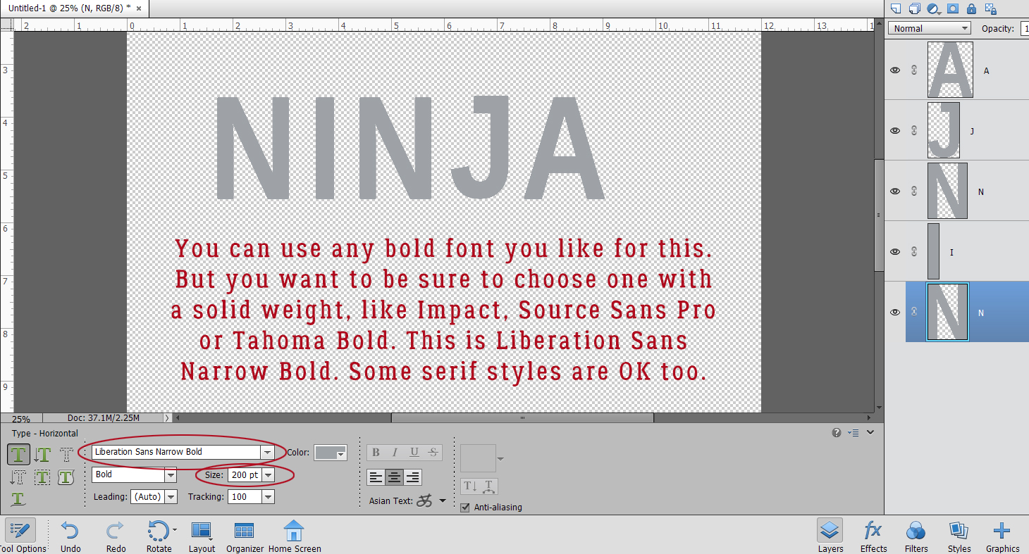
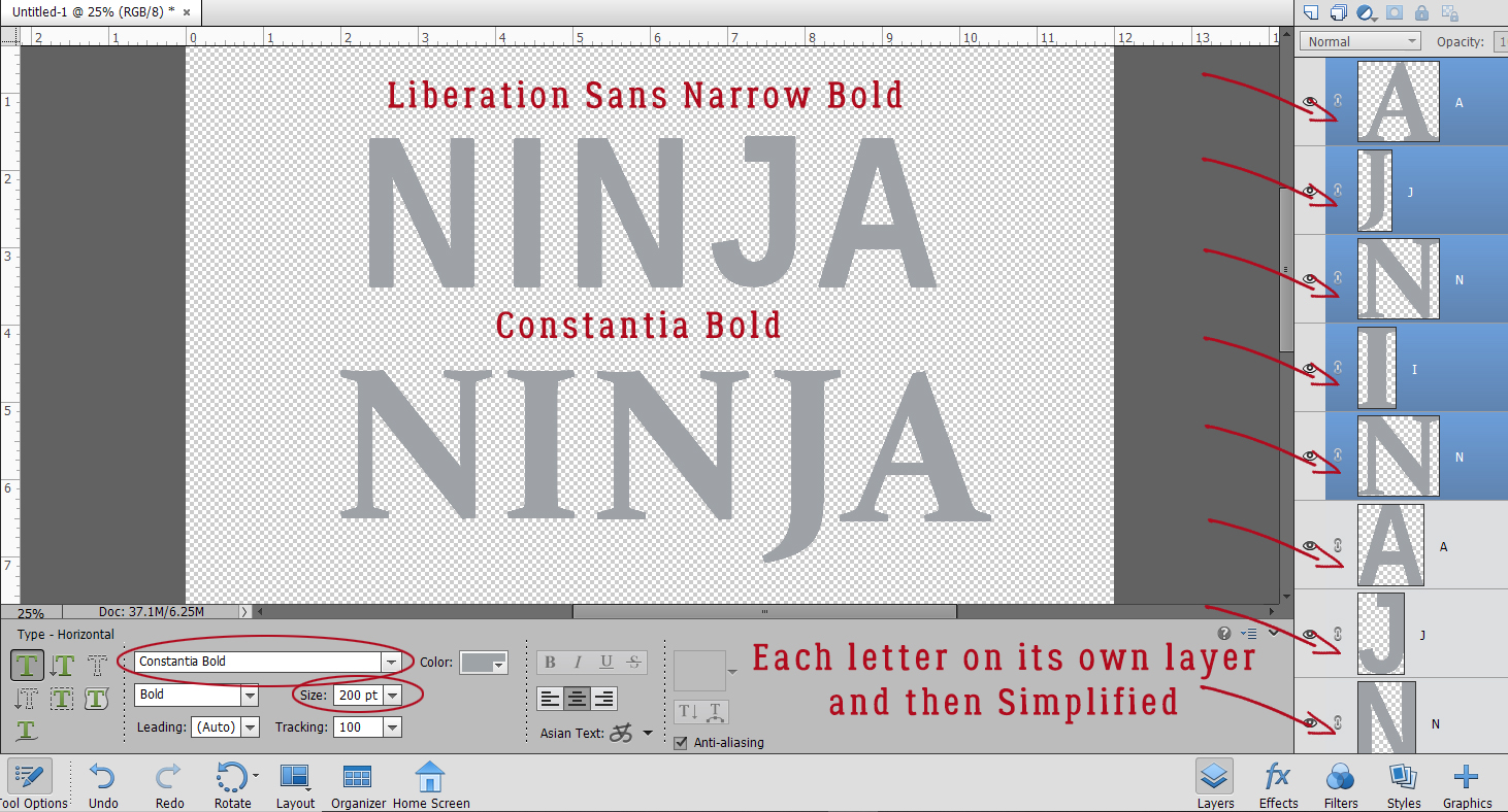
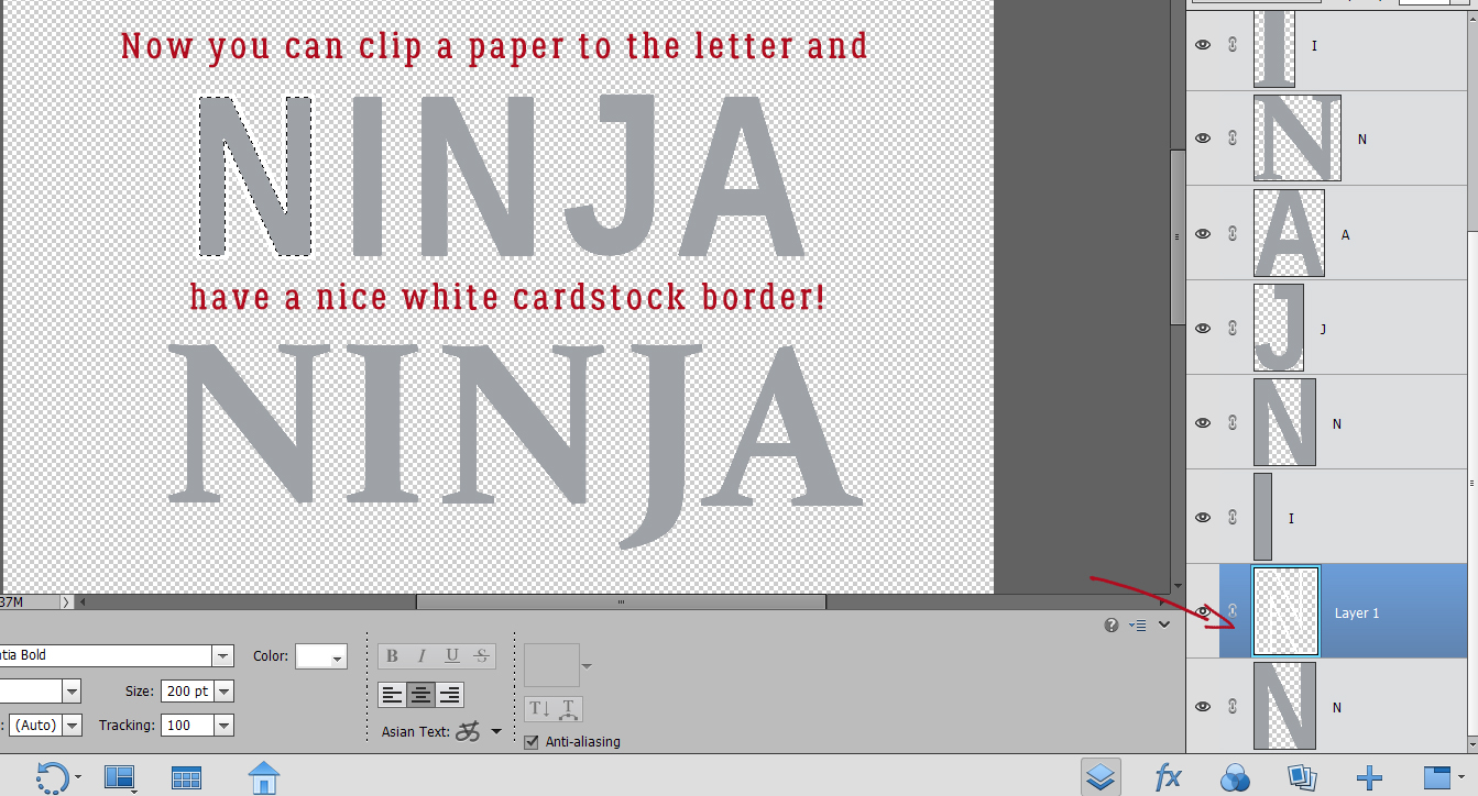
Actually, many of the system fonts that come standard on most computers will work beautifully for this technique; I’m pretty sure Impact is the basis for the commercially-available template versions. I decided to try two fonts and see which I liked better. I started with a commercial font called Liberation Sans Narrow Bold (yes… the name is that long!). It’s blocky but not harsh. And my second choice was Constantia Bold, a system-based serif font that I wasn’t sure would work, but worth a try. I went with BIG, 200 pixels for my text. And each letter is on its own layer.
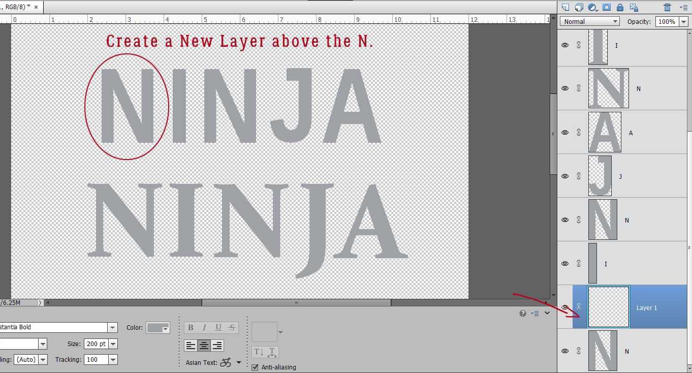
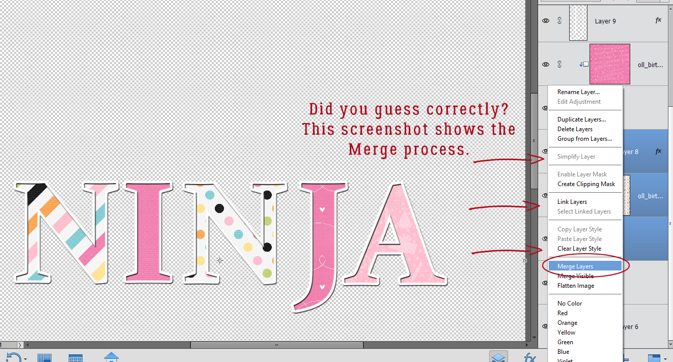
Next, I created a New Layer above the first “N” and CTRL/CMD>clicked on the layer thumbnail for the “N” layer to select the outer edges. (Marching ants are not visible in this screenshot.) These steps will be followed for each letter in the title.
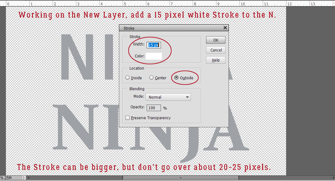
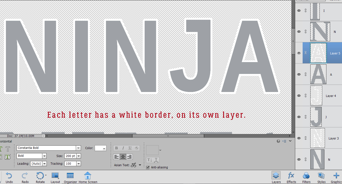
I added a white, 15 pixel Stroke to the outside of the selection. Edit>Stroke (Outline Selection) By putting the Stroke outside the selection, it keeps the sharp points and edges although some corners are slightly rounded. That won’t be visible in the end. You can make the Stroke wider, but be careful not to obliterate your areas that should have gaps. I’d suggest no wider than 25 pixels.
Each of the letters can now be used as a clipping mask. (That’s why I used gray as my foreground colour – to remind me to clip something to them.)
I added a white Stroke to every letter in the same manner. The white Stroke layers will become my “cardstock” border.
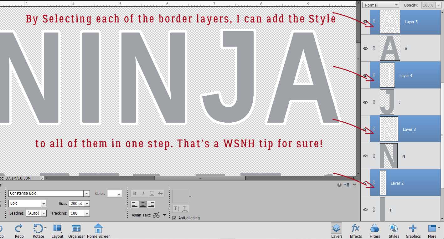
But first, to get the Stroke to that lofty goal, I need to make some adjustments. The Stroke by itself is a little anemic, so I’m going to give it a Bevel Style. I Selected all the Stroke layers by holding down the CTRL/CMD key and clicking on each of them, as you can see in the screenshot. Why? So I can apply the Bevel Style to all of the borders in a single step. Remember: Work Smart, Not Hard!
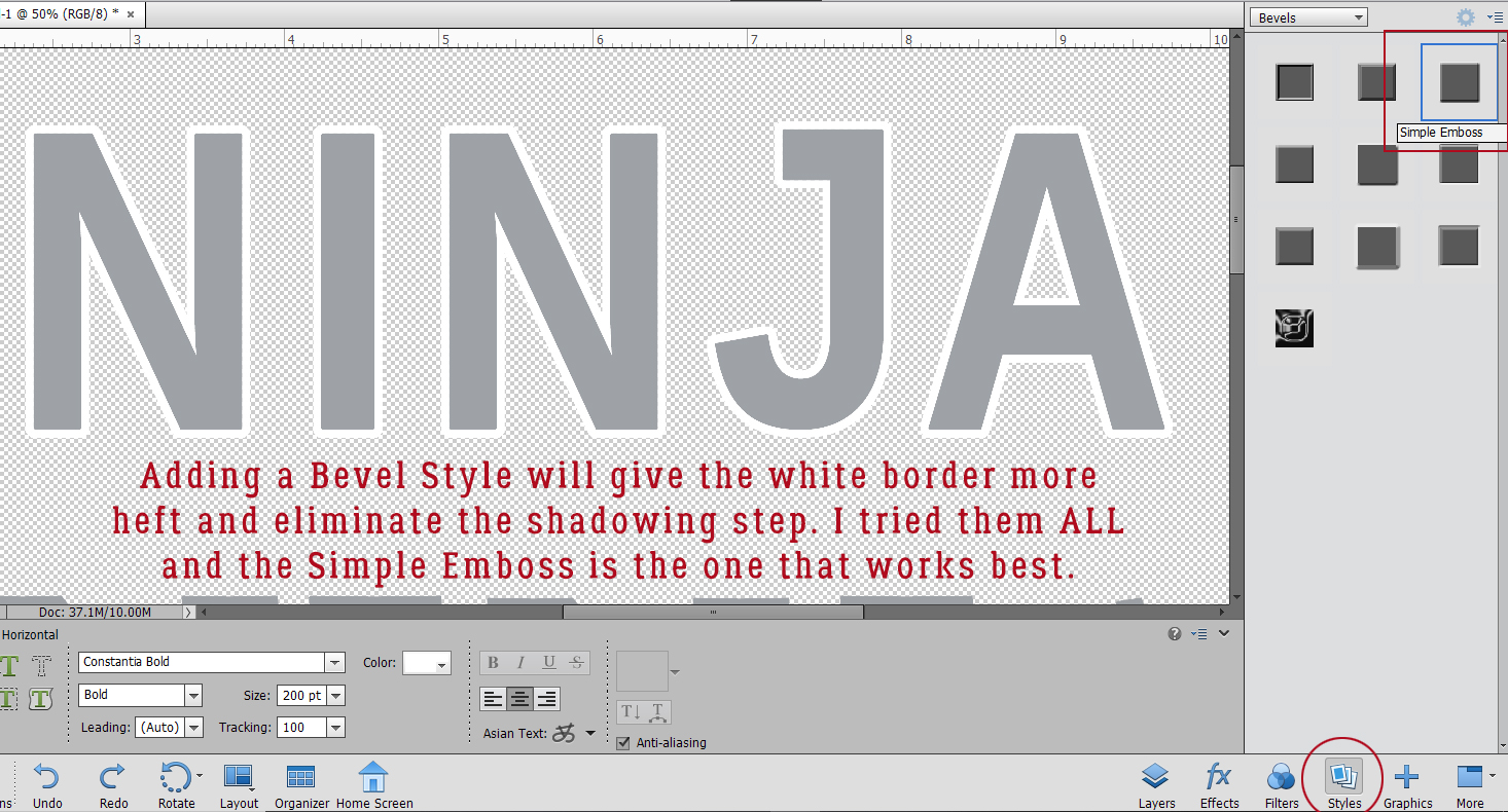
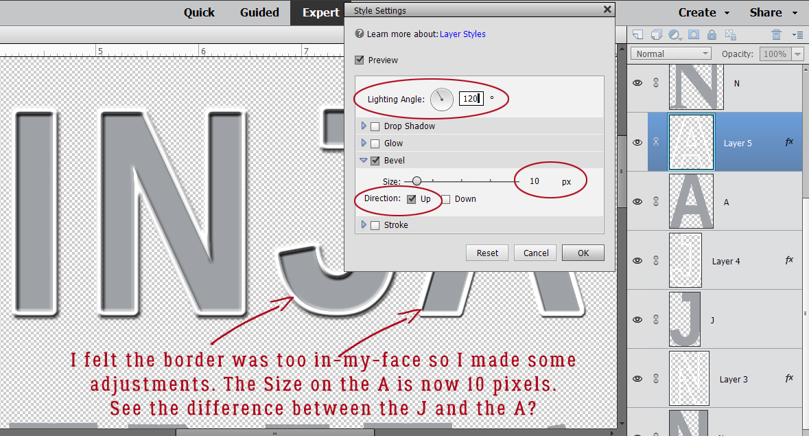
Adding a Bevel Style will accomplish a couple of things – it’ll give the border some substance and it’ll add a bit of shadowing to eliminate the need for doing that as a separate step. Click on the Styles button at the lower right of your workspace and select Bevels from the dropdown menu. Of course, I tried ALL the options for Beveling so I could say authoritatively that Simple Emboss is the right choice.
The default settings for this Style are 90° Lighting Angle, 21 pixel Size and Up for the Direction. I wasn’t blown away by the defaults so I started adjusting each of the Bevels with the letter “A”. Double-click on the fx symbol at the far right of the layer in the Layers panel to open up the adjustment menu. Then I made my changes. You may be able to see the difference between the “J” and the “A”. Once I was happy with the look, I right-clicked on the “A” layer and chose Copy Layer Style. Then I reselected the rest of the border layers and right-clicked again, this time selecting Paste Layer Style. WSNH again!
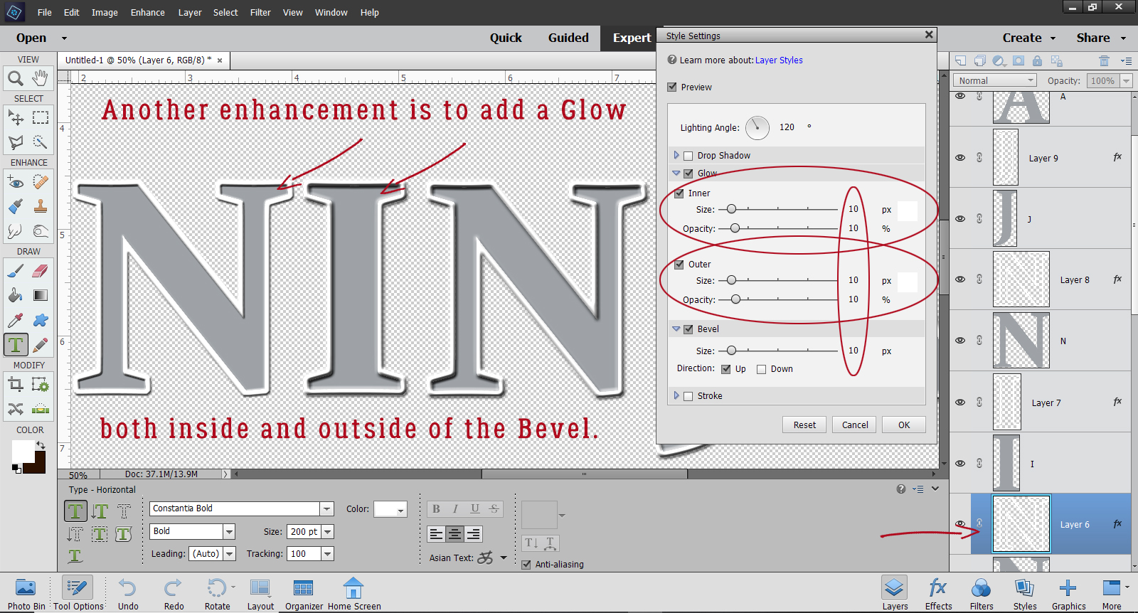
Then I went on to my second title, the one with the serifs. This time when I added the Bevel, I also added both an Inner and Outer Glow – all found in the adjustments for the Layer Style. I made it simple by setting everything to 10. In the image, I’ve adjusted the first “N” but that’s all.
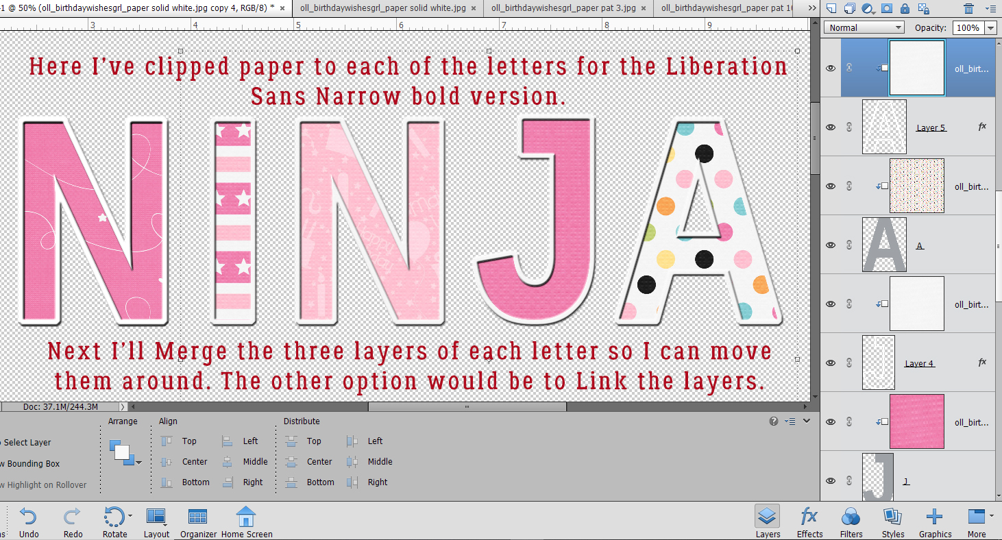
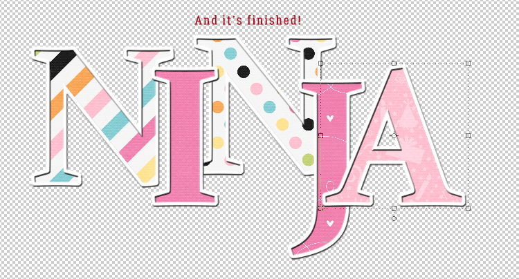
When I was happy I chose some girly papers to clip to my letters from Ooh La La Scraps‘ Birthday Wishes Girl bundle. Need a refresher on clipping? Put your paper over top of the layer you’re using as your clipping mask. Then right-click on the paper layer and choose Create Clipping Mask or CTRL/CMD>G for PSE versions up to 14, CTRL/CMD>ALT>G for versions 15+. Cute, huh?
But which one will I use for my title?
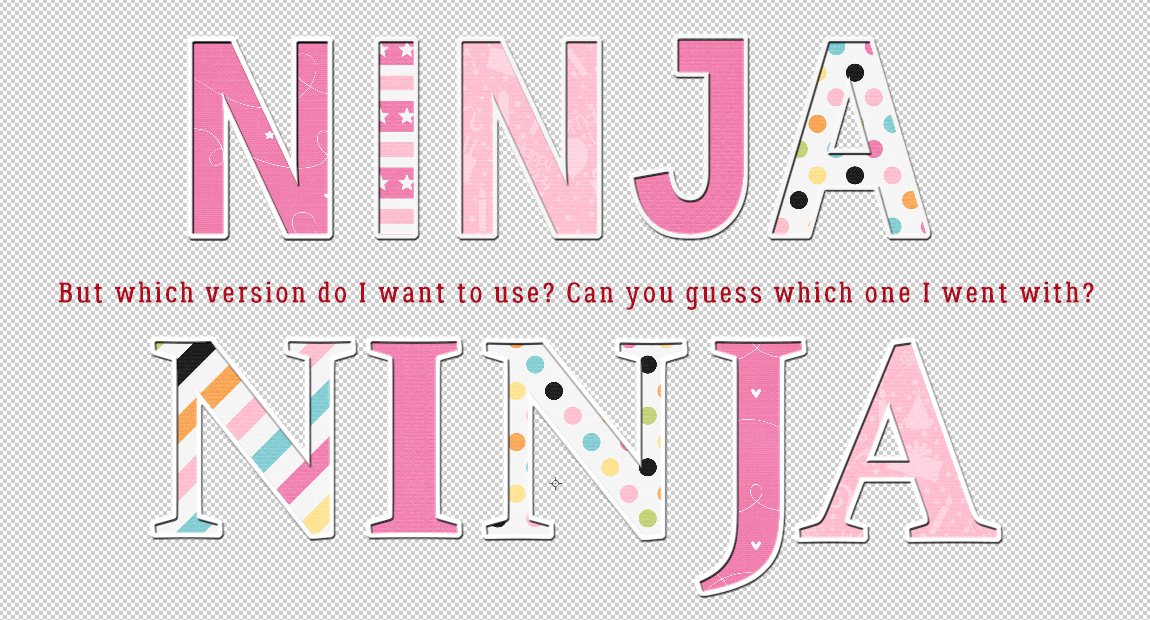
Yes, I went with the second one with the serifs. If I want to manipulate the letters any further, I need to either Merge or Link the layers so that when I move one letter, all parts of it go with it. I Merged (CTRL/CMD>E), but if you prefer to have the layers separate but linked, go ahead and select all three of the layers for each letter then click on the little chunk of chain next to the eyeball icon.
I moved my letters around to make them a little less starchy. And it’s finished! I’m going to be looking for your layouts with jumbo titles now!
Here is a downloadable PDF: https://bit.ly/2LU4oT5
![]()
Another great tutorial !!!
I made the whole alphabet. (how is the best way to save a layered alpha ??)
I grouped each letter and then saved the alpha sheet as a tif.
This will be so useful !! Thank you 🙂
TIFs work! You could save them as individual PSDs but that would eat a lot of hard drive space. Doing the whole alphabet – and the numbers too – is a great idea!
I always wondered how to not lose a stroke around a letter if I clipped a paper to it. Thanks, Jan!
You can add a stroke in the fx adjustments menu along with your shadows, glows and bevels. But it will be attached to the clipping mask, not separable. Any other adjustments made in that menu will affect the whole layer. So really, the tutorial shows the best and easiest way of making it look like a chipboard or cardstock border.
Love this tutorial. Thanks Jan!
Great tutorial, Jan! I like being able to customize the title … and it sounds so easy!
Me again … I am working on the numbers and punctuation for the alpha right now. Glad my choice of saving them was a good one 🙂 I used the tut “Using a Title as a Divider” from last week to make a Font Divider and it turned out great !! It really made the LO POP !! While we are on the topic of fonts, you wouldn’t happen to have one for Snow Writing or Sand Writing ?? I can find tuts and actions for Photoshop but nothing for PSE .
Good for you! You’ll have a great folder full of title seeds when you’re done.
I’m not sure what you’re asking about the snow/sand writing, but I’ll see what I can find. I might be able to figure out a technique for it if I can’t find one. We’ll see!
Just letting you all know the PDF link is up now 🙂
Sorry for the tardiness, I came over to create the PDF before the tutorial was finished, and then totally forgot to come back! I modified the reminder alarm on my phone to go off Tuesday night, so the PDFs should be there Wednesday morning 🙂
Ginger. my goal is to have the tutorials live at 5 pm Pacific time each week. If it looks like I’m going to run late, I can let you know. Thank you for doing the PDF conversions! They’re very popular, it seems!!
Thank, super tutorial, one that I wanted to know how to do.