Creased Paper Cut-Out Word Art
![]()
PDF Version: https://bit.ly/3bowWBc
I had a request in my PMs from glee, who thought I could magick up an Elements version of the Photoshop technique shown on this fabulous layout by physioscrapper. (Hey Nancy!!) So with some trepidation, I embarked on turning a 7 1/2 minute YouTube video into a 46-screenshot tutorial. [I know, only I could do that!] There are quite a few steps, but many of them are repeated a few times so it’s really not that horrible. And, as with some other things that I’ve made up as I was going along, I took a couple of missteps that resulted in more work for myself that I only figured out AFTER I’d gotten there. So I’ll let you know when we get to those!

This is where I began. I used a big, bold sans serif font and only upper case letters. Font selection is super-important for this – it just wouldn’t work as well with an embellished font. You can use more than one word if you like. The inspiration layout only has a single word so I emulated that.

Next I made a Copy layer of the word. As you might recall, I like to use keyboard shortcuts, but there’s a learning curve with that. I’ll always show you an alternate method of doing something then give you the keyboard shortcut for that action where one exists. CTRL is a Windows key, CMD is for Mac. To create a Copy layer, right-click on the layer then choose Duplicate Layer… and OK. Shortcut: CTRL/CMD>J.

In order to take the next number of steps, this Copy layer must be Simplified. Right-click and choose Simplify.

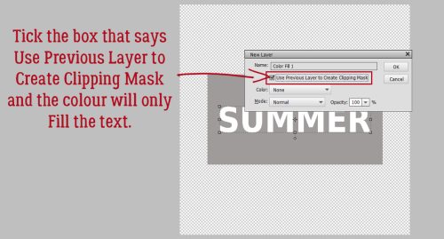
To make keeping the two word layers straight in my mind, I changed the colour of the Copy layer to coral. Using the Paint Bucket would work, but I’d have to pour paint into each letter and the edges might not be sharp with that method. So instead I clicked Layer>New Fill Layer>Solid Color.

To put the Fill Layer right over the letters, tick that Use Previous Layer to Create Clipping Mask box.
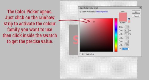
If you’ve never used the Color Picker you may not know how to choose a colour you like. Start by clicking on the colour family you like over there in the rainbow strip. Then fine-tune your choice by clicking inside the big swatch. The Preview box between the swatch and the OK button will show you how the spot you’ve selected in the swatch compares to the previously selected colour.
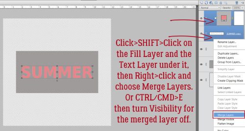
To keep things manageable, click>SHIFT>click on the Fill layer and the text layer then right-click, choosing Merge Layers. Shortcut: CTRL/CMD>E.
Now, go back and activate the original text layer, the one we didn’t Simplify. It’ll be the cut-out part of the word art. There are some techniques in Photoshop that don’t have an Elements equivalent. This is one of those. We want a shadow under the cut-out, but using an Inner Shadow layer Style only applies it to two edges, while in Photoshop, it’s possible to have all four edges shadowed and adjustable. So here’s a work-around. It’s not quite perfect, but it’s good in a pinch! Click the Styles button at the bottom of the Layers Panel then choose Glass Buttons. From the Glass Buttons menu, choose Translucent Glass as shown.

It looks like garbage, but don’t worry! We’ll fix it!!

Double-click on that fx icon on the text layer to access the Styles adjustment menu. These are the default settings for the Style we chose.

Untick the Bevel setting. Then play with the Inner Glow sliders to find a look that you like. These are my choices: Lighting Angle 90° Size 20 Pixels Opacity 60%. It’s possible to change the colour of the Inner Glow here too, but for now we’ll leave it until we see how it all looks later.

Now go back and activate the coloured version of the word. To create the fold, we’ll need to divide the word into two halves. Using the Rectangle Marquee tool, drag out a box around the top half of the letters. Having a capital R there helped. But if your word doesn’t have an obvious halfway part to it, you can turn on the Grid and use it to line things up. View>Grid or CTRL/CMD>’ will turn it on and off.

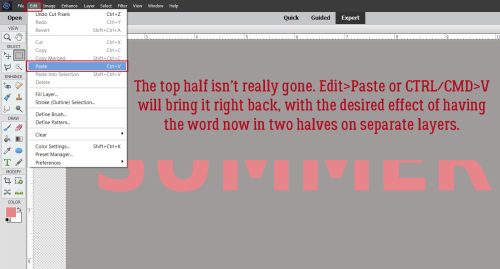
Edit>Cut or CTRL/CMD>X will Cut the top half off and make it disappear. It’s not really gone, just hiding.

To bring it back into view, Edit>Paste or CTRL/CMD>V. Now you’ll have two separate layers, each with half the word on it.
You may need to use the arrow keys to nudge the two halves back into alignment.

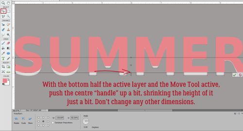
Moving to the layer that has the bottom half of the word on it, activate the Move tool then push the bottom edge upward toward the centre of the word, just a bit.
Still on the bottom, click Image>Transform>Perspective.
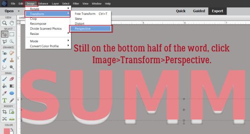
Grab that centre “handle” and move it horizontally to the right. A dialogue box will appear telling you how much you’ve shifted it in degrees. Aim for about 11°.

Move back to the top half of the word and activate the Move tool again, only this time stretch it upward about the same amount you shrunk the bottom. You can toggle the layers’ visibility on and off if it helps you keep track of where you are.

Repeat the Image>Transform>Perspective step.

Moving to the right the same amount as for the bottom, about 11° will keep it symmetrical.

Here we go… it looks like the letters are creased away from the background. There are still some things we need to do to get a realistic look though.

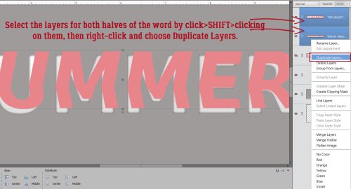
A drop shadow Style isn’t gonna cut it for this so we’ll create a custom shadow. First, select the layers for both halves of the word by click>SHIFT>clicking on them, then right-click and choose Duplicate Layers>OK or CTRL/CMD>J.
This is an optional step: Rename the layers to help remember what they’re doing for you. Double-click on the name Elements gives the layer and change it. Here I’ve labeled the new copies as Top SHADOW and Bottom SHADOW.

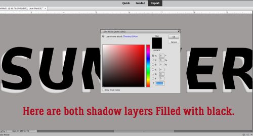
Now we’ll add Layer>New Fill Layer>Solid Color to each of those shadow layers. Make sure you tick the Use Previous Layer to Create Clipping Mask box. For simplicity’s sake we’ll use black for the shadows.

I sometimes just type in a value in the Color Picker‘s # box. Pure black is 000000. White is ffffff… easy enough to remember. Some designers like to use an umber colour, like 2c1902.

With both halves of the shadow layers filled with black, we’re on the way to a nice custom shadow!
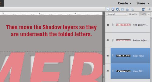
Move the two shadow layers so they’re underneath the folded letters. Click>SHIFT>click on the two layers and drag them down the Layers Panel, or use CTRL/CMD>[ to get them into their proper spots.
Yep, you guessed it… we’re going to pull them off kilter too, one at a time. In the screenshot I’m working with the top half of the shadow. Image>Transform>Perspective.
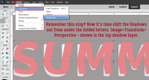
Don’t go too far! 4 to 4.5° is plenty. You just want it to peek out from under the letter above it.

When you’ve got both top and bottom shadows peeking out a little, it should look like this.

Next, Merge the two shadow layers together. Click>SHIFT>click, right-click>Merge Layers / CTRL/CMD>E.

Now to soften that shadow up a bit so it doesn’t look like it could cut glass… Filter>Blur>Gaussian Blur.

The Filter menu opens up. Move the Radius slider until you think the shadow looks realistic. I went to 13.9 Pixels.

But it’s still too harsh, so adjust the Opacity. 70% looks good.

Here’s one of those missteps I referred to at the beginning. **If you’re going to Clip papers to your letters do it now!** That way, the next couple of steps will be visible on your paper rather than the letters you’re using as a template. Merge the papers with the word halves so you don’t get mixed up. Then you can move on to this next step. Activate the layer with the TOP half of the word.
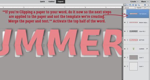
Add a new blank layer above the top half of the word by clicking on the sheet-of-paper icon at the upper left of the Layers Panel and make it your active layer. Then CTRL/CMD>click inside the Layer Thumbnail for the TOP half of the word to Select the edges.

OMG… we’re trying something NEW!! Layer>New Fill Layer>Gradient…

Make sure that Use Previous Layer to Create Clipping Mask box is ticked. We want the effect to apply to just the top half of the word. The marching ants will tell it where to stop.
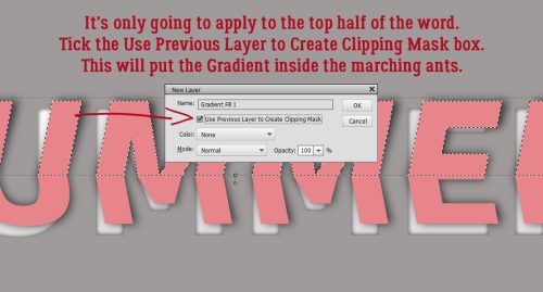
Choose the black-to-transparent gradient option. Of course it looks horrible. Tick the Reverse box, then we’ll make it pretty.

Now the effect is at the top of the letters and by decreasing the Opacity to 15%, it just adds a hint of shadowing where the light couldn’t quite reach the paper.

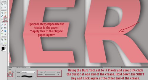
This step is another optional one, but I think it’s actually essential. Using the Burn tool let’s add some deeper shadowing where the paper creases. (You want to take this step AFTER you’ve clipped your paper to your letters.) The Burn tool icon looks like an “OK” hand signal. Use a small diameter, 15-20 Pixels, and don’t go too heavy, maybe 10-15% on the Opacity. To create a straight crease, click your cursor where the two halves of the word intersect then hold down the SHIFT key and move over to the other end of the word. Click the cursor at that intersection point and voilà, you have a straight crease.
So you can see how it looks with some papers in place, here you go.

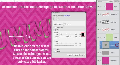
If you think your cut-out shadows aren’t quite dark enough, this is how to fix it. Go back to the original text layer, double-click on the fx icon and use the swatch to change the Inner Glow to black.
Because I wasn’t thinking and waited to Clip my papers until after I’d Burned the crease and added the Gradient, I went back and fixed that.

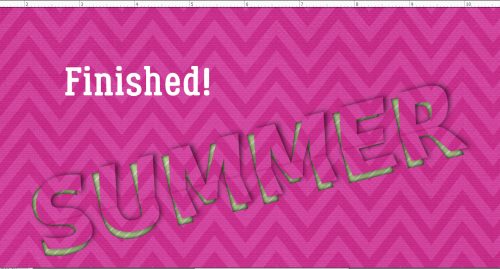
There… a reasonable facsimile of Nancy‘s word art!
PDF Version: https://bit.ly/3bowWBc
I’ll be back in a day or two with the August 2022 Designer Spotlight. See you then!
![]()
Jan and glee… thank you so much for interest in and showcasing my layout! ♥
Jan you did a super job of getting down all those steps and working it with PSE! It is a fun technique and I hope others have as much fun with it now, as I did!
oh my gosh you’re amazing!! (nothing new there, actually!) I have to try this when I have some TIME!!
mahalo, dearest!
I’ve been sitting on this one for almost 2 months already. Because I knew it would be a bit of a slog. But I’m really happy with the responses!
I had an idea of how some of it would go even before I watched the video. The Inner Glow trick was the key to getting as close as possible to the PS version. Every tutorial I write stretches me in such a good way!
What a cool effect !!
Thank you so much for the tutorial 🙂
Wow is all I can say.
Wow, Jan!! Thanks for taking the time to figure this one out. The final effect is amazing!