Pattern Files, Custom Shapes and Styles Mash-Up (Replay)
![]()
PDF Version : https://bit.ly/3IMNvoc
Well, my son hasn’t bounced back from his infection the way I’d hoped. He’s fine… just not back to normal, so that means I’m not back to normal either. I’m feeling a little depressed and unmotivated. Hence the reprise of an older tutorial. This one came about when Ellen (gmae) and her sister Carol (gnana96) wanted to learn more about using Photoshop Elements in more creative ways. Since we’ve been talking about Styles a lot lately, this seems to be a good fit.
I don’t have the original screenshots any more, so I’ll caption the images where the red type on gray background makes them impossible to read.
First thing I did was open a blank canvas so I could experiment.
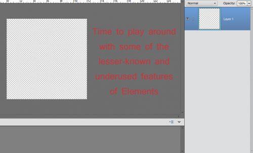
Time to play around with some of the lesser known and underused features of Elements
One of the items Ellen mentioned was shapes. I touched on the Shape tool in the tutorial about rounded rectangles, but there’s a LOT more to it than that. Let’s look at the Custom Shape tool, the one that looks like an amoeba. Below is a screenshot of where to look for the tool in the Tool panel, as well as what the menu looks like. As you can see, there are a number of categories; if you know what kind of shape you’re looking for you can zero in by selecting the category and carrying on. I usually look at them all.
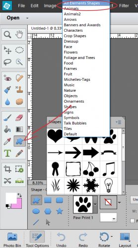
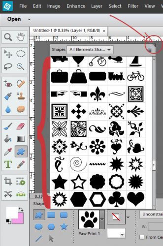
That little window holding all the thumbnails is teeny-tiny and only shows about 12 thumbnails at a time, so I made the window bigger. There’s a wedge-shaped collection of dots in the upper right corner of the window frame that I clicked and dragged on to make the window really big. Now I could get down to business.
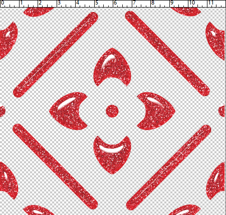
For this demo I decided to choose a Grecian key shape. To create your shape, you put the cursor on your work surface and drag it across the screen. You can adjust proportions by moving that cursor around or you can tell Elements that you want to “constrain proportions” by clicking on that control bar I have circled below then entering in the dimensions you want. You can set it to create the shape from the centre out, or from one corner. If you’re particular or you have a specific idea in mind then select the controls you need to make the software work for you.
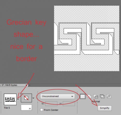
Grecian key shape… nice for a border
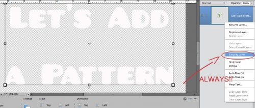
There are two ways to Simplify this shape layer. You can select it in the Tool options panel (for Elements 14 or later), or you can right-click on the layer in the Layers panel and select it there. Why Simplify the layer? That’s how you get a transparent background! With a transparent background, your shape becomes a “smart object” that you can move around, resize, rotate, skew and any other alteration you can think of. You want to have as much control and as few CTRL/CMD>Z moments as possible.
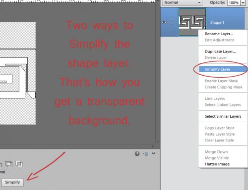
Two ways to Simplify the shape layer. That’s how you get a transparent background.
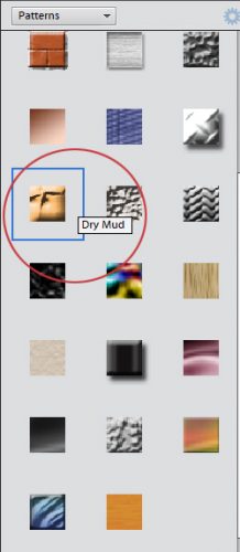
We’ve talked about Styles a lot lately, so this is just a review. There are dozens of embedded styles in the software; they’re found in the Effects panel you open by clicking on the big fx button at the lower right of your workspace. We’re focusing on the Styles section of this set. Open up the menu by clicking on that little bar the arrow indicates and select Patterns to see this menu. These files have .asl as their file type. and are stored in the Presets folder of Elements on your computer. Hover the cursor over the thumbnails to see what Elements calls each pattern.
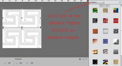
Let’s look at two different Pattern Styles on identical shapes
The software needs to know where you want to put the Pattern Style, so CTRL/CMD>click on the layer thumbnail to select the contents of the layer. Voilà… marching ants!
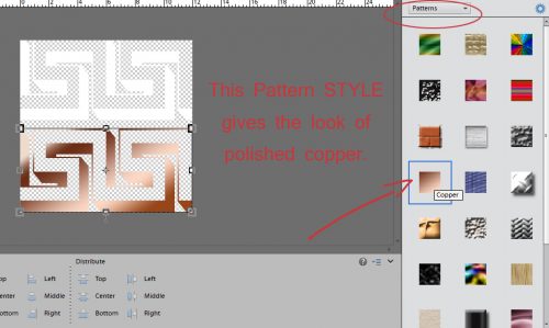
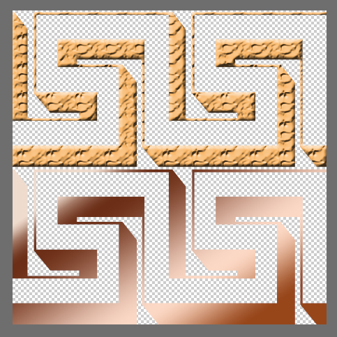
This Pattern Style gives the look of polished copper
CTRL/CMD>click on the layer thumbnail and get those old marching ants
This is what the Copper Pattern Style looks like on the Grecian key shape. To apply the style double-click on it.
This Pattern Style gives the look of polished copper
I wanted to show you one more of the choices from that menu, so I selected the top strip of the Grecian key shape.
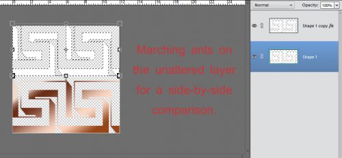
Marching ants on the unaltered layer for a side-by-side comparison
Hmm… dry mud? Why not!
Wow!
Let’s just refresh our memories about those style files several of our GingerScraps designers include in their collections. (Aimee Harrison, Miss Mis Designs, Just So Scrappy/Ooh La La Scraps, Kristmess and Magical Scraps Galore are the ones I can think off right off the top of my head.) I used a different custom shape for this part.
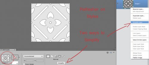
Refresher on Styles… two ways to Simplify
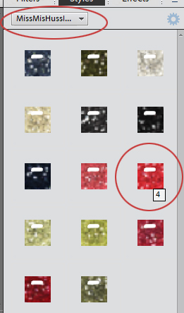
I’m going to apply a glitter-gloss style from Miss Mis Designs’ collection called Hustle and Heart.
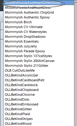
The menu for that Style group looks like this.
You’ll notice that this type of Style adds some dimension and reflected light to the shape.
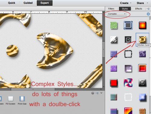
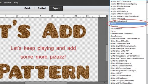
There are many embedded Style categories, as I mentioned. What do the ones in the Complex styles folder do? (OMG, I have a typo on my screenshot! Oh well…) This particular style adds dimension, reflected light and drop shadows all with just a double-click.
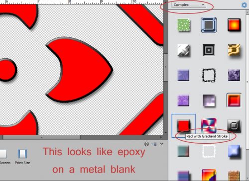
Here’s another Complex style that looks like enameled or epoxy’d metal. Think of the ways you could fiddle with that!
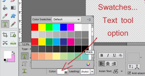
Ellen also had Swatches on her list. There are a few choices with this one. To see the swatches you can click on the Window tab at the top of your screen and select them from the drop-down menu. Or, if you’re in the Text tool clicking on the Color box as shown will open up the same menu. I rarely use this feature because it’s so much easier and more satisfying to use the Color Picker tool (eye-dropper) to select a colour from either my photo or one of my papers/elements. The sky’s the limit with that method; this one is quite limited.
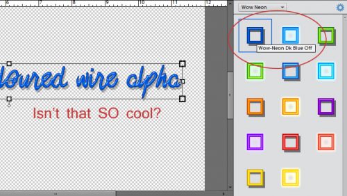
Here’s a happy little accident I experienced while I was experimenting. I checked out the Wow styles way down at the bottom of my (lengthy) styles list and the Wow Neon style looks like that fancy coloured Niobium wire.
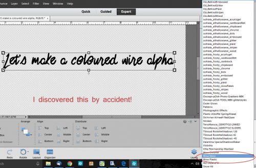
See what I mean?
The style adds a drop shadow, which I felt might be a bit too far from the text for wire, so I opened up the fx menu on the layer to tweak the shadow and noticed that I had the option of changing the colour in there too.
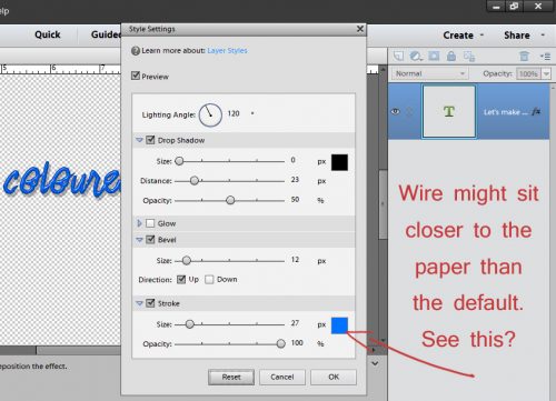
Pulling the shadow in closer to the text looks like this. There are other ways of amping up this look too, by copying the original layer above the one the style is applied to and then applying another style to that layer, playing with the opacity until it looks incredible.
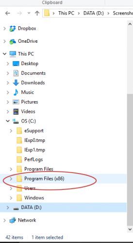
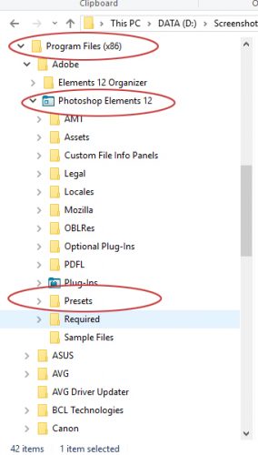
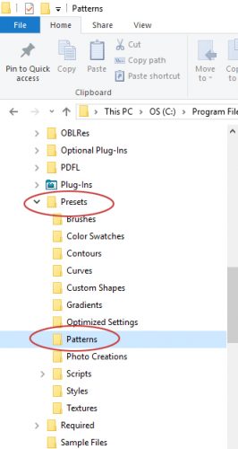
Now to the heart of Ellen’s question. Pattern files. Those ones with .pat as the file type. There are some designers who include a .pat file along with a .asl file in their kits. There are also a number of embedded .pat files in the software. I wasn’t able to find a shortcut for installing these files, so below I’m going to give you the steps for installing them manually. After you’ve extracted the .pat file from your downloads, copy the file (CTRL/CMD>C) then in Windows Explorer, look for the path I’ve shown. C:> Program Files (x86)> Photoshop Elements> Presets> Patterns. then paste the file into the folder. (CRTL/CMD>V)
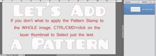
Now let’s play with some .pat files! When you use a font for anything, you have to Simplify the layer before you can make any alterations to it. Don’t worry if you forget this step, because Elements will remind you. But ONLY with fonts!
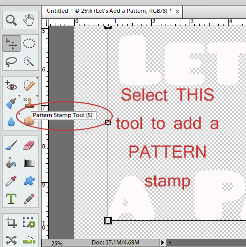
Now how do we access those Pattern Files? By using the Pattern Stamp tool, of course! It does the same thing as the Clone Stamp tool, but rather than stamping a sample from the image you’re cloning, it uses a pattern. If you use the keyboard shortcut <S> you can toggle between Clone Stamp and Pattern Stamp easily.
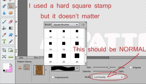
The Stamp uses Brush tool options to select the area it covers. I used a hard square brush for my sample, but it really doesn’t matter what shape you use. You’re just going to click and drag the brush over the item you want to use the Pattern Stamp on anyway. Make sure you have NORMAL selected in the Mode box, otherwise you won’t see the effect you think you should.
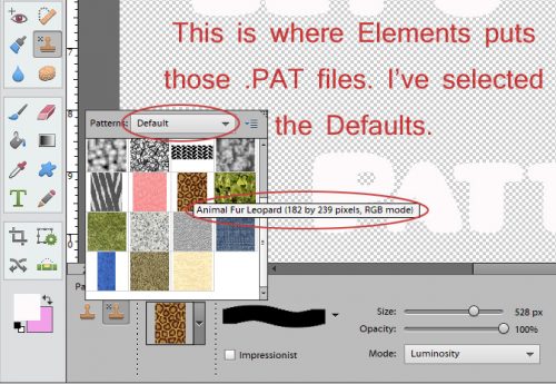
This is where Elements hides those .pat files. There are several defaults, and any that you’ve installed into the Patterns folder will appear in the menu.
The Pattern Stamp will cover everything unless you select where you want it to go. So make sure you’ve selected the areas to apply your pattern to.
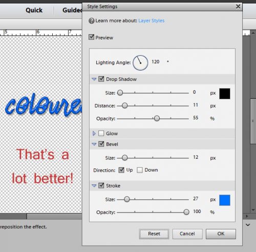
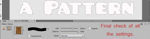
Do a quick visual check to make sure all the settings are correct.
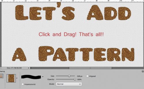
Click and drag your Pattern Stamp brush over your selection… Bingo!
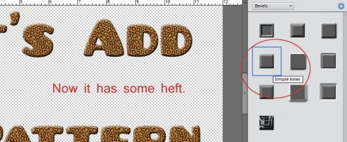
It looks neat, but I want it to look even neater, so I added a Bevel.
I used the Simple Inner bevel to add dimension.
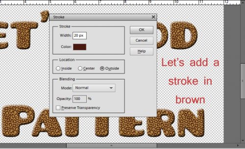
Then I added a stroke to the resulting rounded text.
And here’s how to find the .pat files you’ve installed. My experience with those that come in kits is that they’re generally just glitter, but I only have the two you see below so what do I know?!
I haven’t completely wasted the last two weeks; I’ve been watching Facebook reels (lots of reels… so many reels!) of Photoshop tricks that I just may be able to replicate in Elements. It’ll take some experimentation but I think I should be able to make them work. Stay tuned! Next week I’ll be letting YOU shine in the Challenge Spotlight.
![]()
Facebook reels (lots of reels… so many reels!) of Photoshop tricks that I just may be able to replicate in Elements. Sounds great
Jan,
This replay is great! So much stuff in here to try, Do you have a record of when you originally posted this and if it was under the same name? Thanks.
This one was first posted on June 6, 2017 and was titled Ellen: Talking About Tools.
This is great. I wonder if I missed the original. But playing around with patterns and styles is fun! I noticed some build on each other. Thank you! A whole new ‘nuther thing to play around with.