Four Ways to Use Dingbat Fonts
![]()
PDF Version : https://bit.ly/3PVn7eh
After last week’s tutorial, Lisa commented, “… now that you bring up dingbats I’d love a tutorial on how to really use them in a layout!” So today, I have four techniques to share. There are many more than four, but for now we’re just looking at four. These are all relatively simple techniques we’ve used before so I’m not going deep into the weeds with step-by-steps. If you think of other ways to use dingbats, I’d love to try them!
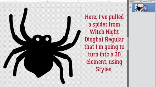
First, if you’re not using a font manager like High Logic MainType, and aren’t familiar with Wordmark It, figuring out which characters will give you the image you want means either searching your computer for “character map” or trying one character at a time. If you look at the screenshot, I’ve enlarged the character V for this spider from Witch Night Dingbat as shown on the Type Layer.
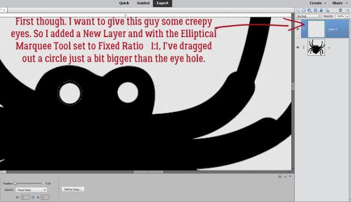
I think this spider would look a lot more scary with some glowing red eyes. So I added a New Layer to put the eyes on, then using the Elliptical Marquee Tool, set on Fixed Ratio 1:1, I dragged out a circle just slightly bigger than the eye hole.
Then using the Paint Bucket Tool, I filled the circle with red.

He’s got two eyes, so I Duplicated the red circle [CTRL/CMD>J], positioned the new circle over the other eye hole then Merged [CTRL/CMD>E] the two layers.

I intend to layer two Styles on the eyes, one a red acrylic Style that adds both a Bevel and a highlight, and a glass Style which will add some shine and a Drop Shadow. While it IS possible to layer Styles on a single layer, the two I plan to use won’t work that way. So I Duplicated [CTRL/CMD>J] my eyes layer.

The acrylic Style is opaque and changes the colour of what’s under it. The glass Style makes the layer it’s applied to transparent or translucent, depending on which glass Style you choose. This is why the acrylic was applied to the lower eye layer and the glass to the upper. I wasn’t totally jazzed by how the glass layer looked so I made some adjustments; I double-clicked on the fx symbol on the glass layer and moved the sliders until I liked the look. To put the highlight in the right spot, I changed the Lighting Angle. Once I was happy, I Merged [CTRL/CMD>E] the two layers and moved them under the spider body layer.

All that was left now was to add a Simple Scalloped Bevel to the spider’s body and it looks quite evil!

Dingbats are ideal for creating Brushes. The character for this black cat in Witch Night Dingbat is the letter O. Resize the image until it’s about 2500 pixels. Then click Edit>Define Brush.

My example is 1583 pixels, but can be enlarged when it’s used as a Brush. I gave it a name, Black Cat. A highly original name.

This part is just for fun. I want to add some dimension to the image, so I’m going to apply a Layer>New Fill Layer>Pattern Fill. Then I scrolled through the options in the Pattern Fill menu to Texture Fill and chose Denim. It’s the one that looks most like fur. Only problem is now the cat’s gray, not black. So…

I Merged [CTRL/CMD>E] the Fill Layer and the Brush Layer together. Then I adjusted Levels. [CTRL/CMD>L] I also filled the eyes with green and added a pupil, but that was for me! Now if I add a little Bevel, I’ve got a puffy sticker to add to my layout.

The third use I’ve got for you today is to use dingbats to create a border. I’m still using Witch Night, and the character that produces a pair of witchy shoes is either E or Y. All I did here was to type out a row of 13 pairs of shoes.

Don’t forget that dingbats are actually fonts where Elements is concerned. So they have to be treated like fonts. Before I can add Texture, Styles or do much of anything, the font has to be Simplified.

For the top of the border, I just Duplicated the base layer [CTRL/CMD>J] and moved it to the top of the canvas. Use your View>Grid (not shown)! It really helps with positioning and symmetry.

Now, I could have just Duplicated the base layer again and rotated it, but I decided I wanted to have the soles of the shoes all “touching the ground”. I knew there were individual shoe dingbats in the set, so I changed the Type Tool from Horizontal to Vertical then typed out a line of alternating Is and Rs. I ended up with one too many shoes, but that was easy to fix.

There. I have a border!
This last example is using both a traditional font and a dingbat. My favourite Bugs Bunny cartoons are the ones with the vampire, the witch, bats and the two-headed buzzards. In one, Bugs and the vampire have a spell-casting battle. So this just seemed to create itself. The traditional font is called Abracadabra (of course, what else could it be?) and the dingbat is from Alit Halloween. I typed out Abra ca dabra – with spaces for the bats, then Simplified the text. If I didn’t do that, when I switch to the dingbat, the font will change to it too. So nope!! I typed out the bats (character is b) on their own layers so I could tilt them. I wasn’t happy with the way everything aligned and fitted together so I Cut the “ca” out, Pasted it back onto the canvas then moved it into place a bit lower than the baseline. This could be used as a sticker by adding a white Stroke to it, or it could have a Style applied, or a paper clipped to it, or… whatever suits my fancy.

If you think you might want to reuse any of the things you’ve created from dingbats, make sure to Save As a PNG so the transparent background is preserved. I hope I’ve given you some ideas here. If the kit you’re working with doesn’t have that one special object in it that you’d really like to include, check out your dingbats!
![]()
You did it again Jan! Thanks for an informative tut. It got my juices going, especially dealing with some potential obstacles and how to adjust for them. Thanks again.
Very fun tutorial! I think some playing with dingbats is required.