Realistic Snowy Titles
![]()
PDF Version : https://bit.ly/4an7OEw
Well, to be completely fair, I used this technique for my December siggy, but that’s not really any different from a title. Right? This technique will work best with either a simple font or a plain, flat alpha. I went with the alpha from the GingerBread Ladies’ Holiday Joy. It’s a painted kraft alpha and it was perfectly suited for the technique. I aligned and spaced all my letters, then Merged the layers – Click>SHIFT>Click on the first and last layers, which Activates all the layers in between, Right-click then choose Merge Layers. Or use the keyboard shortcut CTRL/CMD>E.

Why do all this extra work when you can just use a white glitter Style, you ask. This is why!

Instead, a Pattern Style will give me a much more realistic look. To find this collection of awesomeness – which comes with your software! – click on that Styles button at the bottom of the Layers Panel then using the drop-down menu found at the top, scroll down to Patterns. And there they are!

The Pattern I used is Fiberglass. It looks a bit (a lot) rough, but that’s not permanent.

To adjust Layer Styles, double-click on the fx icon on the layer to open up this menu. Then use the slider to make your tweaks. I decreased the Bevel to 8 pixels, which nicely softened the edges of the lumps, and changed the Direction to Up.

Yeah, it looks a bit like lumpy concrete, but that too is fixable. First, though, the layer needs to be Simplified. (Broken record, amirite?) Right-click on the layer and choose Simplify Layer. (No keyboard shortcut. 🙁 )

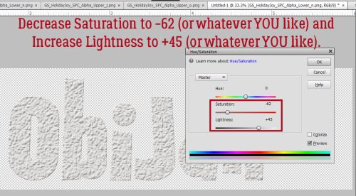
Now we can go into Enhance>Adjust Color>Adjust Hue/Saturation. Keyboard shortcut (yes!) is CTRL/CMD>U.

These sliders are the key to white! Pull the Saturation slider to the left to (about) -62 and push the Lightness slider to the right to (about) 45. You have control here; these are the settings I used, but you may like something different. Just watch what’s happening on your screen as you make your adjustments and stop when you’re happy!

Now to give it a bit of sparkle! I’m going to go back to the glitter and apply it to a Copy layer – right-click>Duplicate Layer…>OK. Or CTRL/CMD>J.

Just So Scrappy‘s Winter Whimsy has been archived, but there are a LOT of choices for glitter in the Shop. Click HERE. After trying all the white options in the collection, I decided to use the fine glitter-gloss Style. It’s a bit extra, so I’ll tone it down.

All I had to do was decrease the Opacity of the layer to ~40% and now I have frosty snowy letters!

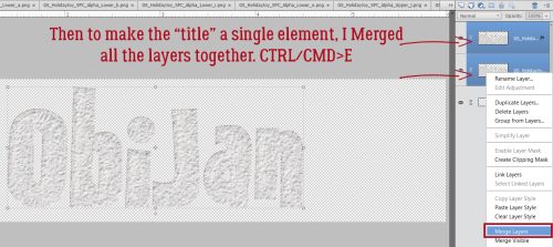
The last step is to Merge all the layers together to make the word move as one element. Too easy!

Maybe I should play with some of the other Pattern Styles and see what they look like. Maybe I’ll come up with another way to elevate our titles.
![]()
[…] 327. Realistic Snowy Titles […]