Texture Overlays – Whut?
![]()
PDF Version : https://bit.ly/48LXfch
Just before Christmas I had a request from Hilary: “I didn’t know where to stick this so here goes. Can you do a tutorial on the .jpg textured-overlays please? Or an explanation of how to use them? When I try using them all I’m seeing is dark splodges, you can’t see the underneath photo/picture. TIA” Of course I can! But let me start by saying that texture overlays are better suited to applications on paper, and not photos, unless you’re doing a very arty layout. The following tutorial will work with photos, with the same caveats as for papers. The textured overlay I’m using in my samples is from Karen Schulz‘s CU Textured Overlays V.01. (CU stands for Commercial Use, meaning the item can be used by designers and others without crediting the original designer. This is in contrast to Personal Use (PU), where crediting the original designer is part of the terms of use of both the designer and GingerScraps.)

These Overlays are intended to by adjusted using Blend Mode and Opacity tweaks to achieve the look you like best. As you’ll see, there are infinite combinations which provide very different looks. I can’t show you every possible permutation; you’ll have to experiment a little. Nothing is final until you say it is! In the example below I’ve simply dropped the Overlay onto a solid colour Fill Layer, which in its unadjusted state just looked like “dark splodges”. I changed the Blend Mode on the Overlay to Multiply. Opacity here is 100%. I like it, and might use it as is.

By decreasing the Opacity to 50% the texture is still visible, but much more subtle. For most of the subsequent versions, I’ll leave the Opacity at 50% for comparison.

Color Burn gives a bit brighter look with a slight increase in the Overlay’s visibility.

Linear Burn darkens everything somewhat, even without an Opacity change.

See how Lighten changes everything? The teal is softer, the Overlay is grayer.

Screen lightens and softens everything. I like this version a lot too.

Overlay brings a ton of detail into the Overlay that was less obvious in the previous versions. Note too how the centre of the paper looks lighter and brighter.

Soft Light is very subtle and reads as almost a solid. I would keep this one in my repertoire.

Hard Light brings the detail back, lightens and brightens everything, as you would expect.

Vivid Light is really dramatic! The teal is so much brighter and the detail sharper.

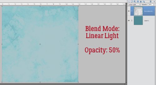
Linear Light maintains the tonal change of Vivid Light, but lightens and softens it all.

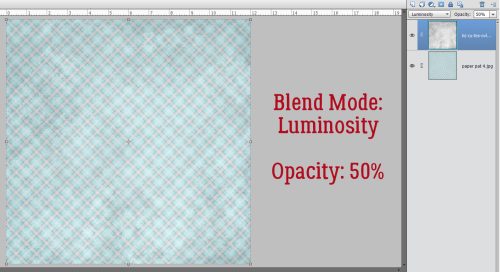
Luminosity has preserved the sharper details, while changing the colour only slightly.

Now, let’s look at what happens with a patterned paper. This one is from Ooh La La Scraps‘ Freezing collection. It’s got a similar shade of teal in the plaid for consistency. Right here, it just looks like it’s been dragged through the mud. It could work for an arty layout just the way it is.

With a 50% drop in Opacity, now it looks more distressed and less depressed.

Switching to Multiply dampens the texture but doesn’t hide it completely.

With Color Burn, the texture all but disappears. The patterned paper does look brighter, though.

To my eye, Linear Burn gives a sort of grungy grease-stained look. Could work!

Lighten gives the appearance of worn paper in the more transparent areas of the Overlay.

Screen completely obliterates the texture and blows out the pattern too much. But… maybe it could be salvageable with an Opacity increase. Remember, I’m just showing you samples. You’re in control of your work.

Overlay isn’t dramatically different from Screen at 50%. Maybe at 25% it might look good. Here’s a tip: use the SLIDER. Watch what changes as you move it. Stop when it looks right.

Soft Light just basically makes the whole image soft and light. Boring…..

Hard Light gives some slight variation in depth, but not really a visible texture.

Vivid Light. Just no.

Pin Light shows more variation in depth than Hard Light. Think of a tiny flashlight shining on it.

Luminosity brings back the grunge.

If we go a step farther and add that solid colour teal Fill Layer between the Overlay – Opacity at 50% – and the patterned paper, a whole other world of possibilities opens up. Color Burn on the FILL LAYER at 100% changes the entire look!

Drop the Fill Layer Opacity to 50% and the texture pops back into view. With the three layers, you can tweak both the Overlay and the Fill Layer Blend Modes for an incredible variety of looks.

As I said many times before, don’t be afraid to play around with your options. It hurts nothing and isn’t permanent unless you want it to be. CTRL/CMD>Z (Undo) is your friend! If you don’t like it, make it go away. When you find something you really like and think you might use it again sometime, don’t forget to Save it. For papers the format is JPG, for elements the format is PNG. Put it somewhere that you’ll be able to find it again. 😉
The new dishwasher was installed on Friday and it’s FABULOUS! Whisper-quiet, gets everything spotless and even gets the plastic stuff dry. Now I just have to pay the credit card bill… Next week is Challenge Spotlight Tuesday. Which Challenge will I choose this time?
![]()