Back-to-School
![]()
If you live anywhere in North America, you can’t escape the back-to-school frenzy, even if you have nobody in your life who’s in school. It worked out well for us though… our son’s backpack came home from his day program last week with a totally fubar zipper. Walmart had a wide variety of options and I grabbed him one that holds everything he needs on a day-to-day basis. Score one for Jan!! I managed NOT to buy any pens, paper and paint this year, so that’s another point for me. So how did we end up looking at back-to-school fonts, you’re thinking. Well, when my mom came to see me on my birthday back in May, she brought me a bag full of things she found when cleaning her house after my dad died. They were all things I’d saved from high school. I KNOW, right?! Looking through them was a real walk down memory lane. One thing that really struck me is how much my handwriting has changed over the course of my life. That bag had half a dozen different variations! So that led me to thinking about how much it bothers me that schools aren’t teaching kids cursive writing any more and how that will severely hobble them in the future. But I digress. I’ve rounded up a baker’s dozen of schoolish fonts, from learning basic printing to more “sophisticated” teenage girl script. (I don’t have to describe that one, do I?) 😀 They’re all from dafont.com and 100% free for personal use. Just click on the font’s name and you’ll go right to the download screen. Oh, yeah… they’re not in any particular order. You’ll see.
First one up is KG Perfect Penmanship. Many of you already know Kim Geswein‘s fonts… she’s a machine! This one is the most perfect example of grade-school printing ever. You’ll see a couple more of Kim‘s fonts in a minute.

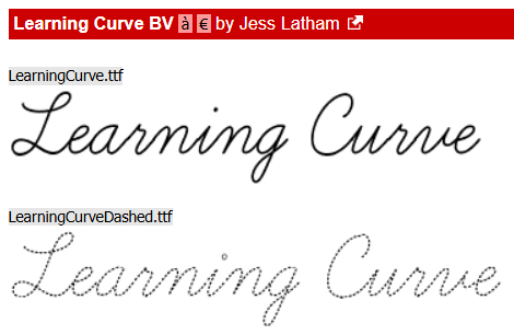
This isn’t one of them. 😉 Learning Curve BV is exactly how I remember being taught cursive writing. Very controlled, perfectly shaped and spaced letters, easily legible.
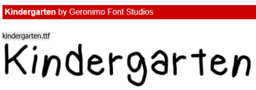
Kindergarten looks a lot like a real child trying very hard to make every letter perfectly. I love it!
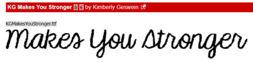
Makes You Stronger is Kim‘s controlled middle-school cursive. My handwriting looked a lot like this when I as about 12.
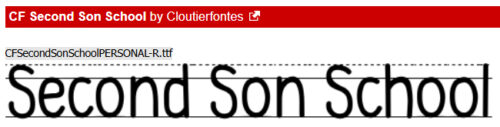
I liked Second Son School for the notebook lining. Doesn’t it bring back memories?
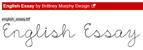
I feel like English Essay is an evolution of a typical girly cursive hand from the basic to beginning to add some personality. Remember writing big, loopy, widely-spaced letters to fill up the page faster? 😉
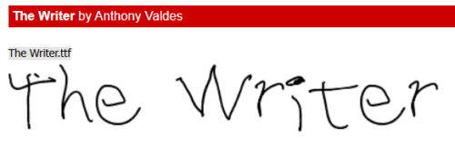
Why do I think this could be a serial killer’s first printing? Just kidding. The Writer is definitely a beginner’s hand.
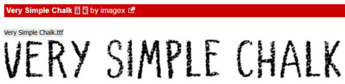
Very Simple Chalk is exactly that. It’s an all-caps font, with two sizes to represent upper and lower case characters. It includes numerals and a wide range of punctuation, as well as multilingual characters.
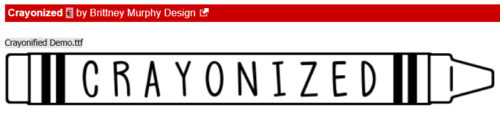
When I saw this, I HAD to share it with you. The crayon shape is part of the character map and you can point the business end in either direction. To point to the left, use the { and } at each end of your word. To point right, use the [ and ]. Each of the letters in Crayonized has the lines above and below, so they all connect up. It’s pretty cool!
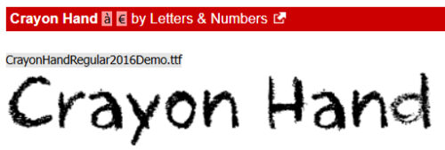
Then, if you want your journaling to look like you wrote it with a wax crayon… Crayon Hand.
Ooh, teenage boy time! Most of the guys I’ve ever known mix printing and cursive, with small letters – Random Handwritten. My husband’s writing is so tiny and tight it’s hard to read; it’s like he has to pay for the ink. And he likes superfine pens, to make it worse.

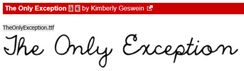
Here’s another must-conform-avoid-attention-and-meet-expectations-at-all-costs late middle-school girly hand. Ironic name, though: The Only Exception.
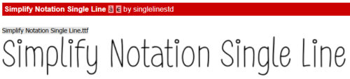
And last… the tween girl who wants to assert some individuality but still craves the approval of her teachers……. Simplify Notation Single Line is tidy, controlled but has little circle tittles. How many of us dotted our I’s with hearts at some time in our lives? 😉
Did you see one that you might use for the Journaling Challenge this month? I hope so!
![]()
Jan, every time you do one of these font posts I think I’ll never find any to add to my stash – and low and behold ,I find at least one I like. Today, I downloaded several. I think they will be useful as I scrap school pictures, not only of my kid, but me as a school age kid as well! Thanks for doing the leg work of finding these!