Digital Shadowbox: Take One

Yay!! I’m back in business! Turns out fibreoptic systems can fail right at the connector if they’re not perfectly aligned, and heavy truck traffic can knock those connectors ever so slightly out of alignment. The joys of living in a construction zone. All fixed, carry on! <whispers: The service tech gave me his cell number so I can call him directly if it happens again. 😉 >
Okay, on to the tut! I tried to put the tutorial together offline so I could do a hit-and-run, but it messed up the formatting so badly, I’m starting from scratch… Awhile back Jill sent me request. Could I deconstruct a shadowbox-style layout she found online? She sent me two images and I’m going to deconstruct BOTH of them! The first one (the layout is from The LilyPad and the scrapper is Roxana) is this one.
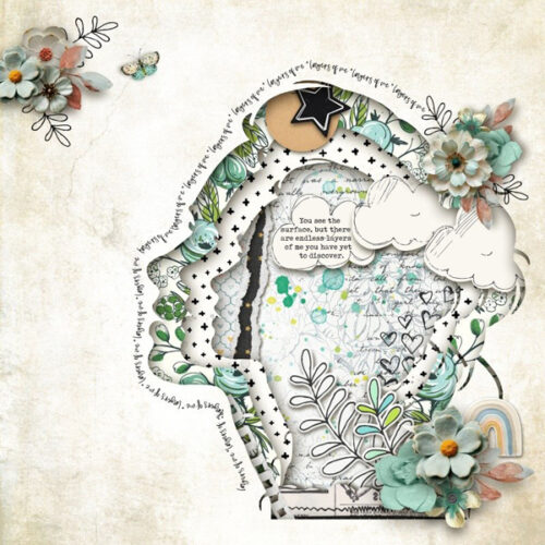
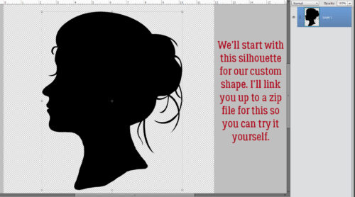
Of course, I’m 1000% going to scraplift this layout, and my scraplifts are always very true to the original. You’ll see! Here’s the silhouette I created to use as my custom shape. You can grab the zip file HERE. Warning: This is at least an intermediate technique and assumes some familiarity with the software.
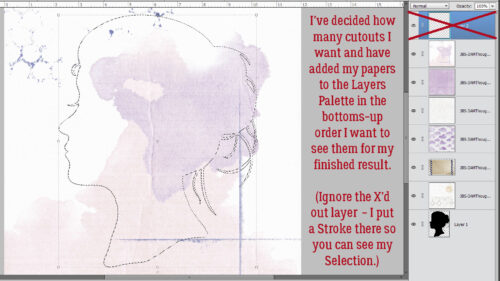
I’m using JB Studio’s 3 A.M. Thoughts kit throughout. First thing to do is decide how many cutout layers desired and choose papers for them. They go into the Layers Panel bottom-up. (Ignore the topmost layer in the screenshot – it’s where I put a Stroke so you could see where I’ve Selected the outline of the silhouette.) The silhouette layer is at the bottom but its placement isn’t a big concern.
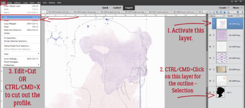
Now that the papers are in the correct order, 1. activate the top-most paper layer. Then go to the layer with the silhouette on it. 2, CTRL/CMD>click on the layer’s THUMBNAIL to Select the outline. Make sure you haven’t accidentally made that layer the active one. It shouldn’t be filled with blue. Then click on Edit>Cut or use the keyboard shortcut CTRL/CMD>X to cut out your first shape.
Look at that! To make this process as simple and easy to remember as possible, I decided to Resize the shape to 90% of whatever size I just used on the previous layer. The quickest way to Resize anything is to click on any of the four corners of the Bounding Box. That activates the Transform menu, which includes a sizing box. Type your desired number into the box and for this purpose, make sure the Constrain Proportions box is also ticked. That way your newly sized item maintains its shape exactly, just smaller (or larger, depending).
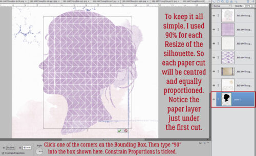
I just followed all the same steps of Activating the paper layer, Selecting the edges of the shape and Cutting out the bit in the middle.
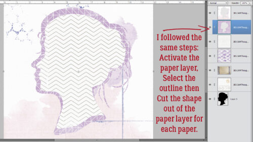
I worked my way down the stack of papers, shrinking the shape to 90% of the previous size and Cutting that out of the middle. Notice how everything remains in alignment.
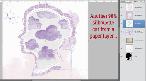
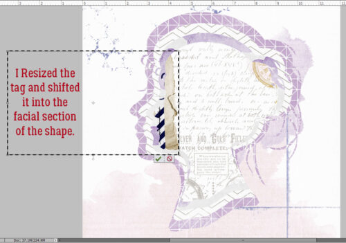
I opted to use this grungy tag for the layer with the torn and curled edge. Bet you were wondering…
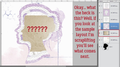
It needed some massaging to make it work.
Now you’ll see why I reran the Custom Shadow tut. Each of these cutouts need to have shadows. 😉 If you have a set of shadow Styles that includes a cutout, you’re all set. Go ahead and hit each layer. But if you don’t, it’s all good. We can make our own! Pop a new blank layer UNDERNEATH your topmost paper layer. We’ll work our way down.
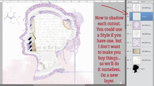
Now, with the blank layer active, Select the edges of the top paper layer by CTRL/CMD>clicking on the paper layer’s THUMBNAIL. Next, go to the Paint Bucket Tool and fill the blank layer with your shadow colour. I used black for simplicity.
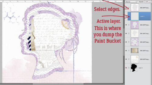
Okay… there’s a black layer under the paper cutout. But it’s not doing anything.
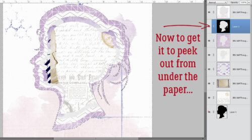
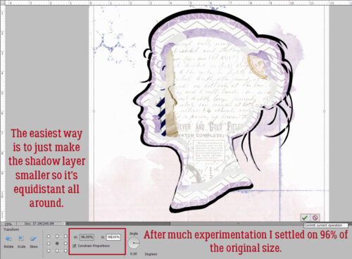
The very easiest way to turn this black layer into a shadow for a cutout is to just make the whole layer a little smaller so it peeks out from under the paper above it. I played around quite a bit before settling on shrinking it to 96% of the original size. Each shadow layer will be the same.
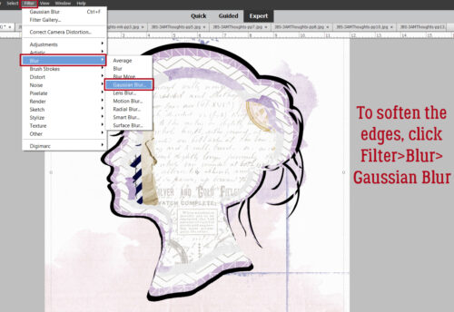
To take that stark black shape and make it look like a shadow, it needs softening. So click Filter>Blur>Gaussian Blur…
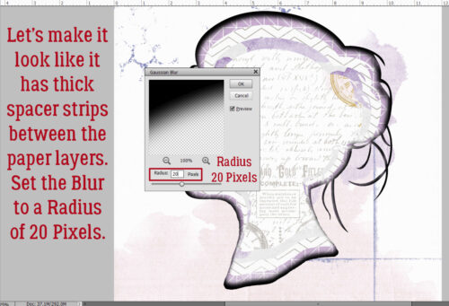
I like the look of a shadowbox with thick spacers between layers so I used that as my mental view. If you want your layers to look closer together, adjust accordingly. I went with a 20 pixel Radius.
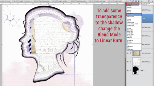
Realistic shadows don’t obliterate the visibility of what it’s cast on, so to give the shadow some transparency, change the Blend Mode to Linear Burn.
Last step… decrease the Opacity of the shadow to whatever looks right to you. I went to 33% because my spacers are THICK!
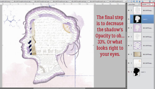
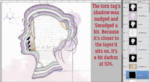
The torn tag needed a little different treatment because it’s much closer to the paper underneath it. I nudged it out and down a smidge, then used the Smudge Tool to customize it a bit more before Blurring it by only 4 pixels, changing the Blend Mode and decreasing the Opacity to 53%.
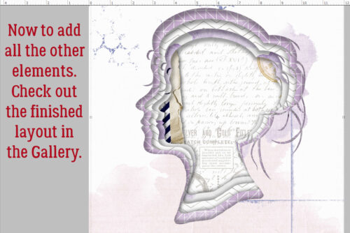
Et voilà! The basic shadowbox look is there. Now I’ll finish the layout and you can check it out in the Gallery!
I think the other example Jill sent me will focus more on paper tearing and curling. Sound good?

Amazing! You’re the best. thank you
Fantastic Jan, thank you for doing this.
Very interesting effect Jan.
You wrote: “She sent me two images and I’m going to deconstruct BOTH of them! The first one (the layout is from The LilyPad and the scrapper is Roxana) is this one.” But the layout does not show in the tutorial. Would you mind trying to replace the empty box with the image of the full layout? Thanks, Lorri
Well, that’s odd… it shows for me in WordPress. I’ll fix it.
Hello, I’m thrilled with your tutorial; I’ll try to recreate it in Affinity V3. Thank you!
Doska
This is awesome! Thank you for the step-by-step instructions!! Can’t wait to see what you do with the next one…
I saw this from a link in the gallery, simply incredible!! Thank you for the tutorial, I’m going to try my hand at it!