There’s a Flag on the Play – Out Of Bounds!
![]()
I had a mini-crisis on Friday when the screen on my laptop started to fail. Geek Squad guy I’m married to tried to fix it but was unable to so out he went to find me a new one. I spent the weekend transferring files and installing software so I apologize for all the redirects you’re going to find in this tutorial. I try to show every step and explain it all in detail as I go along, but I ran out of time… And I seem to have lost the font I was using to label my screenshots, so I’ve switched to Lumberjack. At any rate, this tutorial builds on skills I’ve already shared with you in past tutorials, so I’m going to link you up where necessary.
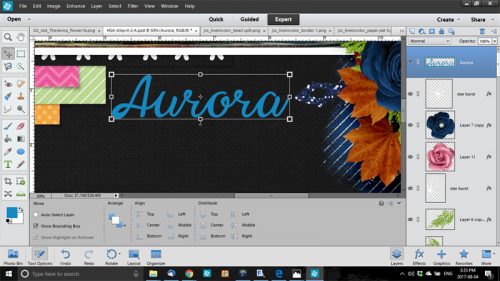
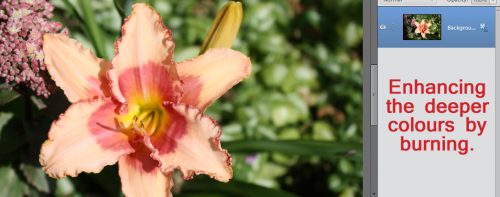
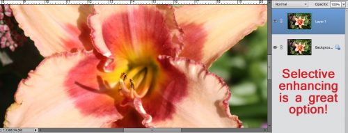
I spent some time recently checking out the forum at another shop that had a big event happening. One of the event-related threads asked members to show a layout with a technique the member really wanted to learn. Guess what I’m teaching you today? You guessed it! We’re going to take this:

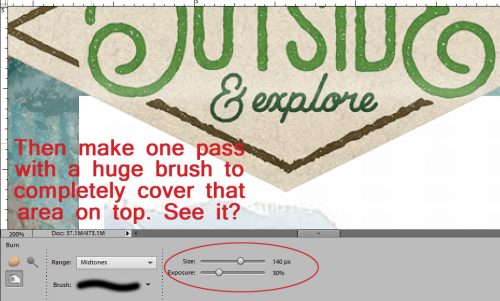
to THIS!

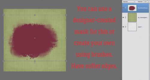
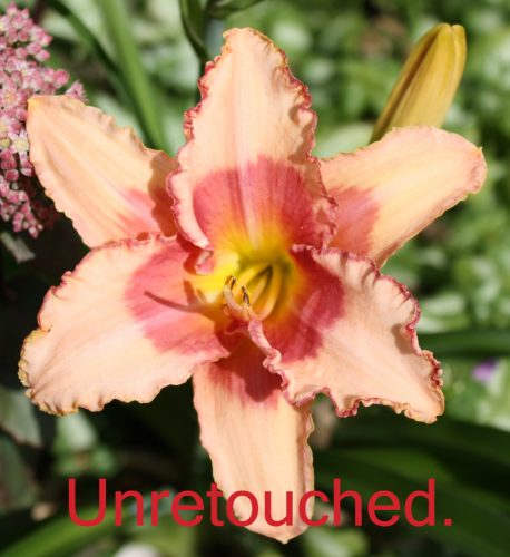
I used a stock photo I found on Pixabay, along with a mask created by PHOTOCowgirl (former GingerScraps designer), a paper from Just So Scrappy‘s Chasing Rainbows kit (the bundle is on sale right now for the incredible price of $5!) and a frame from the GingerBread Ladies‘ MEGA collab True Friend. If you don’t have a mask that will work with your photo, you can make your own using brushes, varying the opacity from 100% at the center to about 30% at the edges.
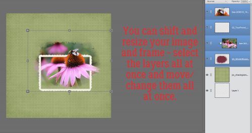
I laid down my mask then dropped my photo on top of it. I made a copy (CTRL/CMD>J) of the photo so I could extract the bee and part of the cone on the focal flower.

I clipped the photo to the mask temporarily while I decided where to put the frame. Looking at it now, I might want to move it up a smidge so the cone on the flower just behind the focal point is inside the frame… or I could extract it too. Let me think about that…

Zoom in (CTRL/CMD>+ to enlarge, CTRL/CMD>- to shrink) and out while you’re working so you can see what you’ve done.

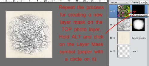
I turned off the visibility of the photo to be clipped to the mask and the frame, using the Rectangular Marquee tool (CTRL/CMD>M) to cut away the areas in the background that I don’t want to show against the frame. Then I added a Layer Mask to my cut-down photo.

Working on the Layer Mask I carefully erased the remainder of the background. The basics of this technique can be found in this tutorial. Later I went to the frame layer and masked off the area where the petals extend over the frame.

You can resize and move the mask, clipped photo, frame and extracted bit of photo to suit yourself by selecting all the layers using the click-shift-click method.
Now I wanted to have the cone and bee cast a shadow on the frame and the photo to add some dimension. CTRL/CMD>click on the sheet of paper at the top of the Layers panel to create a new layer underneath your extraction. Or just click on the icon then move the layer down. In case you need some reminders on how to create shadows on their own layer, you can review this tutorial. Make sure your shadow layer doesn’t shadow the photo underneath the frame where the sharp edge is, along the bottom of your extraction.
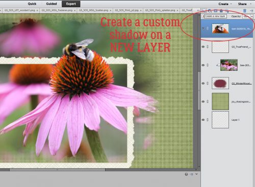
One step that isn’t always needed is to remove areas of that shadow layer that wouldn’t be there if the image was a real thing. You can just erase those areas.

For the petals’ shadow I used a drop shadow brush that is one of the prepackaged brushes Elements comes with. This too went on its own layer so I could adjust it as much as I needed to.

Shadow the frame and it’s good to go!

Next week’s tutorial is going to blow your socks off, so get ready!!!!
![]()


