Only the Shadows Knows… Take TWO
![]()
Holy moly! Where did January go? I don’t know about you, but the older I get, the faster time flies.
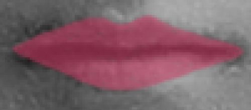
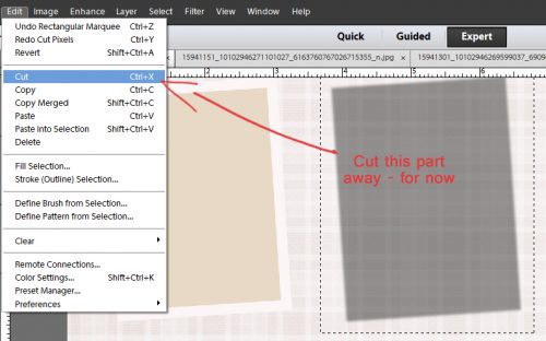
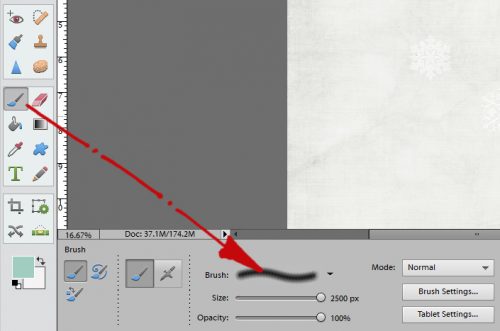
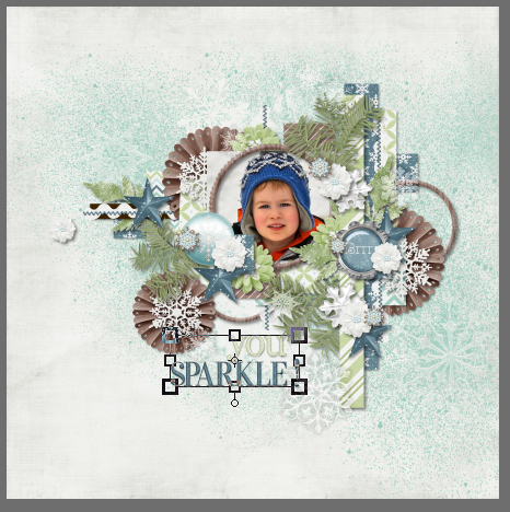
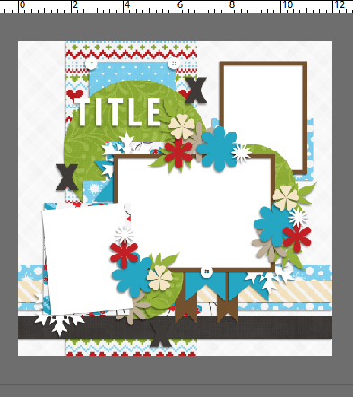
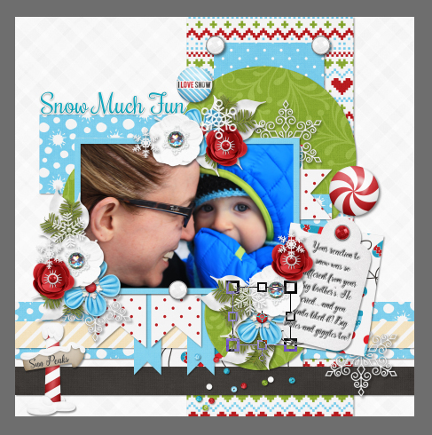
Two weeks ago I showed you one way to work around PSE’s blah shadows by cutting and pasting it onto its own layer so it can be tweaked to look more real. Today I want to show you another way to do that, along with a quick little trick for adding even MORE realism to your images. If you’re thinking you’ve already seen this tut, you are experiencing a little bit of déjà-vu but only that I’ve made this layout do double duty. (Remember, it’s a lot better to Work Smart Not Hard – WSNH!) I’m using this lovely ribbon and a paper from Seatrout Scraps‘ gorgeous Linen and Lace collection (retired).
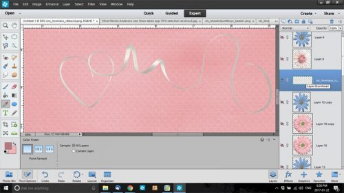
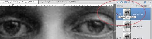
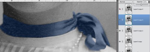
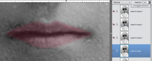
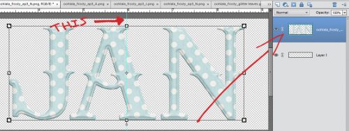
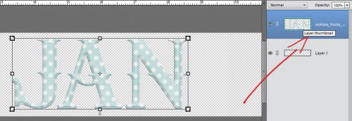
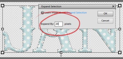
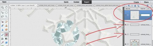
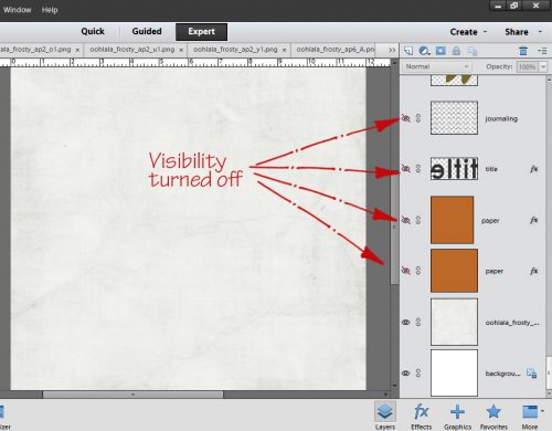
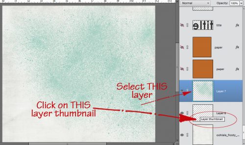
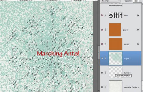
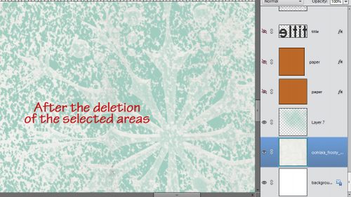
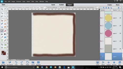
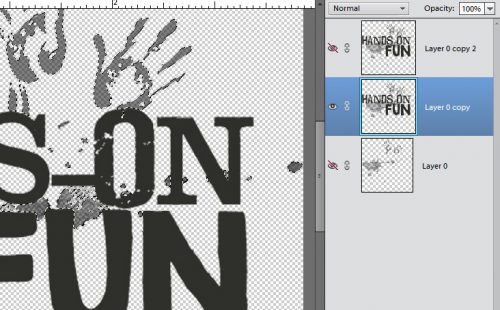
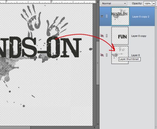
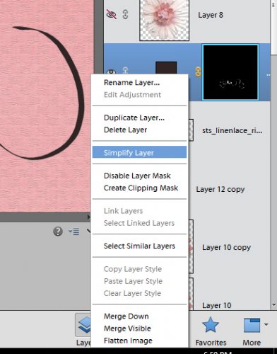
I decided I wanted to play with this ribbon after I’d already constructed my layout, so to see what was happening to it, I turned off visibility of all the other layers as you can see in the screenshot below. Then I clicked on the Layer thumbnail in the Layers panel to get my marching ants around the ribbon.
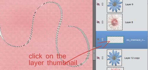
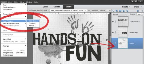
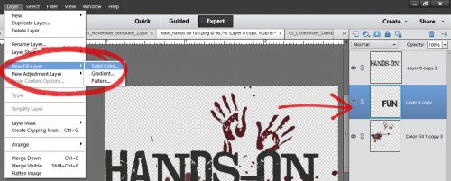
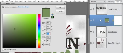
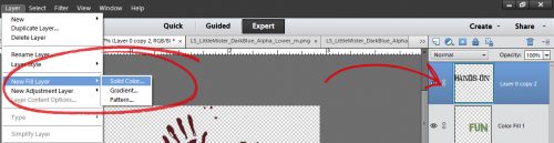
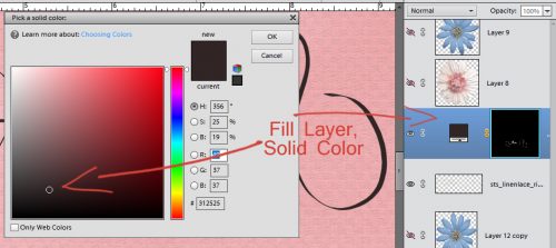
Then I clicked on that little circle icon at the top of the Layers panel that is half blue and half light gray and has a little triangle next to it. That’s how you create a Fill Layer quickly and easily. (WSNH!) I chose Solid Color and then with the Color Picker I chose a gray.
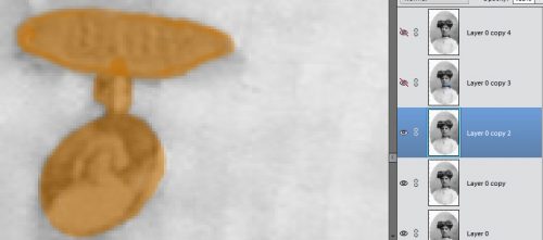
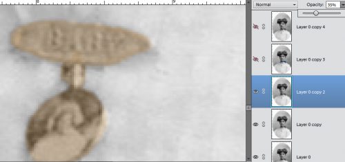
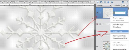
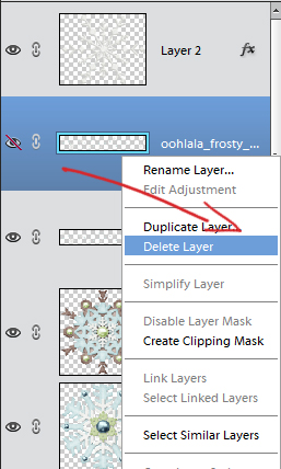
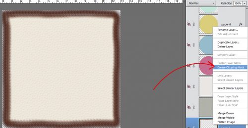
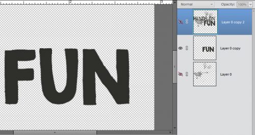
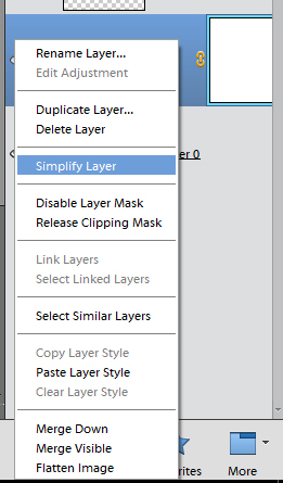
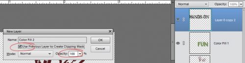
In order to play with the shadow, the next step is to Simplify the layer. You can also rename the layer to help you remember what it is. I’ll confess I don’t often bother. Note that for the moment, this shadow layer is still ABOVE the ribbon, which isn’t visible because it’s covered up.
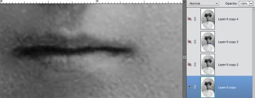
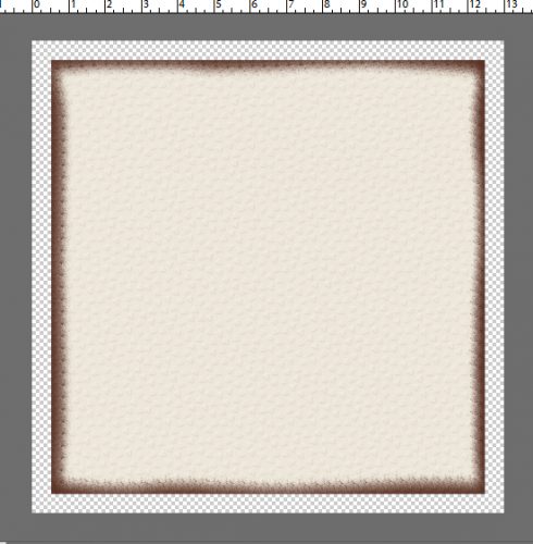
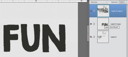
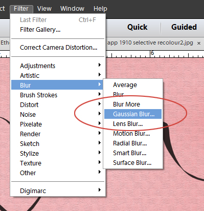
Okay, so now we can soften the edges of this new shadow layer, and we’ll do that with a Gaussian Blur Filter. Turn the visibility of the ribbon off so you can see exactly what’s happening.
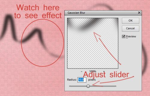
You can see what is happening with your shadow both in the preview pane of the Gaussian Blur menu and on your layout as you move the slider left or right. Just play with it until you like the way it looks.
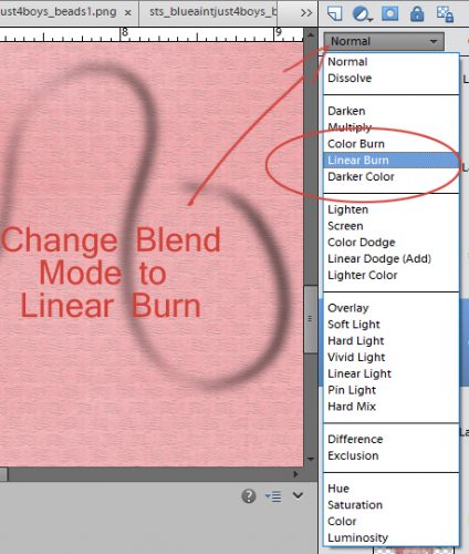
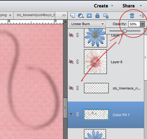
We haven’t actually touched on Blend Modes yet, partly because it’s a more advanced topic, and partly because we haven’t done anything needing a Blend Mode… until now. The menu for this handy, dandy tweak is found right at the top of the Layers panel under the other icons we’ve used before. Shadows look best when they’re a Multiply or Linear Burn, which I like better, so I selected that.
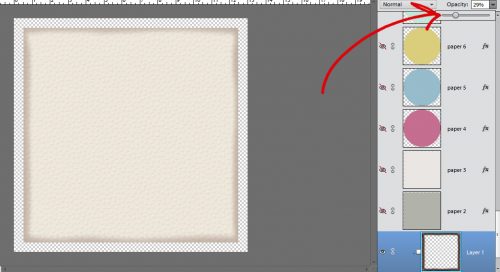
To keep working on natural and realistic, I decreased the opacity of my shadow to about 50% of its original appearance.
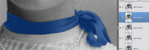
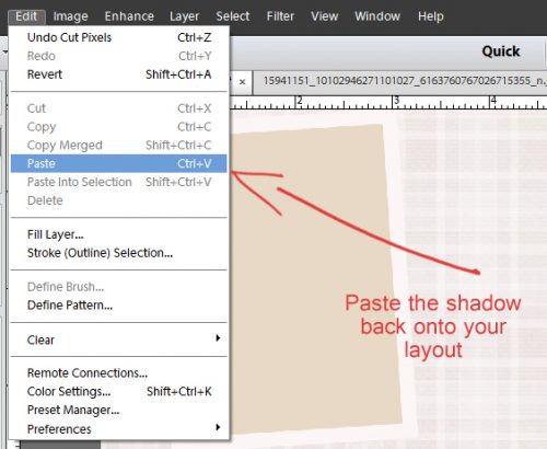
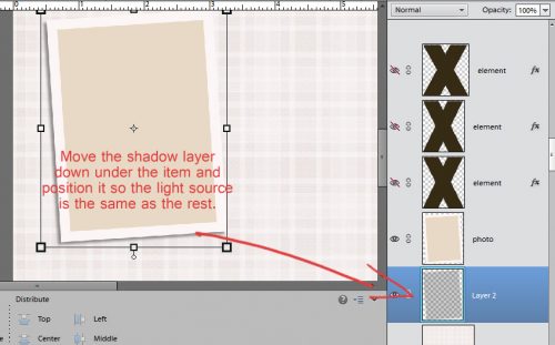
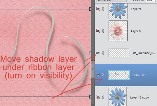
Looks pretty good, right?? Oh wait! We can make it even better! But to do that we need to see the ribbon itself, so turn the visibility for that layer back on, and move the shadow underneath it. WSNH tip: Ctrl/CMD+[ will do that for you. Then you can shift the shadow according to where your light source is coming from on your other layers.
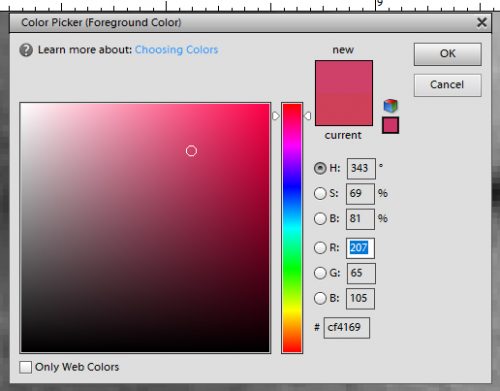
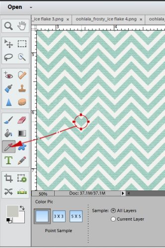
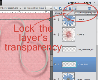
The next tweak we’re going to make is to change the colour of the shadow itself. Because let’s face it, a black or gray shadow isn’t really what one would see against a pink paper. You can make your shadow colour similar to whatever it’s falling on by selecting that colour with your eye dropper Color Picker tool then moving the eye dropper to the right and down to choose a deeper, richer hue of the same colour. Make sense? You can go ahead and choose your colour first but before you move on, lock the transparency of your shadow layer by clicking on the icon shown below.
For my shadow, I chose a colour from the paint splatter I used and then adjusted it as I described above.
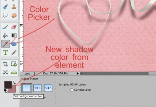
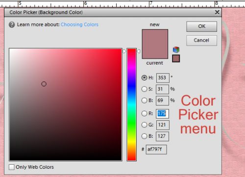
Now, with your shadow layer selected and locked down, click ALT/OPT+ Delete and bingo! Your shadow colour is transformed!

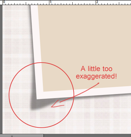
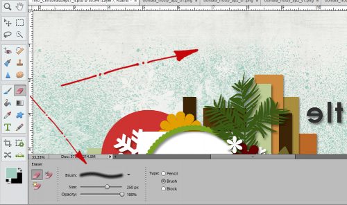
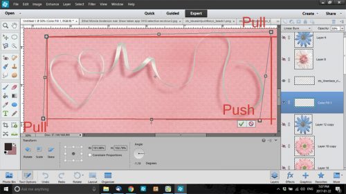
Now we can play with how the ribbon touches the paper. So click on the Image tab then Transform>Distort. Skew will work, but it doesn’t give you as much control. To distort your shadow, you’ll pull or push on the handles as shown in the screenshots below.
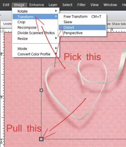
Pulling will move the shadow out and down in the direction you’ve chosen, while pushing movies it in and up.
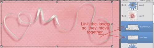
The last thing you have to remember is to link the layers together by clicking on that little chain symbol so that when you move one, the other moves too. I know it seems like a lot of steps, but you can do all of this in less than a minute once you’ve got the steps down.
While we’re talking about shadows and the colour of shadows, a loyal GingerScrapper named Jen (hclappy in the gallery and forum) asked about shadowing elements against black or dark coloured papers. Obviously, using a black or dark gray shadow isn’t going to make much of a visual impact. So when I have a dark background, I’ll use a slightly brown shadow just to make some differentiation of colour. If you’re using drop shadow styles, they’re usually already a brownish shade, but if you find you’re not seeing them well, you’ll have to change each layer’s shadow colour individually. Unfortunately there isn’t a WSNH trick for that… I looked. You CAN, however, change one layer style colour then select like items (all your papers or flowers, for example) and shadow them all at once with your new colour by right-clicking with all your layers selected then selecting Paste Layer Style. Then it’s just a matter of tweaking where you see fit to make it all esthetically pleasing. That’s the goal, after all!
So far there is only one entry into the Tutorial Challenge. If you use any of the techniques or tips I’ve shown you this month, post your work to the GingerScraps Facebook fanpage Challenge Gallery, or if you’re not a Facebooker, you can post a link in the comments here for me. Then I can enter you into a draw to have your very own personal tutorial right here in February.
Next week, we’re going to talk about clusters and what to do if you don’t want to use a template but want an awesome cluster or two. Stay tuned!
![]()