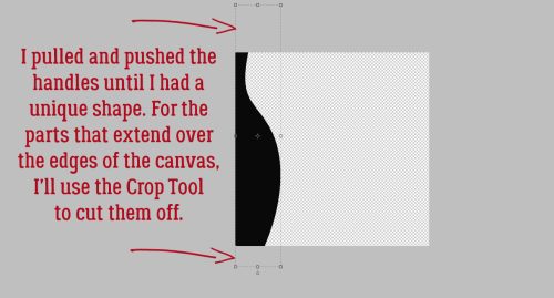
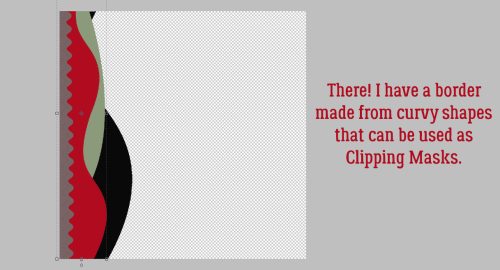
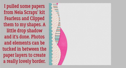
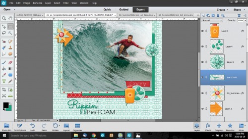
Tutorial Tuesday (Individual Style)
Challenge Spotlight: INSPIRATION

Yes, it’s the third Tuesday of February already! This month and next start on a Tuesday, so here we are… looking at a Challenge and the Individual Style each of us brings to a common goal. With the month really only halfway over – and both the Olympics and the Super Bowl squeezed in there, it was a challenge in itself to find one with enough examples to make a good post. But not to worry, the Inspiration Challenge, with Memory Mosaic, fills the bill. Before I go on, these Challenge Spotlights aren’t only meant to encourage you to give them a try, but also to help with the logistics. There are several layouts displayed in the thread that aren’t found in the Challenge Gallery. Posting your layouts to the Challenge Gallery is a required element for proper credit toward Challenge Rewards. So don’t forget that step! Now, let’s talk Inspiration

Joy’s theme for this month’s challenge is SHAPES. But she also wants a brief explanation of how the participants decided which shapes to include. There are some unique takes on this one, and my descriptions aren’t going to replace the scrappers’ own words. You’ll have to check out the layouts in the Gallery to see those. Each layout is linked to the Gallery through the scrappers’ names, so please do drop by and leave them some praise.

First up is this one by B2N2Scraps. She has a variety of geometric shapes here: circles, rectangles and parallelograms. (Thank you, Google, for helping me out with the names of some shapes that I’ve forgotten.)
What has Pippin got going on here? I see hexagons, triangles, trapezoids, pentagons, circles and rectangles. Oh, and some square gems too!

In SusanSays‘ layout the predominant shape is the triangle, but it isn’t the only one. I see squares, rectangles, circles, trapezoids, a couple of ellipses and a star.

Tbear has used lots of circles, but she’s also got some pyramids there, some trapezoids and rectangles too.

This layout by greenfiend27 is too clever by far! There are a plethora of trapezoids, triangles, rectangles, squares and at least one pentagon in there. I almost overlooked the tiny circles!

I like how simple mdusell’s layout is, but still contains a number of shapes: triangles, a parallelogram, rectangles, circles and two overlapping trapezoids.

Trapezoids seem to be a very popular shape! pjm117 has included some circles and triangles, as well as a couple of rectangles too.

There’s a lot going on in Lisa Campbell’s layout, but a close look shows triangles, parallelograms, circles, rectangles and some overlapping trapezoids.

Dovedesign made it easy. Circles and rectangles are obvious; ellipses are less-so… they’re the beads!

Basketladyaudrey made it easy too, big squares, rectangles, a big circle and two overlapping trapezoids are there.

Here, lousmith went with just the square of her background and LOTS of circles.

Last but not least, princess-scrap has circles and rectangles and one solitary square photo.

Great layouts, ladies!!

PDF Version : https://bit.ly/351E7f8

Tutorial Tuesday (Mixing It Up)

Perfectly Paired, with Diamond Dust Designs

After last week’s marathon tutorial I needed some downtime, so I took a look at the February Challenges. (I know, it sounds like the opposite of relaxing, right?) But to me, Challenges are a way of turning off and tuning out a bit. I mean, come on… they tell you what to do, all you have to do is do it! Lots of room for creativity, but less thought required. Ha!! Did you look at the Perfectly Paired Challenge?

“…you must use two different kits from two different GS Designers and select an equal number of papers and an equal number of elements from each kit that go well together. Then pick a favorite template from a GS Designer and create your LO, showing how you perfectly paired the two kits together. List both kits and their designer and the template designer in your credits.”

Sure, Ginger laid it all out about how to meet the requirements of the Challenge, but many of us are single-kit scrappers. So that got me thinking about a tutorial I wrote quite some time back about how to use multiple kits without losing our minds, and it seemed a good idea to replay it this week so more of you might be tempted to give it a try. The original tutorial is Windows-based, so if you’re using a different operating system there will be some adjustments to the search piece needed. Let’s have a look.

Caveat: This is my workflow and you might have a method that will work better for you.

I like to use templates, not gonna lie. They make scrapping so much easier. And I like to use folders. For me, they too make scrapping easier. For mixing kits, folders are a HUGE help. I have folders for each store I frequent, each of the kits I’ve added to my stash and I have folders for every layout I’ve created. It helps keep me organized. I’ve read posts from people who go through all of their kits and individually tag EVERYTHING. That’s a ton of work, and for the most part, it’s unnecessary. Designers usually label everything in a kit in some way, so why duplicate their efforts? Work Smart, Not Hard!

So let’s talk about folders. At the beginning of every month, I create a Challenges folder. And in this folder I add subfolders for all my favourite challenges. Into those folders, I copy my photo(s), template, papers and elements. After I’m happy with the layout, have ensured I have no bloopers and the layout is posted, I empty the folder of everything but the PSD of the layout and 2 JPEGs. That keeps the space taken up by the layout to a minimum but lets me find them later. The image below shows some of my folders in the list to the left. My first step is to select a template to use. In the tutorial on organizing your stash, I talked about labeling template previews in some fashion so it’s easier to find what you’re looking for later. My system, borrowed from someone else but modified to suit my workflow, is to label with whether the template is for a single or double spread, the number of photo spots and sometimes the shape/mask/blend the photo spots assume. The screenshot below shows a Windows File Explorer search for a single spread with 1 photo. (The icon for this utility is the file folder… super simple!) I had chosen a cute photo to build my layout around, so I opened my GingerScraps digikit folder then in the search box shown on the upper right, I typed in “single1“. After a few minutes, Windows had found all the template previews so labeled and showed them to me. (The actual search time will depend on the size of the folder you’re searching and the number of like objects to be found. It may only take seconds.) Now I could look at them and pick a template that would work for my layout.

Now, how did I find the actual template, you ask, since all that’s displayed are the preview thumbnails? I right-clicked on the preview and selected Open file location from the menu window. That takes me right to the folder that holds the template. Then I copied the template file into my challenge folder. For other searches this step won’t be necessary, because you can just copy the objects right from the search pane.

Next, I opened the template preview thumbnail in a photo viewer so I could see what supplies I needed to find next. I counted up the different papers the template employs and went on to my next search.

For this search, I put “paper blue” in the search box, as I’ve shown below. And Windows found all the papers labeled with those two words. Results will show both folders and individual images, which makes it easy to see just what you’re looking for.

I copied each of the blue papers I might want to use into my GingerScraps Challenges> September 2017>Colour SHADES OF BLUE folder so I could see them all in one place. That helped me determine if they’d work together or not. They look pretty good!

I worked my way through the different items used for the template one at a time to find things I wanted to include. There was a circular element I decided must be a flair, so I did a “flair” search.

Remembering that templates don’t necessarily have to be duplicated exactly, I chose to add some string to it. The search showed me a blue string right near the top that would work beautifully!

Once I had chosen all the things I thought I might use (substituting flowers for the stars) I could see everything in one place and knew they’d all work well together. I had pieces from FOURTEEN kits!

Once I was ready to build my layout, I opened Photoshop Elements and went to the Colour SHADES OF BLUE folder and opened all the items onto my workspace. From there it was zip, zip, zip!

And this is where I ended up. (Once I post my challenge layout, I add a hyphen to the beginning of the folder name so I know it’s done.)

Another way this method is useful is for speed scraps. You can have Windows searching for things while you work on the previous steps. That’s sort of where I came up with my system. I used to partake of monthly speed scraps at another site that is no longer around and I wanted to be sure I was finished my layout with time to spare in order to win the prize.

This screenshot shows how CathyK has labelled the items in her kit Aviator. This is for GingerScrapper Karen who had some questions about metadata.

Please feel free to adapt this however it will work for you! Now I’m going to collect my papers and elements to take on this Challenge. See you next wee, when we’ll be looking at Individual Style Challenge Spotlight time! (It might even be this one…)

PDF Version : https://bit.ly/3t0uMfT

Tutorial Tuesday (Photoshop Elements)

Another Paper-to-Digi Technique: Partial Cutouts


Anybody own a Cricut? This tutorial is based on a Cricut Joy video sent to me by CalGirl (aka Steph). She asked if I could see a way to make a similar version using only digi-supplies. I’m not going to minimize the amount of work involved in recreating the folded hearts using Elements – my first attempt was so complicated that I couldn’t possibly turn it into a tutorial. CONTENT WARNING!! There are many steps to this, and it’s definitely not as quick or easy as a Cricut technique where somebody else has done the heavy lifting and all you have to do is push a button. But if you’re intrigued and think you might want to try it, read on! [Editor’s note: Read all the way through before you attempt this stunt. You’ll Work Smarter than Jan did!]

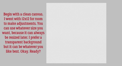
I like to start big and resize later. I want to be able to see what I’m doing and work as smartly as I can. Having said that, there are LOTS of things inside the Photoshop Elements Toolbox that I haven’t explored yet, and there are probably much better and easier ways to accomplish a lot of things. Today isn’t the day for experimenting with that, so we’ll start with a 12×12 canvas with a transparent background.

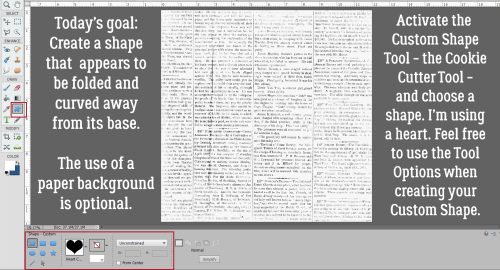
Some of these steps can be rearranged; I’m showing them to you as I figured them out so please bear with me. 😉 This is one that could wait but that isn’t how I worked it through. I chose the Custom Shape Tool (aka “cookie cutter”) and looked at All Elements Shapes to decide which shape I’d use for my demo.

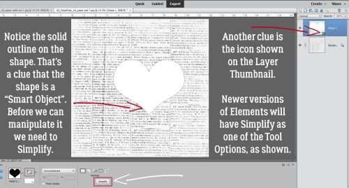
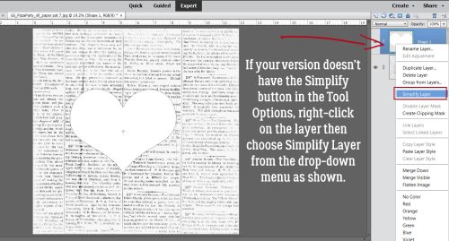
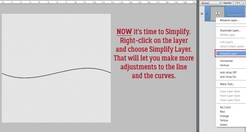
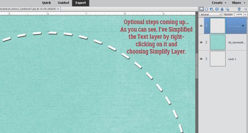
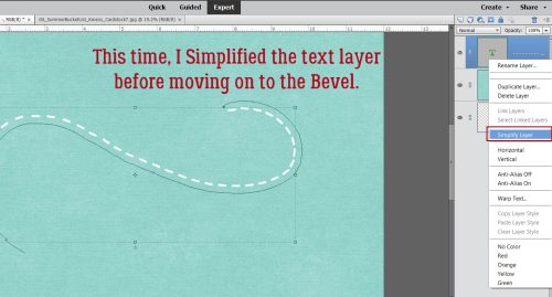
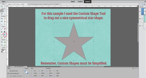
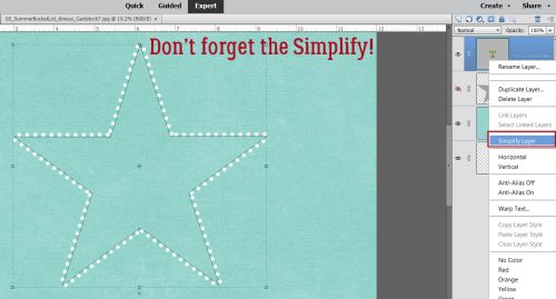
I was thrilled to see this outlined heart, so similar to the shape used in the Cricut video. Remember that when working with Custom Shapes, they will need to be Simplified before you can manipulate them. Later versions of Elements include a button in the Tool Options to make it quicker. If your version doesn’t have it, then you’ll need to right-click on the layer in the Layers Palette and choose  Simplify Layer.

The next seven (yes, SEVEN) steps are optional, but they will make the rest of the technique go more smoothly by providing placement assistance. On a new blank layer I dragged out a 6 inch circle using the Elliptical Marquee Tool and centred it on the canvas.

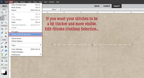
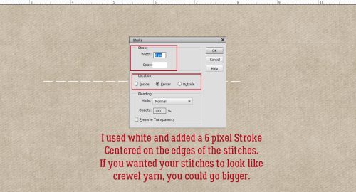
Next I added a black Stroke to outline the circle. Edit>Stroke (Outline) Selection.

To make sure it’s visible, I used 10 pixels and put it on the Outside of the Selection.

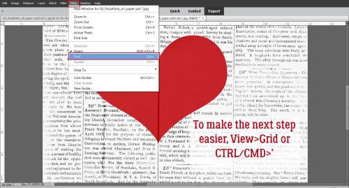
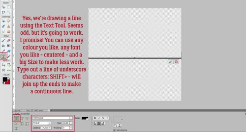
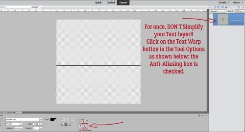
I want to turn it into a wagon wheel. The Cricut version has eight hearts, so I’ll make my wheel with eight spokes. Adding in the spokes is easier when I have the Grid visible. View>Grid or CTRL/CMD>’

Drawing straight lines is easy when you know how.

Click on the starting point. Hold down the SHIFT key and click on the end point. Easy-peasy!

Then the Grid can go away. (Pssst… this is also how you can turn on and off the Guides : CTRL/CMD>; ) If you think there might be a time when this wheel could come in handy later, Save it right now as a PNG. That’ll preserve the transparent background for you.

Now I made my first outlined heart shape. I made it symmetrical by setting Fixed Size>3 in by 3 in. It can go anywhere on the canvas to start out, then moved into position once it’s been Simplified.

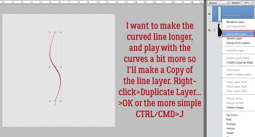
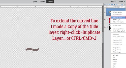
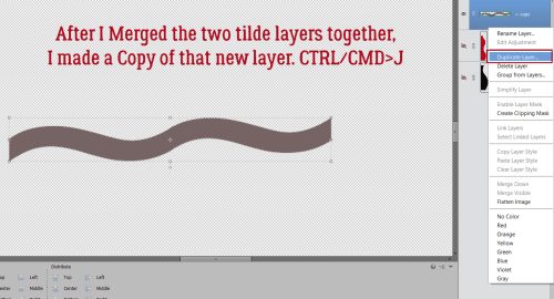
Then I used the wheel to position. In retrospect, I’d put the first heart on the vertical axis and save some steps later. I always figure these things out AFTER the fact. <sigh> I made some Copy Layers. Right-click>Duplicate Layer>OK will drop the Copy right on the canvas. Or use the keyboard shortcut CTRL/CMD>J.

Because this is a demo and I didn’t want it to be too complicated, I decided I’d put four hearts in my circle, not eight. And then there’s my first stab at this, where I had eight, but it was a dumpster fire!

This is something I hope you’ll internalize, because it can really be a big time saver. Whenever I’m making something up as I go along, I make Copy layers so that if I mess up later, I’ll still have the steps that worked properly somewhere in my stack. I just tuck it away by turning Visibility off.

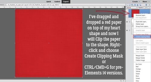
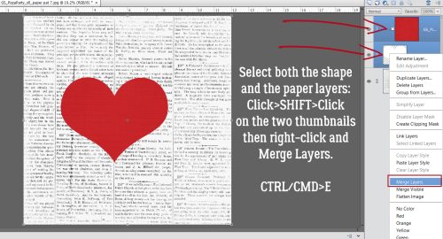
I chose two pink papers from Ooh La La Scraps Birthday Wishes Girl for my demo. I dragged the lighter pink on top of the hearts layers. You can see the darker one at the bottom of the stack, tucked away for later. I also CTRL/CMD>Clicked on the hearts Layer Thumbnail to Select the edges of the hearts.

I wanted to Cut out the hearts from the light pink paper, so first I had to tell Elements to Invert the Selection. Select>Inverse or CTRL/CMD>SHIFT>I

Then I could Edit>Cut [CTRL/CMD>X] the rest of the paper away. (Once you Cut paper with a Cricut, it’s too late to change your mind.)

Before I moved on and made a mistake I couldn’t Edit>Undo [CTRL/CMD>Z] I made a Copy of the pink heart layer and tucked it away. If I don’t end up needing it I can always Delete it later. Here’s where you see the results of NOT positioning the first heart on the vertical axis… I’m Rotating the whole set of four hearts so the first one is… on the vertical axis. 😮

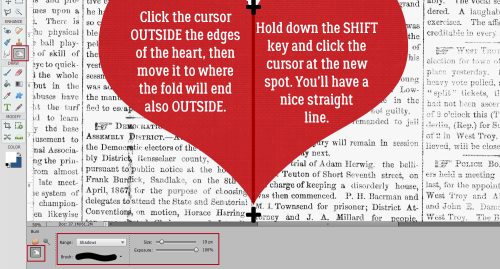
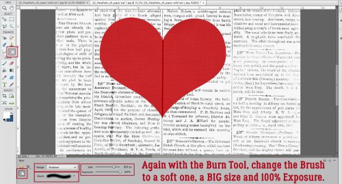
If you’re wondering if the next few steps are necessary, I assure you… I tried NOT to have to do this, but it was an abject failure. Using the Rectangle Marquee Tool, I dragged out a rectangle over half the heart, with one edge exactly over the pointed parts and carefully avoiding the other heart near it. It means I’ll have to repeat this step to remove the rest of that half, but there isn’t a good way around that.

Next, I Cut that bit inside the box away. Edit>Cut [CTRL/CMD>X] then drew another box and Cut again to get the rest out of there.

I Cut away the same side of each of the hearts, leaving this. Make a Copy of this layer and tuck it away. You’ll thank me later!

Again, this step would have been unnecessary if I’d only put that first heart on the vertical axis, or if I Rotated and left everything that way. Hindsight, y’know!

Each pink half-heart needs to be on its own layer so they can be individually manipulated. So again, I used the Rectangle Marquee to Select one of the halves.

Only this time I Cut and Pasted the paper piece. First Edit>Cut [CTRL/CMD>X]

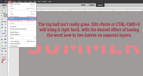
Then Edit>Paste [CTRL/CMD>V]

Elements will keep the Pasted piece in the same orientation but will drop it on the centre of the canvas. So it’ll need to be nudged back into its rightful place. Having that original layer tucked away helps a lot with this! Do these steps for each of the hearts.

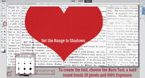
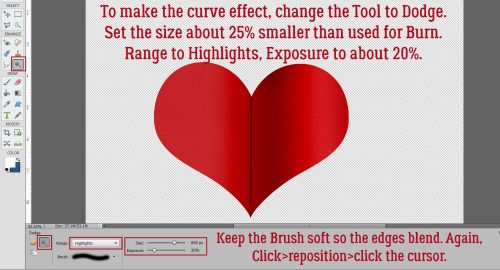
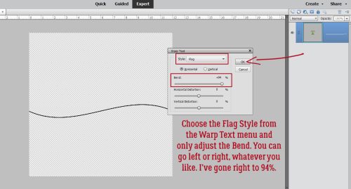
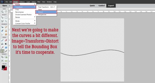
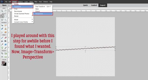
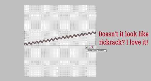
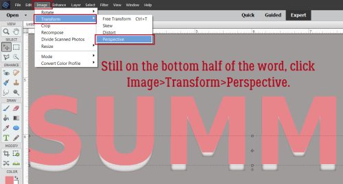
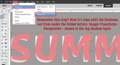
Now to create the appearance of a folded-over, lifted half. I tried a few tricks for this and found using Image>Transform>Distort worked best.

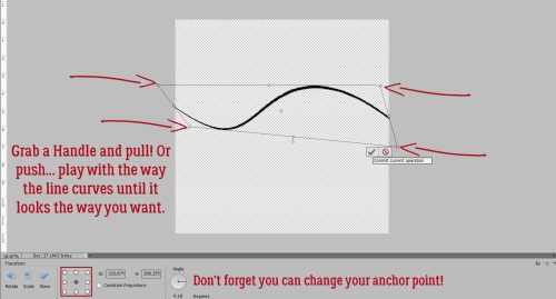
Grab the handle on the Bounding Box that’s closest to the curved part of the image. Push it up a little and in toward the centre a little to create the illusion that it’s lifted off the page. Take care not to move the cut edges where the “fold” is happening. Work this magic on all the pieces.

How’s that? The original hearts layer really helps with visualizing the effect, don’t you think? It’s starting to take shape.

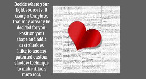
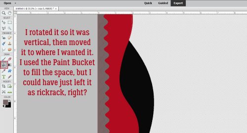
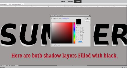
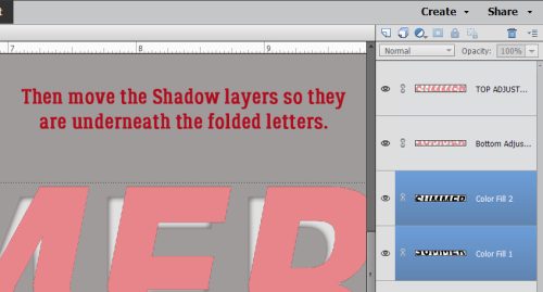
I tucked the original hearts layer away again and turned the visibility of the dark pink paper back on. Time to add some custom shadows. [Editor’s note: If you’re already comfortable with custom shadowing, feel free to skip ahead.] First step is to add a new blank layer UNDER the object you’re going to shadow. Hold down the CTRL/CMD key and click on the “blank page” icon at the top left of the Layers Panel. Then with that layer your active layer, CTRL/CMD>Click inside the Layer Thumbnail of the object to be shadowed to Select its shape. Then using the Paint Bucket Tool and a “shadowy” foreground colour, Fill the shape with the shadow colour. You can use black [000000] or something like an umber [2c1902] for your shadows.

Adjusting the shadow to help with the illusion the paper is lifted is easily accomplished with the Smudge Tool. The icon looks like a hand with a finger rubbing on the paper. More on using the Smudge Tool in a minute. When you’re creating shadows, think about where the light is coming from, how much light will get under the object, and how diffuse it might be.

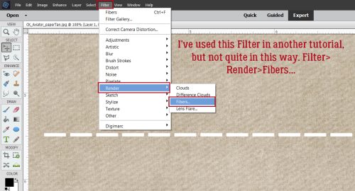
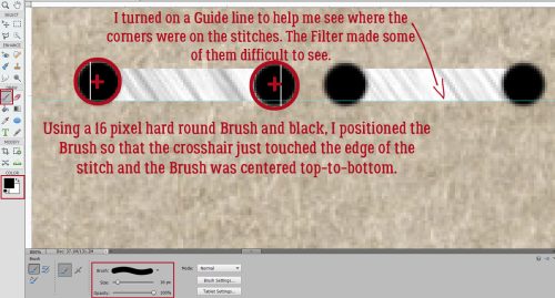
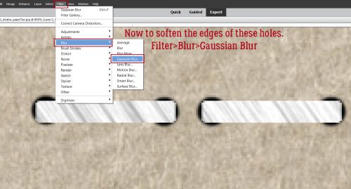
Shadows that are too harsh will always look out-of-place, so adding a Filter>Blur>Gaussian Blur… will soften the edges even more than Smudging does.

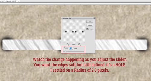
If the Preview box is empty when you get to this screen, click your cursor over the edge of your shadow layer somewhere and it’ll show up. Then you can watch the effect in action in both the Preview box and on your canvas. I decided this shadow needed a 12.5 pixel Radius Blur.

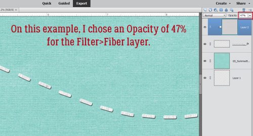
OMG. I shouldn’t have put the CNN documentary on Carole King and James Taylor on the TV. I’m so distracted, singing along! To make the shadow look most realistic the Blend Mode needs to be changed to either Multiply or Linear Burn. Those modes make the shadow layer more transparent so the colour underneath the shadow shows through. Last step is to decrease the Opacity of the shadow layer until it looks natural. I dropped it to 45%.

And it’ll look like this. Follow the shadowing steps for each of the half-hearts.

As promised, more info on using the Smudge Tool. This little thing is pretty powerful and it’s too easy to go overboard! I’ve found that using a large “fingertip” and gentle pushes gives me the best results. Sometimes there’s a lag between making an adjustment and it being visible, so try not to be in a rush or CTRL/CMD>Z will get a workout.

Once all the halves have been shadowed, on to the rest of the technique.

I dragged another light pink paper onto the canvas underneath all the heart layers. It looks interesting, but we’re not there yet.

I flouted my own rule and didn’t make a Copy of the unaltered half-hearts, so I had to go back and recreate that set of steps. Here’s where you’d want that Copy I mentioned back about 18 screenshots… CTRL/CMD>Click on the Layer Thumbnail of the unaltered halves, and with your uppermost light pink paper layer active, Edit>Cut [CTRL/CMD>X] the half-hearts out.

I decided I really needed to have the uncut halves to be recognized, and the best way I could think to make it visible but unobtrusive was to Emboss it. First, I had to show Elements what it was Embossing. I created a new blank layer on top of the pink layer from the last step – just Click on the blank sheet of paper icon at the top left of the Layers Panel. On this layer, I CTRL/CMD>Clicked on the original hearts Layer Thumbnail to Select the edges to which I’ll add a thin little Stroke.

It doesn’t have to be too obvious, so I went with a 2 pixel black Stroke Centered on the edges.

It was pretty in-my-face so I decreased the Opacity to 26%. See it?

I didn’t want the WHOLE outline to be Embossed so I used the Eraser to eliminate the line on the inside opposite the “folded” edge and all around the “folded” half’s edge, just leaving the line on the outside of the uncut side.

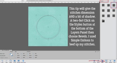
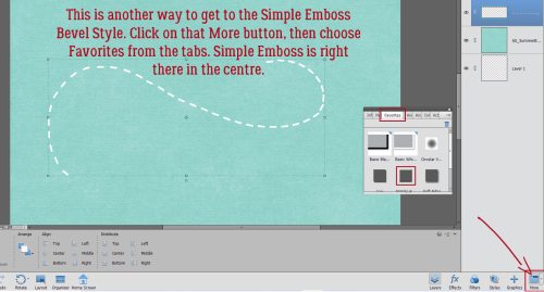
There’s a quick way to get to the Simple Emboss command. Click on More down in the bottom right under the Layers Panel, then choose the Favorites tab from the pop-up. Simple Emboss is right there.

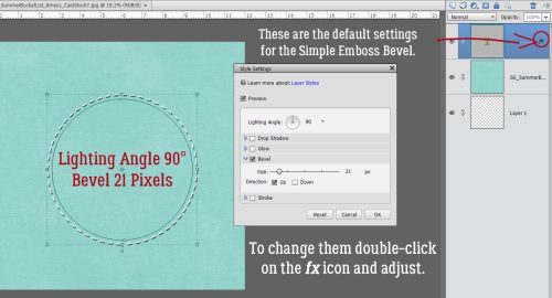
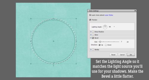
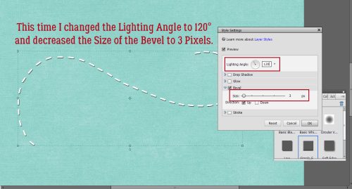
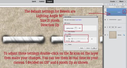
The default settings aren’t going to be right for this, so I double-clicked on the fx icon to the right side of the Stroke layer to access the Command menu. Make sure the Lighting Angle matches your shadows, then adjust the amount of Bevel the effect gives. I decided 35 pixels Down looked right.

Alrighty! Now it’s looking like something. But it’s missing something.

The light pink paper needs a Drop Shadow! But I won’t make you do a custom job for this one. Styles>Drop Shadows>Soft will work.

It’s a little too harsh for me, so I double-clicked on the fx icon for that layer to access the Drop Shadow controls then moved the sliders until it looked right to me.

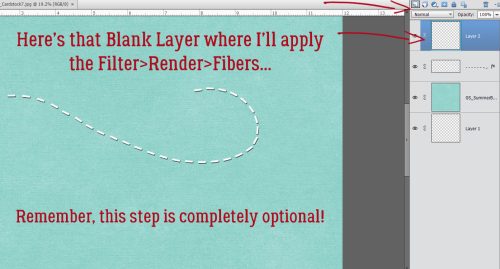
Last thing I did was to add some flourish-y brushes between the hearts. The finished product looks similar enough to the video for me!

I’ll be back in a day or so with the transcript of my chat with our two February Spotlight Designers. There’s too much going on here today and I don’t want our chat to be lost in the pile! Next week, I think I’ll have mercy on all of us and go for something simple, with only a few steps. Until then…

PDF Version : https://bit.ly/3sZnHMv


Tutorial Tuesday (Fabulous Fonts)

Romantic and Corny… Valentine’s Day Fonts

How is it even possible that January is almost over already? It’s not even like I got anything accomplished this month. Except getting back on the one med that controls my “functional dyspepsia” and also treats my insomnia… that was a good thing. Anyway, I thought we’d get a jump on Valentine’s Day and check out some new(er) fancy fonts that would be useful for layouts, wedding invitations and cards so I popped in at DaFont.com and had a look. They’re always adding new fonts (and dingbats!) so there’s often some new and unexplored (FREE) goodies there. Each of these is linked through the name of the font – bolded and in red. Just click on it and you’re there. I’ve got a dozen fonts and three sets of dingbats, so let’s have a look!

First up is Xhers Alove. As shown, both regular and italic versions are included. It would be good for titles and to draw attention to your message. Look at all those cute little heart cutouts!

Ready Lover can be manipulated in SO many ways. I’d throw a Bevel at it to bulk it up and maybe put it on top of pink or fuchsia paper. It’s a title font, without question.

I’m such a sucker for swirly script fonts. Billy Bella ticks so many boxes for me. I can see it as a subtitle or without the extra glyphs, as text. What are your thoughts?

I adore this upright script font, Hanifah. It’s sophisticated, pretty and only a little fussy. It would work nicely for journalling, I think.

This one, Romantic Dates, is a bit sturdier but swirly. It’s versatile like Billy Bella, with many options for use.

Beauty is another very useful font. Pretty, swirly but highly legible, you can use it for anything your heart desires.

Isn’t Love Match quirky? With or without the glyphs, it’s got potential.

I think I swooned a little when I saw Hello Valentine. That cupid-heart dot over the “i” is so fun! The uneven baseline and the scripty look are so current.

Valentine Soul has a broader wheelbase than some other script fonts, and it’s a great all-purpose font too!

This font is such a contradiction… compact AND zaftig at the same time! I can see it on a wedding invite pretty clearly. Lovea Hegena could even be used as a divider.

Love Story has those cute little cutout hearts, and would be a perfect title font. I might apply an acrylic Layer Style to it, and then stick it on a contrasting paper to give it real presence.

This is an older font, but I’ve never seen it anywhere else. Don’t let it throw you, it’s Kinkee in name only. It’s got so much potential too. Layer Styles would turn it into a phenomenal alpha!

Now for some dingbats. These are little pictograms tied to the alpha keys. Hey Babe looks a lot like graffiti and could be stunning on a chalkboard paper.

Loveya Doodle is chock-a-block with doodly hearts. They could be used like brushes to jazz up your background papers.

Last, but not least, Romantine Dingbat is a more solid doodly set, and I think they’d make amazing scatters. Maybe with a glitter-gloss Layer Style?

For next week’s tutorial, I’m planning another paper-to-digi technique very appropriate for Valentine’s Day. It’s coming together in my head, I just have to translate it into something approaching coherence. Til then,

PDF Version : https://bit.ly/3AMYGYw

Tutorial Tuesday (Individual Style)

Photo Mask Challenge with PrelestnayaP

Omigosh, the 2022 Challenges are fabulous! There are some new ones that I’m still familiarizing myself with, but I wanted to highlight the new-for-2022 Photomask Challenge brought to us by the incredibly talented PrelestnayaP Design (Irina). I’m always intrigued by how each of us interprets a Challenge based on a single, specific element and how we arrive at such unique results. For this Challenge, Irina has provided this photo mask that must be part of the layout.

I visited the Challenge Gallery and randomly (well, not exactly) selected a dozen layouts to share with you. I’ll offer my critique and why it caught my eye. Each layout will be linked to the Gallery so you can take a closer look if you like, and maybe leave a little praise for the scrapper too. Just click on the scrapper’s name!

The first layout is from etycz. She’s blended the plaid paper with a snowflake paper quite seamlessly by placing the mask the full width of the page. I suspect there’s another mask at play here too, under the Challenge mask. Then she concealed the edges of the mask with clusters. Beautiful!

PixyGirl has used the mask to create a paint swatch, and then used it again for her photo. See how the photo follows the contours of the larger painted mask?

The way chris01 has used the mask is to focus the eye on the heron in her photo, an effect she amplified by framing it with foliage. It looks like it could just fly away!

I love this layout by HalinaMiga. She’s used the mask to make the skier look like he’s surrounded by blowing snow. The stone cottage, fir tree and leafless bush with birds in it create such a charming image.

What drew me to Pippin‘s layout is the overall vintage look she’s obtained by using the mask to blend her sepia-toned photo into a dark brown background. It’s hard to tell where the photo ends and the cup-and-saucer-pitcher cluster starts.

Jill‘s layout is another example of flawless blending. The grungy paper she chose for her background is an inspired choice. Her clusters enhance the overall look of the layout and the whole effect is amazing.

Here, gmae has created an echo of sorts with the build-up of colour variation. It reflects the principle behind the cairns in her photo, careful stacking to achieve a stable foundation. And what a whimsical touch, tucking the photographer behind her cluster.

Wait! What?!! How clever of fontaine to cut the mask and rearrange the pieces to create a mask map of California! (Please tell me I’m not the only one who sees it…) Her layout is super-simple, but eye-catching nonetheless.

Katherine Woodin documents all the little moments of each day through photos and layouts. Here, she’s used the mask to frame that beautiful snow-covered mountain. The kit she chose pulls colours from her photo so accurately!

I’m positive Karen Diamond has used multiple brushes and masks for her layout. I zoomed in on it and there are so many layers of paint and snippets of paper, then a stack of paper pieces, the Challenge mask and her photo. That cluster is exquisite – balancing out the photo stack without taking centre-stage.

For her layout, Lisa Campbell has used the mask to create a paint swatch that ties the the whole layout together. Her clusters are perfectly positioned to put the focus on her photo.

And finally, NHSoxGirl has evoked a sense of dreaminess and imagination with both the photo she’s masked and the elements she’s surrounded it with that wouldn’t be there if she’d simply framed her photo.

Examining all these layouts has given me some inspiration for my own Challenge layout. Off the dig through my supplies!

PDF Version : https://bit.ly/3GIbxx8


Tutorial Tuesday (Photoshop Elements)

Build-Your-Own-TEMPLATE!

A few weeks back I asked for some tutorial topic suggestions and there were some really good ones! Steph brought up the idea of building templates from your favourite (unique!) layouts, and it was something I’d given some thought to already so it was a slam-dunk that I’d take it to the next step. The layout I created and based the save-a-cluster tutorial on last week was purposefully 100% designed in my own head with both the cluster tut and this template-creation tut too. Working Smart, Not Hard, I am.

This is the layout I’m talking about. The kit I used is Aimee Harrison‘s Winter Blush. When I create a layout I always Save As a PSD file in case I need to make some adjustments. That’s also a necessary step for turning a layout into a template.

I build layouts from the bottom up, just as I would if I was using paper and glue rather than digital supplies. That’s how I’m going to build the template too. I turned the layers’ Visibility off for clarity but if you choose not to do that, no problem!

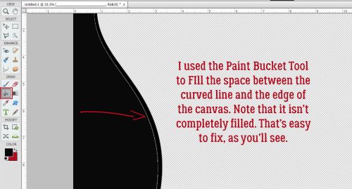
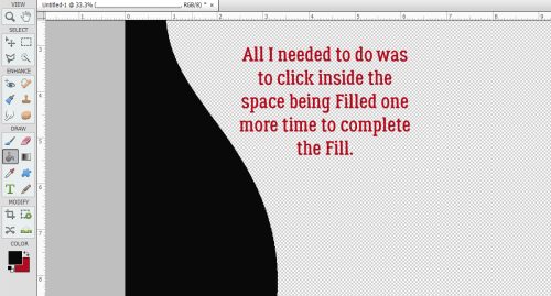
This background layer reads to Elements like it’s completely flat, so using the Paint Bucket to fill it with a solid gray worked out.

To make it easier on the eye to distinguish between paper layers, I chose a lighter gray for the second paper layer.

Wait. What?? Oh, the grungy paper doesn’t Fill completely and cleanly with the Paint Bucket. That could be a big issue later when I go to use the template. Clipping a paper to this could look really awful!

I’m going to take you on a little detour for a second. When I was experimenting with Filling layers and Merging them to simplify things, I discovered that once the layers are Merged, the Shadow Style on the base layer becomes embedded in the image but isn’t adjustable. Adding a Shadow Style to that makes for VERY dark and odd-looking shadows. So I experimented some more and came up with this. Before I Fill the layer to create a place-holder, I Right-click on the layer and choose Copy Layer Style. Then I Right-click on the layer again and choose Clear Layer Style. That removes the Style from the layer, but puts it in safe-keeping for later.

To achieve a solid Fill on this paper, I’m going to use the Layer>New Fill Layer>Solid Color command. Each of the place-holder layers will be created the same way. (You’ll get lots of practice, and it’ll be almost automatic by the time you’re done!)

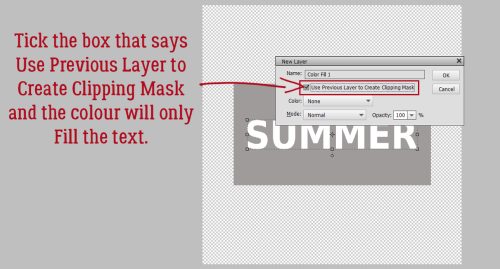
This command prompt opens up; make sure Use Previous Layer to Create Clipping Mask is ticked. That tells Elements to Fill ONLY what’s on the layer under it. You can Name the layer with the type of object you’re creating a place-holder for right here. Just delete that Color Fill 1 and type in your object. (Pardon the typo on the screenshot. Sleep is in short supply here at the moment.)

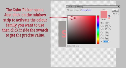
Here’s what happens when you’ve clicked OK. The Color Picker opens and the image on the workspace shows a preview of the end result. See how it’s now a Clipped layer above the patterned paper?

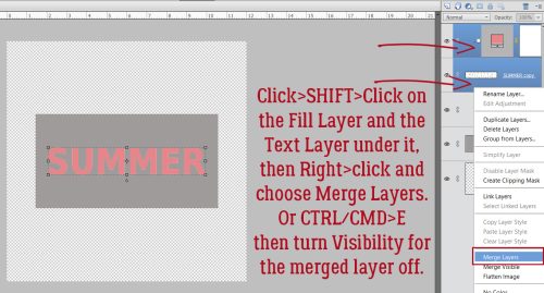
The utility of your template will be greatly enhanced by Selecting both the base layer and the Fill layer then Merging them. Click>SHIFT>Click on the layers then Right-click and choose Merge Layers. The keyboard shortcut is CTRL/CMD>E.

Time to add back the Shadow Style. Right-click on the layer and choose Paste Layer Style.

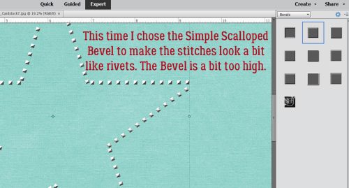
Now let’s do some BRADS. The process for each layer will be the same: Copy Layer Style, Clear Layer Style, Layer>New Fill Layer>Solid Color, Merge Layers, Paste Layer Style.

Merge the layers and now you’ve got a BRAD place-holder. CTRL/CMD>E

Don’t forget to Paste the Layer Style back onto the place-holder.


Here’s where we get into the real Work Smart Not Hard groove. When you have multiple identical elements on your layout, don’t make extra work for yourself. You’ve already done the work, now just make Copies! Either Right-click on the layer and choose Duplicate Layer or CTRL/CMD>J. When the Command prompt opens, remove the “copy” part of the name and click OK.


For each of the identical elements, make a Copy and move it into place. Once you’ve got them into position you can Delete the original layers. Your place-holders are on the job.

But wait! Don’t make more work for the second grouping of brads. Select all three BRAD layers and Duplicate them!!

Then move the place-holder versions into position.

You can also Delete multiple layers in a single step. Select them all, then Right-click>Delete Layers or simply click the Delete key.

Here’s my finished template, with a recap of all the steps to create the place-holder layers.

Now to Save it! You can Save As either a PSD or a TIFF, whichever is your preference. Your Layers and Layer Styles will be preserved with either format for use again whenever you want.

Figure out where you’re going to keep it, give it a unique name and choose your format. All done!

This is only one way of creating a template. To me it seems the easiest. Another way would be to use the Custom Shapes tool and replace each element on the layout with one that represents it. I may try that method and see if there are efficiencies. If I do, I’ll let you know!

Next week I’ll be doing a Challenge Spotlight. Did you see the new ones? How accommodating that we’ve been given so many more options!!

PDF Version: https://bit.ly/3txC2Bx

Tutorial Tuesday (Photoshop Elements)

How Do I Build a Reusable Cluster?

Happy New Year, GingerScrappers! The holidays were quiet at our house, but exhausting anyway. In a few days it’ll be time to put all the decorations away and turn to figuring out what life will look like this year. Sort of depressing, isn’t it? Thankfully we have our digi-scrapping hobby to distract from all that!

This week’s tutorial was inspired by a question from Rachel M. She wanted to know how to create a cluster that she could save and reuse on other layouts – for themed albums, I’m guessing – with the separate layers preserved. She’d experimented but just couldn’t make it work. So I took over the experimenting and came up with a way to do it. Why keep the layers separated though? So the clusters can be modified a little, of course! To keep them from looking too contrived, to maybe substitute some of the elements, to rotate and manipulate easily while keeping the overall look consistent. Now, I’m going to climb up on the soapbox for a second before we go on… I strongly suggest you create your own unique clusters if you plan to do this. If you’re using a template created by someone else, there’s really no need to save a cluster, right? Because the original creator has already saved it… O-o-okay. Onward and upward.

This image is of the cluster I created for Magical Scraps Galore‘s January Surprise Challenge. I used Aimee Harrison‘s Winter Freeze kit (no longer available) and a photo from Pixabay for my layout. The cluster is simple, but has several layers so I figured it would be a good one for demonstrating this technique. The layers are all together in the Layers Panel to make the next step easier. As you might have noticed, I’ve used Shadow Layer Styles rather than custom shadows. I know, how unlike me! But for the cluster to be really reusable, custom shadows would need to be added to individual layers once the layout is completed. The reason for this will become a bit more clear as we work through the tutorial.

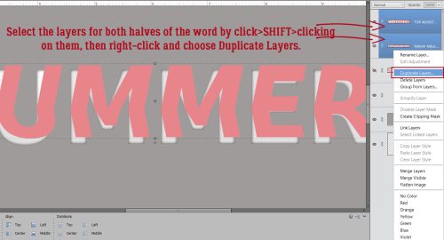
I Selected all the element layers by clicking on the top layer of the cluster, holding down the SHIFT key and clicking on the bottom layer. It works the other way too, clicking on the bottom layer, SHIFT>clicking on the top. You do what works for you!

Next, I right-clicked on a random layer. (With them all Selected, what happens to one happens to all.) Then I chose Duplicate Layers from the drop-down menu.

PSE will need you to tell it where you want those Duplicated Layers to go. If you just want to add them to the canvas you’re already working on (named Untitled-1 here), all you need to do is click OK. But for this exercise, I chose New.

PSE will create a whole new canvas and to help keep track of it, I recommend giving it a name. I went the lazy route and just called it Cluster, but if this was a cluster I planned to use over and over again, I’d give it a more descriptive name, maybe with the layout name, the kit name, the theme or a combo of all of them.

The new canvas is the same dimensions as the original one, 12×12. All the individual layers are there, all the Shadow Styles are there. To make it a little less cumbersome, I Cropped it down to a more manageable size, with a little border of white space around it for future tweaking.

Now, the reusing part isn’t quite as straight-forward. If I just drag-and-drop the layered cluster from the Photo Bin onto my layout, it comes up as a single, Merged/Flattened layer. That might be okay, but what if I decide I want to Rotate it? The Shadow Styles aren’t going to adapt to the new position! And that might be okay, unless your eye sees the inconsistency and it drives your OCD crazy. Oops, projecting!

When I Open the cluster while it’s in the Photo Bin, all the layers and Styles are still there. How can I harness that so that I can have my cluster and tweak it too?

Answer? Do the tweaking right there on the layered cluster canvas! Here I’ve used the Rotate command to Flip the cluster Horizontally, then I Filled the word strip with white and oh yeah. I rearranged things a little.

This step can be done before you play with things, rather than after like I’ve done. But the tweakability is there either way. The goal is to be able to use the LAYERED cluster again, so it will need to be Saved As a layered cluster – a Photoshop document, so make sure it’ll preserve the Layers and Color Profile. You could alternatively Save As a TIFF to save some hard drive space. Go with whichever format you’re more comfortable with.

Here I’ve Saved the PSD to the folder for my Challenge layout. If it was going to be used again and again, I might put it into the kit folder so it would be right there to mix and mingle.

Now, how is it reusable once it’s been Saved? As I said, just drag-and-drop isn’t going to work.

I could decide how I want the cluster to be oriented on the layout, adjust all the shadows to sync with the rest of the layout and then drag-and-drop. But that’s a lot of work and might need a bunch of Undo and Redo [CTRL/CMD>X and CTRL/CMD>Y]. Surely there’s a better way… one that’ll keep the layers loose. Just build the layout behind it!

But to do that I’ll need to Image>Resize>Canvas [CTRL/CMD>ALT>C] so there’s room.

I used the default center as my Anchor point but it isn’t essential. What does matter is making the Canvas the size you want your finished layout to be. I work with a transparent background, so I want that preserved too.

Bingo! All the layers are there, I have room to add papers, photos and other elements, and the canvas is the correct size to become a layout!

I just popped a paper behind the cluster layers to show you how it works. I hope this is what Rachel had in mind when she asked her question…

Next Tuesday I’m going to use this same layout as my example. Can you guess what the topic will be?

PDF Version : https://bit.ly/3EVpJRJ


Tutorial Tuesday (Individual Style)

Challenge Spotlight: Miss Fish Memory Mix Up Challenge

Here’s the fourth installment of Challenge Spotlight. This month we’re going to dive into Miss Fish’s Memory Mix It Challenge. Every month, Juli (aka Miss Fish) presents us with a different Challenge focusing on preserving our memories. For December, she said, “This month’s challenge is a Recipe Challenge. No, not the kind where I give you different “ingredients” to put on your page. The kind where you scrap your favorite recipe. It can be one for the holidays, a family hand me down recipe or a new favorite. Your choice!” I thought it was the perfect topic for this month and also for this Blog post! I’m going to share a baker’s dozen (plus one – see what I did there? 🙂 ) of YOUR recipe layouts. Some of them sound pretty tasty! [Each layout is hyperlinked to its location in the Gallery in case you’d like a closer look or to leave some love.] Let’s have a look at how this Challenge shakes out!

First up, gmae shares her taco seasoning with us. It’s pretty similar to the one I make, and her “recipe card” is packed with taco-related embellishments.

I LOVE this one from jam-on-toast! The colour palette is so wintery, and that photo makes my mouth water. The tag tucked behind the recipe is telling the truth. And can we talk about the way she created her title – it looks like meringue!!

What caught my attention with curio‘s recipe is the rustic look it has. It’s a brilliant choice for a cobbler recipe, right? But that photo… yummmmmmmmmm!

How amazing is it that linweb has this recipe in her mother’s handwriting? (With one small addition. 😉 ) She has a lovely memory of the first time she made the pie and has embellished her layout with some pecans.

I think most of us have made sugar cookies as children or with children at least once. chigirl has photos to prove it for her family. The kit she chose for this layout is particularly appropriate, and let’s talk for a second about using a striped paper border to pick up on the striped sweater!

Everybody has their own favourite hot chocolate recipe (and some of us make it from a tin) but how many of us has a beautiful winter layout with ours printed on it? I’ll have to try hichchei‘s method one of these days.

CathyS has cleverly provided us with a bakery-worthy recipe for chocolate chip cookies. I love how she’s surrounded her photo with all those baking-related elements.

This one is a historical recipe dating back to 1914! The original pecan pie wasn’t the syrupy custard packed with nuts that we know today, and it had meringue. The way fontaine presents the recipe has a heritage look to it.

<record scratch> Time to move away from the sugar for a second. Daydreamer‘s recipe is a savoury one, set in eye-catching yellow.

Okay, back to sweet! Flighty-188 makes her own animal cookies using a 60+ year-old recipe from her mother-in-law. I love how she found a baking-themed kit to match the cookie colours.

Pups-r-Paps has a savoury recipe for some luscious lemon chicken; it sounds similar to a scampi recipe I’ve made and loved. She kept her layout simple so the photos could be the focus.

Family traditions are what connect us to both the past and the future. Reading alexandergirl68‘s journaling brings that message home pretty clearly! On special occasions when I was a child my mom used to make lime Jell-o salad with apples and celery in it. None of us liked it and it eventually faded into memory to be replaced by peanut brittle, of all things! I found a fool-proof microwave recipe and became the maker-of-peanut-brittle-for-all. I could make it in my sleep.

What could be more “holidays” than snickerdoodles? This is basketladyaudrey‘s version. I notice she doesn’t put nutmeg in them, so I might have to try them! [But I’d halve the recipe, since I should NOT eat 8 dozen cookies before they go stale…]

And lastly, Pixel Palette brings us a recipe for lemon cookies that sound am-AZING!

The Studio Recipe Card II template

I didn’t have lunch and now I’m STARVING!! What family favourite recipe do you know off by heart? Which of these will find their way into your collection?

PDF Version : https://bit.ly/3EVLYXL


Tutorial Tuesday (Photoshop Elements)

DIY Worn Wood

Last week I asked for some tutorial suggestions and you came through for me. There are some interesting topics coming up, ladies! This week, I went for a quick trick, since I’m super-busy with other things right now. (I bet I’m not the only one, either!!)

Before we get going, I want to thank Lee for the idea of creating custom worn wood papers. I played around and was shocked at how easy it can be. A few tips though… 1. Choose your woodgrain paper carefully. It should have some visible texture and its underlying colour family should work well with the paper you want to rough up. 2. Choose your second paper carefully too. It’ll look best when it’s got a highly-contrasting pattern or when it’s a solid. Some of my examples will show you why. 3. Practice using Undo! (CTRL/CMD>Z) If you pay attention to where the marching ants are you shouldn’t need it a lot, but there will be times when you just have to back up. Let’s get started!

This wood paper came from the GingerBread Ladies‘ collab Pizza Party. I recoloured it because the original is really yellow and it looked AWFUL with the buffalo check paper on it. But it has some good texture and the planks are well-defined. The buffalo check paper is from GingerBread LadiesCrafty Christmas.

So go ahead and drop the patterned paper on top of the wood paper. The following steps may not ALL be required, so take a good look at the result after each Cut stage to see if you’re satisfied with the outcome and stop when you are!

You want the patterned paper on top of the stack, but you don’t want to see it for this part. So turn Visibility off. Make sure the active layer is the wood paper layer. Then click on the Magic Wand Tool. Select the mode that looks like a sparkler. The default for this tool is New Selection, but if you’ve used the tool recently, it may be on the last setting you used, so make sure you’ve got New Selection on. Set the Tolerance slider to 75 and only tick the Anti-Aliasing box.

On the wood paper, click your Magic Wand on an area where there’s visible texture. The marching ants will appear.

Click on the Refine Edge button and when this menu appears, choose these settings: Edge Detection to Smart Radius, Shift Edge to 25% and Output to Selection.

Now turn the patterned paper layer back on and make it the active layer.

To rough up the red paper, Edit>Cut or CTRL/CMD>X will remove the red paper where the marching ants are.

I found that there was still too much red paper visible, so I went back to the first step, turned the red paper off and activated the wood paper layer again. With the Magic Wand Tool, I chose Subtract and set the Tolerance to 50. Then I clicked the Wand on one of the gaps between the planks.

This time, in the Refine Edge menu, I unticked the Smart Radius then adjusted the Contrast slider and the Shift Edge slider to 25%. Output to Selection.

Then I repeated the Edit>Cut (CTRL/CMD>X) step.

I still wasn’t happy. In this situation there’s no substitute for trial and error, so I went back to the Magic Wand Tool, Subtract, Tolerance 100. This time I see a lot of marching ants, so it might be the ticket.

But I still decided to Refine Edge with these settings: Contrast 5%, Shift Edge -20% and Output to Selection.

And then I Cut the selection away from the patterned paper again.

It isn’t all I’d been hoping for, although it is very rustic-looking.

Because I’m always trying to “get it right” I thought I’d see what happened if I played with the Eraser Tool to enhance the worn look. I tried a LOT of brushes before I found one that worked the way I wanted it to. I used a (PSE default) Dry Media Brush, the one inside the box (sorry for the cell phone photo but it was the only way I could capture the menu).

Then I randomly followed the contours of the exposed wooden areas to tidy it up a bit. I do think it looks a bit more worn.

But did I really need to do that Eraser step? I tried a few more papers to see if just the Magic Wand steps would be good enough. Interestingly, I got different results each time. For this example and the next I’ve used papers from GingerBread LadiesA Holiday in the Baking.

This sample gave me a headache. It just wouldn’t cooperate! I had to CTRL/CMD>Z so many times!!

In one of my OOPS moments, I forgot to switch between patterned paper and wood when I used the Magic Wand, and had this happy accident when I used the Wand on the patterned paper instead.

I changed up the wooden paper for this one from GingerBread LadiesSweater Weather. It has some roughed-up paint on it and oodles of texture.

It looks really insipid, but I think with a brighter paper it could be amazing!

Let’s see what happens when I use a plaid paper from Sweater Weather.

Or… If I Invert the selection? Magic Wand>[click on the rough part]>Select>Inverse (CTRL/CMD>SHIFT>I)>[activate patterned paper]>Edit>Cut (CTRL/CMD>X) and I’m in love!!

Who knew it could be so easy to get such interesting results?

Next Tuesday is the third Tuesday of December so I’ll be dissecting one of the monthly Challenges. It’ll be a little light reading just a few days before Christmas. Stay tuned!

[PS… remember, the coloured bold text contains embedded links that will take you right to the shop!]

PDF Version: https://bit.ly/33vL9rE

Tutorial Tuesday (Photoshop Elements)

Clearly Complete – Adding Some Background

Whew… we’re in the 2021 home stretch now! Twenty-three more days and it’ll be over. This last week has been a whirlwind for me! Last Tuesday my daughter and I spent 5 hours – the first 90 minutes in torrential rain! – in a car so we could spend 3 hours with my parents on the day before their 65th anniversary. On the first we set a temperature record, 63°F. Now we have 6 inches of snow! And later today I see the ophthalmologist to find out when he can remove my cataracts. [I thought the dramatic changes in my vision were related to having had COVID in the spring. Surprise!] It’s a good thing I already had a lot of the work done for this tutorial! Today I’m going to show how I added some “wallpaper” in the background behind my glass mixing bowl and made it look realistic-ish. We’ll pick up right where we ended last week.

It was a challenge to find the right paper for this part. I tried a few and didn’t like the results, so let me offer some tips on selecting. Pick a paper with some pattern, but not too small or large. Choose something with colour, but not too light or dark. Texture is good, but only to a point. I think I might try to fake some subway tiles later and see how that goes… The paper I liked best was from ADB DesignsAntiques Emporium. It kind of reminds me of my grandmother’s kitchen. The way I imagine it, not how it really was – she had no running water! As you can see, the paper is behind everything except the original bowl layer.

I was really glad I hadn’t Deleted the original bowl layer when I started figuring out how to make this work, because it DOESN’T work using the glass version of the bowl at all. With the paper layer active, I Selected the edges of the bowl by CTRL/CMD>clicking on the Layer Thumbnail (that little picture of the bowl in the Layers Panel).

Light changes as it passes through glass. This step adds that effect. Enhance>Adjust Lighting>Brightness/Contrast.

When the Tool Options menu opens, adjust the Brightness by INcreasing it to 15, and DEcrease the Contrast to -5.

Now, it could be my eyes, but when I was looking at real curved glass with a pattern behind it as I figured this out, the glass created a slight blur on the paper. So Filter>Blur>Gaussian Blur. But just a little bit, 1.7 pixels‘ worth. Keep the edges of the original bowl Selected until I tell you to Deselect it!

It looks okay, but there are still a few things it needs. I added a new blank Layer immediately above the paper. Click on the sheet-of-paper icon to the upper left of the Layers Panel.

Next, I Filled the outline of the bowl on that blank Layer with black using the Paint Bucket tool. Looks awful, but it’ll be great! Now you can Select>Deselect the original bowl outline (CTRL/CMD>D).

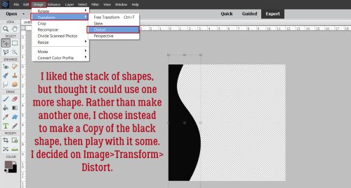
Don’t worry about that black, and don’t be intimidated by this step either. It’s going to work beautifully, I promise! The black is going to become a shadow, and bowls cast very complex shadows. To make it work, Image>Transform>Distort.

The best thing about Distort is that you can adjust the image in a single dimension, or multiple dimensions, depending on what your goal is. I know the light is coming from the top right part of the bowl because of where that big shiny spot is. For the shadow effect I arrived at through lots of trial-and-error, discarded screenshots and Undos, what worked best was just to pull the lower left “handle” straight out as shown. The image comes out from behind the bowl. I clicked the checkmark.

Then I Rotated the black image to the left, keeping the corners of the bowl and shadow layers aligned. And yes, it looks like it’s just a mess.

But not for long! Remember, the outline of the original bowl is still Selected. So now I’m going to Cut out the black that sits inside the outline. Edit>Cut or CTRL/CMD>X.

That wedge of black has to go too. I used the Rectangle Marquee tool to draw a box around it.


And again, Edit>Cut (CTRL/CMD>X).

Now to soften it up. Clear glass will never cast a harsh shadow. Ever. Filter>Blur>Gaussian Blur.

This shadow needs a LOT of softening, so I pushed the Blur all the way to 24.9 pixels. See how it spreads behind the glass a bit? Exactly what I wanted to see.

I know I’ve mentioned why I change the Blend Mode on my shadows to Linear Burn, but I think it bears repeating. The Normal Blend Mode remains opaque and doesn’t allow any of the colour under it to show through. Linear Burn will let both the colour and the texture be visible.

Last step for this shadow is to decrease the Opacity down to about 18%. It’s subtle, but quite nice!

All that’s left is to add a smidge of shadow behind the “dough”. Remember the steps for custom shadows?

1- Select the edges of the object by CTRL/CMD>Clicking on the object’s Layer Thumbnail.

2- Add a blank layer underneath the object. CTRL/CMD>Click the sheet-of-paper icon if you have the object’s layer active.

3- Fill the Selection from Step 1 on the new blank layer with your shadow colour using the Paint Bucket Tool.

4- Select>Deselect (CTRL/CMD>D) the object’s outline and nudge the filled layer so that the light source conforms to the rest of the layout.

5- Smudge the shadow layer to change the contours a bit, making the shadow look more natural. This is based on how the light would penetrate to the background. Thick, flat things will be more snugly connected to the background and the shadows here will be sharper and closer. Thin, curved things might be farther away from whatever is behind them and the shadow would be less distinct.

6- Filter>Blur>Gaussian Blur the shadow layer to the degree the object will block passage of the light.

7- Change the Blend Mode to Linear Burn.

8- Decrease the Opacity of the shadow layer until it looks “right” and you’re done!

I really enjoy trying to make two-dimensional images look real, and think it’s worth the effort. My next attempt might be a snow globe. If you choose to give this a try, don’t feel like you have to use exactly the same settings and what-have-you that I’ve used. Play a little so that when you’re finished, it looks good to YOU! Because you’re the only one who gets to have an opinion.

Anybody have a great idea for next week’s topic? Drop a comment below and I’ll see what I can do.

PDF Version: https://bit.ly/3pYuqon