Tutorial Tuesday (Individual Style)

Use It All! Challenge Spotlight

The response to my Jumpstart Your Layout Challenge post showcasing YOUR layouts and YOUR individual style was so good, I’m going to choose one Challenge each month and shine a Spotlight on it. It’ll be the last post of the month and I think it’ll be really a lot of fun! This month I’ve chosen another Challenge that includes a FREE mini-kit, the Use It All Challenge with Karen Schulz.

Each month Karen provides a mini kit – shown above – but for this Challenge, ALL the items in the mini MUST be included in your layout. Karen’s Challenge minis are add-ons to larger kits she has in her store, so if you like the mini you’ll LOVE the full collection! (Find Trick or Treat here!) [Pssst… Karen has a little surprise in the download, but I’m not going to include it in the upcoming layout showcase. Only those layouts using the 6 papers, 5 elements and 1 word art in the preview are shown.] Let’s have a look at how YOU have been inspired by this mini!!
In this layout, willow has given us a layout that isn’t about Hallowe’en. I had to really look to see how she blended the arty background paper with the much brighter orange-and-plaid paper, so skillfully was it done. Her beaded flower clusters frame her masked photo and the graffiti piece grounds it.

Sweetpea2020 has used a variety of paper shapes to mat her photos. The pops of orange draw the eye and the curly ribbon provides a frame for them.

Here, Flighty-188 has also blended the arty paper with the brighter orange-plaid paper but in reverse, and she’s given the graffiti the look of an actual piece of screen. Add in the raffia bow in the upper left corner of her photo and the cluster in the opposite corner, and she’s made great use of a visual triangle to create movement around the layout.

AlyciaIN‘s layout made me smile. Her little Hermione looks like she’s levitating! The basics of her layout are similar to Flighty-188‘s but with the paper borders’ straight edges, it looks quite different. Can you see a visual triangle here?

This simple layout isn’t as simple as it looks! khoskins has stacked the papers in a pleasing arrangement, and turned the graffiti into a pretty anchor for her photos. I like how she framed her photos with black paper to bring them into focus. She also created her own custom tag using the brighter orange paper and word art very creatively.

By clipping the lighter-coloured paper to a mask on a black background, KatL has cleverly drawn the eye right to that grinning Jack. Placing the beaded flower off-centre on the raffia bow adds interest to the cluster and tilting the word art is a nice, informal touch.


The way galaviktor has spread out the sheets of paper form a pattern that frames her photos nicely. Creating a brushed border for the word art, she’s pulled the colour variations from the arty paper into focus.

Isn’t Zelda just the cutest girl on four legs? For all its simplicity, NHSoxGirl‘s layout is very eye-catching, and the heart paper behind the word art has a lot to do with it.

The interlocking paper-strip squares AJRandom has created here both ground and highlight her photos. I like how she’s tucked the ribbon between the photos and then anchored them with the beaded flowers. I just noticed that she’s positioned the paper with all the eyes on it so that only one set of eyes is peeking at us. LOVE it!!

What can I say about greenfiend27‘s layout? It’s genius! Her paper borders are shadowed beautifully to give the appearance of papers overlying each other. Blending the graffiti into the paper behind it and using it to anchor her cluster shows her creativity. Having the ribbon dangle adds focus to her cat’s beautiful eyes and her clever alterations to the word art is just the right whimsical touch. A+!

Can you believe that October will be over the next time we meet? There’s snow on the mountains already but none here in the valley yet. It’s crazy how quickly time flies. Considering how awful this year has been for so many people, I’m thinking the sooner 2021 is in the rearview mirror, the better.

PDF Version : https://bit.ly/2ZZoWAO


Tutorial Tuesday (GingerScraps)

Giving Credit where Credit is Due

Or: Editing your Gallery images

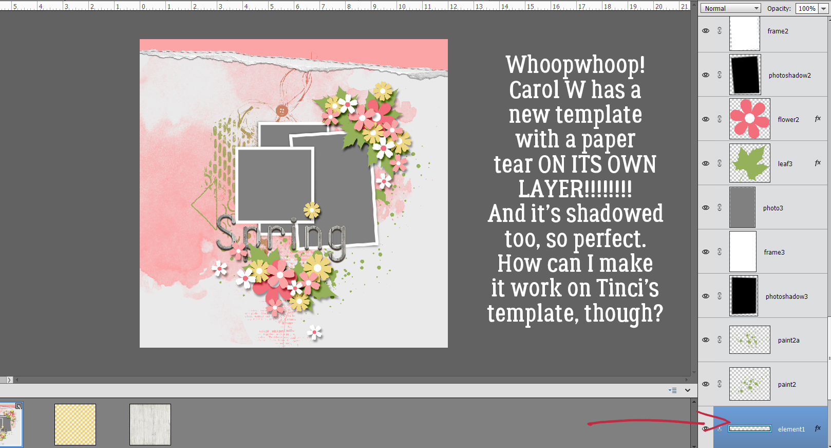
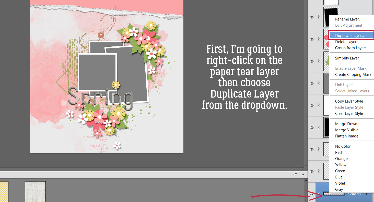
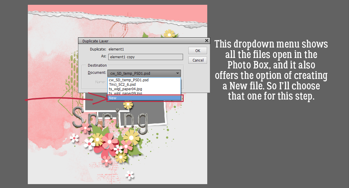
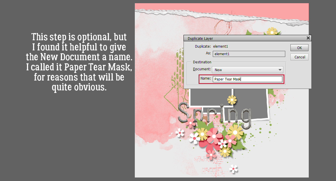
Hi again ladies! Today I want to talk about something a bit more serious than usual. I’m going to do a Featured Challenge post next week, and have been perusing the Gallery to check out the layouts I want to include. I noticed that there are quite a few layouts that don’t include any credits; whether it’s an oversight or intentional, I don’t know. But I do know this. The Terms of Service at pretty much EVERY digiscrapping website that hosts a Gallery, and the Terms of Use included  by every designer in every kit include a requirement for providing proper credit to the designer(s) of the content the scrapper uses. I know that when I see a layout that’s exquisitely created, I’m going to look at credits to see which kit(s) the scrapper used so I can go shopping! If we think about it, giving credit to someone whose products inspire us and help us improve our skills should be automatic, as a courtesy if nothing else. And really, who wants to be accused of theft of intellectual property? Those who are new to our hobby may not realize they’re missing a step. And then there’s the well-known GingerScraps Gallery glitch that deletes some of the things we add to the first Upload screen that’s easy to overlook. (I think that might have been fixed, it hasn’t happened to me in a while.) But what can you do if your layout posts to the Gallery without that important information? Let me show you!

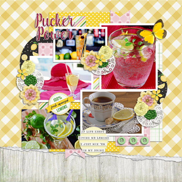
Here’s the layout I created for the Jumpstart Your Layout Challenge this month. At the bottom of the layout inside the red oval, the only detail that appears is the title I gave my layout. OOPS!

A quick word about titles… if you use a special character like a # or a @ or a ? for example, the Gallery uploader will lose everything you’ve typed AFTER the first of those characters. It’s going to mess up your Member Gallery but if you know ahead of time that will happen you can remember to follow these steps to fix it. Other things that may need to be changed in your layout’s details could be typos, omitted information, or an error on the layout itself that you’ve corrected already but the image you’re seeing is still the one with the mistake. When you click on My Photos and then choose the layout you need to fix, scroll down past the image until you see your avatar on the left, as shown. In that User Options box, click on Edit Photo.

When you upload a Challenge layout, if you want it to count for the Challenge Reward, it must be posted in the current month’s (and year’s!) Challenge Gallery. The website’s uploader default is to place uploaded images in the Member Gallery, which is fine, but not for being rewarded! (It’ll also sometimes default to the last Gallery you chose, or some other random Gallery, so check and see where it’s going!) This first change I’m making is to put my layout in the Jumpstart Your Layouts October 2021 album.

This next (optional) step is especially useful for people who create for designers on their Creative Teams. The layout can be Copied to other Galleries just by making a selection in the second dropdown. There’s also another advantage to using this Edit part of the uploader. If you put your layout into multiple albums when you first upload them, EACH of those copies will count as one of your 8 permitted daily uploads, but if you Copy them with the Edit feature, they only count once! Yeah, it’s an extra step and it’s a bit of a drag, but it’s a lot better than getting told you’ve already used up all your uploads for the day on only 2 or 3 layouts.

Okay, so let’s pretend you spotted a glaring typo in your title – maybe I spelled my title OTCBREO because I was tired, in a hurry and wanted to get my layout into the Gallery so I could go to bed. I get up this morning to several comments on my layout, all of them politely ignoring OTCBREO, but I’m still upset with myself that I didn’t notice it. So I open up my saved PSD version of my layout, fix my title, save it with a slightly different file name (more about that in a second) and now I want to post the corrected version instead of the trashed one. I can click on the Choose File button and select the corrected version to replace the other one. [If I didn’t Save my corrected layout with a slightly different file name, the uploader won’t know the image has been changed, and it’ll use the original one. So if you end up having to do this kind of big correction, add a number to the end of your file name and the uploader won’t be confused.] I can also fix the title if I notice it’s missing some special characters, or if in my addled, sleep-deprived state, I used the mis-spelled title here too. I also have the ability to add my credits here too, in the Photo Description section. Last, if I’ve changed my mind and don’t want to share my layout with the world after all, I can Delete it. It and everything I’ve typed about it will disappear forever. There’s no way to UNDO this step, so be really sure you can’t Edit it before you take this drastic step. When all the needed adjustments have been made, Submit changes.

Now everybody can see which kit and template I’ve used for my layout. The only time it’s not necessary to include credits is if you’re using Commercial Use products. Oh darn… I just realized I forgot one very important credit! Back to the Edit screen…

I neglected to give credit to my dear friend Sandy, the photographer who rescued Beau so that Beau could rescue her. She has graciously given me permission to use her photos for scrapping and deserves to be recognized for her talents too!

Now, which of this month’s Challenges should I Feature next week?

PDF Version : https://bit.ly/3xD8rqw

Tutorial Tuesday (Photoshop Elements)

Custom Word Art using Only Fonts!

Greetings and salutations! Yesterday was Thanksgiving in Canada, which isn’t quite the event our neighbours to the south have grown into, but I still spent part of the day in a food coma. Let me offer you a little tip – don’t wait too long to buy your turkeys. Demand here was significantly greater than supply; even Costco didn’t have any turkeys this weekend. If you see turkeys in your supermarket, grab one! But I digress…

As you may recall, at the end of my last tutorial (with the childish fonts and dingbats) I said I’d show you how to use fonts and dingbats to create your own word art. You might also recall my inspiration was my grand-daughter. The little girl who eats like a lumberjack… I’m using Cookie Dough, Amateur Comic Regular and MTF Sweet Dings Regular today. For more guidance on how to choose fonts that will look good together, I have a tutorial for you here.

When I’m creating things like this I always use a 12×12 canvas with a transparent background. I like the larger image so I can see better how it all works together and the extra room for tweaking. The end result can easily be resized later.

I’m going to start with Amateur Comic Regular. It doesn’t matter what colour I use, because I’m going to change it later. But I do want it centered and I want both Asian Text and Anti-aliasing on. The Asian Text control helps with kerning – spacing between individual characters. In later versions there is a kerning control, labeled Spacing but it doesn’t work quite as well as actual kerning. The Anti-aliasing control gives your fonts smooth, clean edges; it just diminishes the jaggedy pixels you’d see with larger text.

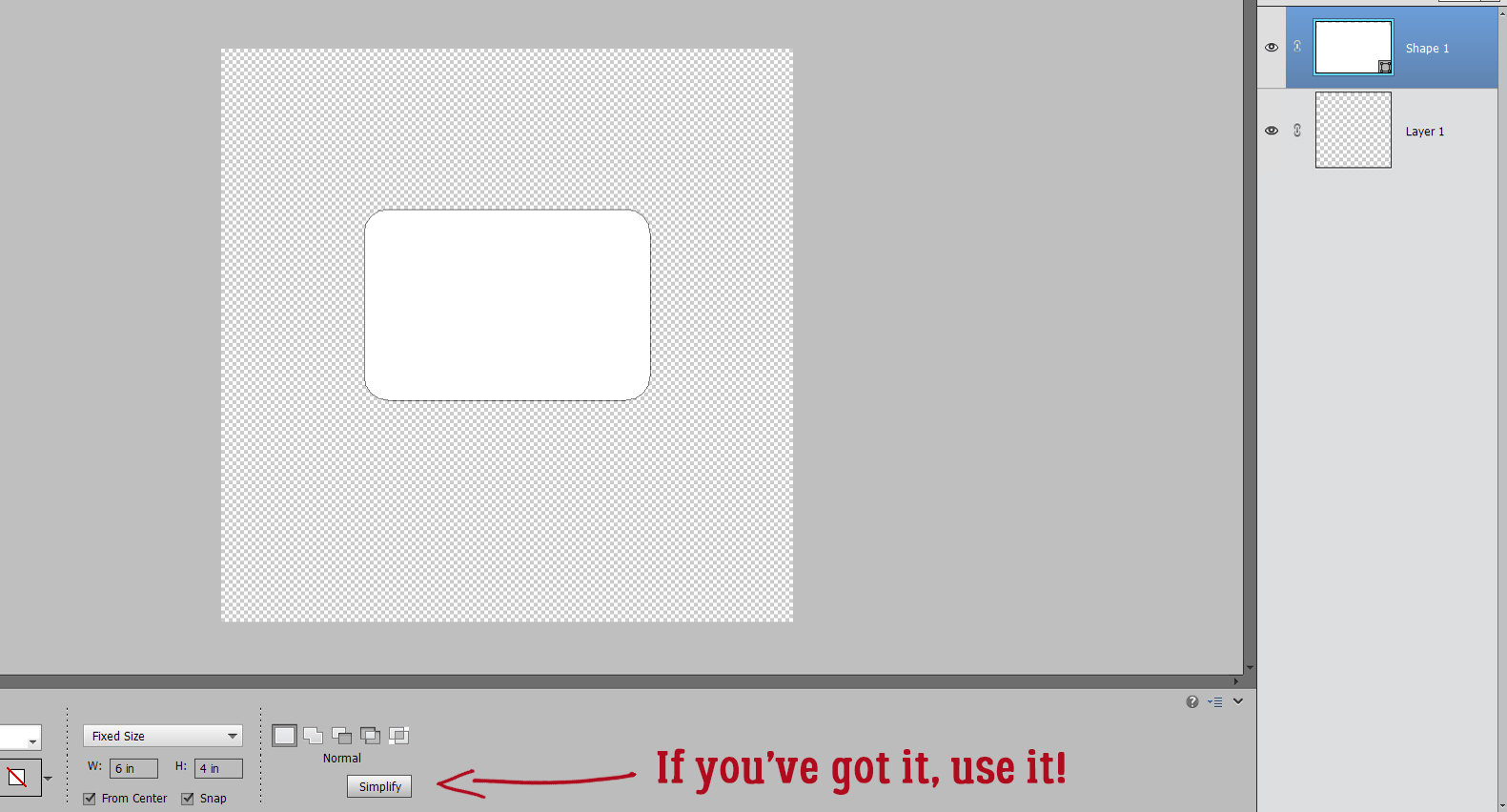
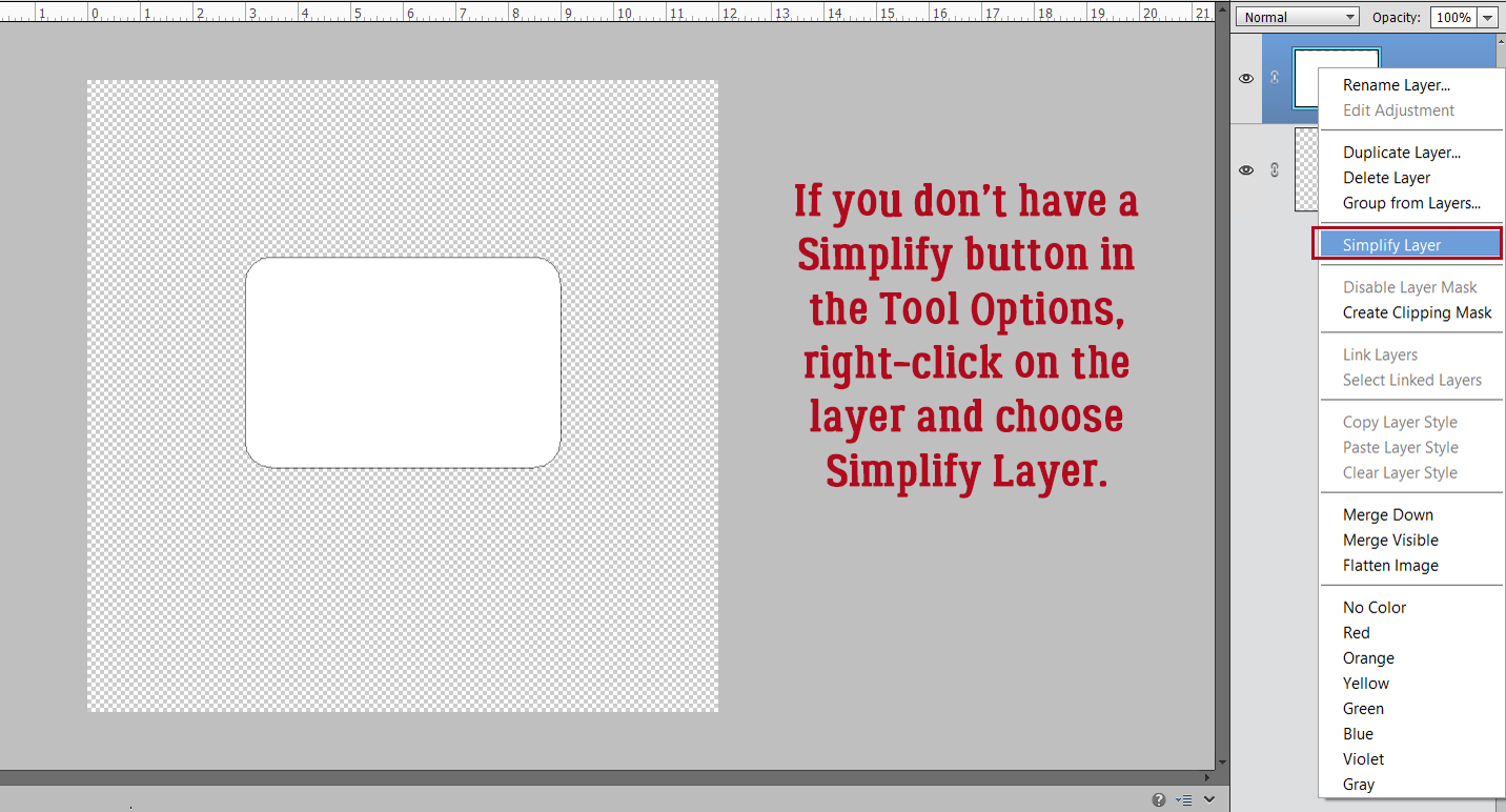
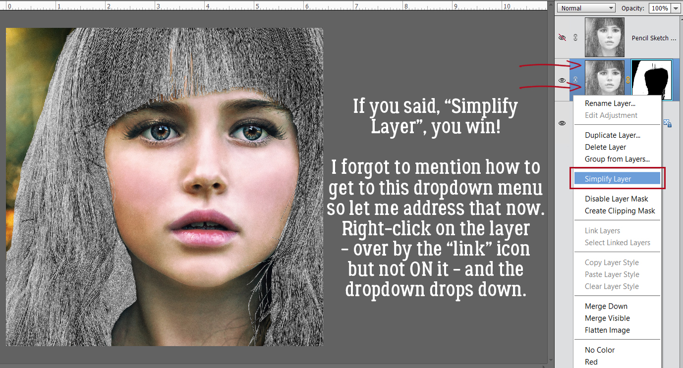
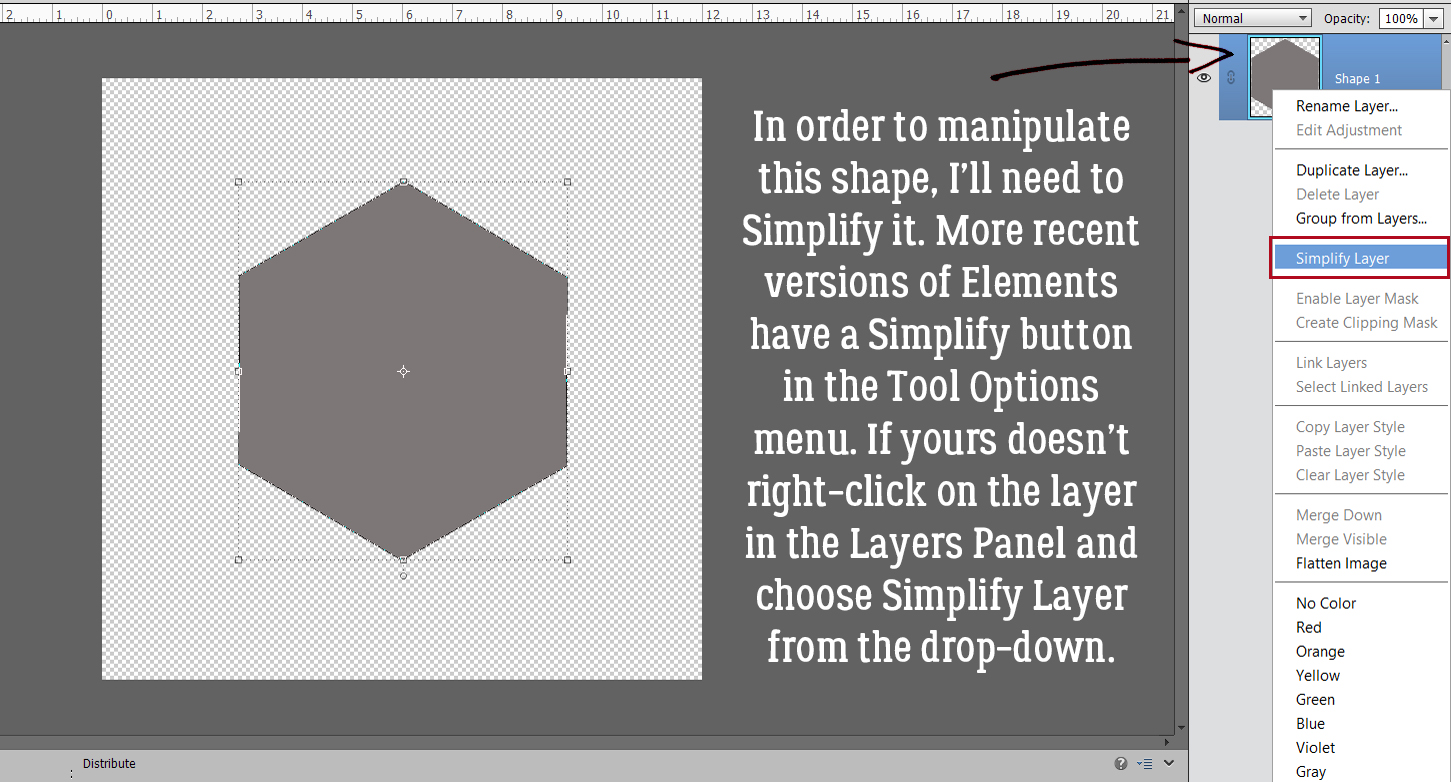
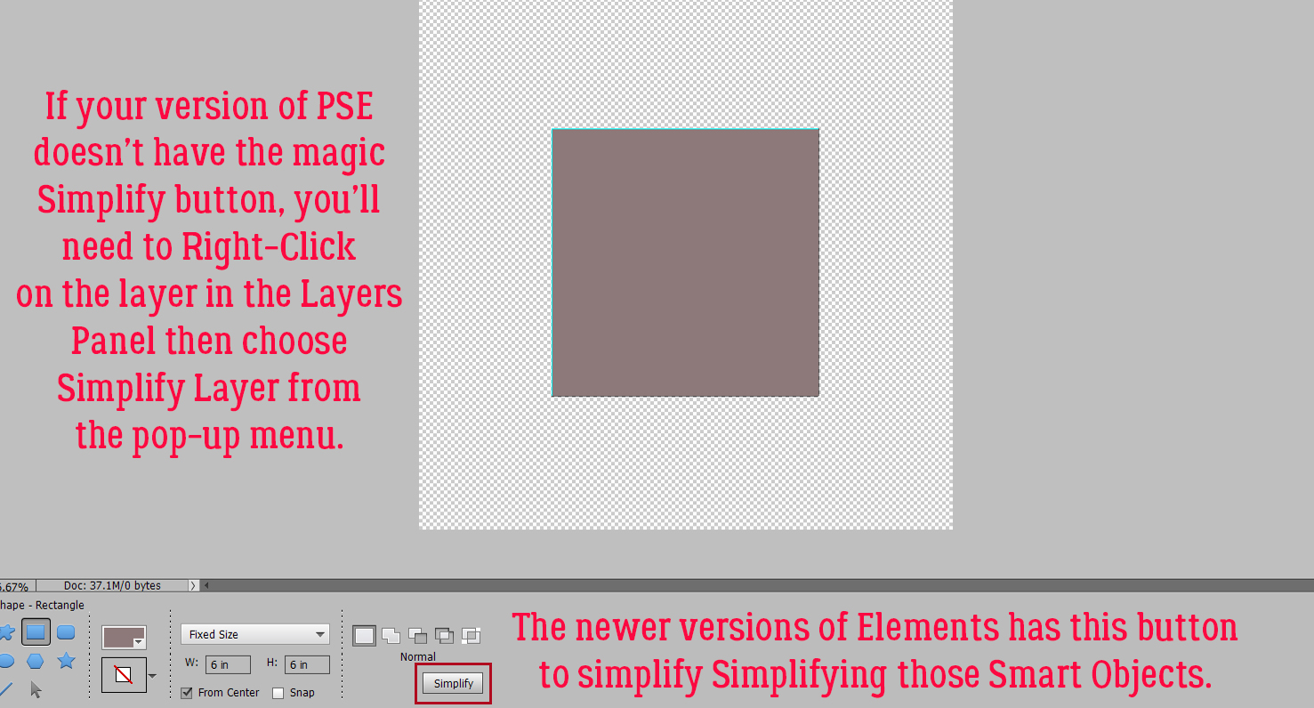
When using fonts the resulting layers need to be Simplified before you can manipulate them, so that any changes to that layer only affect that layer. If I typed out this text but didn’t Simplify the layer, then changed the font (as I’ll be doing in a minute) this layer would change to that font too. So always remember to spell-check. grammar-check then Simplify by right-clicking on the layer in the Layers Panel and choosing Simplify Layer from the dropdown menu.

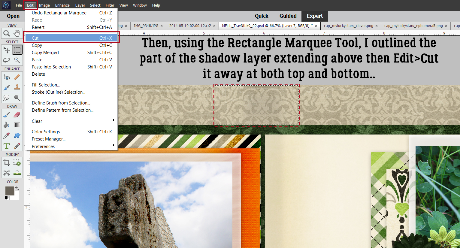
I may need to make some further placement adjustments to this text, so I opted to break up the layer into two chunks of text. With the Rectangular Marquee tool, I outlined the second line.

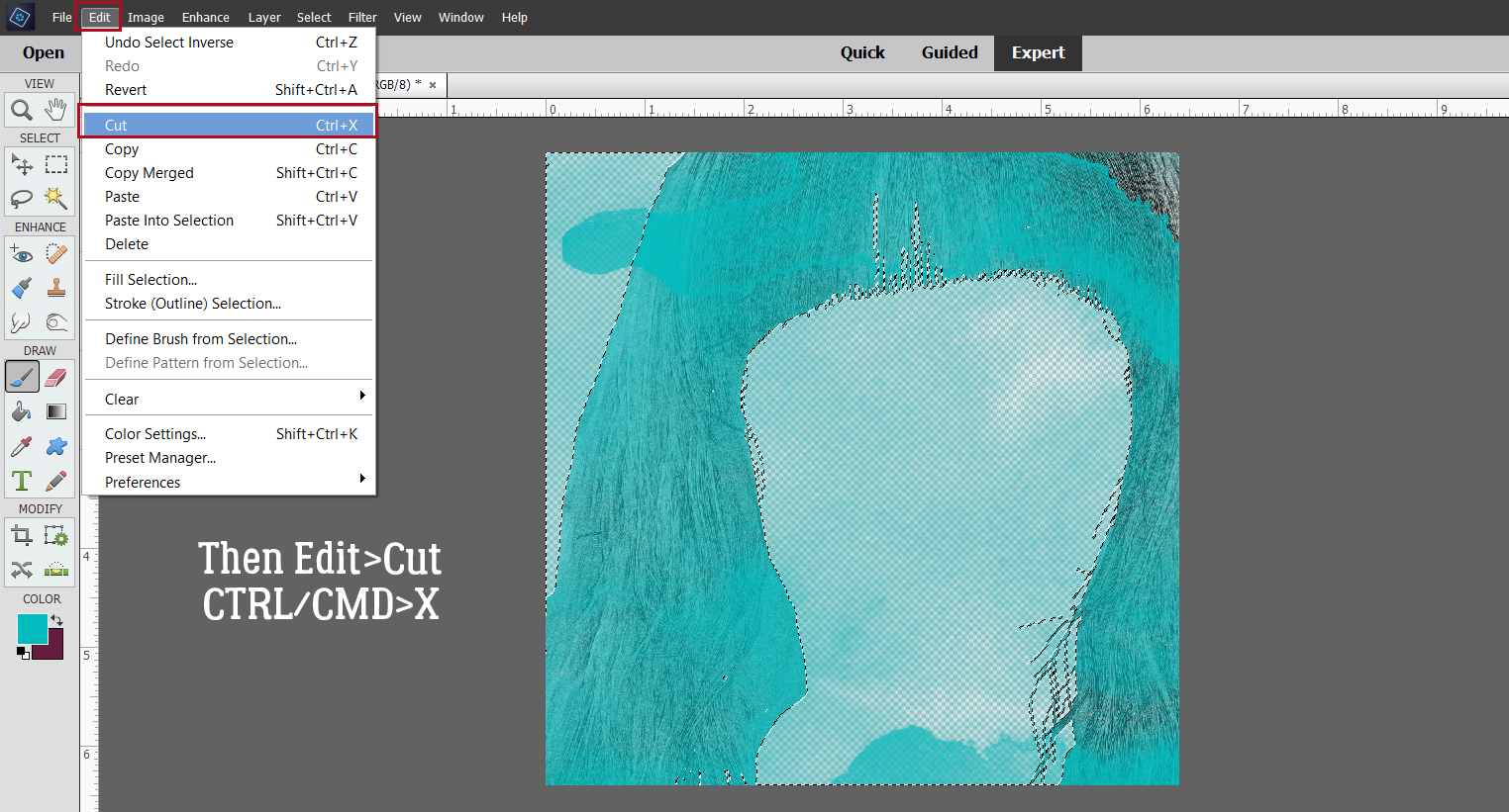
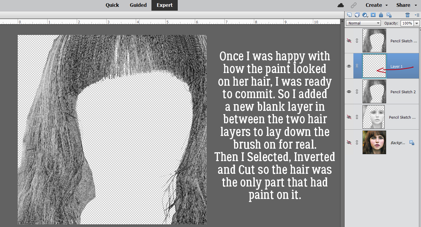
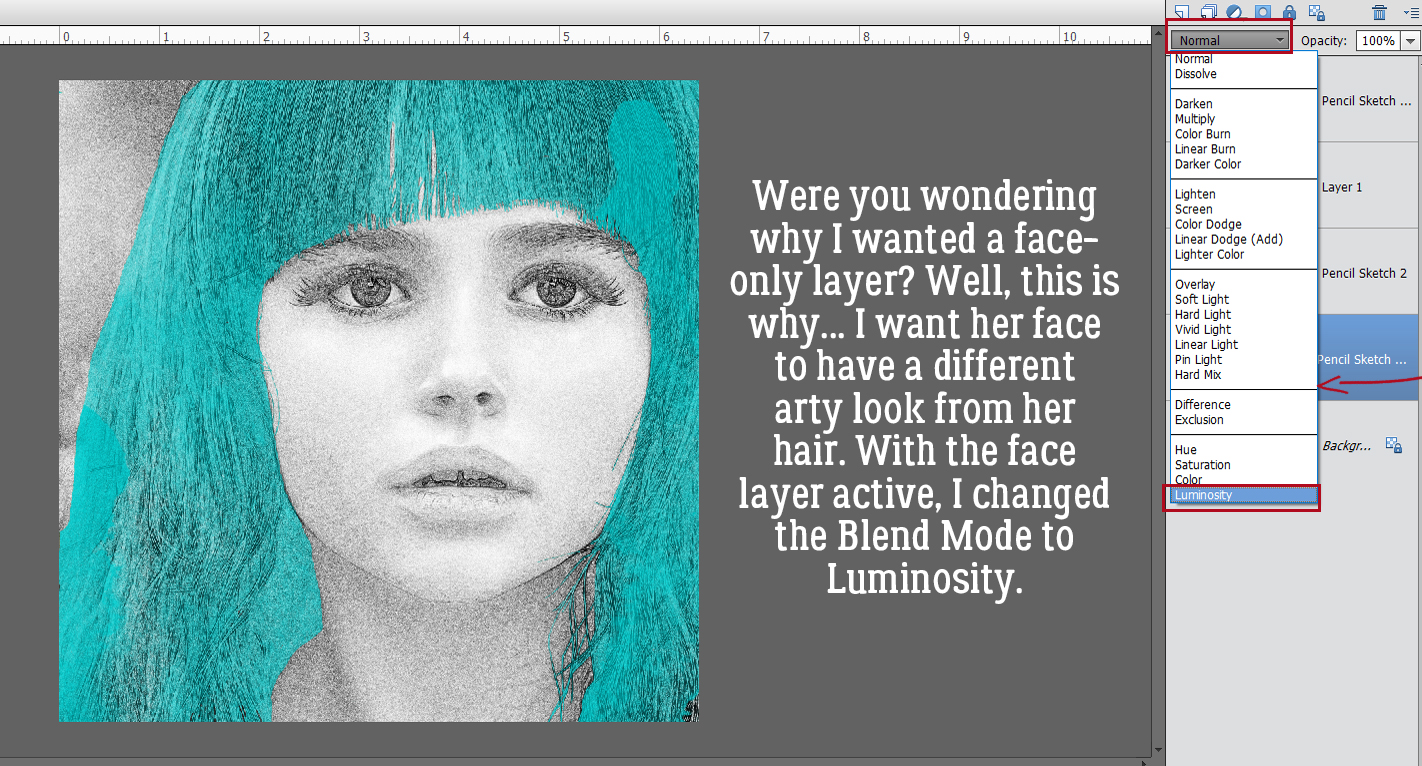
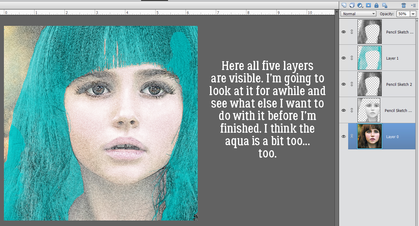
Next, I Cut that line away from the first line: Edit>Cut [keyboard shortcut: CTRL/CMD>X]

And then without any further ado, I Pasted it back onto the canvas: Edit>Paste [CTRL/CMD>V]

Now I can move each line around, resize and reposition as needed.

I changed my font to Cookie Dough. For this word, I’m going to put each letter on its own layer for now. (If you don’t intend to make many changes to the text, you won’t need to do these steps.) So I typed a D, Committed the Operation and then carried on. You can toggle between the Move Tool and the Text Tool by clicking [V] for Move, [T] for Text.

I wanted the letters to be a little off-kilter and shifted them around until I was happy with their positions.

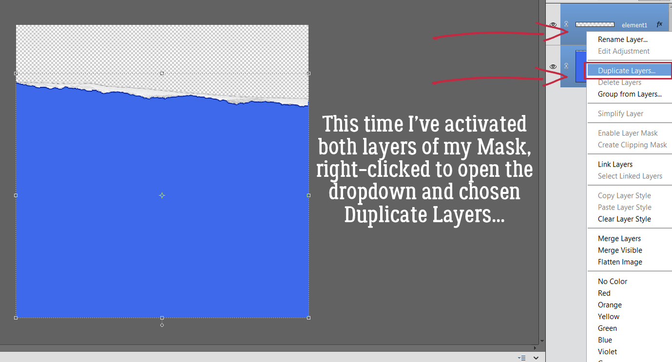
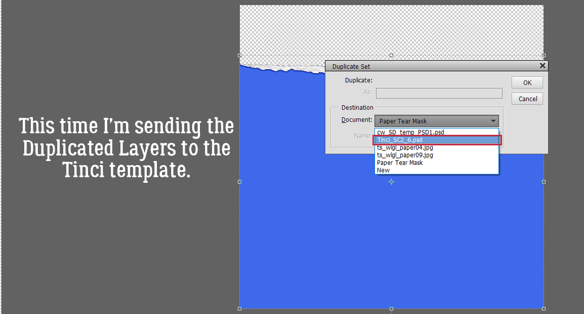
At this point, I’m planning to turn the letters into donuts so I’ll need to Simplify each layer. Because I was only rotating the letters before, I could wait until everybody was where I wanted them then I could Simplify in one step instead of 6. I Activated all 6 layers by clicking on the top letter layer, holding down the SHIFT key and clicking on the bottom letter layer. Then I right-clicked and chose Simplify Layer. Boom!

The layers can now be Merged into a single layer.

I added a MTF Sweet Dings Regular donut. Dingbats are drawings that correspond to the alphabet. The donut’s the letter W.

And of course, I Simplified the layer…

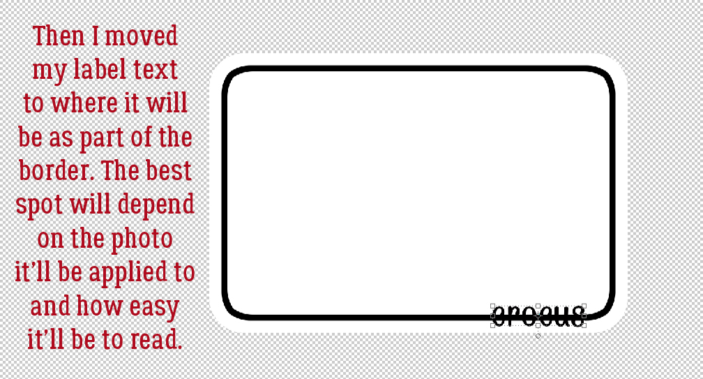
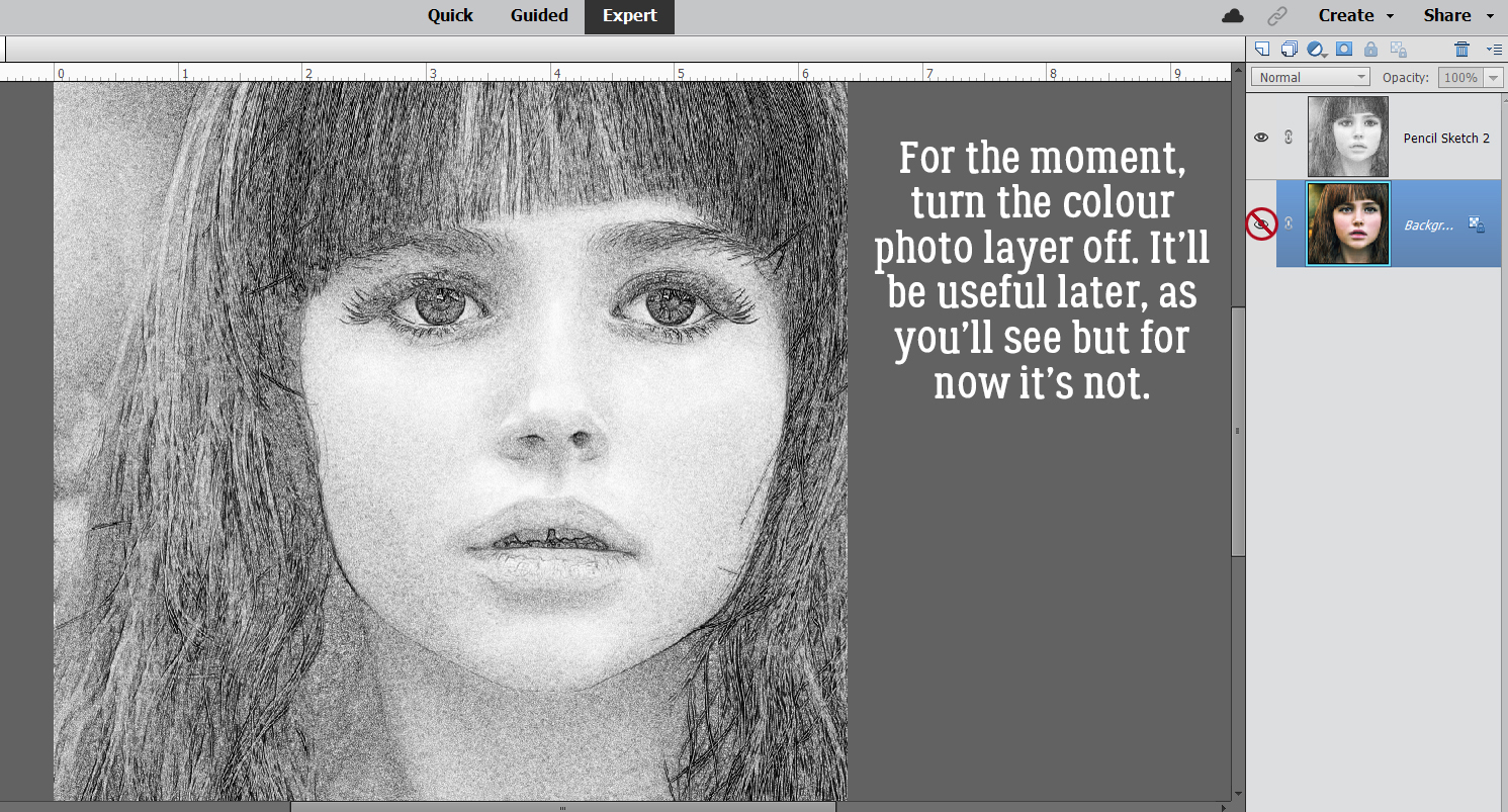
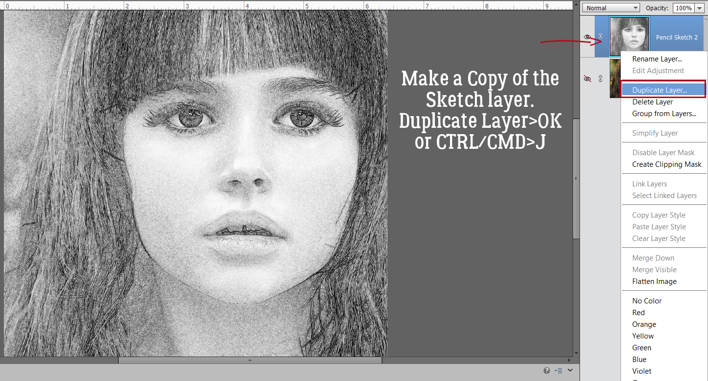
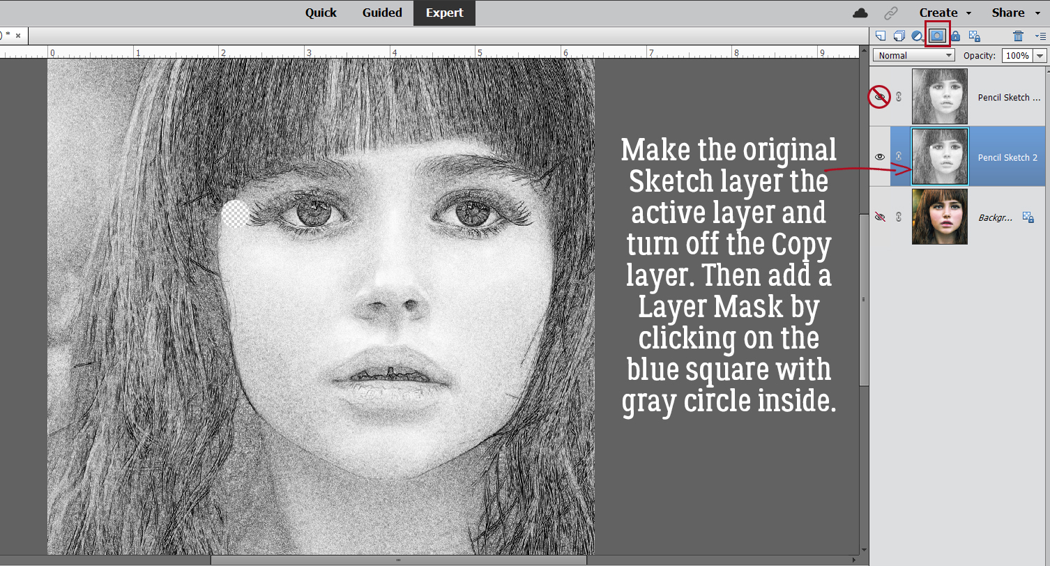
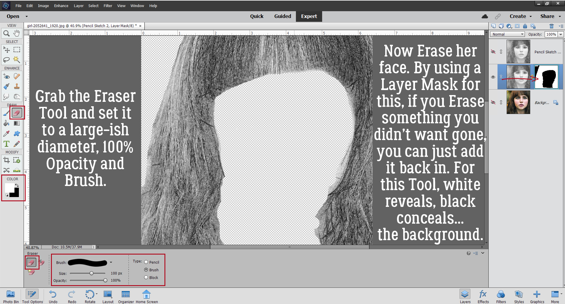
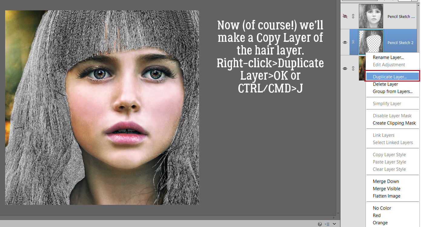
… made a Copy layer: right-click>Duplicate Layer>OK [CTRL/CMD>J] and used the Paint Bucket tool [K] to Fill the bare donut part with a golden brown colour. More about that step in a bit. I made some Copies of the DONUTS layer [CTRL/CMD>J] so I can separate out certain elements of the text for enhancement. I added a Layer Mask – click on the icon at the top of the Layers panel that looks like a blue square with a white circle in the centre – to the bottom DONUTS layer so I can remove parts of the image without actually deleting the pixels. This is the best way to remove parts of an image because if there’s an OOPS!, the accidentally-erased part can be painted back in. Remember, black conceals, white reveals – THE BACKGROUND. Using the Eraser tool and with white in the foreground I removed all the sprinkles. To paint back an OOPS, toggle to black in the foreground [X] and fix it.

To make the Layer Mask part of the layer just Simplify Layer. Right-click in between the mask and the image thumbnail.

Next, I just want an outline of the frosted area of each letter. With a Layer Mask, I removed the sprinkles and the cakey parts. It doesn’t have to be perfect because the other layers will conceal any wobbles.

I like to make more Copy layers than I think I’m going to need, which usually is a good idea. Here I’m going to just leave the sprinkles, but I’ve already done the hard work.


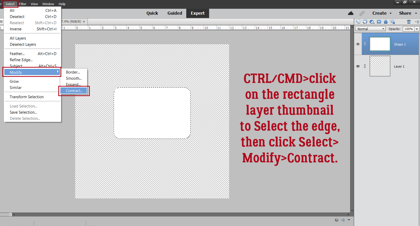
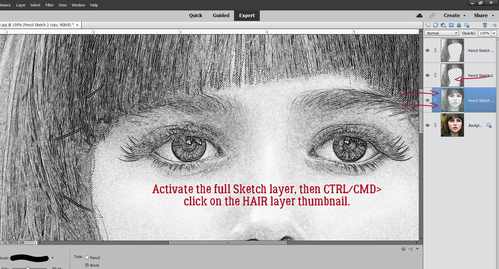
I CTRL/CMD>clicked on the layer thumbnail (the tiny image of what’s on each layer at the far left of the layer in the Layers panel) for the first DONUTS layer with no sprinkles. That Selected the edges of that layer. See the marching ants?

Then with the topmost Copy layer active, I just Deleted what I Selected. [CTRL/CMD>D or just hit Delete] and voilà! All that’s left are the sprinkles.

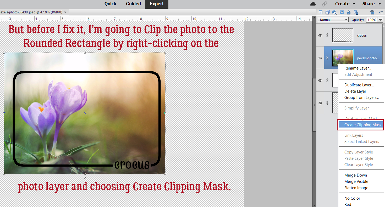
Now to get some colour into the picture. With the first of our DONUTS layer active, I’m going to add a Fill Layer. The reason for this is that the results are much cleaner than if I used the Paint Bucket. Layer>New Fill Layer>Solid Color.

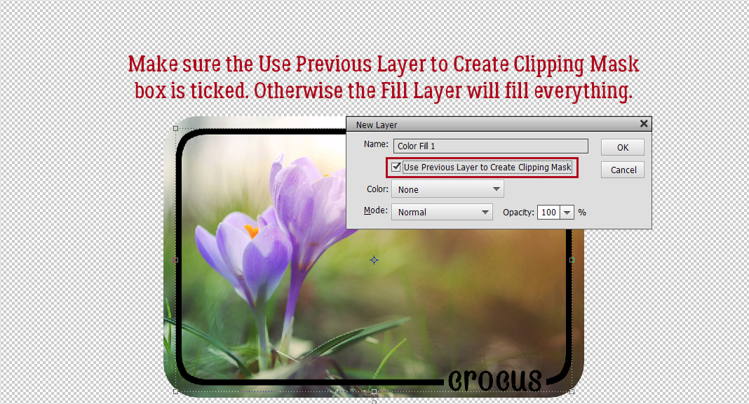
Tick that Use Previous Layer to Create a Clipping Mask box and let Elements do the work.

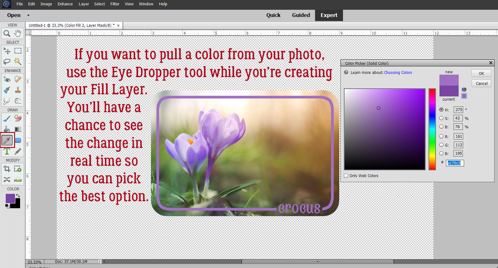
The Color Picker opens and I chose a nice golden brown.


The Fill Layer and the layer it’s clipped to need to be Merged, so click>SHIFT>click on the two layers, right-click and choose Merge Layers [CTRL/CMD>E]

The frosting layer will be Filled with white using the Paint Bucket tool [K].

Make sure you’re not going to leak!

I also used a Fill Layer to make the sprinkles layer pink. I won’t show screenshots of those steps because that’s unnecessarily repetitive! But I will show you screenshots of the Fill Layer for the Amateur Comic text. I want it to be pink too.

I decided the pink text lacked a bit of presence so I’ve chosen to add a white Stroke to the outside. Edit>Stroke (Outline) Selection.

8 pixels makes a nice stroke for titles. I’ll position it to the Outside so it doesn’t hide any of the pink.

I think it looks good now.

I went on to use the Paint Bucket to frost the dingbat donuts, change some of the sprinkles to purple and position the layers so they look right. Then I Merged all the layers. To have my word art (and work!) saved for later, I’m going to Save As> [CTRL/CMD>SHIFT>S].

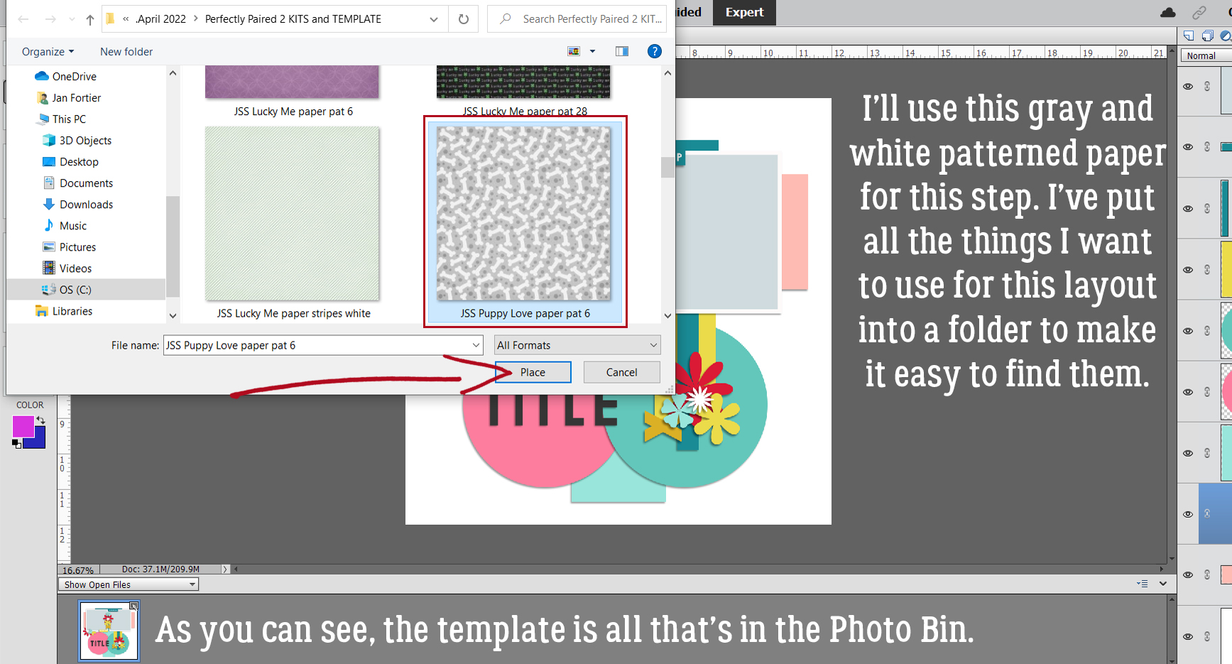
I have a Jan’s Elements folder on my laptop, so that’s where I’ll put it. I named the file Donuts Word Art and will save it as a PNG so the background stays transparent.

Smallest/Slow Compression and No Interlace will preserve the word art for me in the cleanest and neatest format so I can use it as the title for my layout.

I’ve been told there are a LOT of new members of the GingerScraps family, so I’m going to do a few basic tutorials in the coming weeks to help them feel more comfortable here. Stay tuned!

PDF Version: https://bit.ly/3FNtvOy

Tutorial Tuesday (Fonts)

Fun Fonts for Layouts about Kids

It’s been a while since I did a post about fonts. I didn’t really think there were that many more “types” of fonts to explore but Ellen (gmae) pointed out to me that there are categories I’ve overlooked. I have to tell you about this because it blew my mind totally. Ellen has created a spreadsheet of ALL the tutorials I’ve posted here – all 240-some – and made it sortable by a bunch of different terms. The amount of work she put in just boggles my mind! An unintended result of all her work is that she’s made some very important suggestions about where I could take you all next. One of those suggestions was to explore some fonts specifically suited to layouts about children. So I spent some time at dafont.com, looking at hundreds of fonts and selected this baker’s dozen along with five sets of dingbats I think you’ll like. (And while I was there, I came up with some new categories to share later!) Okay so let’s get a look at what I like. PS… each font name is linked to the website for one-click access. And they’re all FREE!

First up is Cookie Dough. What kid doesn’t love cookies (other than my second daughter)? This would be a great choice for a title or for some custom word art.

Eye Monsta made me think of my two grandsons right away, especially A-boy. J-man is more cerebral and a bit less inclined toward monster-like behaviour. It’s another title-suitable font but is legible enough that it could be used for both subtitles and journaling too.

I like how solid Childhood is. It looks like it’s been filled in by a child and has a bit of grubby awesomeness too. Multi-use fonts are worth the download.

Space Out comes in two different styles. It’s another good title/word art font, don’t you think?

This font, Crayon Kids, looks like an older child was the writer. It can be fun for journaling and subtitles. It would also be a good choice for word art, when combined by a more fancy font.

I LOVE Calvin and Hobbes!! Did you see the cross-over to Bloom County? An adult Calvin (click to view) is tracked down by Opus and it’s perfect!

This cute font would make a good title, but is also legible enough for journaling. Helloo Kidos will be joining my collection.

Tiny Friends is like Eye Monsta… very child-oriented and fun. And it has so much potential for creative alterations!

I think Childhood Memories looks like it was hand=printed by an older child/teen. Great choice for journaling.

I like Amateur Comic for journaling too. It’s a bit less organized than Childhood Memories, but still easily read.

Another good font for journaling and subtitles is Gilles’ Comic Handwriting. It’s a nice blend of careful and a bit rushed.

Who doesn’t adore Lego? Toys comes with four different versions and has a lot of potential.

I think the name of this last font is totally appropriate. It’s Kindergarten!

Now I’ve got some dingbat collections for you. What are dingbats? They’re accessed as fonts, but instead of letters, each character is a drawing. They’re really a lot of fun and have a multitude of possibilities. The first set is called Seaside Things. The drawings are child-like, but not necessarily childish.

When my own kids were small, they all loved the Mr Men books. We had a box full of them and when I saw this set of dingbats, I was transported back to bedtime stories.

We can’t leave the girls out. Little Miss is a companion set to the Mr Men books and the dingbats too!

DT Rachel’s Toys is a bit more of a detailed set. I think there are a lot of ways these can be used.

And our last dingbat collection is MTF Sweet Dings. They’re all so cute!!

I’ve barely scratched the surface of the incredible choices you can find at dafont.com. There are other sources for free fonts too, if you’re interested. Next week I’m going to use two of the fonts and one of the dingbats to show you how to create your own word art. See if you can guess which ones. [Hint: I’m going to use it as a title for a layout featuring my granddaughter.] See you soon!

PDF Tutorial: https://bit.ly/3iBte7w

Tutorial Tuesday (Tips and Tricks)

It’s Almost DIGITAL SCRAPBOOKING DAY!!

Hey all you GingerScrappers! Digital Scrapbooking Day is coming up fast!! It’s on Saturday, October 2 and it’s going to be a blast. But don’t let “Day” throw you off. It’s not just a day, it’s a week-long celebration of our hobby and it’s always epic. This year’s theme is just perfect. Ginger has given me the go-ahead to share this sneak peak with you. Drum roll please!

All the digital scrapbooking stores around the worldwide web have special events and sales. Here at GingerScraps, there are a bunch of grab bags specifically designed for DSD, special challenges, another scavenger hunt, and a free-with-$20-purchase MEGA collab. (I’ve seen the MEGA collab… you’re going to love it!!!! It has about 100 papers… and the palette is beautiful.) Other stores will have designer blog hops and special events on their sites too…

So start with a PLAN! Don’t just jump into the deep end. Check out the forums at your favourite stores to see what they have going on. Then make yourself a calendar of events. Set some reminders so you don’t miss the entry deadlines, speed scraps or chats. If you’ve ever missed out on something amazing by a matter of an hour, you’ll understand the need for some nudges.

Make sure you have hard drive space for your purchases and freebies. Or invest in some thumb drives or an EHD to transfer some of your older stuff to so you have lots of room for your downloads. That MEGA is going to need a bunch of room. Label this extra storage right away so you don’t forget what you’ve put on it. Forgetting to label them could mean you lose track of all the awesome kits you’ve moved and you don’t want that! I have a brand new 6TB EHD just waiting for me to fill it up.

Set a BUDGET! It’s way too easy to overspend when you’re surrounded by smokin’ hot deals, and PayPal makes it painless… until later. Figure out how much you have to spend, and stick with it. I usually save a bit of money so I can spend $20-25 per favourite digishop (I have 3 that I like a lot) without feeling guilty. (With the slightly stronger Canadian dollar this week, I might be able to make my money go a bit farther. As long as there isn’t some catastrophe here that causes our currency to tank. ‘Cause that’s never happened before….. 😉 )

Don’t feel obligated to participate in anything that isn’t going to make you happy. If you don’t have time to join in on the games in the Forum, don’t worry about it! If you aren’t into speed scraps, that’s great! Extra challenges might be fun, but if you have better things to do, you have better things to do. Freebies take up a lot of space, both on your computer and in your head; if you don’t think you’ll ever use what the designer is giving away, you don’t have to take it. This is especially true of blog hop freebies; the topic and palette may be really exciting, but there will be some designers’ contributions that don’t fit into your style of scrapping, so don’t download them. Believe me, you won’t miss them.

While you’re waiting for the festivities to begin, go through your photos and choose some for those challenges you just won’t be able to resist. Let your family know when you’re going to need some uninterrupted time and don’t stay up too late! Because there’s still Black Friday next month – we have to pace ourselves!

Sharing our stories is important, both for us now and for those who come after us. The last 18 months have had quite an impact on all of us in one way or another. Some of us have lost loved ones, some of us have been sick ourselves, some of us have worked harder than ever before to help others and some of us have channeled our energies in new directions. But we all have learned what matters and what doesn’t. Let’s celebrate ourselves!

Tutorial Tuesday (Individual Style)

Jumpstart Your Layouts!

So how many of you are Challenge fans? If you aren’t, you should be!! The GingerBread Ladies designers are incredibly generous with their talents both through their participation in the GingerBread Ladies‘ collaborations: Monthly Mix, Free-with-Purchase and Challenge rewards, and within the Challenges themselves. Did you know there are freebies included in several Challenges EVERY month? Brushes, templates, word art, mini kits, add-ons – so many gifts!! Sheri, whose design handle is Jumpstart Designs, provides a mini kit every month in the Jumpstart Your Layouts Challenge (although these minis are the same size as some designers’ full kits…) and they’re amazing. I posted my JSYL Challenge layout to the thread in the Forum and couldn’t help but notice how every scrapper’s layout – using the identical collection of supplies – looked SO different. So I thought we could talk a bit about how we all have such individual approaches to creativity.

This is the preview for the Jumpstart Your Layout Challenge. Like all of Sheri‘s kits, the colour palette is versatile, it’s a bit grungy, a bit pretty, a bit sophisticated and 100% awesome.

A-M chose to use only the cream and brown parts of the kit. Her layout is simple, but eye-catching. Having a black-and-white photo as the centerpiece was genius.

Breoni too chose mainly the neutrals, but added a couple of aqua pops… which are the perfect accompaniments for her photo. Her positioning of the metal tag and ribbon element frames her face and really leads the eye to her photo.

In keeping with the mostly cream background, next up is this beauty. What makes this layout by nimble4u truly stunning is the way she’s used her photo. She embellished with restraint and the sentimental feel of the photo is the star of the show.

Roxana has added a bit more of the aqua to her layout. The large word art is perfectly displayed against the aqua paper and the photo she chose adds a bit of whimsy. I think she’s used every single item in the kit as well, even though it’s not a requirement.

Kristal’s background is also mainly cream, but with some taupe details that adds to the seaside impact of her photos. Masking the boat photo with some aqua behind it makes it look like the water continues outside the photo. Genius!

Maskyra used the papers with such panache! The grungy, rubbed, torn and splattered background is a masterpiece! Her layout is a bit of a segué from mostly neutral/cream background into more colour detail.

This layout by beckturn moves us to an aqua background with a beautiful tear revealing the shades-of-brown striped paper behind it. I love the way she repeated her heritage photo with a tighter crop on the girls’ faces.

What immediately caught my eye about jcfdelaware‘s layout is the undulating anchor behind her photos. With aqua paint behind all the brown paper hexagons, it moves the eye across the page. and the large word art tucks into the lower left corner so neatly.

LisaCampbell‘s layout doesn’t really use a lot of aqua elements, but it “reads” as an aqua background, thanks to the curved paper cuts and aqua paint wrapping around her photos. (

Alasandra‘s layout just screams HAPPY to me! The aqua elements pop right off the paper.

I love how Pippin has turned her photo to sepia and makes it look like it grew out of the paper behind it. The dark brown border draws the eye, the bokeh leads it to the photo and the clusters keep it moving.

This layout is so perfect in every respect! It’s from the creative mind of kabrak1207 and is gently shifting us toward a darker brown palette. Her use of the scalloped borders is clever, and really frames the focal photo perfectly.

MomDoc_99 went monochromatic with the browns and it works very well. The scatters echo the circles on the background paper  and by framing the photos inside a circular paper mat and creating a similar frame for her title, her repeating shapes create a pleasing layout.

Here, DebraB has given us a grid-style layout on a deep brown background that makes the photos stand out. The border along the left draws attention to her journaling. I love how she used only part of the word art on a paper strip to customize her look.

And last… this layout by galavictor is completely different! She’s changed the Blend Mode on the striped paper and the floral aqua paper to accent the orange in her photo, created a bokeh effect with the scatters while also making brilliant use of masking to blend papers together and fade the photo into them. She applied some Layer Styles to the word art too. So much creativity!!

There you have it, fifteen unique layouts using a single kit. (You can see my own vision for this kit here. And yes, my granddaughter does eat non-stop.) What might YOU do with this FRE-E-E-E-E-E-E kit?


PS… What do you think about a Challenge spotlight post every once in awhile?

PDF Version: https://bit.ly/2ZeFvb3


Tutorial Tuesday (Photoshop Elements)

Anchors Aweigh! (Reverse Masking)

Hey GingerScrappers! It’s raining in the Okanagan… something that hasn’t happened much around here for months. That makes today a perfect day to do some scrapping.

I want to talk a little bit about anchors though. Not the heavy iron pieces that keep ships from floating away. The kind that help bring cohesion and polish to our layouts by keeping our photos from floating away! Think for a minute about how template designers create their templates and what draws your eye to them. There are lots of factors that come into play when choosing a template, and consciously or unconsciously, anchors are usually involved. They can take many forms. Paper strips and stacks are likely the most common anchors. But paint splats, brushes, masks, scatters and ephemera can all play that supporting role. Even a grungy paper itself can provide an anchoring effect when there’s a faded area that sort of frames your photo. But what if you want something a little different? Let me show you how to create an anchor point using paper, brushes and a reverse mask. The suggestion for this topic came from Ellen [gmae], with a hat-tip to AnnieA for the example she provided in the Gallery.

In my demo, I’ll be using a semi-solid paper and a patterned paper from Aprilisa‘s (retired) Captured Romance kit. [I chose it because my layout will be showcasing a heritage wedding photo.] If you choose to use this technique, you can use whatever combo you like: solid/solid, solid/patterned, patterned/patterned or any other combination you like. I’m using a freeform method in my demo; if you choose to use a template, turn visibility to all layers but the background and your focal photo spot off so you can see what you’re doing while we work through it. My photo spot is sized to the wedding photo I’m going to use.

I stacked the semi-solid gray paper behind the photo spot and popped the patterned paper above it.

If you’re a faithful follower [thank you!!] you’ll already know I love layer masks. They’re considered a non-destructive way of removing parts of a layer; you’ll see that the colour pickers change to white and black when you add a layer mask. White reveals, black conceals. But whatever you’ve concealed is still there, lurking in the background, just in case you want it to reappear. That’s the definition of non-destructive in the Photoshop/Elements context. If you’re concealing some part of a photo or an object and you oops, all is not lost. Just click the X key to swap conceal for reveal and paint it back in! The uses for layer masks are infinite, limited only by your imagination. So to create a layer mask, click on the blue square icon with the circle in the centre, found across the top of the layers panel. You’ll see the mask appear to the right of the layer you’re masking, and it’ll have a blue box around it indicating that’s the part of the layer that is active.

Elements has a default selection of brushes already installed in the software when you download it. They’re pretty basic brushes but are useful for a lot of things. My assumption is that we’re not making a nice straight, crisp edge on our contrasting papers so for this demo I’m going to use a Wet Media Brush. The number at the bottom of the thumbnail is the default size of the brush. You can ignore that. [Yeah. I have a lot of brushes. Many of them were free.]

Resize the brush so it’s manageable but not too big. 200 pixels is a good place to start. The default brush settings are shown in the Brush Settings menu.

Before using the brush, the layer mask must be inverted. We want it to conceal everything then reveal only the parts we want to see. The mask thumbnail will be black and the paper/object being masked will be invisible. To get there, just click CTRL/CMD>I. Make sure the foreground colour in the Color Picker is white… otherwise nothing will happen!

My first version is a simple oblong heart shape. I just dragged the brush to draw out a heart! Check out the layer mask. See what happened?

Here I’ve just dragged my brush in a sort of swath, cutting off a corner of the gray paper.

Zig-zags can look pretty cool.

Or making several vertical passes frames the photo as well as anchors it.

But what if we go horizontally?

Following are a few examples of using a brush as a stamp to create an anchor. To do this, make the brush as large as you can. With this butterfly brush, I think it would look better under a smaller, squarer photo. See how the polka dots on the paper show up?

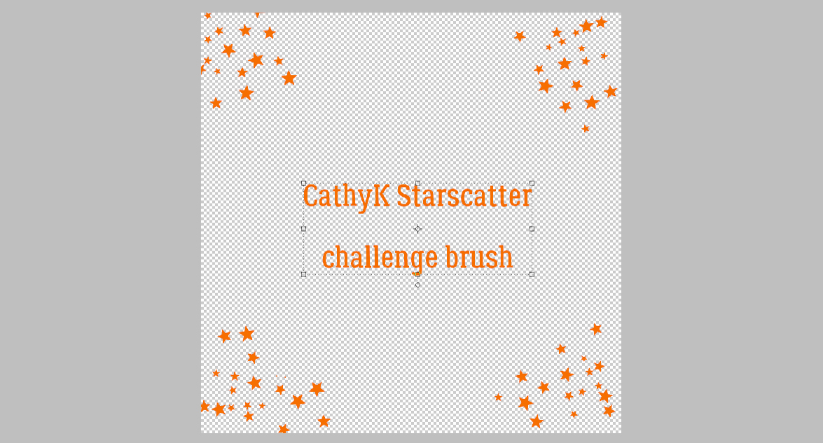
This star scatter [a challenge brush from CathyK a long time ago] would work better with a much smaller, more obvious pattern, don’t you think?

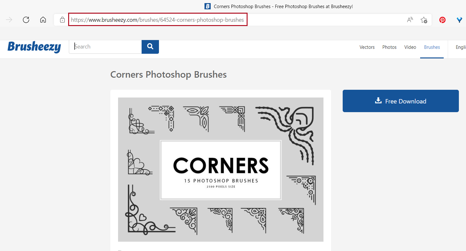
Ooh, I like the idea of this one. Not necessarily the execution though… I used three different brushes from a free set called Corners with Birds. I’d want to make sure the brushes don’t overlap because the contours are muddied.

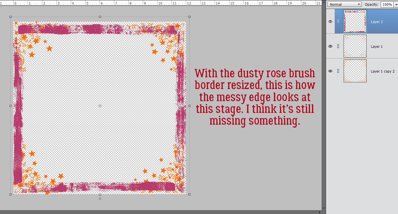
Then there’s this filigree floral corner. I really like this one! But which version will I settle on? You’ll have to look for my layout in the Gallery to find out. I’m still on the fence!!

If you’ve seen something you’d love to emulate but aren’t sure how to get there, just shoot me a message and I’ll see what I can do to make it work for you!

PDF Version: https://bit.ly/39cdrH3

Tutorial Tuesday (Photoshop Elements)

How Did They Do That? (Outlining a Title with Paper Cuts)

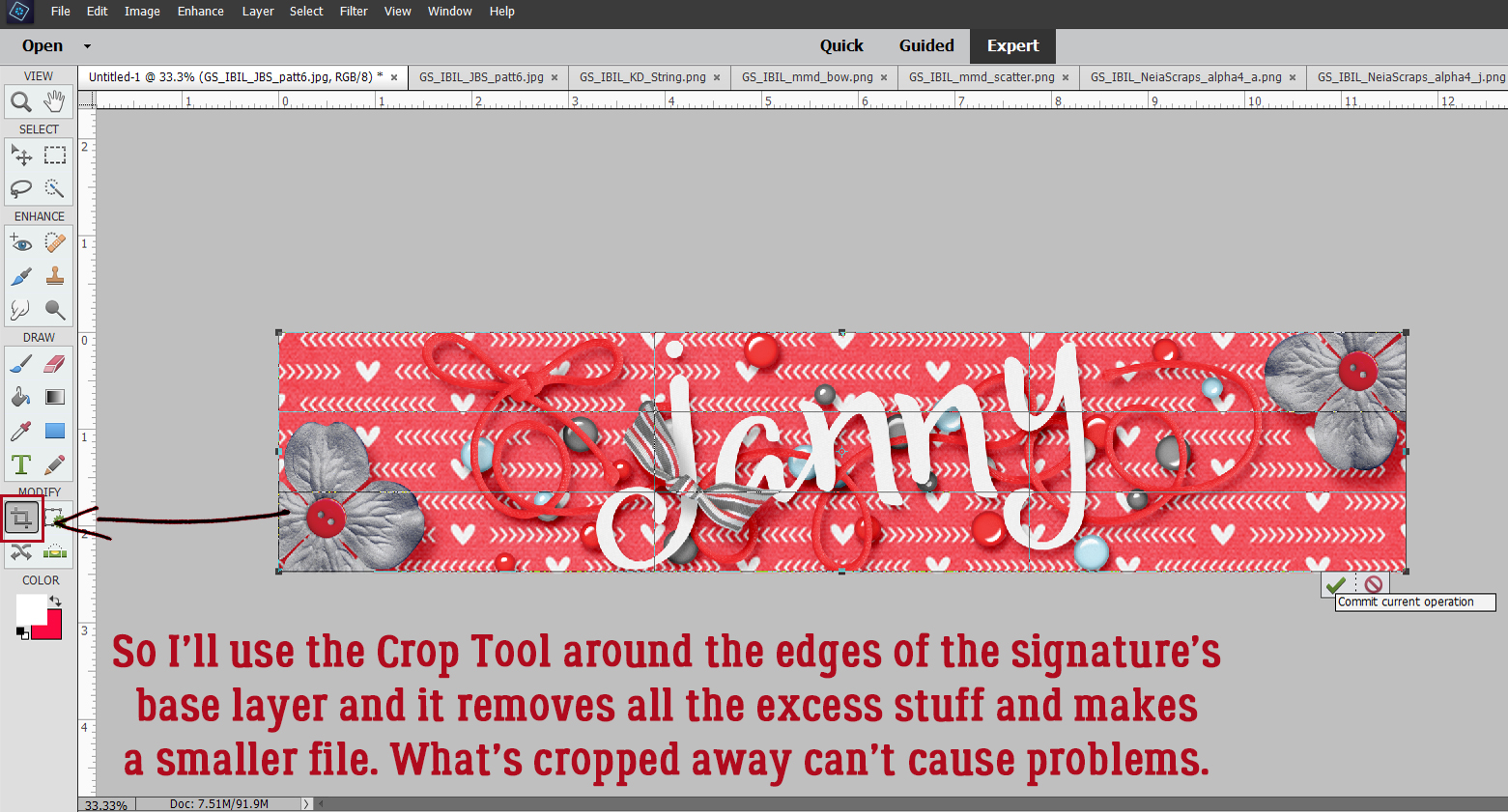
Are the kids all back to school now? Are you able to just sit in silence for a while? I remember how that feels! This week’s tutorial is a short snapper, not too complicated, since I don’t want to distract you from your relaxation. Sherry (spenny) messaged me a couple of weeks back, asking for some help. She’d seen some really interesting titles in the Gallery where the scrapper had lined her title up so it overlapped a series of paper/photo strips. Then she cut some of the paper strips away, leaving a background paper border visible around the alpha she used. Sherry wanted some input on how it’s done. This is what I’ve come up with. Now remember, you don’t have to follow my instructions to the letter; do what looks good to your eyes. I’m offering guidance only!

This technique can be used at any angle. Vertical, horizontal, diagonal… all the same steps. If you want a crisp look, choose a sans-serif (no extensions on the terminal strokes) alpha with some substance and clean lines. I went with a bit more of a fun alpha from the GingerBread Ladies‘ collab Happiness Is. My papers are also from this collab. Here you can see I have 8 paper strips, one for each letter in my title. I’ve resized the alpha so each letter is the same height as the paper strip. If you want to, you could double up some of the letters to a single strip for a really unique look. To make the steps easier, I’ve sandwiched the letters between the paper strip layers.
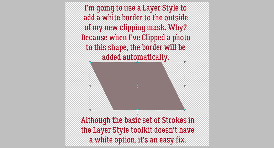
I decided how far over I wanted to move my letters so that they sit on top of the paper then I dragged out a Guideline to snug them up against. Guidelines are really useful for precision. All you need to do is ensure the Rulers are active [View>Rulers] then with your cursor inside one of them, click-hold and drag the cursor to the place where you want the Guideline. The actual Guideline won’t be this obvious. I’ve enhanced it for better visibility.

Next, I nudged the first letter over so it’s just touching my Guideline, and then I CTRL/CMD>clicked inside the LETTER‘s layer thumbnail in the Layers Panel to Select the edges of the letter. See the marching ants?

I need to make the area inside the marching ants a bit bigger. Otherwise there won’t be a border around the letter later, right? Select>Modify>Expand will make the Selection grow.

Here’s where personal preference comes into play. There’s no hard-and-fast rule for this step, and it may take some experimentation to find the right number of pixels to go with. I ended up at 15 pixels, but 20 or 25 might have worked well too.

Here you can see where the new line of marching ants, the new Selection, is.

Now, with the turquoise paper layer active, I Cut some of the paper away. Edit>Cut or CTRL/CMD>X will work for that.

I followed the same process with each of the letters in the title. Where there are little bits of paper completely disconnected from the paper strip, I used the Eraser tool and got rid of them.

Where the paper bits are still attached, like inside the C, the S and the E, I left them there.

Then I shadowed up each layer and my title is done!

The layouts Sherry showed me as examples can be seen here, here and here.

If you try this tip, let me know so I can leave you some Gallery love!!

PDF Tutorial: https://bit.ly/3kYGNyg

Tutorial Tuesday (Potpourri)

Colour Palettes, Swatches and How to Use Them

Hey ladies! Welcome back!! Did you know that my very first Tutorial Tuesday Blog post appeared FIVE years ago yesterday? I never dreamed we’d still be here, learning new things together after this long. It’s amazing! [And I already have topics lined up for the next two tuts. Crazy!!]

This week I’d like to shine the light on colour – challenges, swatches, palettes and colour codes. I had a request for this info, but I can’t find the original correspondence so I can’t remember who asked for it. My apologies. Essentially, her questions were how she could save swatches and how she could make better use of those alpha-numeric colour codes the Color Picker assigns to the rainbow. [It’s raining here today – something that hasn’t happened much for more than four months. Rain is on my brain.] So let’s talk.

Our friendly GingerScraps designers host the Forum Challenges, as you know. Each month there’s a Color Challenge, where the hostess provides the Challenge palette, most often by supplying a swatch, but sometimes it’s a photo or simply a list. I’m a Color Challenge nerd, 100%. If there’s a swatch in the Forum thread, there will be a swatch somewhere on my layout. I typically tuck it under the edge of a paper or photo, but it’s there if you look for it. This is how I make it part of my workflow. I right-click on the image in the thread and select Save Image As from the dropdown.

Usually at this point I’ve already decided I’m doing a Color Challenge and have created a subfolder to put all my pieces-parts into for ease of access. So it’s easy for me to decide where I’ll put the swatch image. I renamed it here for clarity but I don’t bother when it’s just for me.

Now that it’s in my Challenge folder I can go to my stash and pick my papers and elements. This palette reminds me of my daughter’s wedding, so I chose some photos from that folder then paired them with Ooh La La ScrapsJust Breathe and Pocket Full of Sunshine. The colours aren’t a perfect match but they’re in the ballpark.

I’ve already done a tutorial on recolouring so this next part will be mostly just review. If you want a more detailed look at the subject, you can look here. In the context of this tutorial you’ll see how I use the swatch to get my chosen elements to match the colours as closely as I can.

I start by dropping the swatch on top of whatever it is I want to adjust and moving it around so the colours touch. Sometimes no adjustment is necessary. To easily adjust colour, click Enhance>Adjust Color>Adjust Hue/Saturation… [CTRL/CMD>U] then play with the sliders. For this orange brad, I just needed a minor tweak of Lightness and it slid right into place. Once I’m happy with the change, I Delete the swatch layer – it’s still in my Photo Bin so don’t worry about it getting lost. The changes I’ve made to the brad will be kept until I close Elements.

Here I’m adjusting the brown flower. It took a bit more convincing to change. Just remember that any colour adjustments you make to something composite like this flower will be made to the entire object unless you exclude some parts.

Can you believe this paper was originally a bright off-white?

I was happy to see that making these adjustments to this paper didn’t touch the white flowers. I like the contrast.

This button looks pretty good too!

Here’s a quick refresher on selective recolouring; I don’t want to change the button in the middle of this flower. I used the Magic Wand took to outline it with those marching ants.

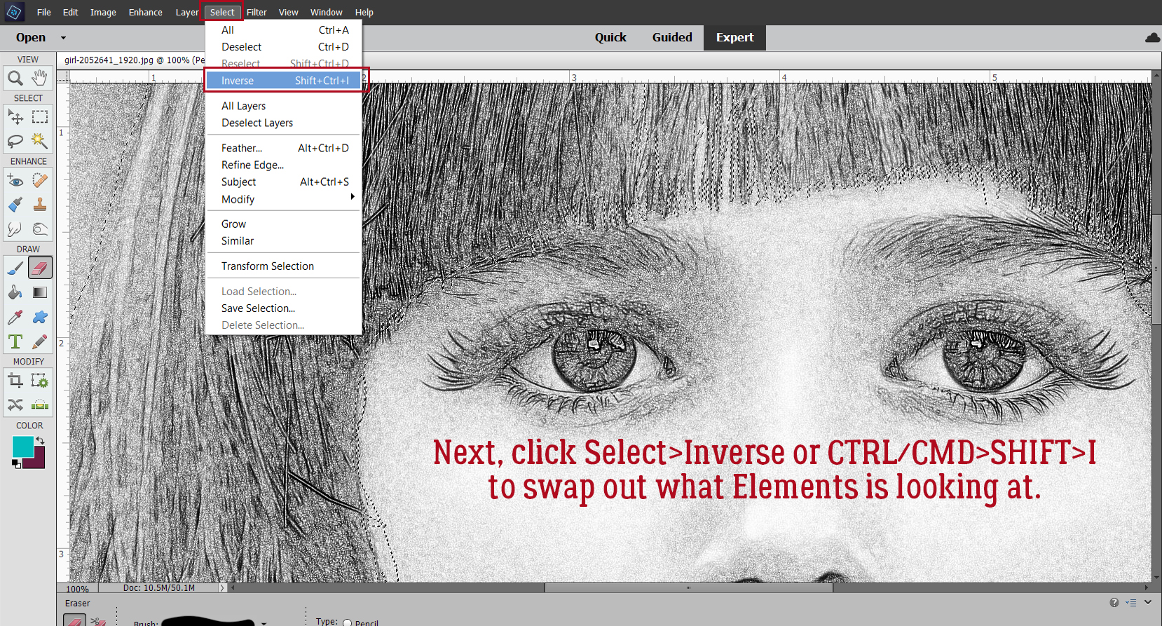
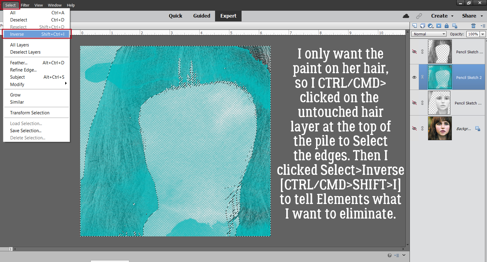
Without this step ALL that would be altered is the button. So I Inverted the Selection: Select>Inverse [CTRL/CMD>SHIFT>I]

Here you can see the marching ants around the button Selection. It’s not being touched by the adjustments made to the petals. They needed a lot of persuading!
Now let’s make a swatch of our own! It’s easy to do, and can really make a difference to your work. This photo has a lot of neutrals in it, but the Ball jar, flowers, hat… they’re all beautiful.

Start off with a blank New Document [CTRL/CMD>N] of whatever size you think will work based on how many colours you plan to add to your palette and with a transparent background. Make it something that is easy to divide. I’m making a grid with six columns and four rows, for a total of 24 colour blocks.

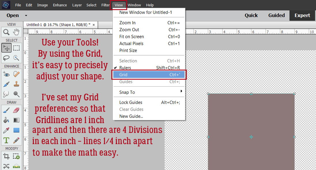
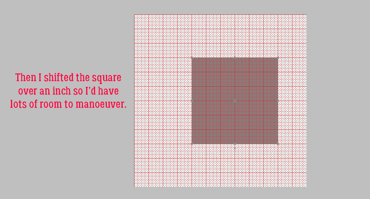
Elements has many hidden tools like the Grid. It’s activated by clicking View>Grid [CTRL/CMD>’] The parameters of your grid can be personalized in the Edit>Preferences menu. Mine are set to a major division every inch with guidelines every 1/4 inch. Using the Pencil tool with a diameter of 30 pixels and white in the foreground, I clicked at the top of the canvas at the 1 inch mark then held down the SHIFT key and clicked again at the bottom at the 1 inch mark. Then I worked across the canvas in the same way until I had 6 columns all 1 inch wide. Then I worked across, putting my lines at 1 1/2 inches apart.

I used the Eye Dropper tool [CTRL/CMD>I] to choose a spot on the darker, shadowed area of the Ball jar.

Next I used the Paint Bucket tool [CTRL/CMD>K] to fill the first block on my grid with that blue colour. I want to include the colour code on my swatch so then I clicked on the foreground colour – the darker blue – and made a note of the code in the box shown. If you trust your memory you don’t need to write the code down… I typed the colour code on top of the block in white and then Simplified the text layer – right-click and Simplify Layer. Why? If I didn’t, and I later needed to change the colour of my text for better visibility, ALL the unsimple text boxes would change too. No bueno!


Following the same process I used the Eye Dropper to pick a spot of lighter blue.

And filled the second colour block with the Paint Bucket.

Then getting the colour code from the Color Picker.

And here’s my palette derived from my Pixabay photo. I picked colours from the Ball jar, the tulips and the satin clutch purse. You might have chosen differently, and isn’t it grand that we’re all unique?!

Curious about the layout I built this tutorial around? It’s here.

Have fun with colour!

PFD Version: https://bit.ly/2WDWxyi


Tutorial Tuesday (Photoshop Elements)

Faking the Wood Burning Look

Last week Ellen (gmae) sent me this message:

Hi Jan, The above YouTube is for wood burning in Photoshop. He talks through this way too quickly for me so it will take me a few stop and go’s to get the directions down pat to try in Elements but I can see it being great for rustic, western, and camping titles. Since its from Photoshop not Elements there are some things he says to do that may take some figuring. My first attempt not so wood burning looking. Has a lot to do with the styles he puts on at the end I think. Just an FYI if you look at this.

Well, you know how much I love a challenge! And this one was a doozy. As Ellen said, it’s all about the styles he puts on at the end. Because this tutorial is adapted from Photoshop AND a 7 minute video, there are 46 screenshots so I can show each step clearly. That doesn’t mean it’s hard or will take all day. I just want to be sure even the most inexperienced user can follow along.

I’ll be demonstrating using a word art file from Word Art World‘s Jen Arbon. The woodgrain paper is from the GingerBread LadiesCabin Fever collab kit. If you’d like to use your own text or image, the technique will be exactly the same. [Simplify your text layer though!]

To start off, I made a Copy of the word art layer. You can right-click on the layer and choose Duplicate Layer then click OK on the pop-up, or you can use the keyboard shortcut CTRL/CMD>J. [It’s been awhile since I explained the keyboard shortcuts. These are simple keystrokes that take the place of several steps using the other methods of achieving something. I use Windows, which has a CTRL key. On a Mac, it would be a CMD key. Windows uses ALT and Mac uses OPT. So when I show you a keyboard shortcut I’ll give you both Windows and Mac keys.]

Next I created a new blank layer BETWEEN the two word art layers by holding down the CTRL/CMD key and clicking on the New Layer icon [looks like a sheet of paper with a corner dog-eared] from the top left of the Layers panel. The CTRL/CMD key tells Elements to put it UNDER the active layer.

With the blank layer active, I made the layer solid white: Layer>New Fill Layer>Solid Color

Since I’m filling the whole layer with white the box for Use Previous Layer to Create Clipping Mask can be unticked.

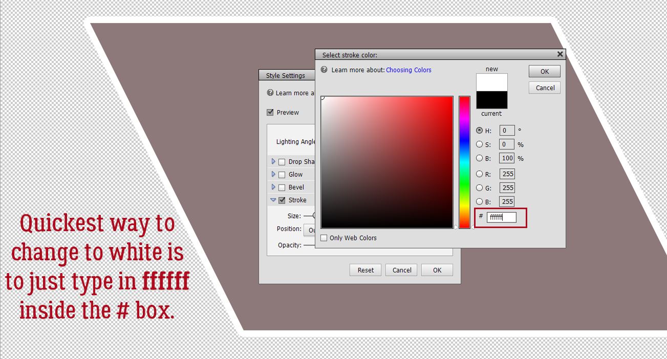
There are a couple of ways to choose a colour from the Color Picker: click on an area of a photo/paper/element with the Eyedropper tool, click on a spot inside the colour swatch or type in the colour number. Pure white is “ffffff“.

Then I Merged the white layer with the word art Copy layer: SHIFT>click on the two layers then right-click and choose Merge Layers or even simpler, CTRL/CMD>E.

Now I have three layers, with the wood paper on the bottom of the stack and the black-and-white word art layer on top as shown. I want to Select just the word art on the black-and-white layer so I CTRL/CMD>clicked on the layer thumbnail [the little image on the left of the layer in the panel] of the word art with the black-and-white layer active. See the marching ants?

I want to Modify the Selection. I clicked Select>Modify>Expand as shown.
I only want it to Expand by 1 pixel.

To fill that hairline space with black [in the foreground colour box] I clicked ALT/OPT>D and Elements did the work.

Next I Inverted the colours so the word art is white on black by just clicking CTRL/CMD>I. This tutorial has a bunch of things I’ve never tried before. This is the first one. Filter>Stylize>Wind.

This menu opens up. Make sure the Method is Wind. The Direction doesn’t matter at this point. You can see in the Preview pane what the Filter will do.

This Filter will be applied two more times. Elements will remember the last Filter used, so you can click Filter and Wind will be right at the top. Or, even easier, just click CTRL/CMD>F. Just make sure it’s applied three times in total.

This is what it’s supposed to look like. Don’t be alarmed!!

Now I’m going to do the Filter step again. Because I’m going to make a change to the settings I can’t just CTRL/CMD>F my way there.

This time the Direction has to be changed so the streaks go the opposite way.

Here’s after the first hit with the Wind Filter. The change isn’t very obvious.

So I hit it again two more times! CTRL/CMD>F and CTRL/CMD>F.

Wow! But don’t worry, that’s what it should look like!

And then I Inverted the colours again so the word art was once again black-on-white. CTRL/CMD>I.

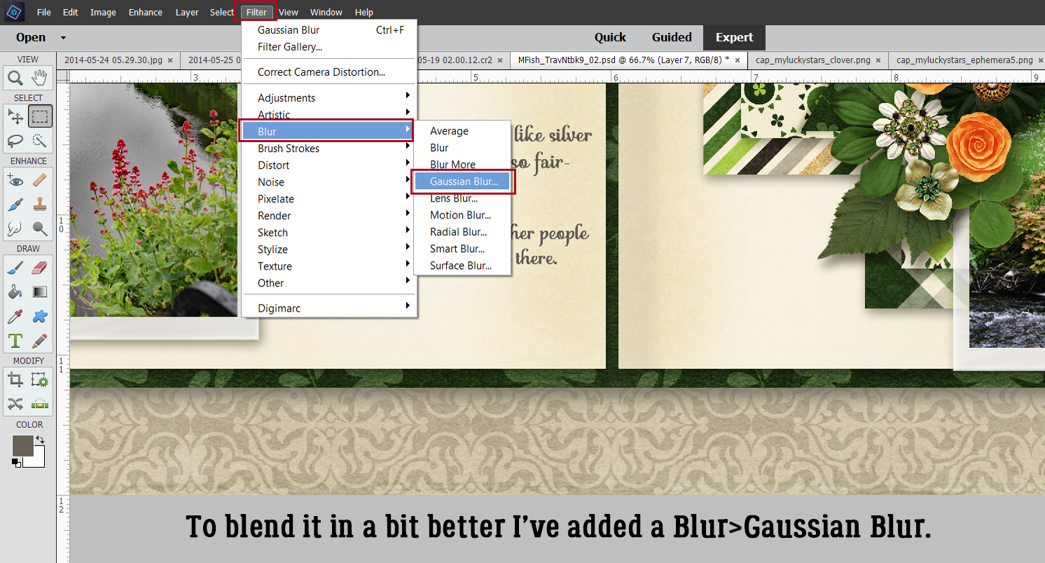
I’m not done with Filters yet. This time I’m going to add a Filter>Blur>Gaussian Blur to the mix.

But not too much of a Blur… just a Radius of 1 pixel.

The black is a bit harsh, so I clicked Enhance>Adjust Lighting>Levels. Keyboard shortcut: CTRL/CMD>L.

And I changed the Output Level from 0 to 72. That grays the black a bit, but not too much.

Remember Blend Modes? They’re such a great tool!! I changed the Blend Mode to Color Burn by clicking on that bar above the Layers panel that usually says Normal and choosing Color Burn from the dropdown list.

Now the sugars in the wood look like they’ve been caramelized!

It’s a little TOO obvious, so I dropped the Opacity of the layer to 60%.

Once again I Selected the edges of the word art by CTRL/CMD>clicking on the word art layer thumbnail with the altered word art layer active. Then I did something else I’ve never tried before… Select>Feather to soften the edges of the caramelized areas just a teensy bit.

I gave it a Feather Radius of 2 pixels. Everything about this needs a light touch.

With the edges still Selected, I added a new Fill Layer. Layer>New Fill Layer>Solid Color. This new Fill Layer will be the base for the next few steps.

Again, I didn’t need to tick the Use Previous Layer to Create Clipping Mask, because only the Selected areas will be filled. On this settings menu, I dropped the Opacity of the Fill to 40%.

The Color Picker opened, and I wanted pure black. The code number for black is 000000.

After I created the Fill Layer, I Simplified it so the mask went away. Right-click on the layer and choose Simplify Layer.

Next I made 2 Copies of this black Fill Layer and turned Visibility for the top two Copy Layers off. I wanted to see what was happening to each active layer, starting with the original Fill Layer. [In Photoshop the next several steps can all be accomplished on the same layer, but Elements isn’t that skillful. Each step needs its own layer. *Where have you heard that before?*]

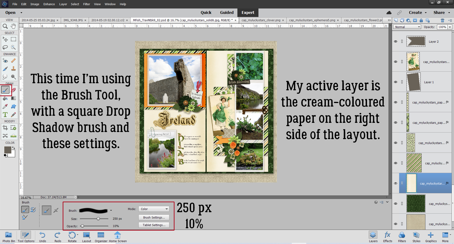
To the bottom Fill Layer, I added a Bevel Style. Click on the Styles button at the bottom of the Layers panel then choose Bevels. From the dropdown menu choose Simple Outer as shown. [If you hover the cursor over the thumbnails in the dropdown, a description box opens so you know what’s what.]

Each of the Styles has a default setting, but you can easily change the settings by double-clicking on the fx icon on the far right of the layer. The settings menu opens. Here I changed the Lighting Angle to 130°, the Drop Shadow settings to Size 29 pixels, Distance 13 pixels, and Opacity 22%, then the Bevel settings to 20 pixels and the Direction to Down.

Next I activated the first Copy Layer just above the layer I last worked on, but this time I chose Styles>Inner Shadows.

I double-clicked the fx icon and from the settings I made the Lighting Angle 147°, Size 50 pixels, Distance 4 pixels and Opacity 20%.

Then I changed the Blend Mode for this layer to Linear Burn.

It’s looking pretty good!

I wanted just a bit more depth to the image so I activated the top Copy Layer and from the Styles menu I chose Outer Glows.

I used Simple from the menu as shown.

After double-clicking on the fx icon, I adjusted the settings: Lighting Angle 130°, Size 21 pixels and Opacity 25%.

The Outer Glow layer looked odd on top so I moved it to the bottom of the Copy Layer stack and lowered the Opacity to 10%. This took a bit of experimentation based on what I wanted to see.

Last but not least, I turned the original word art layer’s visibility back on. I’m quite pleased with how it turned out.

Some comments: The way this technique looks in the end will depend on several factors. If you use a smooth wood paper, your burned area will be smooth too. If you use a darker or lighter wood paper, you may need to fiddle with Opacity to get the looks you want. Obviously, doing this to a darker wood will result in darker burned areas, and it may be hard to see. On a lighter coloured wood, it may look too black, and again, you’d need to make some tweaks. I scrapped my work (and about 100 screenshots) 4 times before I was comfortable with this enough to show it to you. Don’t be afraid to make some of your own decisions! If you’re not happy with it, make some changes!!

PDF Version: https://bit.ly/3zAdEQ4