Mixing it UP!
![]()
This week’s tutorial is going to take a slightly different path than most of the others. Many of you may not know this about me but I’m NOT a kit-scrapper. I can do it if I must, but I like to pull goodies from several kits for most of my layouts. My credit lists are usually quite lengthy and the September Color Challenge layout I created as the basis for this tut is no exception. Colour challenges are actually the perfect vehicle for mixing up kits; this month’s was pretty straight-forward since it only required shades of blue. But what do you do when the designer has provided a swatch and you don’t have a kit with all the colours in it? You mix a bunch of kits together!
Caveat: This is my workflow and you might have a method that will work better for you.
I like to use templates, not gonna lie. They make scrapping so much easier. And I like to use folders. For me, they too make scrapping easier. For mixing kits, folders are a HUGE help. I have folders for each store I frequent, each of the kits I’ve added to my stash and I have folders for every layout I’ve created. It helps keep me organized. I’ve read posts from people who go through all of their kits and individually tag EVERYTHING. That’s a ton of work, and for the most part, it’s unnecessary. Designers usually label everything in a kit in some way, so why duplicate their efforts? Work Smart, Not Hard!
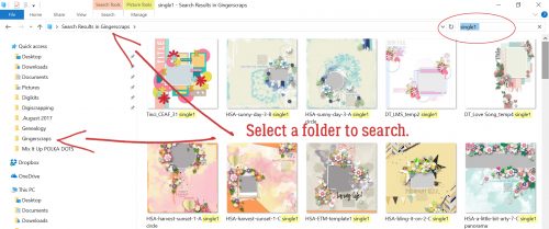
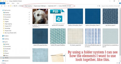
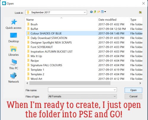
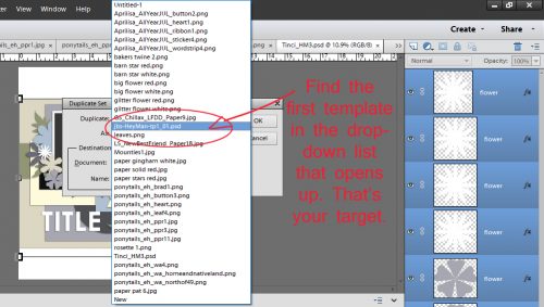
So let’s talk about folders. At the beginning of every month, I create a Challenges folder. And in this folder I add subfolders for all my favourite challenges. Into those folders, I copy my photo(s), template, papers and elements. After I’m happy with the layout, have ensured I have no bloopers and the layout is posted, I empty the folder of everything but the PSD of the layout and 2 JPEGs. That keeps the space taken up by the layout to a minimum but lets me find them later. The image below shows some of my folders in the list to the left. My first step is to select a template to use. In the tutorial on organizing your stash, I talked about labeling template previews in some fashion so it’s easier to find what you’re looking for later. My system, borrowed from someone else but modified to suit my workflow, is to label with whether the template is for a single or double spread, the number of photo spots and sometimes the shape/mask/blend the photo spots assume. The screenshot below shows a Windows File Explorer search for a single spread with 1 photo. (The icon for this utility is the file folder… super simple!) I had chosen a cute photo to build my layout around, so I opened my GingerScraps digikit folder then in the search box shown on the upper right, I typed in “single1“. After a few minutes, Windows had found all the template previews so labeled and showed them to me. (The actual search time will depend on the size of the folder you’re searching and the number of like objects to be found. It may only take seconds.) Now I could look at them and pick a template that would work for my layout.
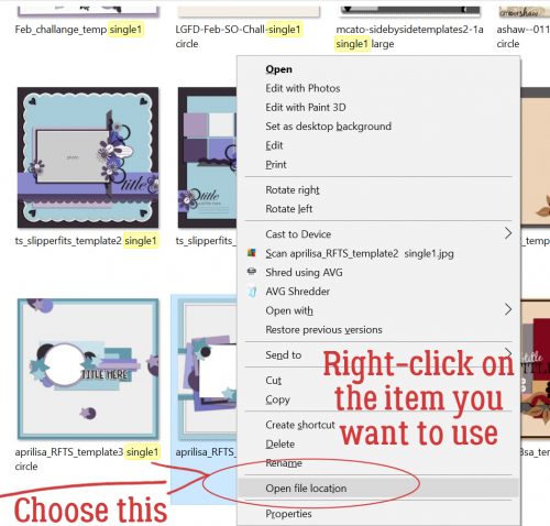
Now, how did I find the actual template, you ask, since all that’s displayed are the preview thumbnails? I right-clicked on the preview and selected Open file location from the menu window. That takes me right to the folder that holds the template. Then I copied the template file into my challenge folder. For other searches this step won’t be necessary, because you can just copy the objects right from the search pane.
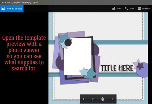
Next, I opened the template preview thumbnail in a photo viewer so I could see what supplies I needed to find next. I counted up the different papers the template employs and went on to my next search.
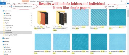
For this search, I put “paper blue” in the search box, as I’ve shown below. And Windows found all the papers labeled with those two words. Results will show both folders and individual images, which makes it easy to see just what you’re looking for.
I copied each of the blue papers I might want to use into my GingerScraps Challenges> September 2017>Colour SHADES OF BLUE folder so I could see them all in one place. That helped me determine if they’d work together or not. They look pretty good!
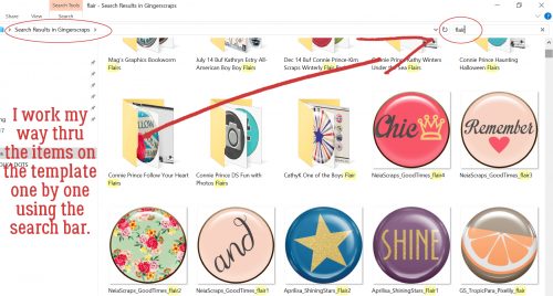
I worked my way through the different items used for the template one at a time to find things I wanted to include. There was a circular element I decided must be a flair, so I did a “flair” search.
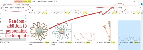
Remembering that templates don’t necessarily have to be duplicated exactly, I chose to add some string to it. The search showed me a blue string right near the top that would work beautifully!
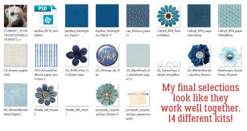
Once I had chosen all the things I thought I might use (substituting flowers for the stars) I could see everything in one place and knew they’d all work well together. I had pieces from FOURTEEN kits!
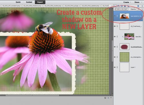
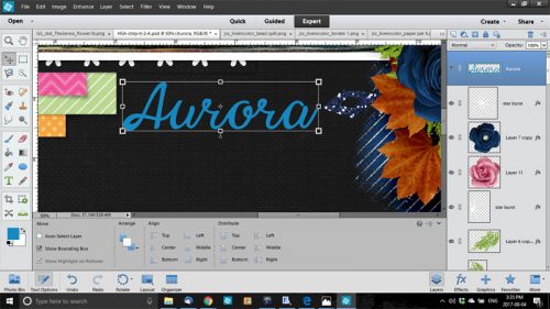
Once I was ready to build my layout, I opened Photoshop Elements and went to the Colour SHADES OF BLUE folder and opened all the items onto my workspace. From there it was zip, zip, zip!
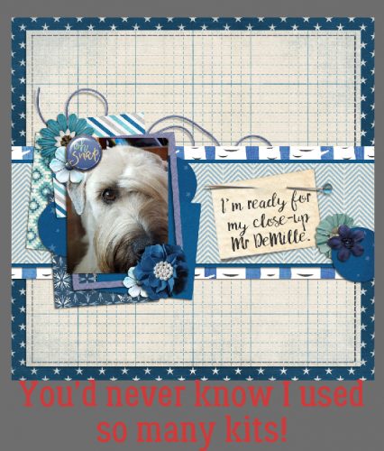
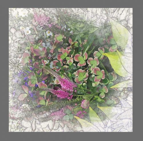
And this is where I ended up. (Once I post my challenge layout, I add a hyphen to the beginning of the folder name so I know it’s done.)
Another way this method is useful is for speed scraps. You can have Windows searching for things while you work on the previous steps. That’s sort of where I came up with my system. I used to partake of monthly speed scraps at another site that is no longer around and I wanted to be sure I was finished my layout with time to spare in order to win the prize.
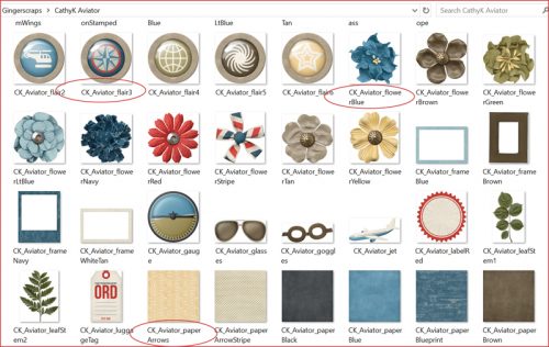
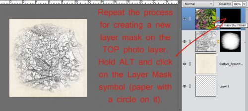
This screenshot shows how CathyK has labelled the items in her kit Aviator. This is for GingerScrapper Karen who had some questions about metadata.
Please feel free to adapt this however it will work for you!
![]()


