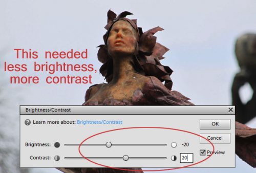
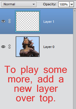
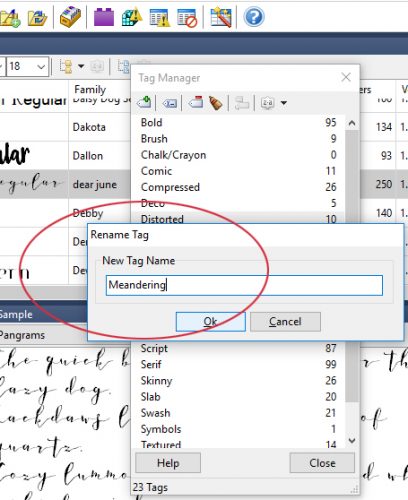
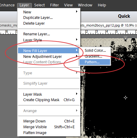
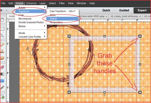
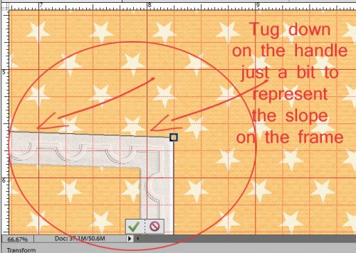
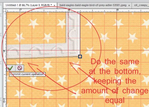
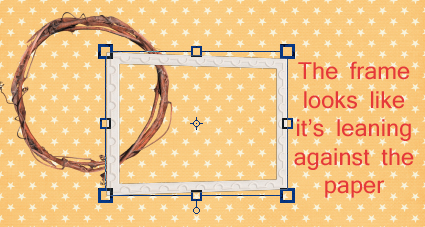
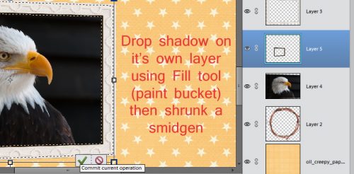
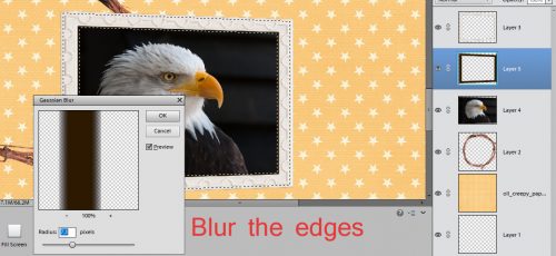
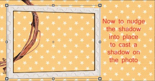
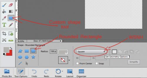
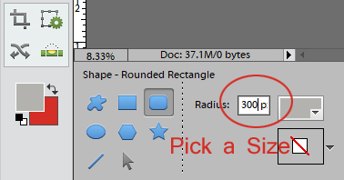
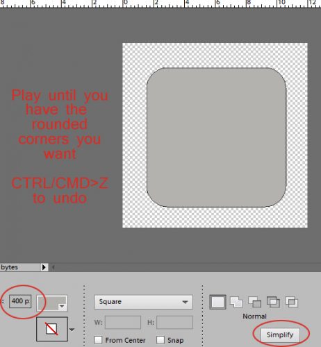
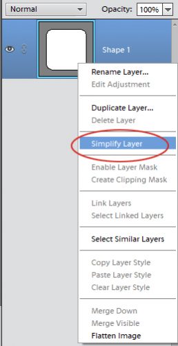
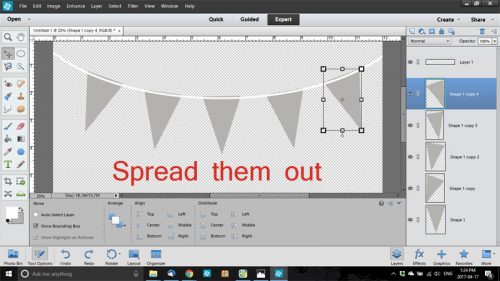
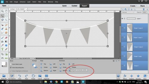
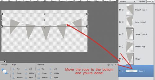
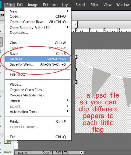
Over-the-Top TITLES
![]()
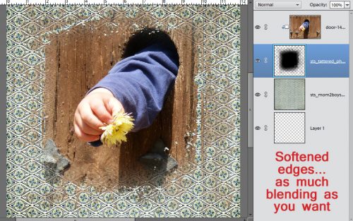
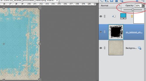
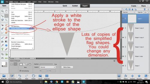
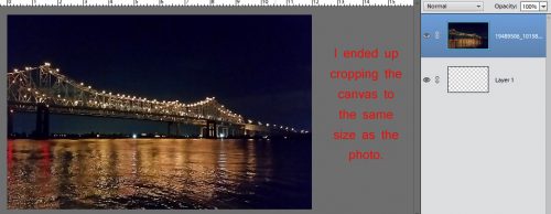
I don’t know about the rest of you but I’ve had a ridiculously busy week. Actually, all of June has been ridiculously busy! So this week’s tutorial is a quick-and-dirty little how-to that was inspired by some of the layouts popping up on my Facebook feed. I thought I’d show you how to have your title looking like it’s coming right out of a fantastic panoramic photo. So I went through some of my favourite scenic shots and chose this one of the Crescent City Connection bridge over the Mississippi River in New Orleans. In the screenshot below, the transparent canvas underneath it is 12×12, because I thought I’d use that size canvas… but…

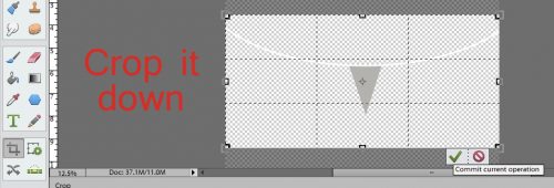
I changed my mind and cropped it down to the same size as the photo.
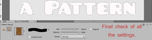
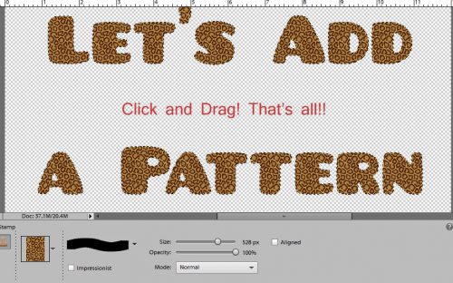
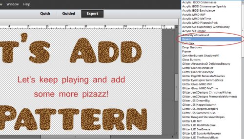
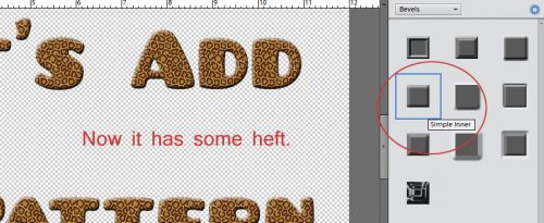
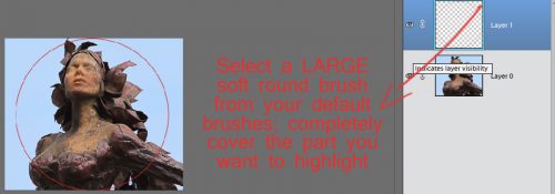
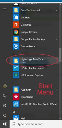
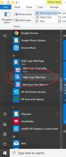
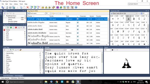
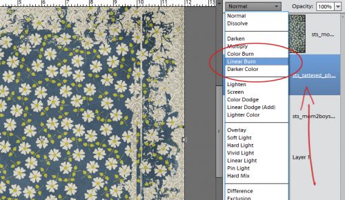
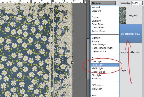
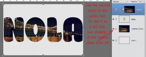
Then I took a look through my fonts (using MainType 7.0, of course!) and found a meaty, slab-type font that would be perfect for my purpose. It’s called Konga Pro and it’s got that lazy, Deco summer-day kind of look to it. I typed out my title and enlarged it to stretch from one side of my canvas to the other. The photo’s visibility is turned off so I don’t get confused.

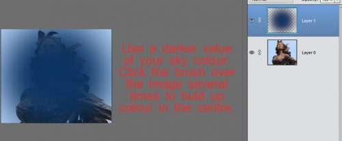
Then I copied my photo (CRTL/CMD>J) and moved the copy on top of my title as I’ve shown below.

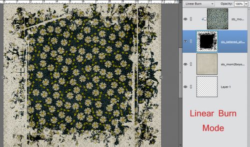
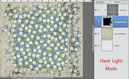
Visibility of the first photo is still off for this step. Clip the photo to the title; CTRL/CMD>G is your WSNH shortcut.
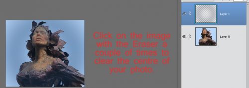
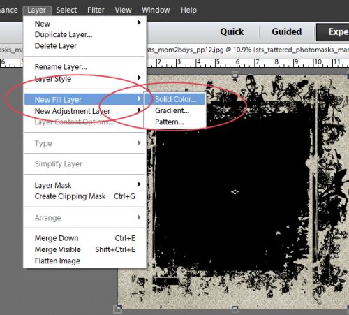
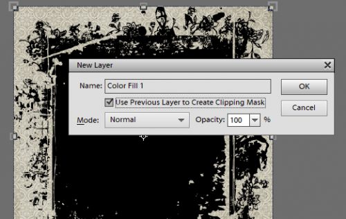
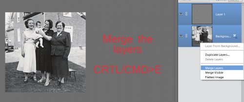
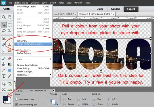
If you’re happy with the placement and appearance, go ahead and merge your clipping mask and photo layers. Select both the layers in the Layers panel then WSNH = CTRL/CMD>E

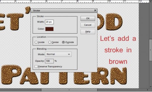
Now to set the title apart from the photo. Choose a colour from the photo to use for a narrow stroke around the outside. I chose one of the dark blue shades. You want a visible separation but nothing really obvious; since my photo is a night shot, dark was my choice, but if you’re using a winter scene or a beach scene, it might be better to choose a lighter colour. You’ll know it’s right when you see it.
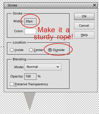
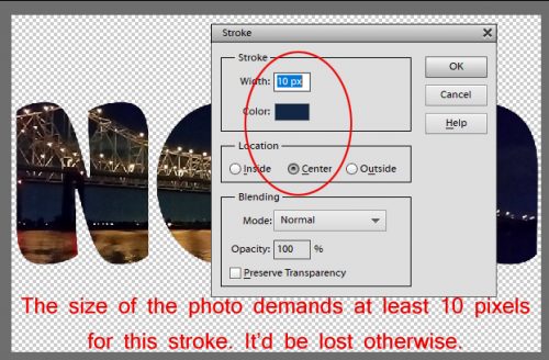
I went with 10 pixels for this outline, just to tighten it up and give a bit of definition. I centered it on the edge to smooth out the jagged pixels.
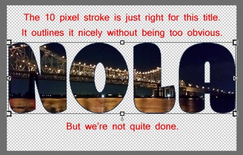
As you can see below, it looks just fine.
Another stroke outside the first one will add a little more distinction. I tried white and 20 pixels.

Not loving it! The white is too much, and too wide. So for my next version, I dropped the width down to 10 pixels again.

I made the stroke a greenish-grey pulled from the horizon. Not really working either.

But this bronze from the lights reflecting on the water is subtle, and it looks much nicer to my eye. I’m going to go with this one.

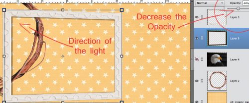
Pop in a bit of a drop shadow and it’s just the look I was after!

With the shadow, it’s got some dimension. Give it a shot with one of your favourite scenic photos and a hefty font and see how you like it!

![]()