Keeping Things in Perspective
![]()
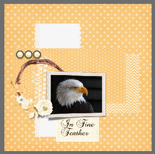
Ellen (aka gmae) issued me the challenge of helping her with perspective. We think that’s what she wants to learn… we had some difficulty pinning it down since she wasn’t able to find the example she wanted to emulate. She described it as a framed photo that wasn’t perfectly perpendicular to the viewer, or not laying flat on the paper. She said that when she tried to do it herself it looked odd, because the photo didn’t match the perspective of the frame. So this is what I’ve come up with. Ellen, if it’s not what you wanted to learn, we’ll take another run at it.
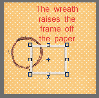
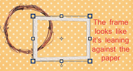
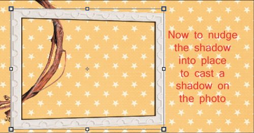
I started out with a frame (Seatrout Scraps Summer’s End – retired) that is resting partially on a grapevine wreath (Seatrout Scraps Autumn Odyssey). To make the steps more visible, they’re laying atop a paper from Ooh La La Scraps Creepy kit, which I used extensively in the remainder of my layout.
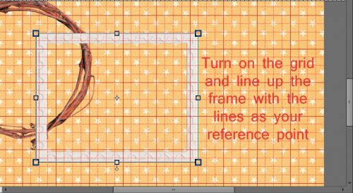
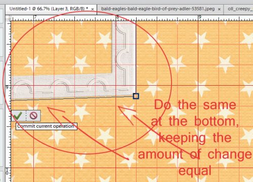
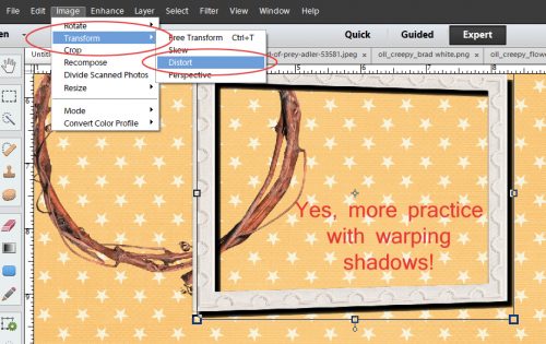
To make this technique work you’ll need PSE’s grid overlay to be visible. If you don’t use this tool, you’re missing out! You can do so many great things with it. To turn it on, click the View tab, then select Grid from the drop down menu. WSNH= CTRL/CMD>’ Line up your frame so that the top and the bottom are either on a line or an equal distance from two parallel lines.
Next step: Image>Transform>Distort where you’ll be moving the corners toward each other just the teensiest bit. I started with the top one and moved the handle (that square at the corner of the bounding box) vertically until it was halfway between two horizontal lines on the grid.
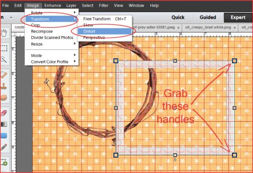
You can see in the detailed screenshot below what I mean. You can also see that I kept the right edge parallel to the edge of the paper.
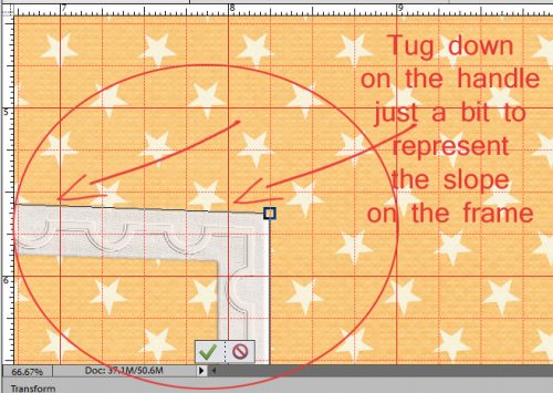
Then I did the same thing at the bottom. DON’T Commit current operation until you’ve adjusted both corners!
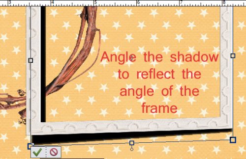
So now the frame is slightly narrower at the right edge than it is on the left, just enough to be visible. And it looks like it’s touching the paper, but raised off it by the wreath.
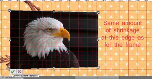
The photo I chose doesn’t provide a dramatic view of what needs to happen to the photo in this technique in the way a photo of a landscape might, but I still went ahead and adjusted it anyway.
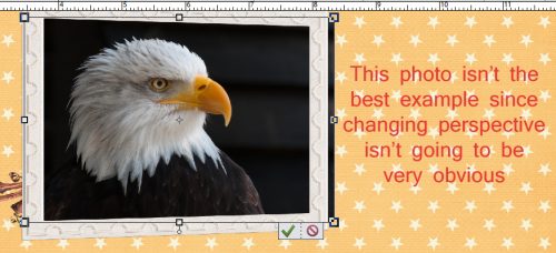
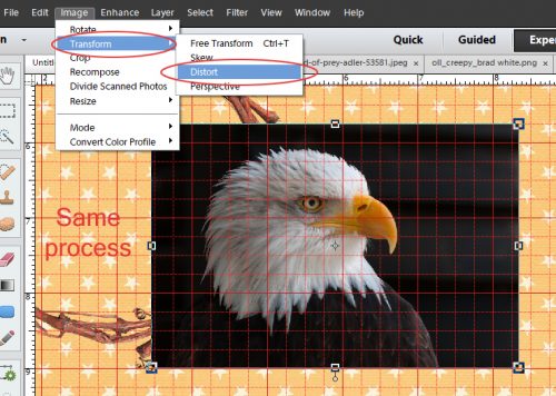
You guessed it… I did exactly the same thing with the photo that I did with the frame.
The amount I shrunk it is the same as for the frame.
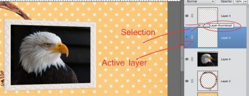
Now it’s essential to create perfect shadows for this frame and photo so it looks natural and real. So I created a new layer just underneath the frame. Layer>New>Layer and then moved it down. WSNH= CTRL/CMD>sheet of paper icon puts it underneath automatically. Then I clicked on the layer thumbnail for the frame to select the outline of it, while my NEW layer was active.
Using the Fill tool (aka the paint bucket) and my shadow colour (2c1901) I filled the selection on that layer under the frame.
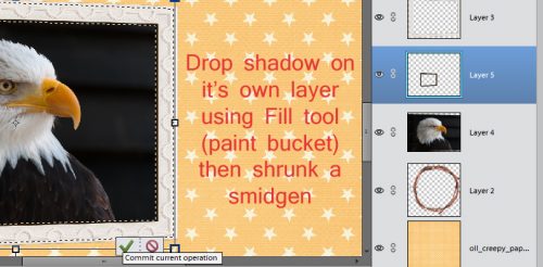
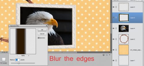
This shadow is going to be for the inside edge of the frame. So I resized it a little bit, as you can see by the location of the marching ants. I blurred the shadow layer using Filter>Blur>Gaussian Blur set at 7.1 pixels. You can choose what looks good to you.
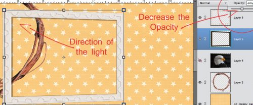
Then I nudged the shadow into place with the direction of the light source coming from the upper left corner (120°). I turned the visibility of the photo off, since the background of it is dark, and I needed to see where I was putting the shadow.
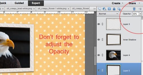
To make it look more natural, I decreased the Opacity to 44%.
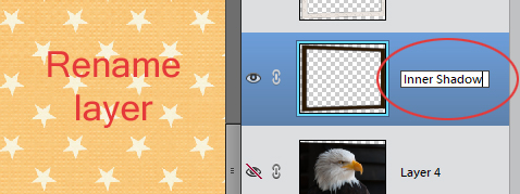
I renamed the layer by double-clicking on the name in the Layers panel and called it Inner Shadow.
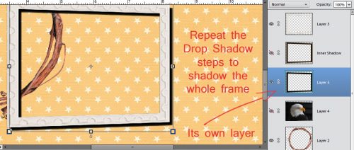
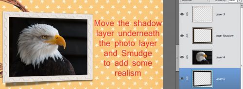
Then I repeated the steps for creating a shadow for the frame so that I could have a shadow under the framed photo. It’s on its own layer.
Look at all the practice you’re getting with Transforming images!
I pulled the lower left corner of the frame’s shadow down and away to add to the visual impression that the frame is resting on top of something thick, while keeping the lower right corner fairly close to the frame.
Then I moved that shadow layer underneath the photo and used the Smudge tool to enhance the realism of the shadow. I just pushed some of the edge a little closer to the frame.
After adjusting the Opacity to 50%, I was really pleased with how it all looked.
Does it look to you like the framed photo is lifted off the page where it rests on the wreath? I think it does.
Remember, if you’ve used a technique from these tutorials, post your finished layout in the GingerScraps Facebook Tutorial Tuesday Challenge Gallery for an opportunity to have YOUR chance to challenge me. If you’re not a Facebooker, you can post a link to the layout you’ve created with the tutorial you used in the comments section here on the Blog. I’ll get a notification and will then enter you into the draw. The first week of each month I’ll have a random draw of all entries and the winner will be announced at the end of the first tutorial of that month.
Next week I’ll have the winner of the April Tutorial Challenge for you, and hopefully Michelle will have her challenge for me figured out. I’m having so much fun!
![]()